在Python中使用 Plotly 绘制箱线图
Plotly是一个Python库,用于设计图形,尤其是交互式图形。它可以绘制各种图形和图表,如直方图、条形图、箱线图、散布图等等。它主要用于数据分析和财务分析。 plotly 是一个交互式可视化库。
箱形图
箱线图是通过四分位数对数字数据的人口统计表示。最后四分位数和上四分位数用方框表示,而中位数(第二四分位数)在方框内用一条线表示。 Plotly.express 是一个方便、高级的 plotly 界面,它对各种数据进行操作并生成易于样式化的图形。Box 对于比较数据组非常有用。箱线图划分约。将 25% 的部分数据分成集合,这有助于离子快速识别值、数据集的分散性和偏度迹象。
Syntax: plotly.express.box(data_frame=None, x=None, y=None, color=None, facet_row=None, facet_col=None, facet_col_wrap=0, hover_name=None, hover_data=None, custom_data=None, animation_frame=None, animation_group=None, category_orders={}, labels={}, color_discrete_sequence=None, color_discrete_map={}, orientation=None, boxmode=None, log_x=False, log_y=False, range_x=None, range_y=None, points=None, notched=False, title=None, template=None, width=None, height=None)
参数:Name Description data_frame This argument needs to be passed for column names (and not keyword names) to be used. Array-like and dict are transformed internally to a pandas DataFrame. Optional: if missing, a DataFrame gets constructed under the hood using the other arguments. x Either a name of a column in data_frame, or a pandas Series or array_like object. Values from this column or array_like are used to position marks along the x axis in cartesian coordinates. Either x or y can optionally be a list of column references or array_likes, in which case the data will be treated as if it were ‘wide’ rather than ‘long’. y Either a name of a column in data_frame, or a pandas Series or array_like object. Values from this column or array_like are used to position marks along the y axis in cartesian coordinates. Either x or y can optionally be a list of column references or array_likes, in which case the data will be treated as if it were ‘wide’ rather than ‘long’. color Either a name of a column in data_frame, or a pandas Series or array_like object. Values from this column or array_like are used to assign color to marks. facet_row Either a name of a column in data_frame, or a pandas Series or array_like object. Values from this column or array_like are used to assign marks to facetted subplots in the vertical direction. facet_col Either a name of a column in data_frame, or a pandas Series or array_like object. Values from this column or array_like are used to assign marks to facetted subplots in the horizontal direction. facet_col_wrap Maximum number of facet columns. Wraps the column variable at this width, so that the column facets span multiple rows. Ignored if 0, and forced to 0 if facet_row or a marginal is set. hover_name Either a name of a column in data_frame, or a pandas Series or array_like object. Values from this column or array_like appear in bold in the hover tooltip. hover_data Either a list of names of columns in data_frame, or pandas Series, or array_like objects or a dict with column names as keys, with values True (for default formatting) False (in order to remove this column from hover information), or a formatting string, for example ‘:.3f’ or ‘|%a’ or list-like data to appear in the hover tooltip or tuples with a bool or formatting string as first element, and list-like data to appear in hover as second element Values from these columns appear as extra data in the hover tooltip. custom_data Either names of columns in data_frame, or pandas Series, or array_like objects Values from these columns are extra data, to be used in widgets or Dash callbacks for example. This data is not user-visible but is included in events emitted by the figure (lasso selection etc.) animation_frame Either a name of a column in data_frame, or a pandas Series or array_like object. Values from this column or array_like are used to assign marks to animation frames. animation_group Either a name of a column in data_frame, or a pandas Series or array_like object. Values from this column or array_like are used to provide object-constancy across animation frames: rows with matching `animation_group`s will be treated as if they describe the same object in each frame. category_orders By default, in Python 3.6+, the order of categorical values in axes, legends and facets depends on the order in which these values are first encountered in data_frame (and no order is guaranteed by default in Python below 3.6). This parameter is used to force a specific ordering of values per column. The keys of this dict should correspond to column names, and the values should be lists of strings corresponding to the specific display order desired. labels By default, column names are used in the figure for axis titles, legend entries and hovers. This parameter allows this to be overridden. The keys of this dict should correspond to column names, and the values should correspond to the desired label to be displayed. color_discrete_sequence Strings should define valid CSS-colors. When color is set and the values in the corresponding column are not numeric, values in that column are assigned colors by cycling through color_discrete_sequence in the order described in category_orders, unless the value of color is a key in color_discrete_map. Various useful color sequences are available in the plotly.express.colors submodules, specifically plotly.express.colors.qualitative. color_discrete_map String values should define valid CSS-colors Used to override color_discrete_sequence to assign a specific colors to marks corresponding with specific values. Keys in color_discrete_map should be values in the column denoted by color. Alternatively, if the values of color are valid colors, the string ‘identity’ may be passed to cause them to be used directly. orientation (default ‘v’ if x and y are provided and both continuous or both categorical, otherwise ‘v’`(‘h’) if `x`(`y) is categorical and y`(`x) is continuous, otherwise ‘v’`(‘h’) if only `x`(`y) is provided) boxmode One of ‘group’ or ‘overlay’ In ‘overlay’ mode, boxes are on drawn top of one another. In ‘group’ mode, baxes are placed beside each other. log_x If True, the x-axis is log-scaled in cartesian coordinates. log_y If True, the y-axis is log-scaled in cartesian coordinates. range_x If provided, overrides auto-scaling on the x-axis in cartesian coordinates. range_y If provided, overrides auto-scaling on the y-axis in cartesian coordinates. points One of ‘outliers’, ‘suspectedoutliers’, ‘all’, or False. If ‘outliers’, only the sample points lying outside the whiskers are shown. If ‘suspectedoutliers’, all outlier points are shown and those less than 4*Q1-3*Q3 or greater than 4*Q3-3*Q1 are highlighted with the marker’s ‘outliercolor’. If ‘outliers’, only the sample points lying outside the whiskers are shown. If ‘all’, all sample points are shown. If False, no sample points are shown and the whiskers extend to the full range of the sample. notched If True, boxes are drawn with notches. title The figure title. template The figure template name (must be a key in plotly.io.templates) or definition. width The figure width in pixels. height The figure height in pixels.
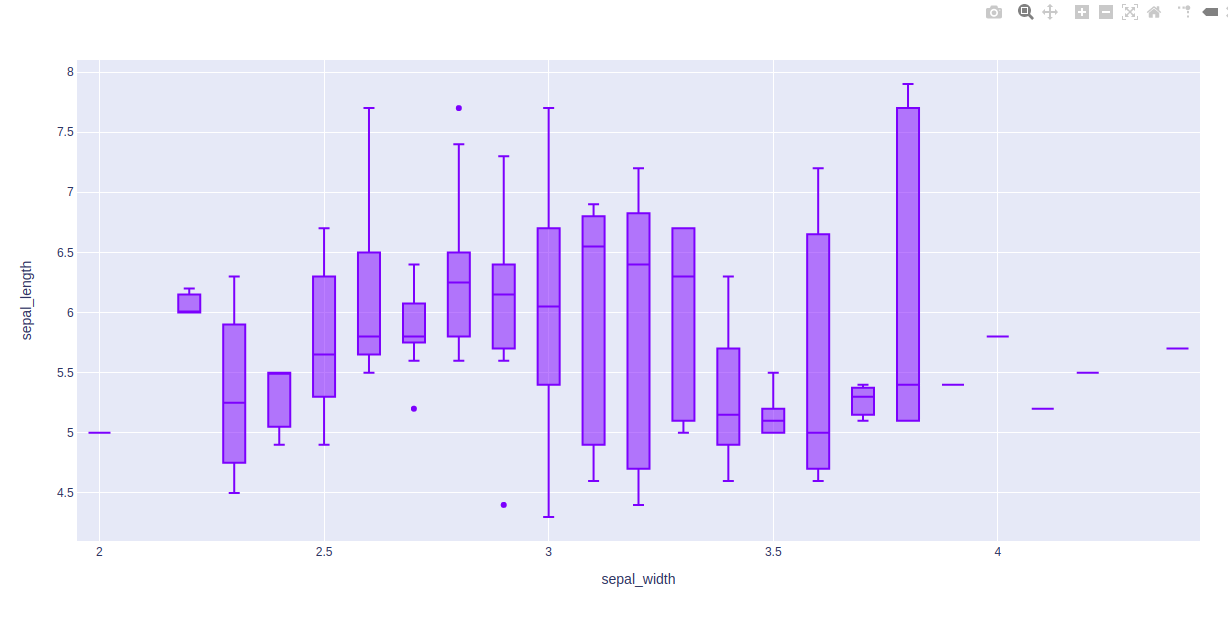
示例 1:使用 Iris 数据集
Python3
import plotly.express as px

df = px.data.iris()

fig = px.box(df, x="sepal_width", y="sepal_length")

fig.show()
Python3
import plotly.express as px

df = px.data.tips()

fig = px.box(df, x = "sex", y="total_bill")
fig.show()
Python3
import plotly.express as px

df = px.data.tips()

fig = px.box(df, x = "sex", y="total_bill", points="all")
fig.update_traces(quartilemethod="inclusive")

fig.show()
Python3
import plotly.express as px

df = px.data.tips()

fig = px.box(df, x = "sex", y="total_bill", points="all")
fig.update_traces(quartilemethod="exclusive")

fig.show()
Python3
import plotly.express as px

df = px.data.tips()

fig = px.box(df, x = "sex", y="total_bill", points="all")
fig.show()
Python3
import plotly.express as px

df = px.data.tips()

fig = px.box(df, x = "sex", y="total_bill", points="outliers")
fig.show()
Python3
import plotly.express as px

df = px.data.tips()

fig = px.box(df, x = "sex", y="total_bill", points="all", notched=True)
fig.update_traces(quartilemethod="exclusive")

fig.show()
输出:
示例 2:使用提示数据集
Python3
import plotly.express as px

df = px.data.tips()

fig = px.box(df, x = "sex", y="total_bill")
fig.show()
输出:
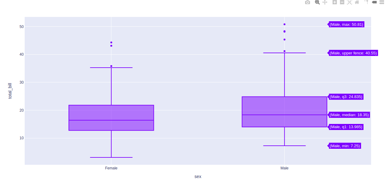
在上面的例子中,我们先看图中的第一个箱线图,了解一下这些统计的东西:
- 箱线图底部水平线为最小值
- 箱线图矩形形状的第一条水平线是第一四分位数或 25%
- 箱线图矩形形状的第二条水平线是第二四分位数或 50% 或中位数。
- 箱形图矩形形状的第三条水平线是第三四分位数或 75%
- 箱线图矩形顶部水平线为最大值。
- 蓝色箱形图的小菱形是异常数据或错误数据。
更改四分位数的算法
选择四分位数的算法也可以在 plotly 中选择。默认使用线性算法计算。然而,它提供了另外两种算法来做同样的事情,即包容性和排斥性。
示例 1:使用包容性算法
Python3
import plotly.express as px

df = px.data.tips()

fig = px.box(df, x = "sex", y="total_bill", points="all")
fig.update_traces(quartilemethod="inclusive")

fig.show()
输出:

示例 2:使用排他算法
Python3
import plotly.express as px

df = px.data.tips()

fig = px.box(df, x = "sex", y="total_bill", points="all")
fig.update_traces(quartilemethod="exclusive")

fig.show()
输出:
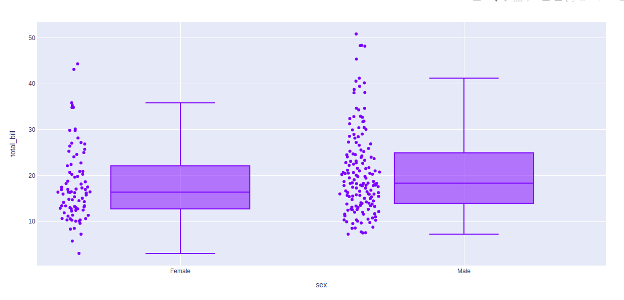
显示基础数据
可以使用 points 参数显示基础数据。这个参数的值可以是三种类型——
- 全部为所有点
- 仅异常值的异常值
- 以上都不是假的
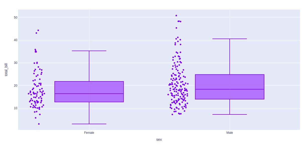
示例 1:将 all 作为参数传递
Python3
import plotly.express as px

df = px.data.tips()

fig = px.box(df, x = "sex", y="total_bill", points="all")
fig.show()
输出:
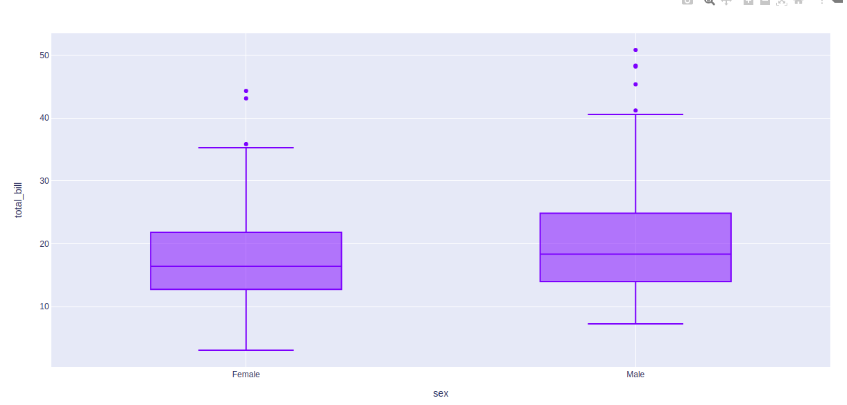
示例 2:
Python3
import plotly.express as px

df = px.data.tips()

fig = px.box(df, x = "sex", y="total_bill", points="outliers")
fig.show()
输出:
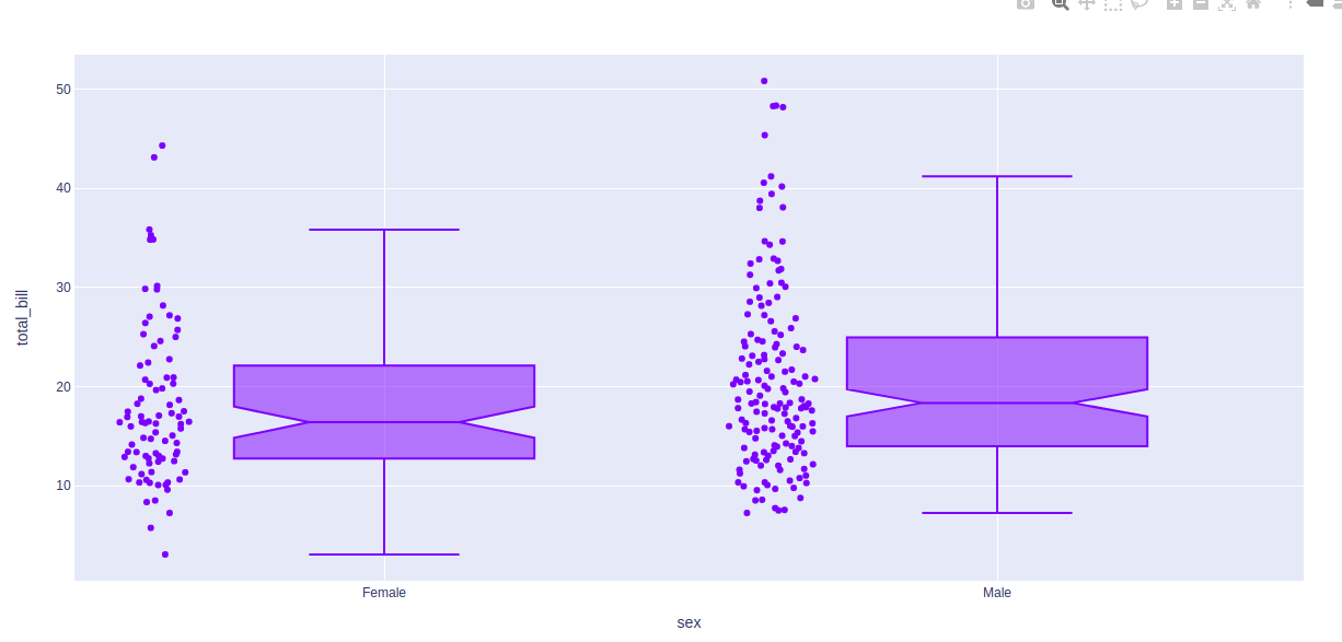
造型箱线图
Boxplot 带有各种样式选项。让我们在下面的示例中查看一个这样的选项。
例子:
Python3
import plotly.express as px

df = px.data.tips()

fig = px.box(df, x = "sex", y="total_bill", points="all", notched=True)
fig.update_traces(quartilemethod="exclusive")

fig.show()
输出: