使用 ggplot2 在 R 中绘制箱线图
在本文中,我们将使用 ggplot2 包以 R 编程语言创建具有各种功能的 Boxplot。
对于数据分布,您可能需要比集中趋势值(中值、均值、众数)更多的信息。要分析数据可变性,您需要知道数据的分散程度。好吧,箱线图是说明数据中值分布的图表。箱线图通常用于通过呈现五个汇总值以标准方式显示数据的分布。下面的列表总结了最小值、Q1(第一四分位数)、中位数、Q3(第三四分位数)和最大值。总结这些值可以为我们提供有关异常值及其值的信息。
在 ggplot2 中,geom_boxplot() 用于创建箱线图。
Syntax: geom_boxplot( mapping = NULL, data = NULL, stat = “identity”, position = “identity”, …, outlier.colour = NULL, outlier.color = NULL, outlier.fill = NULL, outlier.shape = 19, outlier.size = 1.5, notch = FALSE,na.rm = FALSE, show.legend = FALSE, inherit.aes = FALSE)
使用中的数据集:Crop_recommendation
让我们首先创建一个常规箱线图,为此我们首先必须导入所有必需的库和正在使用的数据集。然后简单地将所有属性与 geom_boxplot 一起放入 ggplot()函数。
例子:
R
library(ggplot2)
# Create the dataset or load the dataset
# for the chart
Dataset <- c(17, 32, 8, 53, 1,45,56,678,23,34)
Dataset
# loading data set and storing it in ds variable
ds <- read.csv(
"c://crop//archive//Crop_recommendation.csv", header = TRUE)
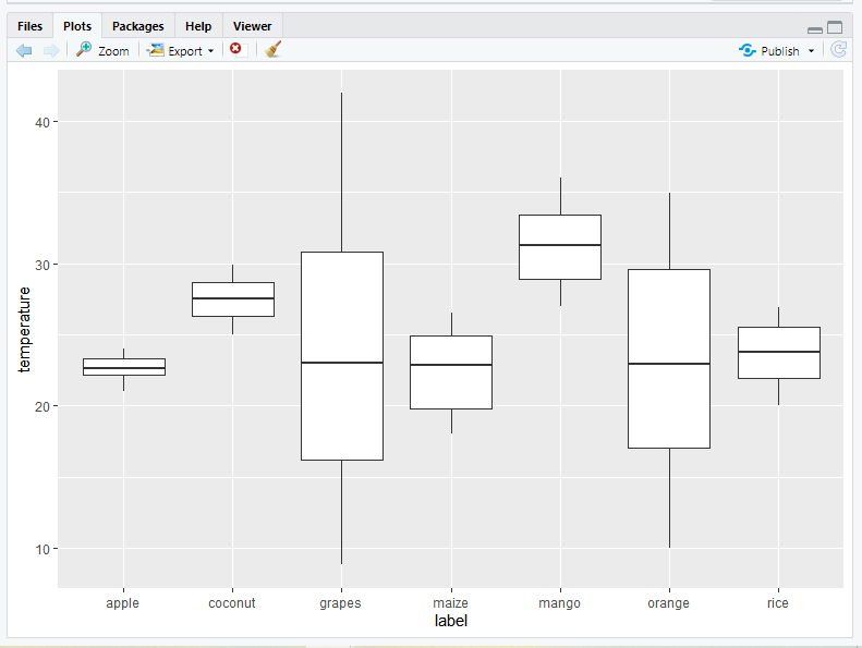
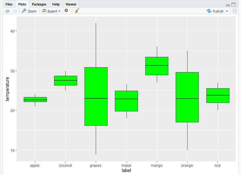
# create a boxplot by using geom_boxplot() function
# of ggplot2 package
crop=ggplot(data=ds, mapping=aes(x=label, y=temperature))+geom_boxplot()
cropR
library(ggplot2)

# loading data set and storing it in ds variable
ds <- read.csv(
  "c://crop//archive//Crop_recommendation.csv", header = TRUE)

# add mean to ggplot2 boxplot
ggplot(ds, aes(x = label, y = temperature, fill = label)) +
  geom_boxplot() +
  stat_summary(fun = "mean", geom = "point", shape = 8,
               size = 2, color = "white")
R
library(ggplot2)

# loading data set and storing it in ds variable
ds <- read.csv("c://crop//archive//Crop_recommendation.csv", header = TRUE)

# change the legend position in R using ggplot2
ggplot(ds, aes(x = label, y = temperature, fill = label)) +
  geom_boxplot() +
  theme(legend.position = "top")
R
library(ggplot2)

# loading data set and storing it in ds variable
ds <- read.csv("c://crop//archive//Crop_recommendation.csv", header = TRUE)

# Creating a Horizontal Boxplot using ggplot2 in R
ggplot(ds, aes(x = label, y = temperature, fill = label)) +
  geom_boxplot() +
  coord_flip()
R
library(ggplot2)

# loading data set and storing it in ds variable
ds <- read.csv(
  "c://crop//archive//Crop_recommendation.csv", header = TRUE)

# Change box plot line colors by groups
crop2<-ggplot(ds, aes(x=label, y=temperature, color=label)) +
  geom_boxplot()
crop2
R
library(ggplot2)

# loading data set and storing it in ds variable
ds <- read.csv("c://crop//archive//Crop_recommendation.csv", header = TRUE)

# Change box plot line colors by groups
crop2<-ggplot(ds, aes(x=label, y=temperature, color=label)) +
  geom_boxplot()
crop2

# Now, it is also possible to change line colors manually
crop2+scale_color_manual(values=c("#999999", "#E69F00",
                                  "#56B4E9","#999999","Red",
                                  "green","yellow"))
R
library(ggplot2)

# loading data set and storing it in ds variable
ds <- read.csv(
  "c://crop//archive//Crop_recommendation.csv", header = TRUE)

# Change box plot line colors by groups
crop2<-ggplot(ds, aes(x=label, y=temperature, color=label)) +
  geom_boxplot()
crop2

# for Using brewer color palettes
crop2+scale_color_brewer(palette="Dark2")
R
library(ggplot2)

# loading data set and storing it in ds variable
ds <- read.csv("c://crop//archive//Crop_recommendation.csv", header = TRUE)

# Change box plot line colors by groups
crop2<-ggplot(ds, aes(x=label, y=temperature, color=label)) +
  geom_boxplot()

# for using grey scale
crop2 + scale_color_grey() + theme_classic()
R
library(ggplot2)

# loading data set and storing it in ds variable
ds <- read.csv("c://crop//archive//Crop_recommendation.csv", header = TRUE)

# Now fill the boxplot with choice of your color
crop1=ggplot(data=ds, mapping=aes(x=label, y=temperature))+
geom_boxplot(fill='green')
crop1
R
library(ggplot2)

# loading data set and storing it in ds variable
ds <- read.csv("c://crop//archive//Crop_recommendation.csv", header = TRUE)

# Change Colors of a ggplot2 Boxplot in R
crop3<-ggplot(ds, aes(x = label, y = temperature, fill = label)) +
  geom_boxplot(outlier.colour="black", outlier.shape=16, outlier.size=2)
R
library(ggplot2)

# loading data set and storing it in ds variable
ds <- read.csv(
  "c://crop//archive//Crop_recommendation.csv", header = TRUE)

crop3<-ggplot(ds, aes(x = label, y = temperature, fill = label)) +
  geom_boxplot(outlier.colour="black", outlier.shape=16, outlier.size=2)

crop3+scale_fill_manual(values=c("#999999", "#E69F00", "#56B4E9",
                                 "#999999","Red","green","yellow"))
R
library(ggplot2)

# loading data set and storing it in ds variable
ds <- read.csv("c://crop//archive//Crop_recommendation.csv", header = TRUE)

crop3<-ggplot(ds, aes(x = label, y = temperature, fill = label)) +
  geom_boxplot(outlier.colour="black", outlier.shape=16, outlier.size=2)

crop3+scale_fill_brewer(palette="Dark1")
R
library(ggplot2)

# loading data set and storing it in ds variable
ds <- read.csv("c://crop//archive//Crop_recommendation.csv", header = TRUE)

crop3<-ggplot(ds, aes(x = label, y = temperature, fill = label)) +
  geom_boxplot(outlier.colour="black", outlier.shape=16, outlier.size=2)

# for using grey scale
crop3 + scale_fill_grey() + theme_classic()
R
library(ggplot2)

# loading data set and storing it in ds variable
ds <- read.csv("c://crop//archive//Crop_recommendation.csv", header = TRUE)

ggplot(ds, aes(x=label, y=temperature)) +
  geom_boxplot()+
  geom_jitter(position=position_jitter(0.2))
R
library(ggplot2)

# loading data set and storing it in ds variable
ds <- read.csv("c://crop//archive//Crop_recommendation.csv", header = TRUE)

# Add notched box plot
ggplot(ds, aes(x=label, y=temperature)) +
  geom_boxplot(notch = TRUE)+
geom_jitter(position=position_jitter(0.2))输出:
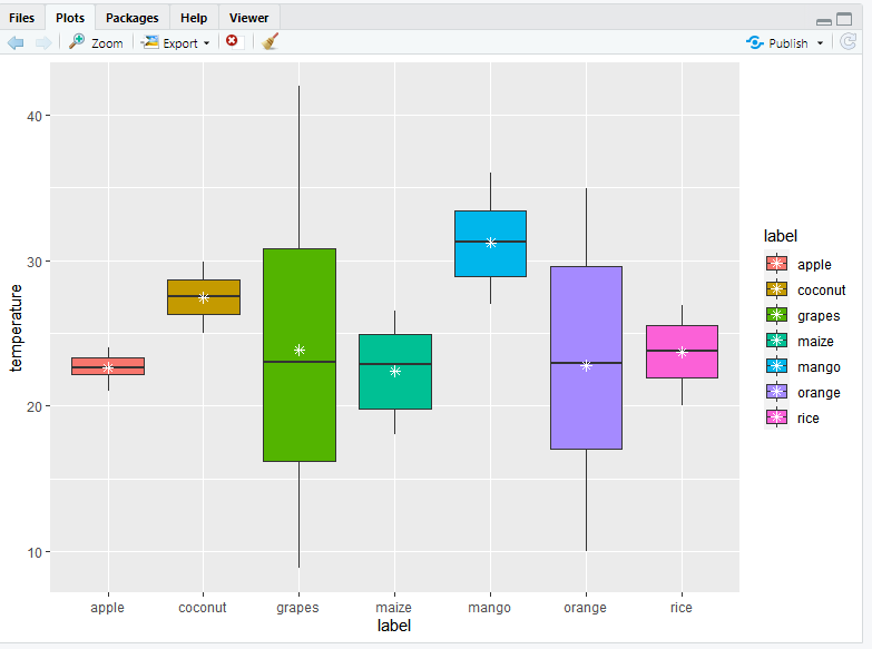
将平均值添加到箱线图中
平均值也可以添加到箱线图中,为此我们必须在 stat_summary() 中指定我们正在使用的函数。此函数用于添加新的汇总值并将这些汇总值添加到图中。通过使用此函数,您无需在绘图前计算平均值。
句法:
stat_summary( fun, geom)
例子:
电阻
library(ggplot2)

# loading data set and storing it in ds variable
ds <- read.csv(
  "c://crop//archive//Crop_recommendation.csv", header = TRUE)

# add mean to ggplot2 boxplot
ggplot(ds, aes(x = label, y = temperature, fill = label)) +
  geom_boxplot() +
  stat_summary(fun = "mean", geom = "point", shape = 8,
               size = 2, color = "white")
输出:
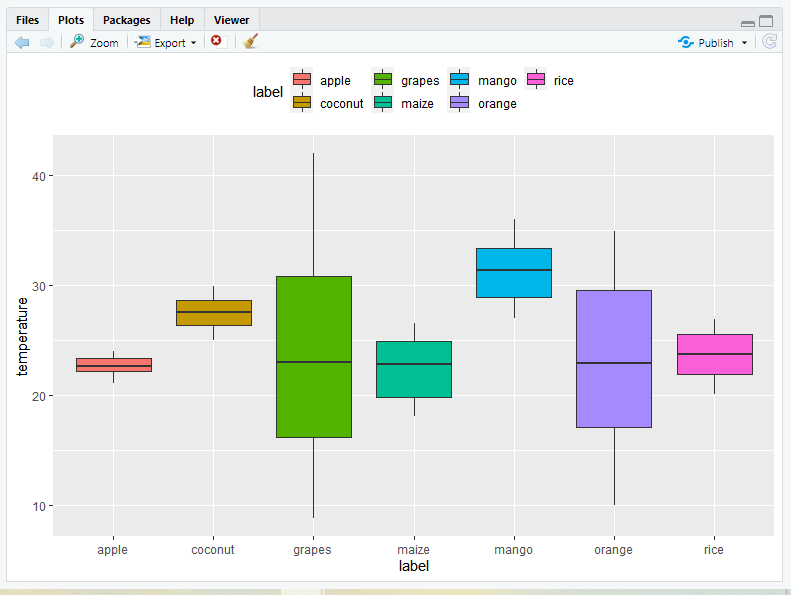
现在让我们使用 theme()函数讨论 Boxplot 中的图例位置。我们可以将图例位置更改为顶部或底部,或者您可以删除箱线图中的图例位置。可以使用主题自定义绘图组件,例如标题、标签、字体、背景、网格线和图例。可以使用主题自定义绘图。您可以使用 theme() 方法修改单个情节的主题,也可以通过调用 theme_update() 修改活动主题,这将影响所有后续情节。
句法:
theme( line, rect, text, title, aspect.ratio, axis.title, axis.title.x, axis.title.x.top, axis.title.x.bottom, axis.title.y, axis.title.y.left, axis.title.y.right, axis.text, axis.text.x, axis.text.x.top, axis.text.x.bottom, axis.text.y, axis.text.y.left, ……, validate = TRUE)
在此函数,如果您将 legend.position 参数设置为 top 或 bottom ,则位置将改变。
例子:
电阻
library(ggplot2)

# loading data set and storing it in ds variable
ds <- read.csv("c://crop//archive//Crop_recommendation.csv", header = TRUE)

# change the legend position in R using ggplot2
ggplot(ds, aes(x = label, y = temperature, fill = label)) +
  geom_boxplot() +
  theme(legend.position = "top")
输出:
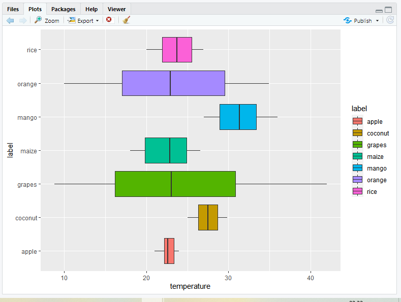
在 R 中使用 ggplot2 的水平箱线图
箱线图也可以使用 coord_flip()函数水平放置。这个函数只是切换 x 和 y 轴。
例子:
电阻
library(ggplot2)

# loading data set and storing it in ds variable
ds <- read.csv("c://crop//archive//Crop_recommendation.csv", header = TRUE)

# Creating a Horizontal Boxplot using ggplot2 in R
ggplot(ds, aes(x = label, y = temperature, fill = label)) +
  geom_boxplot() +
  coord_flip()
输出:
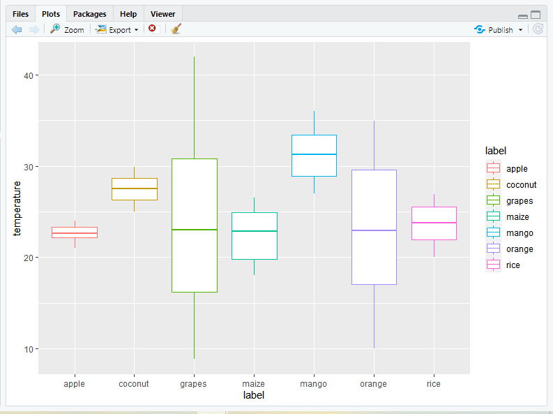
更改箱线图线条颜色
1) 默认
使用命令 color=label 为条形轮廓添加颜色。
句法:
color=label
例子:
电阻
library(ggplot2)

# loading data set and storing it in ds variable
ds <- read.csv(
  "c://crop//archive//Crop_recommendation.csv", header = TRUE)

# Change box plot line colors by groups
crop2<-ggplot(ds, aes(x=label, y=temperature, color=label)) +
  geom_boxplot()
crop2
输出:
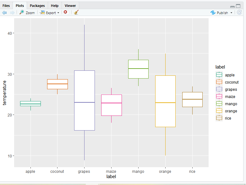
2) 手动
- 使用自定义调色板:要使用自定义调色板,请使用 scale_color_manual()函数,并在此函数为每个箱线图提供轮廓颜色。
例子:
电阻
library(ggplot2)

# loading data set and storing it in ds variable
ds <- read.csv("c://crop//archive//Crop_recommendation.csv", header = TRUE)

# Change box plot line colors by groups
crop2<-ggplot(ds, aes(x=label, y=temperature, color=label)) +
  geom_boxplot()
crop2

# Now, it is also possible to change line colors manually
crop2+scale_color_manual(values=c("#999999", "#E69F00",
                                  "#56B4E9","#999999","Red",
                                  "green","yellow"))
输出:
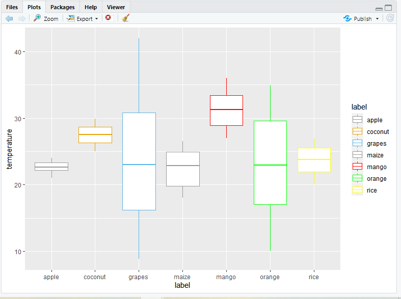
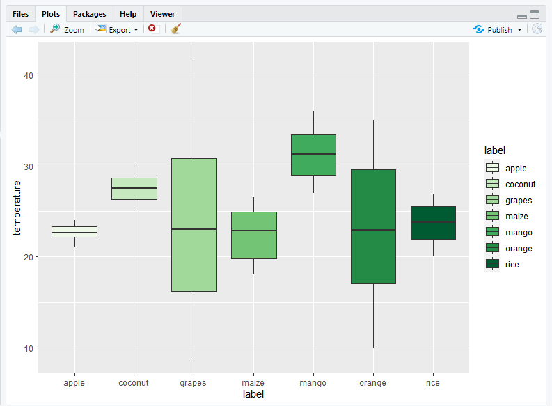
- 使用 brewer 调色板:您可以使用 brewer 调色板更改箱线图的轮廓颜色。为此,您只需要使用 scale_color_brewer()函数并在此函数设置调色板参数。
句法:
scale_color_brewer(palette)
例子:
电阻
library(ggplot2)

# loading data set and storing it in ds variable
ds <- read.csv(
  "c://crop//archive//Crop_recommendation.csv", header = TRUE)

# Change box plot line colors by groups
crop2<-ggplot(ds, aes(x=label, y=temperature, color=label)) +
  geom_boxplot()
crop2

# for Using brewer color palettes
crop2+scale_color_brewer(palette="Dark2")
输出:
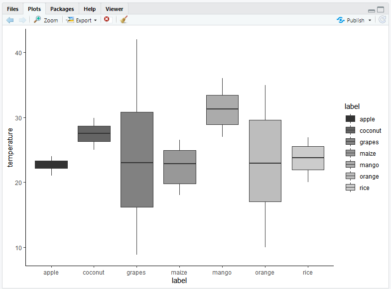
- 使用灰度:要使用灰度调色板,您需要使用 scale_color_grey()函数,并向其添加 theme_classic()函数。
例子:
电阻
library(ggplot2)

# loading data set and storing it in ds variable
ds <- read.csv("c://crop//archive//Crop_recommendation.csv", header = TRUE)

# Change box plot line colors by groups
crop2<-ggplot(ds, aes(x=label, y=temperature, color=label)) +
  geom_boxplot()

# for using grey scale
crop2 + scale_color_grey() + theme_classic()
输出:
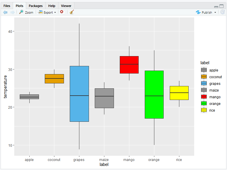
用颜色填充箱线图
1) 默认值:要使用您选择的颜色填充箱线图,您可以使用填充属性命令在 geom_boxplot()函数内添加颜色。填充将在 geom_boxplot() 下,因为在这种情况下它是可变的。
句法:
fill=’color’
例子:
电阻
library(ggplot2)

# loading data set and storing it in ds variable
ds <- read.csv("c://crop//archive//Crop_recommendation.csv", header = TRUE)

# Now fill the boxplot with choice of your color
crop1=ggplot(data=ds, mapping=aes(x=label, y=temperature))+
geom_boxplot(fill='green')
crop1
输出:
为了默认填充箱线图颜色,您只需要在 ggplot() 的 aes()函数包含 fill 属性。填充将在 ggplot( ) 下的 aes( ) 内,因为在这种情况下它是可变的。
句法:
fill=label
例子:
电阻
library(ggplot2)

# loading data set and storing it in ds variable
ds <- read.csv("c://crop//archive//Crop_recommendation.csv", header = TRUE)

# Change Colors of a ggplot2 Boxplot in R
crop3<-ggplot(ds, aes(x = label, y = temperature, fill = label)) +
  geom_boxplot(outlier.colour="black", outlier.shape=16, outlier.size=2)
输出:

2) 手动:如果您想手动更改箱线图颜色,则可以根据您的选择使用三个函数 scale_fill_manual()、scale_fill_brewer() 和 scale_fill_grey()。
- 使用自定义调色板:要使用自定义调色板,使用 scale_fill_manual()函数并将颜色值作为参数。
句法:
scale_fill_manual(values)
例子:
电阻
library(ggplot2)

# loading data set and storing it in ds variable
ds <- read.csv(
  "c://crop//archive//Crop_recommendation.csv", header = TRUE)

crop3<-ggplot(ds, aes(x = label, y = temperature, fill = label)) +
  geom_boxplot(outlier.colour="black", outlier.shape=16, outlier.size=2)

crop3+scale_fill_manual(values=c("#999999", "#E69F00", "#56B4E9",
                                 "#999999","Red","green","yellow"))
输出:
- 使用 brewer 调色板:使用来自 RColorBrewer 包和调色板的 brewer 调色板 scale_fill_brewer() 作为参数
句法:
scale_fill_brewer(palette)
例子:
电阻
library(ggplot2)

# loading data set and storing it in ds variable
ds <- read.csv("c://crop//archive//Crop_recommendation.csv", header = TRUE)

crop3<-ggplot(ds, aes(x = label, y = temperature, fill = label)) +
  geom_boxplot(outlier.colour="black", outlier.shape=16, outlier.size=2)

crop3+scale_fill_brewer(palette="Dark1")
输出:
- 使用灰度:要使用灰度填充箱线图的颜色,请使用 scale_fill_grey() 和 theme_classic()。
例子:
电阻
library(ggplot2)

# loading data set and storing it in ds variable
ds <- read.csv("c://crop//archive//Crop_recommendation.csv", header = TRUE)

crop3<-ggplot(ds, aes(x = label, y = temperature, fill = label)) +
  geom_boxplot(outlier.colour="black", outlier.shape=16, outlier.size=2)

# for using grey scale
crop3 + scale_fill_grey() + theme_classic()
输出:
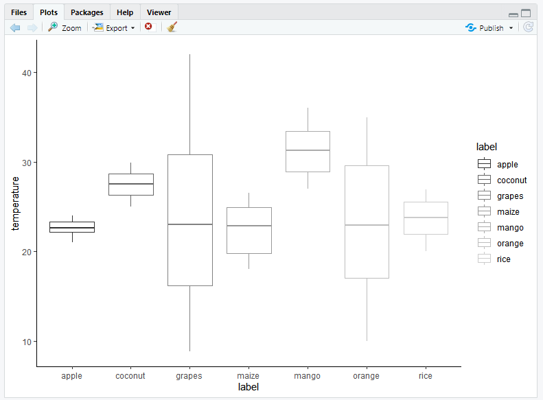
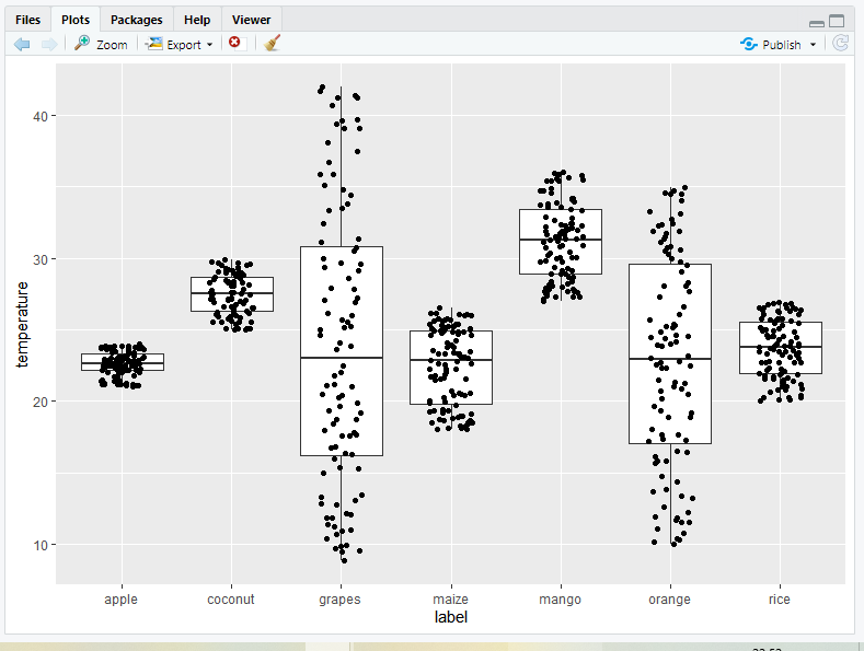
在箱线图中添加抖动
抖动对于处理由离散数据集引起的过度绘制问题非常有用。您也可以调整抖动的位置,为此您只需要在 geom_jitter() 中设置位置属性。您还可以使用 ggplot jitter 中的 size 和 shape 参数来更改点的形状、大小。
句法:
geom_jitter(mapping = NULL, data = NULL, stat = “identity”, position = “jitter”, …, width = NULL, height = NULL, na.rm = FALSE, show.legend = NA, inherit.aes = TRUE)
例子:
电阻
library(ggplot2)

# loading data set and storing it in ds variable
ds <- read.csv("c://crop//archive//Crop_recommendation.csv", header = TRUE)

ggplot(ds, aes(x=label, y=temperature)) +
  geom_boxplot()+
  geom_jitter(position=position_jitter(0.2))
输出:
缺口箱线图
要添加缺口箱线图,您只需要在 geom_boxplot() 中将缺口属性设置为 TRUE。
例子:
电阻
library(ggplot2)

# loading data set and storing it in ds variable
ds <- read.csv("c://crop//archive//Crop_recommendation.csv", header = TRUE)

# Add notched box plot
ggplot(ds, aes(x=label, y=temperature)) +
  geom_boxplot(notch = TRUE)+
  geom_jitter(position=position_jitter(0.2))
输出:
