📌 相关文章
- R线图(1)
- R-箱线图(1)
- 箱线图 python (1)
- 箱线图代码 - Python (1)
- 箱线图 python 代码示例
- 什么是箱线图?(1)
- 什么是箱线图?
- python中所有列的箱线图(1)
- 箱线图代码 - Python 代码示例
- python代码示例中所有列的箱线图
- 箱线图标签python(1)
- R语言中的箱线图
- R语言中的箱线图(1)
- 箱线图标签python代码示例
- 统计-箱线图
- 统计-箱线图(1)
- 在 Excel 中创建箱线图
- 在 Excel 中创建箱线图(1)
- Tableau 中的箱线图
- Tableau 中的箱线图(1)
- 修改线图 - Python (1)
- python中的分组箱线图(1)
- 修改线图 - Python 代码示例
- 如何绘制箱线图python代码示例
- Android中的线图视图示例
- Android中的线图视图示例(1)
- python代码示例中的分组箱线图
- pandas 线图字典 - Python (1)
- plotly 线图 - Python (1)
📜 R线图
📅 最后修改于: 2021-01-08 10:00:13 🧑 作者: Mango
R线图
折线图是随时间连续变化的信息的图形表示。折线图也可以称为折线图。在折线图中,有些点连接数据以显示连续变化。折线图中的线可以根据数据上下移动。我们可以使用折线图比较不同的事件,信息和情况。
折线图用于通过在点之间绘制线段来连接一系列点。折线图用于识别数据趋势。对于线图构造,R提供了plot()函数,该函数具有以下语法:
plot(v,type,col,xlab,ylab)
这里,
| S.No | Parameter | Description |
|---|---|---|
| 1. | v | It is a vector which contains the numeric values. |
| 2. | type | This parameter takes the value ?I? to draw only the lines or ?p? to draw only the points and “o” to draw both lines and points. |
| 3. | xlab | It is the label for the x-axis. |
| 4. | ylab | It is the label for the y-axis. |
| 5. | main | It is the title of the chart. |
| 6. | col | It is used to give the color for both the points and lines |
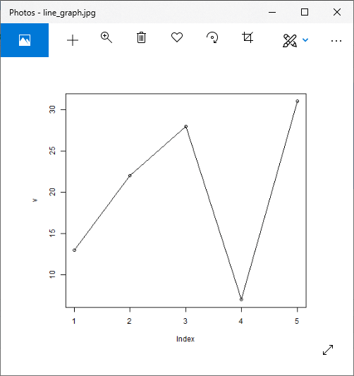
让我们看一个基本的例子,以了解如何使用plot()函数创建折线图:
例
# Creating the data for the chart.
v <- c(13,22,28,7,31)
# Giving a name to the chart file.
png(file = "line_graph.jpg")
# Plotting the bar chart.
plot(v,type = "o")
# Saving the file.
dev.off()
输出:
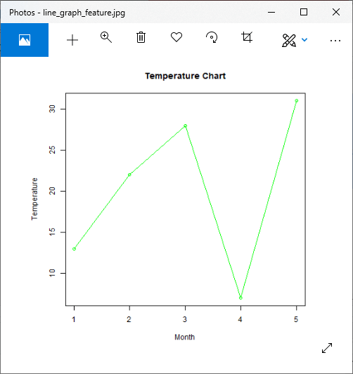
折线图标题,颜色和标签
像其他图形和图表一样,在折线图中,我们可以通过添加更多参数来添加更多功能。我们可以为线条和点添加颜色,为轴添加标签,并为图表提供标题。让我们看一个示例,以了解如何在plot()函数中使用这些参数来创建有吸引力的折线图。
例
# Creating the data for the chart.
v <- c(13,22,28,7,31)
# Giving a name to the chart file.
png(file = "line_graph_feature.jpg")
# Plotting the bar chart.
plot(v,type = "o",col="green",xlab="Month",ylab="Temperature")
# Saving the file.
dev.off()
输出:
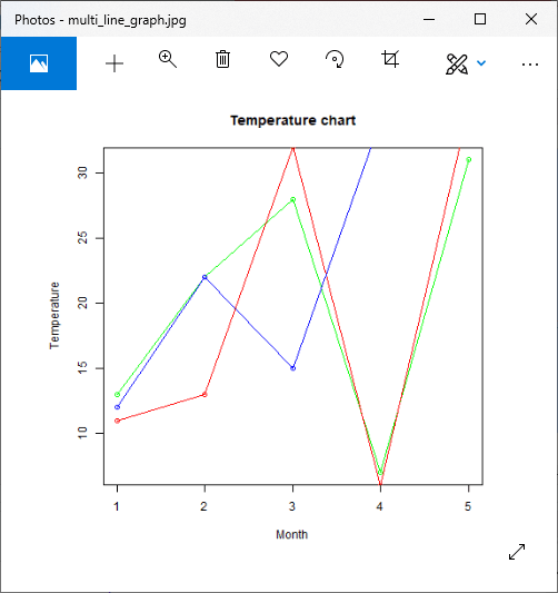
包含多条折线的折线图
在前面的示例中,我们创建了每个线图中仅包含一条线的线图。 R允许我们创建包含多条线的线图。 R提供lines()函数以在折线图中创建一条线。
lines()函数采用附加输入向量来创建线。让我们看一个例子来了解如何使用此函数:
例
# Creating the data for the chart.
v <- c(13,22,28,7,31)
w <- c(11,13,32,6,35)
x <- c(12,22,15,34,35)
# Giving a name to the chart file.
png(file = "multi_line_graph.jpg")
# Plotting the bar chart.
plot(v,type = "o",col="green",xlab="Month",ylab="Temperature")
lines(w, type = "o", col = "red")
lines(x, type = "o", col = "blue")
# Saving the file.
dev.off()
输出:
使用ggplot2的线图
在R中,还有另一种创建折线图的方法,即使用ggplot2包。 ggplot2软件包提供了geom_line(),geom_step()和geom_path()函数来创建折线图。要使用这些功能,我们首先必须安装ggplot2软件包,然后将其加载到当前的工作库中。
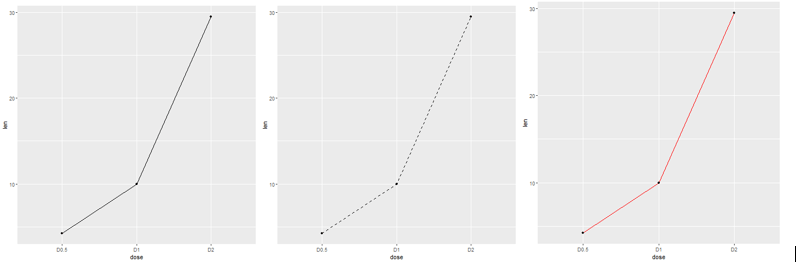
让我们看一个示例,以了解如何使用ggplot2创建折线图。在下面的示例中,我们将使用预定义的ToothGrowth数据集,该数据集描述了维生素C对豚鼠牙齿生长的影响。
例
library(ggplot2)
#Creating data for the graph
data_frame<- data.frame(dose=c("D0.5", "D1", "D2"),
len=c(4.2, 10, 29.5))
head(data_frame)
png(file = "multi_line_graph2.jpg")
# Basic line plot with points
ggplot(data=data_frame, aes(x=dose, y=len, group=1)) +geom_line()+geom_point()
# Change the line type
ggplot(data=df, aes(x=dose, y=len, group=1)) +geom_line(linetype = "dashed")+geom_point()
# Change the color
ggplot(data=df, aes(x=dose, y=len, group=1)) +geom_line(color="red")+geom_point()
dev.off()
输出: