📌 相关文章
- &-Tex命令(1)
- Python – GTK+ 3 中的网格容器
- 交换两个数字的Java程序
- gogole - 任何代码示例
- depmod:未找到 - Shell-Bash 代码示例
- 可以刻在矩形中的最大可能的圆
- 如何在python代码示例中打印字符串
- 给定2D数组中的最小和子矩阵
- 检查数组的素数元素的和是否为素数
- 2的最高幂除以二进制表示的数字
- ruby 数组减数组 - Ruby 代码示例
- 素数的递归程序
- Python|提取过滤的字典值
- python 跟踪表 - Python 代码示例
- html 文本框 - Html 代码示例
- 在 termux 中安装 msf - Shell-Bash 代码示例
- 检查是否可以通过与上一跳重复多次,少跳一次或相同数目的索引重复跳转来到达已排序数组的末尾
- 从0到N的连续数字的汉明差总和|套装2
- 微软面试经历 |第 95 组(IDC 校内)
- 最小化到达数组末尾所需的步骤数|套装2
- PHP | highlight_string()函数
- 基础 CSS 厨房水槽可见性类
- 通过翻转单个子数组的所有元素的符号来最大化数组的总和
- 链表中第二小的元素
- 下一页数据表时弹出窗口不起作用 - Javascript代码示例
- 国际空间研究组织 | ISRO CS 2011 |问题 17
- 不等于 java 代码示例
- DXC技术面试体验(校内)
- laravel api 路由 - PHP 代码示例
📜 R Scatterplots
📅 最后修改于: 2021-01-08 10:01:22 🧑 作者: Mango
R散点图
散点图用于比较变量。当我们需要定义一个变量受另一变量影响的程度时,需要对变量进行比较。在散点图中,数据表示为点的集合。散点图上的每个点都定义了两个变量的值。垂直轴选择一个变量,水平轴选择另一个变量。在R中,有两种创建散点图的方法,即使用plot()函数和使用ggplot2包的函数。
在R中创建散点图有以下语法:
plot(x, y, main, xlab, ylab, xlim, ylim, axes)
这里,
| S.No | Parameters | Description |
|---|---|---|
| 1. | x | It is the dataset whose values are the horizontal coordinates. |
| 2. | y | It is the dataset whose values are the vertical coordinates. |
| 3. | main | It is the title of the graph. |
| 4. | xlab | It is the label on the horizontal axis. |
| 5. | ylab | It is the label on the vertical axis. |
| 6. | xlim | It is the limits of the x values which is used for plotting. |
| 7. | ylim | It is the limits of the values of y, which is used for plotting. |
| 8. | axes | It indicates whether both axes should be drawn on the plot. |
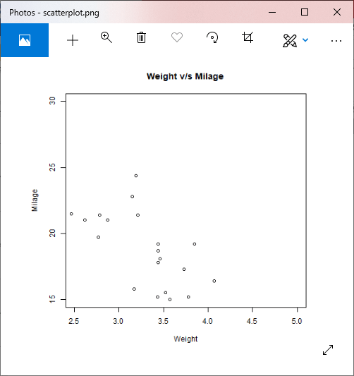
让我们看一个示例,以了解如何使用plot函数构造散点图。在我们的示例中,我们将使用数据集“ mtcars”,它是R环境中可用的预定义数据集。
例
#Fetching two columns from mtcars
data <-mtcars[,c('wt','mpg')]
# Giving a name to the chart file.
png(file = "scatterplot.png")
# Plotting the chart for cars with weight between 2.5 to 5 and mileage between 15 and 30.
plot(x = data$wt,y = data$mpg, xlab = "Weight", ylab = "Milage", xlim = c(2.5,5), ylim = c(15,30), main = "Weight v/sMilage")
# Saving the file.
dev.off()
输出:
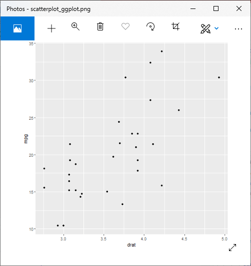
使用ggplot2的散点图
在R中,还有另一种创建散点图的方法,即借助ggplot2包。
ggplot2包提供了用于创建散点图的ggplot()和geom_point()函数。 ggplot()函数接受一系列输入项。第一个参数是输入向量,第二个参数是aes()函数,我们在其中添加x轴和y轴。
让我们在一个使用熟悉的数据集“ mtcars”的示例的帮助下开始了解如何使用ggplot2软件包。
例
#Loading ggplot2 package
library(ggplot2)
# Giving a name to the chart file.
png(file = "scatterplot_ggplot.png")
# Plotting the chart using ggplot() and geom_point() functions.
ggplot(mtcars, aes(x = drat, y = mpg)) +geom_point()
# Saving the file.
dev.off()
输出:
我们可以添加更多功能,也可以绘制出更具吸引力的散点图。以下是一些添加了不同参数的示例。
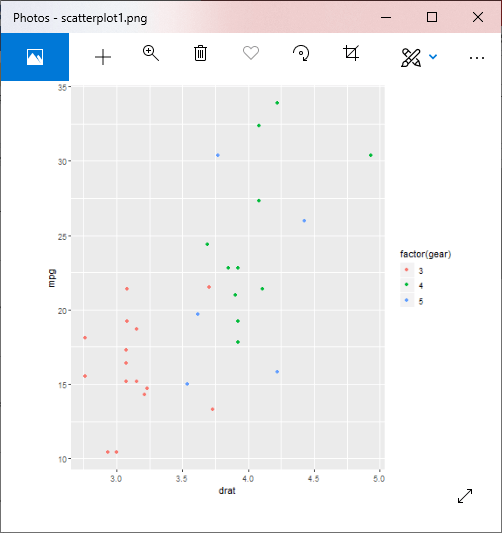
示例1:具有组的散点图
#Loading ggplot2 package
library(ggplot2)
# Giving a name to the chart file.
png(file = "scatterplot1.png")
# Plotting the chart using ggplot() and geom_point() functions.
#The aes() function inside the geom_point() function controls the color of the group.
ggplot(mtcars, aes(x = drat, y = mpg)) +
geom_point(aes(color=factor(gear)))
# Saving the file.
dev.off()
输出:
示例2:轴的变化
#Loading ggplot2 package
library(ggplot2)
# Giving a name to the chart file.
png(file = "scatterplot2.png")
# Plotting the chart using ggplot() and geom_point() functions.
#The aes() function inside the geom_point() function controls the color of the group.
ggplot(mtcars, aes(x = log(mpg), y = log(drat))) +geom_point(aes(color=factor(gear)))
# Saving the file.
dev.off()
输出:

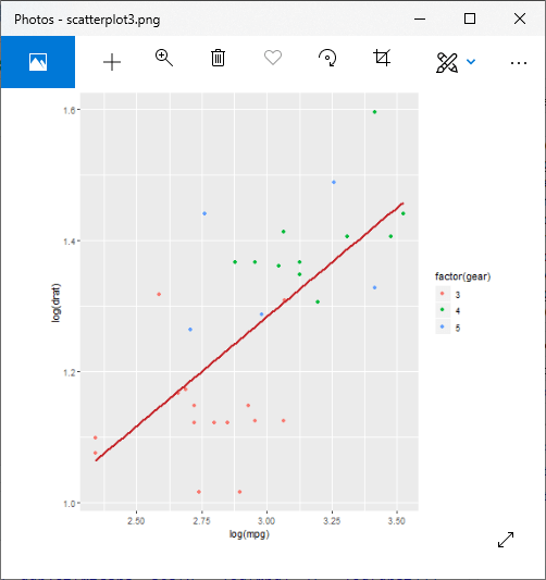
示例3:具有拟合值的散点图
#Loading ggplot2 package
library(ggplot2)
# Giving a name to the chart file.
png(file = "scatterplot3.png")
#Creating scatterplot with fitted values.
# An additional function stst_smooth is used for linear regression.
ggplot(mtcars, aes(x = log(mpg), y = log(drat))) +geom_point(aes(color = factor(gear))) + stat_smooth(method = "lm",col = "#C42126",se = FALSE,size = 1)
#in above example lm is used for linear regression and se stands for standard error.
# Saving the file.
dev.off()
输出:
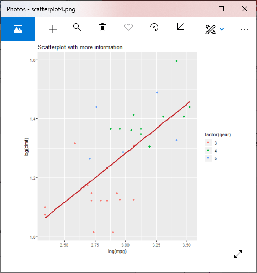
向图表添加信息
示例4:添加标题
#Loading ggplot2 package
library(ggplot2)
# Giving a name to the chart file.
png(file = "scatterplot4.png")
#Creating scatterplot with fitted values.
# An additional function stst_smooth is used for linear regression.
new_graph<-ggplot(mtcars, aes(x = log(mpg), y = log(drat))) +geom_point(aes(color = factor(gear))) +
stat_smooth(method = "lm",col = "#C42126",se = FALSE,size = 1)
#in above example lm is used for linear regression and se stands for standard error.
new_graph+
labs(
        title = "Scatterplot with more information"
)
# Saving the file.
dev.off()
输出:

示例5:添加具有动态名称的标题
#Loading ggplot2 package
library(ggplot2)
# Giving a name to the chart file.
png(file = "scatterplot5.png")
#Creating scatterplot with fitted values.
# An additional function stst_smooth is used for linear regression.
new_graph<-ggplot(mtcars, aes(x = log(mpg), y = log(drat))) +geom_point(aes(color = factor(gear))) +
stat_smooth(method = "lm",col = "#C42126",se = FALSE,size = 1)
#in above example lm is used for linear regression and se stands for standard error.
#Finding mean of mpg
mean_mpg<- mean(mtcars$mpg)
#Adding title with dynamic name
new_graph + labs(
        title = paste("Adding additiona information. Average mpg is", mean_mpg)
)
# Saving the file.
dev.off()
输出:
示例6:添加字幕
#Loading ggplot2 package
library(ggplot2)
# Giving a name to the chart file.
png(file = "scatterplot6.png")
#Creating scatterplot with fitted values.
# An additional function stst_smooth is used for linear regression.
new_graph<-ggplot(mtcars, aes(x = log(mpg), y = log(drat))) +geom_point(aes(color = factor(gear))) +
stat_smooth(method = "lm",col = "#C42126",se = FALSE,size = 1)
#in above example lm is used for linear regression and se stands for standard error.
#Adding title with dynamic name
new_graph + labs(
        title =
                "Relation between Mile per hours and drat",
        subtitle =
                "Relationship break down by gear class",
        caption = "Authors own computation"
)
# Saving the file.
dev.off()
输出:

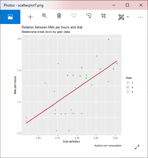
示例7:更改x轴和y轴的名称
#Loading ggplot2 package
library(ggplot2
# Giving a name to the chart file.
png(file = "scatterplot7.png")
#Creating scatterplot with fitted values.
# An additional function stst_smooth is used for linear regression.
new_graph<-ggplot(mtcars, aes(x = log(mpg), y = log(drat))) +geom_point(aes(color = factor(gear))) +
stat_smooth(method = "lm",col = "#C42126",se = FALSE,size = 1)
#in above example lm is used for linear regression and se stands for standard error.
#Adding title with dynamic name
new_graph + labs(
        x = "Drat definition",
        y = "Mile per hours",
        color = "Gear",
        title = "Relation between Mile per hours and drat",
        subtitle = "Relationship break down by gear class",
        caption = "Authors own computation"
)
# Saving the file.
dev.off()
输出:
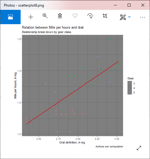
示例8:添加主题
#Loading ggplot2 package
library(ggplot2
# Giving a name to the chart file.
png(file = "scatterplot8.png")
#Creating scatterplot with fitted values.
# An additional function stst_smooth is used for linear regression.
new_graph<-ggplot(mtcars, aes(x = log(mpg), y = log(drat))) +geom_point(aes(color = factor(gear))) +
stat_smooth(method = "lm",col = "#C42126",se = FALSE,size = 1)
#in above example lm is used for linear regression and se stands for standard error.
#Adding title with dynamic name
new_graph+
theme_dark() +
                labs(
                        x = "Drat definition, in log",
                        y = "Mile per hours, in log",
                        color = "Gear",
                        title = "Relation between Mile per hours and drat",
                        subtitle = "Relationship break down by gear class",
                        caption = "Authors own computation"
                )
# Saving the file.
dev.off()
输出: