使用 Matplotlib 在Python中绘制饼图
饼图是一种圆形统计图,只能显示一系列数据。图表的面积是给定数据的总百分比。饼图的面积代表数据部分的百分比。馅饼的切片称为楔形。楔形的面积由楔形的弧长决定。楔形的面积表示该部分相对于整个数据的相对百分比。饼图通常用于业务演示,如销售、运营、调查结果、资源等,因为它们提供了快速摘要。
创建饼图
Matplotlib API 在其 pyplot 模块中具有 pie()函数,该函数创建一个表示数组中数据的饼图。
Syntax: matplotlib.pyplot.pie(data, explode=None, labels=None, colors=None, autopct=None, shadow=False)
Parameters:
data represents the array of data values to be plotted, the fractional area of each slice is represented by data/sum(data). If sum(data)<1, then the data values returns the fractional area directly, thus resulting pie will have empty wedge of size 1-sum(data).
labels is a list of sequence of strings which sets the label of each wedge.
color attribute is used to provide color to the wedges.
autopct is a string used to label the wedge with their numerical value.
shadow is used to create shadow of wedge.
让我们使用 pie()函数创建一个简单的饼图:
例子:
Python3
# Import libraries
from matplotlib import pyplot as plt
import numpy as np


# Creating dataset
cars = ['AUDI', 'BMW', 'FORD',
        'TESLA', 'JAGUAR', 'MERCEDES']

data = [23, 17, 35, 29, 12, 41]

# Creating plot
fig = plt.figure(figsize =(10, 7))
plt.pie(data, labels = cars)

# show plot
plt.show()
Python3
# Import libraries
import numpy as np
import matplotlib.pyplot as plt


# Creating dataset
cars = ['AUDI', 'BMW', 'FORD',
        'TESLA', 'JAGUAR', 'MERCEDES']

data = [23, 17, 35, 29, 12, 41]


# Creating explode data
explode = (0.1, 0.0, 0.2, 0.3, 0.0, 0.0)

# Creating color parameters
colors = ( "orange", "cyan", "brown",
          "grey", "indigo", "beige")

# Wedge properties
wp = { 'linewidth' : 1, 'edgecolor' : "green" }

# Creating autocpt arguments
def func(pct, allvalues):
    absolute = int(pct / 100.*np.sum(allvalues))
    return "{:.1f}%\n({:d} g)".format(pct, absolute)

# Creating plot
fig, ax = plt.subplots(figsize =(10, 7))
wedges, texts, autotexts = ax.pie(data,
                                  autopct = lambda pct: func(pct, data),
                                  explode = explode,
                                  labels = cars,
                                  shadow = True,
                                  colors = colors,
                                  startangle = 90,
                                  wedgeprops = wp,
                                  textprops = dict(color ="magenta"))

# Adding legend
ax.legend(wedges, cars,
          title ="Cars",
          loc ="center left",
          bbox_to_anchor =(1, 0, 0.5, 1))

plt.setp(autotexts, size = 8, weight ="bold")
ax.set_title("Customizing pie chart")

# show plot
plt.show()
Python3
# Import libraries
from matplotlib import pyplot as plt
import numpy as np


# Creating dataset
size = 6
cars = ['AUDI', 'BMW', 'FORD',
        'TESLA', 'JAGUAR', 'MERCEDES']

data = np.array([[23, 16], [17, 23],
                 [35, 11], [29, 33],
                 [12, 27], [41, 42]])

# normalizing data to 2 pi
norm = data / np.sum(data)*2 * np.pi

# obtaining ordinates of bar edges
left = np.cumsum(np.append(0,
                           norm.flatten()[:-1])).reshape(data.shape)

# Creating color scale
cmap = plt.get_cmap("tab20c")
outer_colors = cmap(np.arange(6)*4)
inner_colors = cmap(np.array([1, 2, 5, 6, 9,
                              10, 12, 13, 15,
                              17, 18, 20 ]))

# Creating plot
fig, ax = plt.subplots(figsize =(10, 7),
                       subplot_kw = dict(polar = True))

ax.bar(x = left[:, 0],
       width = norm.sum(axis = 1),
       bottom = 1-size,
       height = size,
       color = outer_colors,
       edgecolor ='w',
       linewidth = 1,
       align ="edge")

ax.bar(x = left.flatten(),
       width = norm.flatten(),
       bottom = 1-2 * size,
       height = size,
       color = inner_colors,
       edgecolor ='w',
       linewidth = 1,
       align ="edge")

ax.set(title ="Nested pie chart")
ax.set_axis_off()

# show plot
plt.show()
输出:

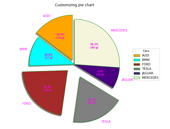
自定义饼图
饼图可以根据几个方面进行定制。 startangle 属性在饼图的 x 轴上以逆时针方向将绘图旋转指定的度数。 shadow 属性接受布尔值,如果为 true,则阴影将出现在饼图边缘下方。可以使用wedgeprop自定义饼的楔形,它以Python字典作为参数,名称值对表示楔形属性,如线宽、边缘颜色等。通过设置frame=True轴,框架围绕饼图绘制。autopct控制百分比的方式显示在楔子上。让我们尝试修改上面的情节:
示例 1:
Python3
# Import libraries
import numpy as np
import matplotlib.pyplot as plt


# Creating dataset
cars = ['AUDI', 'BMW', 'FORD',
        'TESLA', 'JAGUAR', 'MERCEDES']

data = [23, 17, 35, 29, 12, 41]


# Creating explode data
explode = (0.1, 0.0, 0.2, 0.3, 0.0, 0.0)

# Creating color parameters
colors = ( "orange", "cyan", "brown",
          "grey", "indigo", "beige")

# Wedge properties
wp = { 'linewidth' : 1, 'edgecolor' : "green" }

# Creating autocpt arguments
def func(pct, allvalues):
    absolute = int(pct / 100.*np.sum(allvalues))
    return "{:.1f}%\n({:d} g)".format(pct, absolute)

# Creating plot
fig, ax = plt.subplots(figsize =(10, 7))
wedges, texts, autotexts = ax.pie(data,
                                  autopct = lambda pct: func(pct, data),
                                  explode = explode,
                                  labels = cars,
                                  shadow = True,
                                  colors = colors,
                                  startangle = 90,
                                  wedgeprops = wp,
                                  textprops = dict(color ="magenta"))

# Adding legend
ax.legend(wedges, cars,
          title ="Cars",
          loc ="center left",
          bbox_to_anchor =(1, 0, 0.5, 1))

plt.setp(autotexts, size = 8, weight ="bold")
ax.set_title("Customizing pie chart")

# show plot
plt.show()
输出:
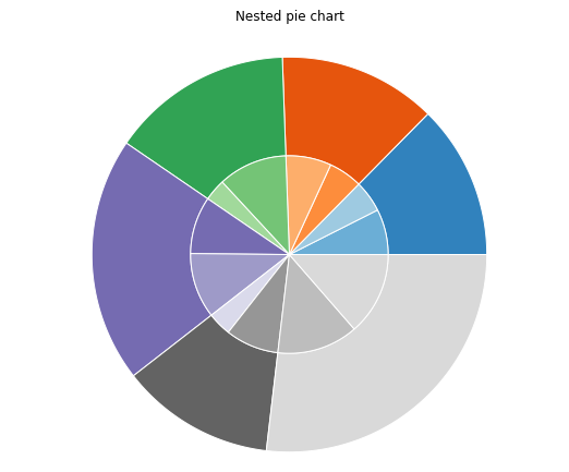
示例 2:创建嵌套饼图
Python3
# Import libraries
from matplotlib import pyplot as plt
import numpy as np


# Creating dataset
size = 6
cars = ['AUDI', 'BMW', 'FORD',
        'TESLA', 'JAGUAR', 'MERCEDES']

data = np.array([[23, 16], [17, 23],
                 [35, 11], [29, 33],
                 [12, 27], [41, 42]])

# normalizing data to 2 pi
norm = data / np.sum(data)*2 * np.pi

# obtaining ordinates of bar edges
left = np.cumsum(np.append(0,
                           norm.flatten()[:-1])).reshape(data.shape)

# Creating color scale
cmap = plt.get_cmap("tab20c")
outer_colors = cmap(np.arange(6)*4)
inner_colors = cmap(np.array([1, 2, 5, 6, 9,
                              10, 12, 13, 15,
                              17, 18, 20 ]))

# Creating plot
fig, ax = plt.subplots(figsize =(10, 7),
                       subplot_kw = dict(polar = True))

ax.bar(x = left[:, 0],
       width = norm.sum(axis = 1),
       bottom = 1-size,
       height = size,
       color = outer_colors,
       edgecolor ='w',
       linewidth = 1,
       align ="edge")

ax.bar(x = left.flatten(),
       width = norm.flatten(),
       bottom = 1-2 * size,
       height = size,
       color = inner_colors,
       edgecolor ='w',
       linewidth = 1,
       align ="edge")

ax.set(title ="Nested pie chart")
ax.set_axis_off()

# show plot
plt.show()
输出: