使用 Matplotlib 在Python中绘制数学表达式
为了绘制方程,我们将使用两个模块Matplotlib.pyplot和Numpy 。该模块可帮助您以逻辑方式组织Python代码。
麻木的
Numpy 是Python中用于科学计算的核心库。这个Python库支持大型多维数组对象、矩阵和掩码数组等各种派生对象,以及使数组运算更快的分类例程,包括数学、逻辑、基本线性代数、基本统计运算、形状操作、输入/输出、排序、选择、离散傅里叶变换、随机模拟和更多操作。
注意:更多信息请参考Python中的 NumPy
Matplotlib.pyplot
Matplotlib 是Python的绘图库,它是命令样式函数的集合,使其像 MATLAB 一样工作。它提供了一个面向对象的 API,用于使用通用 GUI 工具包将绘图嵌入到应用程序中。每个#pyplot#函数都会对图形进行一些更改,即创建一个图形,在图形中创建一个绘图区域,在绘图区域中绘制一些线,用一些标签装饰绘图等。
注意:更多信息请参考 Matplotlib 中的 Pyplot
绘制方程
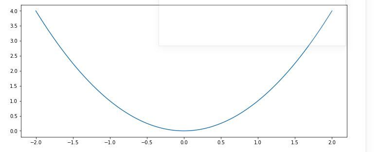
让我们从最简单和最常见的方程式Y = X²开始我们的工作。我们想在 X 轴上绘制 100 个点。在这种情况下,Y 的每一个值都是同一索引的 X 值的平方。
Python3
# Import libraries
import matplotlib.pyplot as plt
import numpy as np

# Creating vectors X and Y
x = np.linspace(-2, 2, 100)
y = x ** 2

fig = plt.figure(figsize = (10, 5))
# Create the plot
plt.plot(x, y)

# Show the plot
plt.show()
Python3
# Import libraries
import matplotlib.pyplot as plt
import numpy as np

# Creating vectors X and Y
x = np.linspace(-2, 2, 100)
y = x ** 2

fig = plt.figure(figsize = (12, 7))
# Create the plot
plt.plot(x, y, alpha = 0.4, label ='Y = X²',
         color ='red', linestyle ='dashed',
         linewidth = 2, marker ='D',
         markersize = 5, markerfacecolor ='blue',
         markeredgecolor ='blue')

# Add a title
plt.title('Equation plot')

# Add X and y Label
plt.xlabel('x axis')
plt.ylabel('y axis')

# Add Text watermark
fig.text(0.9, 0.15, 'Jeeteshgavande30',
         fontsize = 12, color ='green',
         ha ='right', va ='bottom',
         alpha = 0.7)

# Add a grid
plt.grid(alpha =.6, linestyle ='--')

# Add a Legend
plt.legend()

# Show the plot
plt.show()
Python3
# Import libraries
import matplotlib.pyplot as plt
import numpy as np

x = np.linspace(-6, 6, 50)

fig = plt.figure(figsize = (14, 8))

# Plot y = cos(x)
y = np.cos(x)
plt.plot(x, y, 'b', label ='cos(x)')

# Plot degree 2 Taylor polynomial
y2 = 1 - x**2 / 2
plt.plot(x, y2, 'r-.', label ='Degree 2')

# Plot degree 4 Taylor polynomial
y4 = 1 - x**2 / 2 + x**4 / 24
plt.plot(x, y4, 'g:', label ='Degree 4')

# Add features to our figure
plt.legend()
plt.grid(True, linestyle =':')
plt.xlim([-6, 6])
plt.ylim([-4, 4])

plt.title('Taylor Polynomials of cos(x) at x = 0')
plt.xlabel('x-axis')
plt.ylabel('y-axis')

# Show plot
plt.show()
Python3
# Import libraries
import matplotlib.pyplot as plt
import numpy as np

fig = plt.figure(figsize = (14, 8))

# Creating histogram
samples = np.random.randn(10000)
plt.hist(samples, bins = 30, density = True,
         alpha = 0.5, color =(0.9, 0.1, 0.1))

# Add a title
plt.title('Random Samples - Normal Distribution')

# Add X and y Label
plt.ylabel('X-axis')
plt.ylabel('Frequency')

# Creating vectors X and Y
x = np.linspace(-4, 4, 100)
y = 1/(2 * np.pi)**0.5 * np.exp(-x**2 / 2)

# Creating plot
plt.plot(x, y, 'b', alpha = 0.8)

# Show plot
plt.show()
输出-
请注意,我们在折线图中使用的点数(在这种情况下为 100)是完全任意的,但这里的目标是显示平滑曲线的平滑图,这就是为什么我们必须根据函数选择足够的数字.但请注意不要生成太多点,因为大量点需要很长时间才能绘制。
自定义地块
pyplot有很多函数可用于绘图的自定义,并且可以使用线条样式和标记样式来美化绘图。以下是其中的一些:
Function Description plt.xlim() sets the limits for X-axis plt.ylim() sets the limits for Y-axis plt.grid() adds grid lines in the plot plt.title() adds a title plt.xlabel() adds label to the horizontal axis plt.ylabel() adds label to the vertical axis plt.axis() sets axis properties (equal, off, scaled, etc.) plt.xticks() sets tick locations on the horizontal axis plt.yticks() sets tick locations on the vertical axis plt.legend() used to display legends for several lines in the same figure plt.savefig() saves figure (as .png, .pdf, etc.) to working directory plt.figure() used to set new figure properties
线型
Character Line style – solid line style — dashed line style -. dash-dot line style : dotted line style
标记
Character Marker . point o circle v triangle down ^ triangle up s square p pentagon * star + plus x cross D diamond
下面是使用其中一些修改创建的图:
Python3
# Import libraries
import matplotlib.pyplot as plt
import numpy as np

# Creating vectors X and Y
x = np.linspace(-2, 2, 100)
y = x ** 2

fig = plt.figure(figsize = (12, 7))
# Create the plot
plt.plot(x, y, alpha = 0.4, label ='Y = X²',
         color ='red', linestyle ='dashed',
         linewidth = 2, marker ='D',
         markersize = 5, markerfacecolor ='blue',
         markeredgecolor ='blue')

# Add a title
plt.title('Equation plot')

# Add X and y Label
plt.xlabel('x axis')
plt.ylabel('y axis')

# Add Text watermark
fig.text(0.9, 0.15, 'Jeeteshgavande30',
         fontsize = 12, color ='green',
         ha ='right', va ='bottom',
         alpha = 0.7)

# Add a grid
plt.grid(alpha =.6, linestyle ='--')

# Add a Legend
plt.legend()

# Show the plot
plt.show()
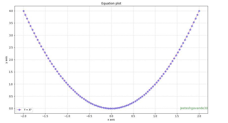
输出-
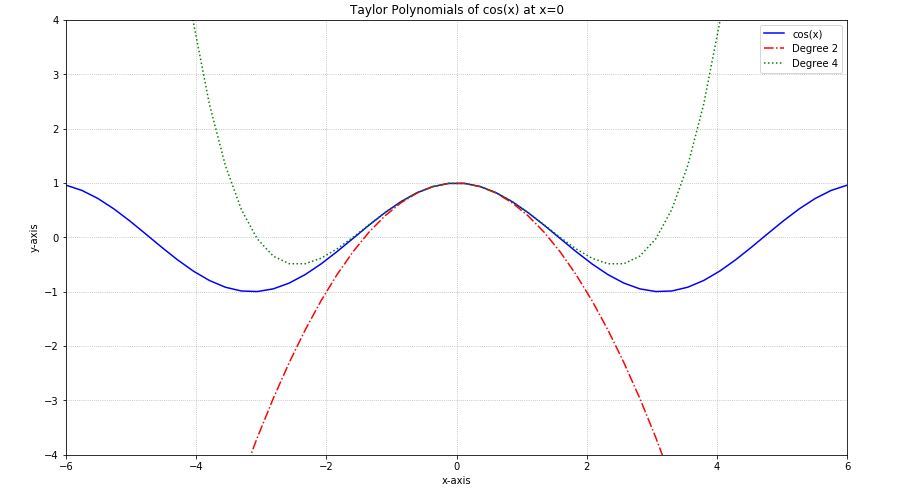
示例 1-
绘制函数y = Cos(x)及其 2 次和 4 次泰勒多项式的图。
Python3
# Import libraries
import matplotlib.pyplot as plt
import numpy as np

x = np.linspace(-6, 6, 50)

fig = plt.figure(figsize = (14, 8))

# Plot y = cos(x)
y = np.cos(x)
plt.plot(x, y, 'b', label ='cos(x)')

# Plot degree 2 Taylor polynomial
y2 = 1 - x**2 / 2
plt.plot(x, y2, 'r-.', label ='Degree 2')

# Plot degree 4 Taylor polynomial
y4 = 1 - x**2 / 2 + x**4 / 24
plt.plot(x, y4, 'g:', label ='Degree 4')

# Add features to our figure
plt.legend()
plt.grid(True, linestyle =':')
plt.xlim([-6, 6])
plt.ylim([-4, 4])

plt.title('Taylor Polynomials of cos(x) at x = 0')
plt.xlabel('x-axis')
plt.ylabel('y-axis')

# Show plot
plt.show()
输出-
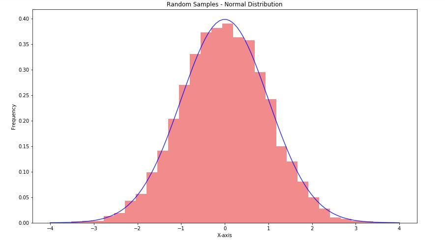
示例 2-
生成从正态分布中采样的 10000 个随机条目的数组,并创建一个直方图以及方程的正态分布:
Python3
# Import libraries
import matplotlib.pyplot as plt
import numpy as np

fig = plt.figure(figsize = (14, 8))

# Creating histogram
samples = np.random.randn(10000)
plt.hist(samples, bins = 30, density = True,
         alpha = 0.5, color =(0.9, 0.1, 0.1))

# Add a title
plt.title('Random Samples - Normal Distribution')

# Add X and y Label
plt.ylabel('X-axis')
plt.ylabel('Frequency')

# Creating vectors X and Y
x = np.linspace(-4, 4, 100)
y = 1/(2 * np.pi)**0.5 * np.exp(-x**2 / 2)

# Creating plot
plt.plot(x, y, 'b', alpha = 0.8)

# Show plot
plt.show()
输出-