在 Matplotlib 散点图中使用误差线
先决条件: Matplotlib
在本文中,我们将使用 Matplotlib 创建带有误差线的散点图。误差条形图是表示数据可变性的好方法。它可以应用于图形以提供有关所呈现数据的详细信息的附加层。
方法
- 导入所需的Python库。
- 创建数据。
- 将所需的值传递给 errorbar()函数
- 绘制图形。
Syntax: matplotlib.pyplot.errorbar(x, y, yerr=None, xerr=None, fmt=”, ecolor=None, elinewidth=None, capsize=None, barsabove=False, lolims=False, uplims=False, xlolims=False, xuplims=False, errorevery=1, capthick=None, \*, data=None, \*\*kwargs)
Parameters: This method accept the following parameters that are described below:
- x, y: These parameters are the horizontal and vertical coordinates of the data points.
- fmt: This parameter is an optional parameter and it contains the string value.
- capsize: This parameter is also an optional parameter. And it is the length of the error bar caps in points with default value NONE.
下面给出了上述概念的实现:
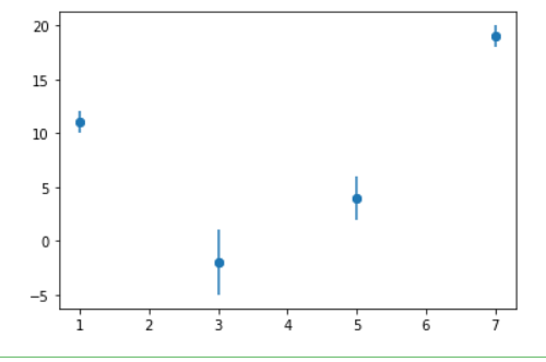
示例 1:在“y”值中添加一些错误。
Python3
import matplotlib.pyplot as plt

a = [1, 3, 5, 7]
b = [11, -2, 4, 19]
plt.scatter(a, b)

c = [1, 3, 2, 1]

plt.errorbar(a, b, yerr=c, fmt="o")
plt.show()
Python3
import matplotlib.pyplot as plt

a = [1, 3, 5, 7]
b = [11, -2, 4, 19]
plt.scatter(a, b)

c = [1, 3, 2, 1]

plt.errorbar(a, b, xerr=c, fmt="o")
plt.show()
Python3
import matplotlib.pyplot as plt

a = [1, 3, 5, 7]
b = [11, -2, 4, 19]
plt.scatter(a, b)


c = [1, 3, 2, 1]
d = [1, 3, 2, 1]

# you can use color ="r" for red or skip to default as blue
plt.errorbar(a, b, xerr=c, yerr=d, fmt="o", color="r")

plt.show()
Python3
# importing matplotlib
import matplotlib.pyplot as plt


# making a simple plot
x = [1, 2, 3, 4, 5]
y = [1, 2, 1, 2, 1]

# creating error
y_errormin = [0.1, 0.5, 0.9,
              0.1, 0.9]
y_errormax = [0.2, 0.4, 0.6,
              0.4, 0.2]

x_error = 0.5
y_error = [y_errormin, y_errormax]

# ploting graph
# plt.plot(x, y)
plt.errorbar(x, y,
             yerr=y_error,
             xerr=x_error,
             fmt='o')
plt.show()
输出:
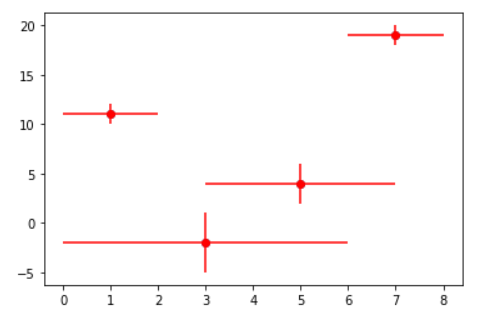
示例 2:在“x”值中添加一些错误。
蟒蛇3
import matplotlib.pyplot as plt

a = [1, 3, 5, 7]
b = [11, -2, 4, 19]
plt.scatter(a, b)

c = [1, 3, 2, 1]

plt.errorbar(a, b, xerr=c, fmt="o")
plt.show()
输出:

示例 3:在 x & y 中添加错误
蟒蛇3
import matplotlib.pyplot as plt

a = [1, 3, 5, 7]
b = [11, -2, 4, 19]
plt.scatter(a, b)


c = [1, 3, 2, 1]
d = [1, 3, 2, 1]

# you can use color ="r" for red or skip to default as blue
plt.errorbar(a, b, xerr=c, yerr=d, fmt="o", color="r")

plt.show()
输出:
示例 4:在 x 和 y 中添加变量误差。
蟒蛇3
# importing matplotlib
import matplotlib.pyplot as plt


# making a simple plot
x = [1, 2, 3, 4, 5]
y = [1, 2, 1, 2, 1]

# creating error
y_errormin = [0.1, 0.5, 0.9,
              0.1, 0.9]
y_errormax = [0.2, 0.4, 0.6,
              0.4, 0.2]

x_error = 0.5
y_error = [y_errormin, y_errormax]

# ploting graph
# plt.plot(x, y)
plt.errorbar(x, y,
             yerr=y_error,
             xerr=x_error,
             fmt='o')
plt.show()
输出:
