在 Matplotlib 的条形图中设置不同的误差条颜色
Python为我们提供了各种库,其中 Matplotlib 就是其中之一。它用于数据可视化目的。在本文中,我们将在 Matplotlib 的条形图中设置不同的误差条颜色。
Matplotlib 中的误差线
matplotlib 的各种图,例如条形图、折线图都可以使用误差线。误差棒用于显示测量或计算值的精度。如果没有误差条,使用 matplotlib 从一组值创建的图看起来具有高精度或高置信度。
Syntax: matplotlib.pyplot.errorbar(x, y, yerr=None, xerr=None, fmt=”, ecolor=None, elinewidth=None, capsize=None, barsabove=False, lolims=False, uplims=False, xlolims=False, xuplims=False, errorevery=1, capthick=None, \*, data=None, \*\*kwargs)
Parameters: This method accept the following parameters that are described below:
- x, y: These parameters are the horizontal and vertical coordinates of the data points.
- ecolor: This parameter is an optional parameter. And it is the color of the errorbar lines with default value NONE.
- elinewidth: This parameter is also an optional parameter. And it is the linewidth of the errorbar lines with default value NONE.
- capsize: This parameter is also an optional parameter. And it is the length of the error bar caps in points with default value NONE.
- barsabove: This parameter is also an optional parameter. It contains boolean value True for plotting errorsbars above the plot symbols.Its default value is False.
如何在 Matplotlib 的条形图中设置不同的误差条颜色
示例 1:
步骤 1:首先创建一个条形图。
Python3
# import matplotlib package
import matplotlib.pyplot as plt

# Store set of values in x
# and height for plotting
# the graph
x = range(4)
height = [ 3, 6, 5, 4]

# using tuple unpacking
# to grab fig and axes
fig, ax = plt.subplots()

# Creating the bar plot
# with opacity=0.1
ax.bar(x, height, alpha = 0.1)
Python3
# import matplotlib package
import matplotlib.pyplot as plt

# Store set of values in x
# and height for plotting
# the graph
x= range(4)
height=[ 3, 6, 5, 4]

# using tuple unpacking
# to grab fig and axes
fig, ax = plt.subplots()

# Creating the bar plot
# with opacity=0.1
ax.bar(x, height, alpha = 0.1)

# Zip function acts as an
# iterator for tuples so that
# we are iterating through
# each set of values in a loop

for pos, y, err in zip(x, height, error):
    ax.errorbar(pos, y, err, lw = 2,
                capsize = 4, capthick = 4,
                color = "green")

# Showing the plotted error bar
# plot with same color which is
# green
plt.show()
Python3
# importing matplotlib
import matplotlib.pyplot as plt

# Storing set of values in
# x, height, error and colors for ploting the graph
x= range(4)
height=[ 3, 6, 5, 4]
error=[ 1, 5, 3, 2]
colors = ['red', 'green', 'blue', 'black']

# using tuple unpacking
# to grab fig and axes
fig, ax = plt.subplots()

# ploting the bar plot
ax.bar( x, height, alpha = 0.1)

# Zip function acts as an
# iterator for tuples so that
# we are iterating through
# each set of values in a loop
for pos, y, err, colors in zip(x, height,
                               error, colors):

    ax.errorbar(pos, y, err, lw = 2,
                capsize = 4, capthick = 4,
                color = colors)

# Showing the plotted error bar
# plot with different color
plt.show()
Python3
# importing matplotlib package
import matplotlib.pyplot as plt

# importing the numpy package
import numpy as np

# Storing set of values in
# names, x, height,
# error and colors for ploting the graph
names= ['Bijon', 'Sujit', 'Sayan', 'Saikat']
x=np.arange(4)
marks=[ 60, 90, 55, 46]
error=[ 11, 15, 5, 9]
colors = ['red', 'green', 'blue', 'black']

# using tuple unpacking
# to grab fig and axes
fig, ax = plt.subplots()

# ploting the bar plot
ax.bar(x, marks, alpha = 0.5,
       color = colors)

# Zip function acts as an
# iterator for tuples so that
# we are iterating through
# each set of values in a loop
for pos, y, err, colors in zip(x, marks,
                               error, colors):

    ax.errorbar(pos, y, err, lw = 2,
                capsize = 4, capthick = 4,
                color = colors)

# Showing the plotted error bar
# plot with different color
ax.set_ylabel('Marks of the Students')

# Using x_ticks and x_labels
# to set the name of the
# students at each point
ax.set_xticks(x)
ax.set_xticklabels(names)
ax.set_xlabel('Name of the students')

# Showing the plot
plt.show()
Python3
# importing matplotlib
import matplotlib.pyplot as plt

# importing the numpy package
import numpy as np

# Storing set of values in
# names, x, height, error,
# error1 and colors for ploting the graph
names= ['USA', 'India', 'England', 'China']
x=np.arange(4)
economy=[21.43, 2.87, 2.83, 14.34]
error=[1.4, 1.5, 0.5, 1.9]
error1=[0.5, 0.2, 0.6, 1]
colors = ['red', 'grey', 'blue', 'magenta']

# using tuple unpacking
# to grab fig and axes
fig, ax = plt.subplots()

# ploting the bar plot
ax.bar(x, economy, alpha = 0.5,
       color = colors)

# Zip function acts as an
# iterator for tuples so that
# we are iterating through
# each set of values in a loop
for pos, y, err,err1, colors in zip(x, economy,
                                    error, error1,
                                    colors):

    ax.errorbar(pos, y, err, err1, fmt = 'o',
                lw = 2, capsize = 4, capthick = 4,
                color = colors)

# Showing the plotted error bar
# plot with different color
ax.set_ylabel('Economy(in trillions)')

# Using x_ticks and x_labels
# to set the name of the
# countries at each point
ax.set_xticks(x)
ax.set_xticklabels(names)
ax.set_xlabel('Name of the countries')

# Showing the plot
plt.show()
输出:

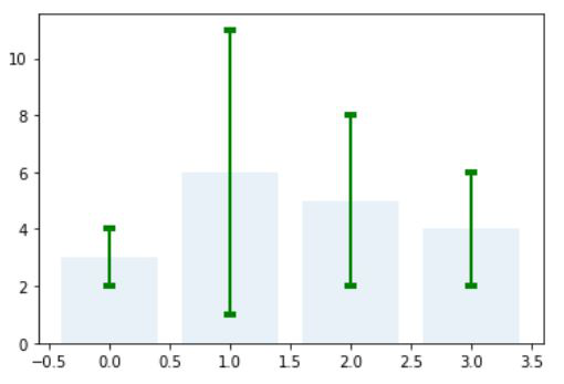
第 2 步:为每个点添加误差条:
蟒蛇3
# import matplotlib package
import matplotlib.pyplot as plt

# Store set of values in x
# and height for plotting
# the graph
x= range(4)
height=[ 3, 6, 5, 4]

# using tuple unpacking
# to grab fig and axes
fig, ax = plt.subplots()

# Creating the bar plot
# with opacity=0.1
ax.bar(x, height, alpha = 0.1)

# Zip function acts as an
# iterator for tuples so that
# we are iterating through
# each set of values in a loop

for pos, y, err in zip(x, height, error):
    ax.errorbar(pos, y, err, lw = 2,
                capsize = 4, capthick = 4,
                color = "green")

# Showing the plotted error bar
# plot with same color which is
# green
plt.show()
输出:
第 3 步:在条形图中设置不同的误差条颜色(示例 1):
蟒蛇3
# importing matplotlib
import matplotlib.pyplot as plt

# Storing set of values in
# x, height, error and colors for ploting the graph
x= range(4)
height=[ 3, 6, 5, 4]
error=[ 1, 5, 3, 2]
colors = ['red', 'green', 'blue', 'black']

# using tuple unpacking
# to grab fig and axes
fig, ax = plt.subplots()

# ploting the bar plot
ax.bar( x, height, alpha = 0.1)

# Zip function acts as an
# iterator for tuples so that
# we are iterating through
# each set of values in a loop
for pos, y, err, colors in zip(x, height,
                               error, colors):

    ax.errorbar(pos, y, err, lw = 2,
                capsize = 4, capthick = 4,
                color = colors)

# Showing the plotted error bar
# plot with different color
plt.show()
输出:

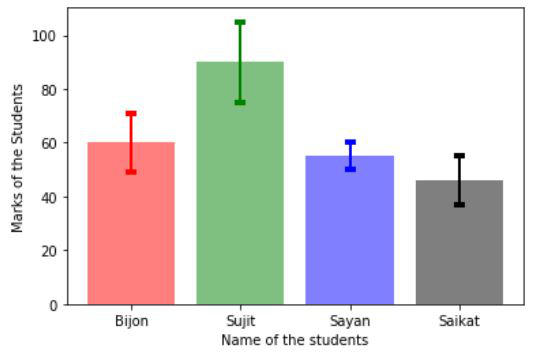
示例 2:在条形图中设置不同的误差条颜色:
蟒蛇3
# importing matplotlib package
import matplotlib.pyplot as plt

# importing the numpy package
import numpy as np

# Storing set of values in
# names, x, height,
# error and colors for ploting the graph
names= ['Bijon', 'Sujit', 'Sayan', 'Saikat']
x=np.arange(4)
marks=[ 60, 90, 55, 46]
error=[ 11, 15, 5, 9]
colors = ['red', 'green', 'blue', 'black']

# using tuple unpacking
# to grab fig and axes
fig, ax = plt.subplots()

# ploting the bar plot
ax.bar(x, marks, alpha = 0.5,
       color = colors)

# Zip function acts as an
# iterator for tuples so that
# we are iterating through
# each set of values in a loop
for pos, y, err, colors in zip(x, marks,
                               error, colors):

    ax.errorbar(pos, y, err, lw = 2,
                capsize = 4, capthick = 4,
                color = colors)

# Showing the plotted error bar
# plot with different color
ax.set_ylabel('Marks of the Students')

# Using x_ticks and x_labels
# to set the name of the
# students at each point
ax.set_xticks(x)
ax.set_xticklabels(names)
ax.set_xlabel('Name of the students')

# Showing the plot
plt.show()
输出:
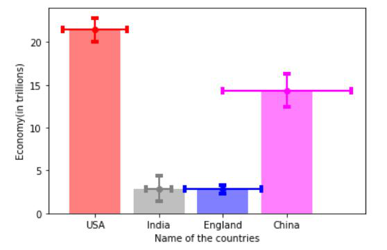
示例 3:在条形图中设置不同的误差条颜色。
蟒蛇3
# importing matplotlib
import matplotlib.pyplot as plt

# importing the numpy package
import numpy as np

# Storing set of values in
# names, x, height, error,
# error1 and colors for ploting the graph
names= ['USA', 'India', 'England', 'China']
x=np.arange(4)
economy=[21.43, 2.87, 2.83, 14.34]
error=[1.4, 1.5, 0.5, 1.9]
error1=[0.5, 0.2, 0.6, 1]
colors = ['red', 'grey', 'blue', 'magenta']

# using tuple unpacking
# to grab fig and axes
fig, ax = plt.subplots()

# ploting the bar plot
ax.bar(x, economy, alpha = 0.5,
       color = colors)

# Zip function acts as an
# iterator for tuples so that
# we are iterating through
# each set of values in a loop
for pos, y, err,err1, colors in zip(x, economy,
                                    error, error1,
                                    colors):

    ax.errorbar(pos, y, err, err1, fmt = 'o',
                lw = 2, capsize = 4, capthick = 4,
                color = colors)

# Showing the plotted error bar
# plot with different color
ax.set_ylabel('Economy(in trillions)')

# Using x_ticks and x_labels
# to set the name of the
# countries at each point
ax.set_xticks(x)
ax.set_xticklabels(names)
ax.set_xlabel('Name of the countries')

# Showing the plot
plt.show()
输出: