📌 相关文章
- Matplotlib 中的条形图
- 字典中的 matplotlib 条形图 - Python (1)
- 字典中的 matplotlib 条形图 - Python 代码示例
- 在 Matplotlib 条形图上添加值标签(1)
- 在 Matplotlib 条形图上添加值标签
- R – 条形图
- 条形图 (1)
- 条形图 (1)
- 条形图(1)
- R条形图
- R – 条形图(1)
- R-条形图
- 条形图
- 如何在 matplotlib 上绘制条形图 - Python (1)
- 水平条形图 matplotlib - Python (1)
- 如何在 matplotlib 上绘制条形图 - Python 代码示例
- 水平条形图 matplotlib - Python 代码示例
- 在 Matplotlib 中创建分组条形图(1)
- 在 Matplotlib 中创建分组条形图
- 条形图python(1)
- python中的条形图(1)
- 用 Matplotlib 绘制水平条形图(1)
- 用 Matplotlib 绘制水平条形图
- 在Python使用 Matplotlib 绘制多个条形图(1)
- 在Python使用 Matplotlib 绘制多个条形图
- 将误差线添加到 Matplotlib 条形图(1)
- 将误差线添加到 Matplotlib 条形图
- 多条条形图 matplotlib (1)
- 条形图python代码示例
📜 Matplotlib-条形图
📅 最后修改于: 2020-11-08 07:27:29 🧑 作者: Mango
条形图或条形图是用高度或长度与其所代表的值成比例的矩形条形图显示分类数据。条形图可以垂直或水平绘制。
条形图显示了离散类别之间的比较。图表的一个轴显示要比较的特定类别,另一个轴代表测量值。
Matplotlib API提供了可以在MATLAB样式使用以及面向对象的API中使用的bar()函数。与axis对象一起使用的bar()函数的签名如下-
ax.bar(x, height, width, bottom, align)
该函数使用大小为(x −width = 2; x + width = 2; bottom; bottom + height)的绑定矩形绘制条形图。
该函数的参数是-
| x | sequence of scalars representing the x coordinates of the bars. align controls if x is the bar center (default) or left edge. |
| height | scalar or sequence of scalars representing the height(s) of the bars. |
| width | scalar or array-like, optional. the width(s) of the bars default 0.8 |
| bottom | scalar or array-like, optional. the y coordinate(s) of the bars default None. |
| align | {‘center’, ‘edge’}, optional, default ‘center’ |
该函数返回带有所有条的Matplotlib容器对象。
以下是Matplotlib条形图的简单示例。它显示了某所学院提供的各种课程的注册学生人数。
import matplotlib.pyplot as plt
fig = plt.figure()
ax = fig.add_axes([0,0,1,1])
langs = ['C', 'C++', 'Java', 'Python', 'PHP']
students = [23,17,35,29,12]
ax.bar(langs,students)
plt.show()

比较多个数量并更改一个变量时,我们可能需要一个条形图,其中一个数量值具有一种颜色的条形。
我们可以通过玩条的粗细和位置来绘制多个条形图。数据变量包含三个系列的四个值。以下脚本将显示四个条形图的三个条形图。条的厚度为0.25个单位。每个条形图将从上一个移位0.25个单位。数据对象是一个multidict,其中包含过去四年来在一所工程学院的三个分支中通过的学生数量。
import numpy as np
import matplotlib.pyplot as plt
data = [[30, 25, 50, 20],
[40, 23, 51, 17],
[35, 22, 45, 19]]
X = np.arange(4)
fig = plt.figure()
ax = fig.add_axes([0,0,1,1])
ax.bar(X + 0.00, data[0], color = 'b', width = 0.25)
ax.bar(X + 0.25, data[1], color = 'g', width = 0.25)
ax.bar(X + 0.50, data[2], color = 'r', width = 0.25)

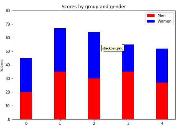
堆叠的条形图将代表不同组的条形图堆叠在一起。结果条的高度显示了这些组的组合结果。
pyplot.bar()函数的底部可选参数允许您指定条的起始值。而不是从零到一个值,它会从底部到该值。第一次调用pyplot.bar()将绘制蓝色条形图。对pyplot.bar()的第二次调用绘制了红色条,蓝色条的底部在红色条的顶部。
import numpy as np
import matplotlib.pyplot as plt
N = 5
menMeans = (20, 35, 30, 35, 27)
womenMeans = (25, 32, 34, 20, 25)
ind = np.arange(N) # the x locations for the groups
width = 0.35
fig = plt.figure()
ax = fig.add_axes([0,0,1,1])
ax.bar(ind, menMeans, width, color='r')
ax.bar(ind, womenMeans, width,bottom=menMeans, color='b')
ax.set_ylabel('Scores')
ax.set_title('Scores by group and gender')
ax.set_xticks(ind, ('G1', 'G2', 'G3', 'G4', 'G5'))
ax.set_yticks(np.arange(0, 81, 10))
ax.legend(labels=['Men', 'Women'])
plt.show()