📌 相关文章
- R – 条形图(1)
- 条形图
- R – 条形图
- 条形图(1)
- R-条形图
- 条形图 (1)
- python中的条形图(1)
- 条形图python(1)
- python代码示例中的条形图
- 条形图python代码示例
- 条形图 - 任何代码示例
- 创建条形图条|创建条形图 - Python (1)
- 创建条形图条|创建条形图 - Python 代码示例
- 条形图 - 无论代码示例
- 条形图 - R 编程语言(1)
- 如何在 R 中创建条形图?
- 如何在 R 中创建条形图?(1)
- 使用 R 中的 ggplot2 更改条形图中条形图的颜色
- 使用 R 中的 ggplot2 更改条形图中条形图的颜色(1)
- R 中的多个条形图
- R 中的多个条形图(1)
- Matplotlib 中的条形图(1)
- Matplotlib-条形图
- Matplotlib 中的条形图
- 条形图 - R 编程语言代码示例
- pandas 的条形图组 - Python (1)
- 更改 R 中 ggplot2 条形图中条形图的空间和宽度
- 绘制-条形图和饼图(1)
- 绘制-条形图和饼图
📜 R条形图
📅 最后修改于: 2021-01-08 09:57:23 🧑 作者: Mango
R条形图
条形图是一种图形表示形式,其中变量的数值由等宽度的线或矩形的长度或高度表示。条形图用于汇总一组分类数据。在条形图中,数据通过矩形条显示,矩形条的长度与变量的值成比例。
在R中,我们可以创建条形图以高效地可视化数据。为此,R提供了barplot()函数,该函数具有以下语法:
barplot(h,x,y,main, names.arg,col)
| S.No | Parameter | Description |
|---|---|---|
| 1. | H | A vector or matrix which contains numeric values used in the bar chart. |
| 2. | xlab | A label for the x-axis. |
| 3. | ylab | A label for the y-axis. |
| 4. | main | A title of the bar chart. |
| 5. | names.arg | A vector of names that appear under each bar. |
| 6. | col | It is used to give colors to the bars in the graph. |
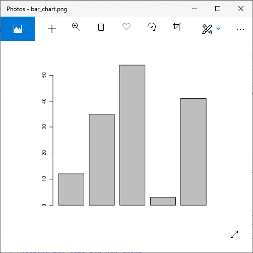
例
# Creating the data for Bar chart
H<- c(12,35,54,3,41)
# Giving the chart file a name
png(file = "bar_chart.png")
# Plotting the bar chart
barplot(H)
# Saving the file
dev.off()
输出:
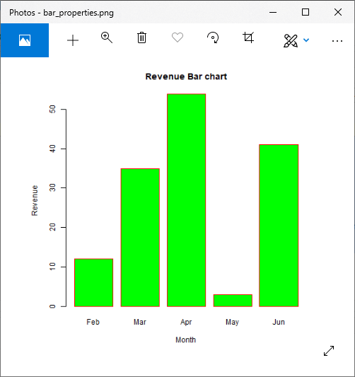
标签,标题和颜色
与饼图一样,我们也可以通过在barplot()函数中传递更多参数来在条形图中添加更多功能。我们可以在条形图中添加标题,也可以通过分别添加main和col参数为条形添加颜色。我们可以添加另一个参数args.name,这是一个具有相同数量值的向量,将其作为输入向量进行输入以描述每个条形的含义。
让我们看一个示例,以了解如何在条形图中添加标签,标题和颜色。
例
# Creating the data for Bar chart
H <- c(12,35,54,3,41)
M<- c("Feb","Mar","Apr","May","Jun")

# Giving the chart file a name
png(file = "bar_properties.png")

# Plotting the bar chart
barplot(H,names.arg=M,xlab="Month",ylab="Revenue",col="Green",
        main="Revenue Bar chart",border="red")
# Saving the file
dev.off()
输出:
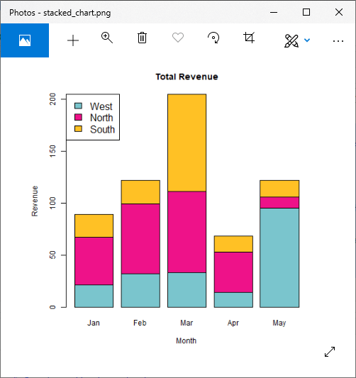
组条形图和堆积条形图
我们可以使用矩阵作为每个条中的输入值来创建具有条和条组的条形图。一个或多个变量表示为矩阵,用于构造组条形图和堆积的条形图。
让我们看一个示例,以了解如何创建这些图表。
例
library(RColorBrewer)
months <- c("Jan","Feb","Mar","Apr","May")
regions <- c("West","North","South")
# Creating the matrix of the values.
Values <- matrix(c(21,32,33,14,95,46,67,78,39,11,22,23,94,15,16), nrow = 3, ncol = 5, byrow = TRUE)
# Giving the chart file a name
png(file = "stacked_chart.png")
# Creating the bar chart
barplot(Values, main = "Total Revenue", names.arg = months, xlab = "Month", ylab = "Revenue", col =c("cadetblue3","deeppink2","goldenrod1"))
# Adding the legend to the chart
legend("topleft", regions, cex = 1.3, fill = c("cadetblue3","deeppink2","goldenrod1"))

# Saving the file
dev.off()
输出: