R – 条形图
条形图是数据的图形表示,它使用矩形条呈现分类数据,矩形条的高度或长度与它们所代表的值成比例。换句话说,它是数据集的图形表示。这些数据集包含表示长度或高度的变量的数值。
R使用函数barplot()创建条形图。在这里,可以绘制垂直条和水平条。
Syntax:
Parameters:
- H: This parameter is a vector or matrix containing numeric values which are used in bar chart.
- xlab: This parameter is the label for x axis in bar chart.
- ylab: This parameter is the label for y axis in bar chart.
- main: This parameter is the title of the bar chart.
- names.arg: This parameter is a vector of names appearing under each bar in bar chart.
- col: This parameter is used to give colors to the bars in the graph.
创建一个简单的条形图
方法:为了创建条形图:
- 采用包含要使用的数值的向量(H <- c(Values…)) 。
- 这个向量H是使用barplot() 绘制的。
例子:
barplot(H, xlab, ylab, main, names.arg, col)输出: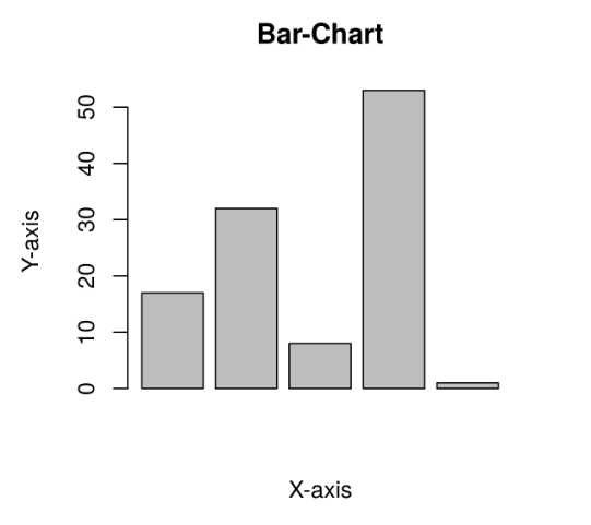
创建水平条形图
方法:创建水平条形图:
- 获取制作简单条形图所需的所有参数。
- 现在要使其水平添加新参数。
# Create the data for the chart
A <- c(17, 32, 8, 53, 1)

# Plot the bar chart
barplot(A, xlab = "X-axis", ylab = "Y-axis", main ="Bar-Chart")
示例:创建水平条形图
barplot(A, horiz=TRUE )输出: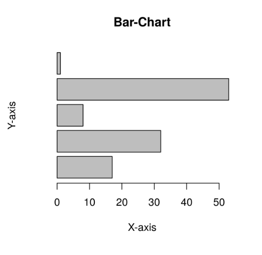
在条形图中添加标签、标题和颜色
标签、标题和颜色是条形图中的一些属性,可以通过添加和传递参数来添加到条形图中。
方法:
- 在条形图中添加标题。
# Create the data for the chart A <- c(17, 32, 8, 53, 1) # Plot the bar chart barplot(A, horiz = TRUE, xlab = "X-axis", ylab = "Y-axis", main ="Bar-Chart") - X轴和Y轴可以在条形图中标记。在条形图中添加标签。
barplot( A, main = title_name ) - 在条形图中添加颜色。
barplot( A, xlab= x_label_name, ylab= y_label_name)
例子 :
barplot( A, col=color_name)输出:
创建堆叠和分组条形图
条形图可以用两种形式的条形组和堆叠来表示。
方法:
- 取一个向量值并将其设为矩阵M进行分组或堆叠。矩阵的制作可以通过。
# Create the data for the chart A <- c(17, 2, 8, 13, 1, 22) B <- c("Jan", "feb", "Mar", "Apr", "May", "Jun") # Plot the bar chart barplot(A, names.arg = B, xlab ="Month", ylab ="Articles", col ="green", main ="GeeksforGeeks-Article chart") - 要显式显示栏,我们可以使用beside参数。
M <- matrix(c(values...), nrow = no_of_rows, ncol = no_of_column, byrow = TRUE)
示例 1:
barplot( beside=TRUE )输出: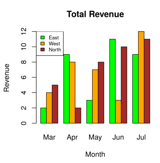
示例 2:
colors = c("green", "orange", "brown")
months <- c("Mar", "Apr", "May", "Jun", "Jul")
regions <- c("East", "West", "North")

# Create the matrix of the values.
Values <- matrix(c(2, 9, 3, 11, 9, 4, 8, 7, 3, 12, 5, 2, 8, 10, 11),
                 nrow = 3, ncol = 5, byrow = TRUE)

# Create the bar chart
barplot(Values, main = "Total Revenue", names.arg = months,
                          xlab = "Month", ylab = "Revenue",
                          col = colors, beside = TRUE)

# Add the legend to the chart
legend("topleft", regions, cex = 0.7, fill = colors)
输出: