在 Matplotlib 条形图上添加值标签
先决条件: Matplotlib
在本文中,我们将在 Matplotlib 条形图上添加值标签。条形图是使用不同高度的条形对数据进行图形显示。我们可以使用此条形图比较不同的数据。为了在Python绘制数据,我们使用 Matplotlib 库提供的 bar()函数,我们可以将数据作为参数传递以进行可视化,但是在给定数据上绘制的默认图表不包含每个条形图上的任何值标签条形图,由于默认条形图不包含条形图每个条形的任何值标签,因此很难分析条形图各个条形所代表的确切值。
为了绘制带有值标签的条形图,我们主要使用 Matplotlib 库提供的两种方法。
- 用于制作条形图
Syntax: plt.bar(x, height, color)- 用于在条形图上添加文本
Syntax: plt.text(x, y, s, ha, Bbox)我们展示了本文中使用的一些参数:Parameter Description x Data values plot on X-axis of the plot. height Data values plot on Y-axis of the plot. color Set the color of the plot. x, y coordinates of the plot. s String to be displayed. ha Horizontal alignment. Bbox Put the rectangular box around the text.
所需步骤:
- 导入库。
- 创建可以通过服用x和y作为参数,现在在函数中添加值标签的函数,我们将运行for循环的x值的长度,我们可以用LEN()函数查找长度,在我们想要的长度的传递变量中。
- 现在使用plt.text()函数将值标签添加到此传递中的条形图 x 和 y 坐标,它们将是 i 和 y[i],它只是条形的高度,并传递 y[i] 这表示将显示在给定坐标上的字符串,即 i 和 y[i]。
- 要在条形高度的中心添加值标签,我们只需将 y 坐标除以 2,即 y[i]//2 通过这样做我们将尽快获得每个条形的中心坐标for 循环针对 i 的每个值运行。
- 有了这个,我们还可以设置水平对齐的参数ha和Bbox ,当我们传递ha=center和 Bbox 时,它们将值标签对齐在条形的中心,它们在被覆盖的矩形框中显示值标签,为此我们必须使用 dict() 创建一个字典,并在这个过程中传递我们想要的颜色的 facecolor 和 alpha 如果我们想要我们可以设置的不透明度。
- 现在在创建函数后,我们必须从程序开始运行的地方创建主函数。
- 创建或导入绘制条形图的数据。
- 给出图形大小,以便绘图的值和标签清晰可见且不能重叠,您可以使用plt.figure()函数进行相应设置,其中将 figsize 作为参数传递。
- 现在使用plt.bar()函数绘制条形图,如果需要,相应地传递数据值和颜色,否则将显示默认颜色。
- 现在在制作条形图后调用我们创建的用于添加值标签的函数。
- 设置图表/绘图的标题、X 轴标签和 Y 轴标签。
- 现在使用plt.show()函数可视化绘图。
示例 1:以默认设置在条形图上添加值标签。
Python
# importing library
import matplotlib.pyplot as plt

# function to add value labels
def addlabels(x,y):
    for i in range(len(x)):
        plt.text(i,y[i],y[i])

if __name__ == '__main__':
    # creating data on which bar chart will be plot
    x = ["Engineering", "Hotel Managment", "MBA",
         "Mass Communication", "BBA", "BSc", "MSc"]
    y = [9330, 4050, 3030, 5500,
         8040, 4560, 6650]

    # making the bar chart on the data
    plt.bar(x, y)

    # calling the function to add value labels
    addlabels(x, y)

    # giving title to the plot
    plt.title("College Admission")

    # giving X and Y labels
    plt.xlabel("Courses")
    plt.ylabel("Number of Admissions")

    # visualizing the plot
    plt.show()
Python
# importing library
import matplotlib.pyplot as plt

# function to add value labels
def addlabels(x,y):
    for i in range(len(x)):
        plt.text(i, y[i], y[i], ha = 'center')

if __name__ == '__main__':

    # creating data on which bar chart will be plot
    x = ["Engineering", "Hotel Managment",
         "MBA", "Mass Communication", "BBA",
         "BSc", "MSc"]
    y = [9330, 4050, 3030, 5500,
         8040, 4560, 6650]

    # setting figure size by using figure() function
    plt.figure(figsize = (10, 5))

    # making the bar chart on the data
    plt.bar(x, y)

    # calling the function to add value labels
    addlabels(x, y)

    # giving title to the plot
    plt.title("College Admission")

    # giving X and Y labels
    plt.xlabel("Courses")
    plt.ylabel("Number of Admissions")

    # visualizing the plot
    plt.show()
Python
# importing library
import matplotlib.pyplot as plt

# function to add value labels
def addlabels(x,y):
    for i in range(len(x)):
        plt.text(i, y[i], y[i], ha = 'center',
                 Bbox = dict(facecolor = 'red', alpha =.8))

if __name__ == '__main__':

    # creating data on which bar chart will be plot
    x = ["Engineering", "Hotel Managment",
         "MBA", "Mass Communication", "BBA", "BSc", "MSc"]
    y = [9330, 4050, 3030, 5500, 8040, 4560, 6650]

    # setting figure size by using figure() function
    plt.figure(figsize = (10,5))

    # making the bar chart on the data
    plt.bar(x, y)

    # calling the function to add value labels
    addlabels(x, y)

    # giving title to the plot
    plt.title("College Admission")

    # giving X and Y labels
    plt.xlabel("Courses")
    plt.ylabel("Number of Admissions")

    # visualizing the plot
    plt.show()
Python
# importing library
import matplotlib.pyplot as plt

# function to add value labels
def addlabels(x,y):
    for i in range(len(x)):
        plt.text(i, y[i]//2, y[i], ha = 'center')

if __name__ == '__main__':

    # creating data on which bar chart will be plot
    x = ["Engineering", "Hotel Managment", "MBA",
         "Mass Communication", "BBA", "BSc", "MSc"]

    y = [9330, 4050, 3030, 5500,
         8040, 4560, 6650]

    # setting figure size by using figure() function
    plt.figure(figsize = (10,5))

    # making the bar chart on the data
    plt.bar(x, y)

    # calling the function to add value labels
    addlabels(x, y)

    # giving title to the plot
    plt.title("College Admission")

    # giving X and Y labels
    plt.xlabel("Courses")
    plt.ylabel("Number of Admissions")

    # visualizing the plot
    plt.show()
Python
# importing library
import matplotlib.pyplot as plt

# function to add value labels
def addlabels(x,y):
    for i in range(len(x)):
        plt.text(i, y[i]//2,y[i], ha = 'center',
                 Bbox = dict(facecolor = 'white', alpha = .5))

if __name__ == '__main__':

    # creating data on which bar chart will be plot
    x = ["Engineering", "Hotel Managment", "MBA",
         "Mass Communication", "BBA", "BSc", "MSc"]
    y = [9330, 4050, 3030, 5500,
         8040, 4560, 6650]

    # setting figure size by using figure() function
    plt.figure(figsize = (10,5))

    # making the bar chart on the data with color red
    plt.bar(x, y, color = 'red')

    # calling the function to add value labels
    addlabels(x, y)

    # giving title to the plot
    plt.title("College Admission")

    # giving X and Y labels
    plt.xlabel("Courses")
    plt.ylabel("Number of Admissions")

    # visualizing the plot
    plt.show()
输出:

上图是在默认设置下绘制的,从上图中我们可以观察到,每个条形的值标签都添加在顶部,但它们略微出现在条形顶部的右侧和 X 轴上部分课程名称重叠。
示例 2:在条形图上每个条形的中心添加值标签。
Python
# importing library
import matplotlib.pyplot as plt

# function to add value labels
def addlabels(x,y):
    for i in range(len(x)):
        plt.text(i, y[i], y[i], ha = 'center')

if __name__ == '__main__':

    # creating data on which bar chart will be plot
    x = ["Engineering", "Hotel Managment",
         "MBA", "Mass Communication", "BBA",
         "BSc", "MSc"]
    y = [9330, 4050, 3030, 5500,
         8040, 4560, 6650]

    # setting figure size by using figure() function
    plt.figure(figsize = (10, 5))

    # making the bar chart on the data
    plt.bar(x, y)

    # calling the function to add value labels
    addlabels(x, y)

    # giving title to the plot
    plt.title("College Admission")

    # giving X and Y labels
    plt.xlabel("Courses")
    plt.ylabel("Number of Admissions")

    # visualizing the plot
    plt.show()
输出:
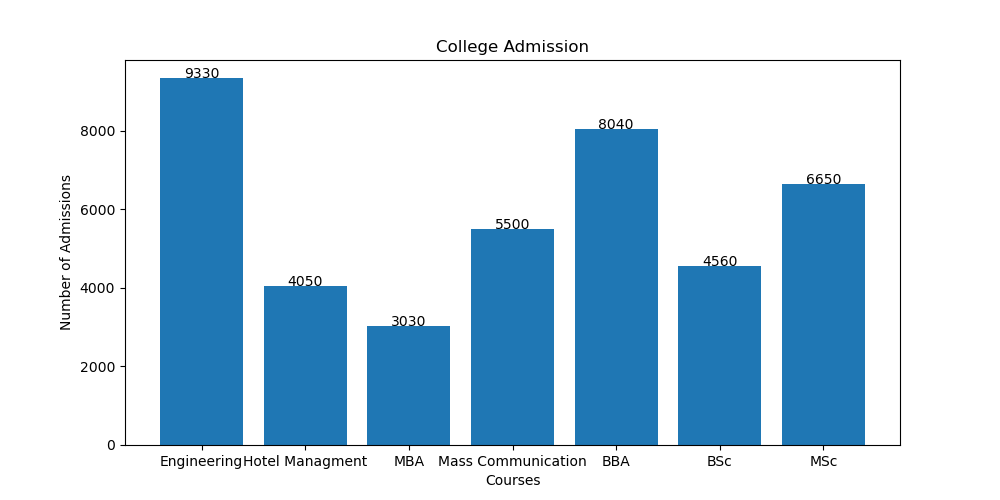
在上图中,我们可以观察到值标签在每个条形的中心顶部对齐,并且在 X 轴上,重叠的课程名称也分别显示。
为了在中心对齐值标签,我们在 plt.text()函数只传递了一个参数“ ha='center ”,即文本的水平对齐方式,并且为了分别显示课程名称,我们有在制作条形图之前添加了 plt.figure()函数,其中我们将图形大小作为参数传递,其余代码相同。
示例 3:通过将值标签放入矩形框来添加值标签。
Python
# importing library
import matplotlib.pyplot as plt

# function to add value labels
def addlabels(x,y):
    for i in range(len(x)):
        plt.text(i, y[i], y[i], ha = 'center',
                 Bbox = dict(facecolor = 'red', alpha =.8))

if __name__ == '__main__':

    # creating data on which bar chart will be plot
    x = ["Engineering", "Hotel Managment",
         "MBA", "Mass Communication", "BBA", "BSc", "MSc"]
    y = [9330, 4050, 3030, 5500, 8040, 4560, 6650]

    # setting figure size by using figure() function
    plt.figure(figsize = (10,5))

    # making the bar chart on the data
    plt.bar(x, y)

    # calling the function to add value labels
    addlabels(x, y)

    # giving title to the plot
    plt.title("College Admission")

    # giving X and Y labels
    plt.xlabel("Courses")
    plt.ylabel("Number of Admissions")

    # visualizing the plot
    plt.show()
输出:

在上面的例子中,我们添加了矩形框覆盖的值标签,为此在 plt.text()函数,我们必须传递参数 Bbox,我们必须在其中创建字典,在该字典中,我们可以给我们选择的 facecolor 和 alpha,它给我们可以相应设置的框的不透明度。
示例 4:在条形图每个条形高度的中心添加值标签。
Python
# importing library
import matplotlib.pyplot as plt

# function to add value labels
def addlabels(x,y):
    for i in range(len(x)):
        plt.text(i, y[i]//2, y[i], ha = 'center')

if __name__ == '__main__':

    # creating data on which bar chart will be plot
    x = ["Engineering", "Hotel Managment", "MBA",
         "Mass Communication", "BBA", "BSc", "MSc"]

    y = [9330, 4050, 3030, 5500,
         8040, 4560, 6650]

    # setting figure size by using figure() function
    plt.figure(figsize = (10,5))

    # making the bar chart on the data
    plt.bar(x, y)

    # calling the function to add value labels
    addlabels(x, y)

    # giving title to the plot
    plt.title("College Admission")

    # giving X and Y labels
    plt.xlabel("Courses")
    plt.ylabel("Number of Admissions")

    # visualizing the plot
    plt.show()
输出:

在上面的示例中,在每个条形的高度中心添加值标签,我们刚刚在 for 循环内的 plt.text()函数中将 y 坐标除以 2。
示例 5:在条形图每个条形高度的中心添加矩形框覆盖的值标签。
Python
# importing library
import matplotlib.pyplot as plt

# function to add value labels
def addlabels(x,y):
    for i in range(len(x)):
        plt.text(i, y[i]//2,y[i], ha = 'center',
                 Bbox = dict(facecolor = 'white', alpha = .5))

if __name__ == '__main__':

    # creating data on which bar chart will be plot
    x = ["Engineering", "Hotel Managment", "MBA",
         "Mass Communication", "BBA", "BSc", "MSc"]
    y = [9330, 4050, 3030, 5500,
         8040, 4560, 6650]

    # setting figure size by using figure() function
    plt.figure(figsize = (10,5))

    # making the bar chart on the data with color red
    plt.bar(x, y, color = 'red')

    # calling the function to add value labels
    addlabels(x, y)

    # giving title to the plot
    plt.title("College Admission")

    # giving X and Y labels
    plt.xlabel("Courses")
    plt.ylabel("Number of Admissions")

    # visualizing the plot
    plt.show()
输出:
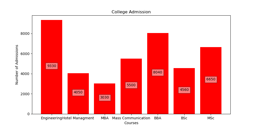
在上面的示例中,我们做了与示例 3 中所做的相同的事情,但唯一的区别是我们将 y 的坐标除以 2,以便值标签应显示在条形高度的中心,并且我们还通过在 plt.bar()函数传递颜色参数将条形图的颜色更改为红色。