📌 相关文章
- matplotlib 直方图 - Python 代码示例
- NumPy-使用Matplotlib的直方图(1)
- NumPy-使用Matplotlib的直方图
- R直方图
- R直方图(1)
- R-直方图
- R-直方图(1)
- 使用 Matplotlib 在Python中绘制直方图(1)
- 使用 Matplotlib 在Python中绘制直方图
- 直方图 |创建直方图 - Python (1)
- 直方图 |创建直方图 - Python 代码示例
- 在Python中使用 Matplotlib 重叠直方图
- 在Python中使用 Matplotlib 重叠直方图(1)
- 在 Matplotlib 中的直方图条之间添加空格(1)
- 在 Matplotlib 中的直方图条之间添加空格
- Matplotlib 直方图中的 bin 大小
- Matplotlib 直方图中的 bin 大小(1)
- 在 Matplotlib 中创建累积直方图(1)
- 在 Matplotlib 中创建累积直方图
- 如何从 Matplotlib 中的数据列表中绘制直方图?
- 如何从 Matplotlib 中的数据列表中绘制直方图?(1)
- 在 Matplotlib 中为直方图条添加标签
- 使用 Matplotlib 在Python中绘制二维直方图(1)
- 使用 Matplotlib 在Python中绘制二维直方图
- 图像的直方图(1)
- 图像的直方图
- 如何在python中使用直方图(1)
- matplotlib 创建直方图边缘颜色 - Python (1)
- 在 matplotlib 中向直方图条添加标签 - Python (1)
📜 Matplotlib-直方图
📅 最后修改于: 2020-11-08 07:27:46 🧑 作者: Mango
直方图是数字数据分布的准确表示。它是对连续变量的概率分布的估计。它是一种条形图。
要构建直方图,请按照以下步骤操作:
- Bin值的范围。
- 将整个值范围划分为一系列间隔。
- 计算每个间隔内有多少个值。
通常将bin指定为变量的连续,不重叠的间隔。
matplotlib.pyplot.hist()函数绘制直方图。它计算并绘制x的直方图。
参量
下表列出了直方图的参数-
| x | array or sequence of arrays |
| bins | integer or sequence or ‘auto’, optional |
| optional parameters | |
| range | The lower and upper range of the bins. |
| density | If True, the first element of the return tuple will be the counts normalized to form a probability density |
| cumulative | If True, then a histogram is computed where each bin gives the counts in that bin plus all bins for smaller values. |
| histtype | The type of histogram to draw. Default is ‘bar’
|
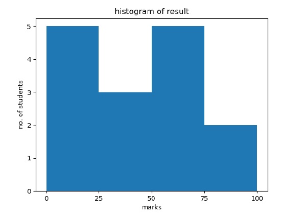
以下示例绘制了班级学生获得的分数直方图。定义了四个容器0-25、26-50、51-75和76-100。直方图显示落入该范围的学生人数。
from matplotlib import pyplot as plt
import numpy as np
fig,ax = plt.subplots(1,1)
a = np.array([22,87,5,43,56,73,55,54,11,20,51,5,79,31,27])
ax.hist(a, bins = [0,25,50,75,100])
ax.set_title("histogram of result")
ax.set_xticks([0,25,50,75,100])
ax.set_xlabel('marks')
ax.set_ylabel('no. of students')
plt.show()
该图如下所示-