使用 Matplotlib 在Python中绘制二维直方图
二维直方图用于分析具有广泛值范围的两个数据变量之间的关系。 2D 直方图与 1D 直方图非常相似。数据集的类区间绘制在 x 和 y 轴上。与一维直方图不同,它是通过包括出现在 x 和 y 间隔内的值的组合总数并标记密度来绘制的。当离散分布中有大量数据时,它很有用,并通过可视化变量密集的频率点来简化它。
创建二维直方图
Matplotlib 库提供了一个内置函数matplotlib.pyplot.hist2d()用于创建 2D 直方图。下面是函数的语法:
matplotlib.pyplot.hist2d(x, y, bins=(nx, ny), range=None, density=False, weights=None, cmin=None, cmax=None, cmap=value)
这里(x, y)指定数据变量的坐标,X数据和Y变量的长度应该相同。bin的个数可以通过属性bins=(nx, ny)来指定,其中nx和ny是分别在水平和垂直方向上使用的 bin 数量。 cmap=value用于设置色标。range range=None是一个可选参数,用于设置矩形区域,其中计算数据值以进行绘图。 density=value是可选参数,接受用于标准化直方图的布尔值。
下面的代码使用matplotlib.pyplot.hist2d()函数创建一个简单的 2D 直方图,该函数具有一些 x 和 y 的随机值:
# Import libraries
import numpy as np
import matplotlib.pyplot as plt
import random

# Creating dataset
n = 100
x = np.random.standard_normal(n)
y = 3.0 * x

fig = plt.subplots(figsize =(10, 7))
# Creating plot
plot.hist2d(x, y)
plot.title("Simple 2D Histogram")

# show plot
plot.show()
输出: 
自定义 2D 直方图
matplotlib.pyplot.hist2d()函数具有多种方法,我们可以使用它们来自定义和创建绘图以便更好地查看和理解。
# Import libraries
import numpy as np
import matplotlib.pyplot as plt
import random

# Creating dataset
x = np.random.normal(size = 500000)
y = x * 3 + 4 * np.random.normal(size = 500000)

fig = plt.subplots(figsize =(10, 7))
# Creating plot
plot.hist2d(x, y)
plot.title("Simple 2D Histogram")

# show plot
plot.show()
输出: 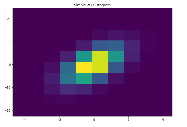
下面列出了上图的一些自定义:
更改 bin 比例:-
# Import libraries
import numpy as np
import matplotlib.pyplot as plt
import random

# Creating dataset
x = np.random.normal(size = 500000)
y = x * 3 + 4 * np.random.normal(size = 500000)

# Creating bins
x_min = np.min(x)
x_max = np.max(x)

y_min = np.min(y)
y_max = np.max(y)

x_bins = np.linspace(x_min, x_max, 50)
y_bins = np.linspace(y_min, y_max, 20)

fig, ax = plt.subplots(figsize =(10, 7))
# Creating plot
plt.hist2d(x, y, bins =[x_bins, y_bins])
plt.title("Changing the bin scale")

ax.set_xlabel('X-axis')
ax.set_ylabel('X-axis')

# show plot
plt.tight_layout()
plot.show()
输出: 
更改色阶并添加色条:-
# Import libraries
import numpy as np
import matplotlib.pyplot as plt
import random

# Creating dataset
x = np.random.normal(size = 500000)
y = x * 3 + 4 * np.random.normal(size = 500000)

# Creating bins
x_min = np.min(x)
x_max = np.max(x)

y_min = np.min(y)
y_max = np.max(y)

x_bins = np.linspace(x_min, x_max, 50)
y_bins = np.linspace(y_min, y_max, 20)

fig, ax = plt.subplots(figsize =(10, 7))
# Creating plot
plt.hist2d(x, y, bins =[x_bins, y_bins], cmap = plt.cm.nipy_spectral)
plt.title("Changing the color scale and adding color bar")

# Adding color bar
plt.colorbar()

ax.set_xlabel('X-axis')
ax.set_ylabel('X-axis')

# show plot
plt.tight_layout()
plot.show()
输出: 
过滤数据:-
# Import libraries
import numpy as np
import matplotlib.pyplot as plt
import random

# Creating dataset
x = np.random.normal(size = 500000)
y = x * 3 + 4 * np.random.normal(size = 500000)

# Creating bins
x_min = np.min(x)
x_max = np.max(x)

y_min = np.min(y)
y_max = np.max(y)

x_bins = np.linspace(x_min, x_max, 50)
y_bins = np.linspace(y_min, y_max, 20)

# Creating data filter
data = np.c_[x, y]

for i in range(10000):
    x_idx = random.randint(0, 500000)
    data[x_idx, 0] = -9999

data = data[data[:, 0]!=-9999]

fig, ax = plt.subplots(figsize =(10, 7))
# Creating plot
plt.hist2d(data[:, 0], data[:, 1], bins =[x_bins, y_bins])
plt.title("Filtering data")

ax.set_xlabel('X-axis')
ax.set_ylabel('X-axis')

# show plot
plt.tight_layout()
plot.show()
输出: 
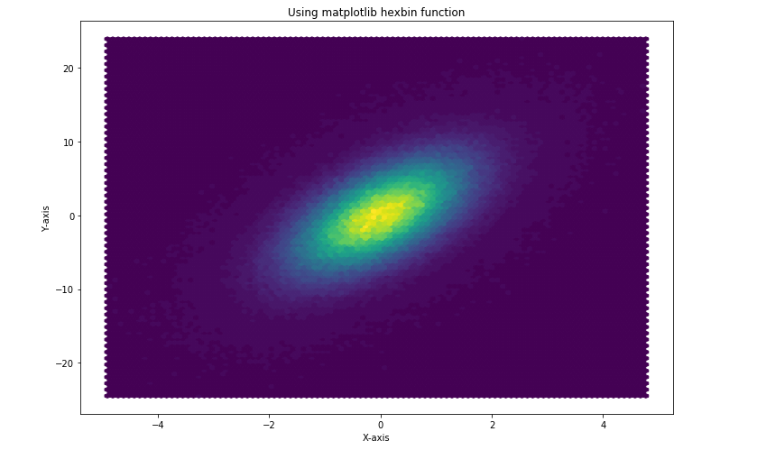
使用 matplotlib hexbin函数:-
# Import libraries
import numpy as np
import matplotlib.pyplot as plt
import random

# Creating dataset
x = np.random.normal(size = 500000)
y = x * 3 + 4 * np.random.normal(size = 500000)

fig, ax = plt.subplots(figsize =(10, 7))
# Creating plot
plt.title("Using matplotlib hexbin function")
plt.hexbin(x, y, bins = 50)

ax.set_xlabel('X-axis')
ax.set_ylabel('Y-axis')

# show plot
plt.tight_layout()
plot.show()
输出: