📌 相关文章
- Python -Matplotlib(1)
- matplotlib 中的图 - Python (1)
- Python -Matplotlib
- matplotlib - Python (1)
- matplotlib - Python 代码示例
- matplotlib 中的图 - Python 代码示例
- 在 python 中使用 matplotlib(1)
- matplotlib 3.0.3 轮文件 - Python (1)
- 在 python 代码示例中使用 matplotlib
- matplotlib 安装 - Python (1)
- NumPy-Matplotlib(1)
- NumPy-Matplotlib
- python matplotlib - Python (1)
- matplotlib 3.0.3 轮文件 - Python 代码示例
- Matplotlib教程
- Matplotlib教程(1)
- Matplotlib-使用文本(1)
- Matplotlib-使用文本
- matplotlib 矩阵图 - Python (1)
- Matplotlib-简介
- Matplotlib-简介(1)
- 安装 matplotlib - Python 代码示例
- matplotlib 安装 - Python 代码示例
- Matplotlib-使用图像
- Matplotlib-使用图像(1)
- matplotlib 点标签 - Python (1)
- matplotlib 轴标签 - Python (1)
- 如何在Python安装Matplotlib(1)
- 如何在Python安装Matplotlib
📜 Matplotlib-饼图
📅 最后修改于: 2020-11-08 07:28:02 🧑 作者: Mango
饼图只能显示一系列数据。饼图以一个数据序列显示项目的大小(称为楔形),与项目的总和成比例。饼图中的数据点显示为整个饼的百分比。
Matplotlib API具有pie()函数,该函数生成表示数组中数据的饼图。每个楔形的分数面积由x / sum(x)给出。如果sum(x)<1,则x的值将直接给出小数面积,并且该数组将不被标准化。结果饼图将具有大小为1的空楔-sum(x)。
如果图形和轴为正方形,或者“轴”纵横比相等,则饼形图看起来最好。
参量
下表列出了饼图的参数-
| x | array-like. The wedge sizes. |
| labels | list. A sequence of strings providing the labels for each wedge. |
| Colors | A sequence of matplotlibcolorargs through which the pie chart will cycle. If None, will use the colors in the currently active cycle. |
| Autopct | string, used to label the wedges with their numeric value. The label will be placed inside the wedge. The format string will be fmt%pct. |
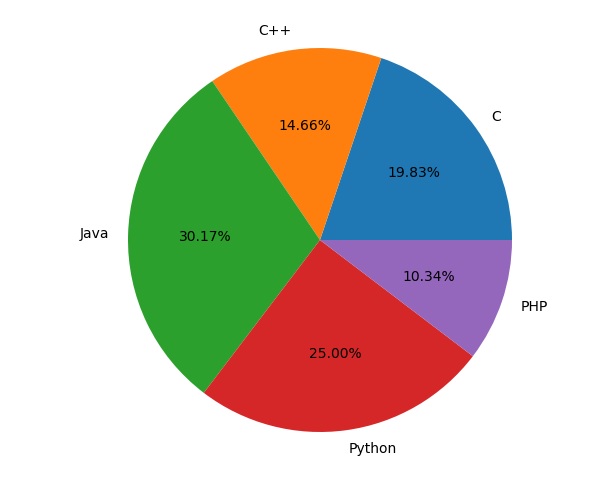
以下代码使用pie()函数显示参加各种计算机语言课程的学生列表的饼图。借助于设置为%1.2f%的autopct参数,比例百分比显示在相应的楔形内部。
from matplotlib import pyplot as plt
import numpy as np
fig = plt.figure()
ax = fig.add_axes([0,0,1,1])
ax.axis('equal')
langs = ['C', 'C++', 'Java', 'Python', 'PHP']
students = [23,17,35,29,12]
ax.pie(students, labels = langs,autopct='%1.2f%%')
plt.show()