使用Python和 Matplotlib 绘制频谱图
先决条件: Matplotlib
频谱图可以定义为频率随时间变化的视觉表示,它显示了特定时间的信号强度。简而言之,频谱图只不过是一张声音图片。它也被称为声纹或声纹。频谱图使用多种颜色显示,表示信号强度。如果颜色很亮,则意味着信号的能量很高。换句话说,颜色的亮度与频谱图中的信号强度成正比。
频谱图实际上是使用短时傅立叶变换 (STFT) 创建的。它帮助我们对提供的信号进行时变分析。无论如何,不需要深入这个主题。主要概念是我们将音频信号分成小块,然后将该音频信号随时间绘制在图表上。
对于此可视化, specgram()函数与所需参数一起使用。
Syntax: matplotlib.pyplot.specgram(Data, NFFT=None, Fs=None, Fc=None, detrend=None, window=None, noverlap=None, cmap=None, xextent=None, pad_to=None, sides=None, scale_by_freq=None, mode=None, scale=None, vmin=None, vmax=None, *, data=None, **kwargs)
Parameter:
- Data- This is the sequence of actual data that needs to be plotted.
- Fs- This is a scaler with a deafault value of 2.
- window- This parameter converts the data segment and returns the windowed version of the segment.
- sides- This specifies the side of the spectrum which should be displayed. It can have three values, namely, “default”, “onesided” and “twosided”.
- NFFT- This parameter contains the number of data points used in each block for the FFT.
- detrend- This parameter contains the function applied to each segment before fitting.
- scale_by_freq- This parameter is allows for integration over the returned frequency values.
- mode- This parameter is that what sort of spectrum to use {‘default’, ‘psd’, ‘magnitude’, ‘angle’, ‘phase’}.
- noverlap- This parameter is the number of points of overlap between blocks.
- scale- This contains the scaling of the values in the spec and can have three values as ‘default’, ‘linear’ and ‘dB’.
- Fc : This parameter is the center frequency of x.
- camp: This parameter is a matplotlib.colors.Colormap instance which allows us to change the colors of the spectrogram.
这些是频谱图的基础知识。现在,让我们继续使用Python的matplotlib库绘制光谱图。
方法
- 导入模块
- 设置时间差拍摄生成的信号
- 生成值数组
- 使用具有正确参数的函数
- 向绘图添加额外的自定义
- 显示图
例子:
Python3
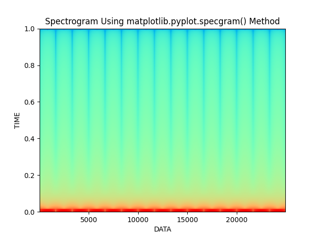
# Importing libraries using import keyword.
import math
import numpy as np
import matplotlib.pyplot as plt

# Set the time diffrence to take picture of
# the the generated signal.
Time_difference = 0.0001

# Generating an array of values
Time_Array = np.linspace(0, 5, math.ceil(5 / Time_difference))

# Actual data array which needs to be plot
Data = 20*(np.sin(3 * np.pi * Time_Array))

# Matplotlib.pyplot.specgram() function to
# generate spectrogram
plt.specgram(Data, Fs=6, cmap="rainbow")

# Set the title of the plot, xlabel and ylabel
# and display using show() function
plt.title('Spectrogram Using matplotlib.pyplot.specgram() Method')
plt.xlabel("DATA")
plt.ylabel("TIME")
plt.show()
输出: