在 Matplotlib 中在条形图上方显示百分比
在本文中,我们将讨论如何使用 Matplotlib 库绘制条形图并在条形图中的每个条形上方显示百分比。
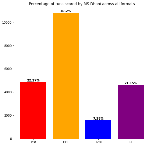
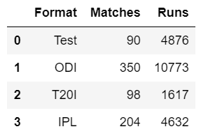
为了便于说明,我们将以前印度队长 MS Dhoni 在所有格式中得分的示例为例,然后我们将比较所有格式的得分相对于他总得分的百分比.让我们首先导入必要的库,然后制作一个包含以每种格式评分的运行的数据框。
Python
# import modules
import pandas as pd
import matplotlib.pyplot as plt

# assign data
data = pd.DataFrame({'Format': ['Test', 'ODI', 'T20I', 'IPL'],
                     'Matches': [90, 350, 98, 204],
                     'Runs': [4876, 10773, 1617, 4632]
                     })

# display data
display(data)
Python
# get total matches of
# a particular player
total_matches = data.Matches.sum()
print('Total matches played by MS Dhoni: %s' % total_matches)

# get total runs of
# a particular player
total_runs = data.Runs.sum()
print('Total runs scored by MS Dhoni: %s' % total_runs)
Python
# compute percentage of each format
percentage = []

for i in range(data.shape[0]):
    pct = (data.Runs[i] / total_runs) * 100
    percentage.append(round(pct, 2))

# display percentage
print(percentage)

# display data
data['Percentage'] = percentage
display(data)
Python
# depict illustration
plt.figure(figsize=(8, 8))
colors_list = ['Red', 'Orange', 'Blue', 'Purple']
graph = plt.bar(data.Format, data.Runs, color=colors_list)
plt.title('Percentage of runs scored by MS Dhoni across all formats')

i = 0
for p in graph:
    width = p.get_width()
    height = p.get_height()
    x, y = p.get_xy()

    plt.text(x+width/2,
             y+height*1.01,
             str(data.Percentage[i])+'%',
             ha='center',
             weight='bold')
    i += 1
plt.show()
Python
# import modules
import pandas as pd
import matplotlib.pyplot as plt

# assign data
data = pd.DataFrame({'Format':['Test','ODI','T20I','IPL'],
                     'Matches': [90, 350, 98, 204],
                     'Runs':[4876,10773, 1617, 4632]
                    })


# compute percentage of each format
percentage = []
for i in range(data.shape[0]):
    pct = (data.Runs[i] / total_runs) * 100
    percentage.append(round(pct,2))
data['Percentage'] = percentage

# depict illustration
plt.figure(figsize=(8,8))
colors_list = ['Red','Orange', 'Blue', 'Purple']
graph = plt.bar(data.Format,data.Runs, color = colors_list)
plt.title('Percentage of runs scored by MS Dhoni across all formats')

i = 0
for p in graph:
    width = p.get_width()
    height = p.get_height()
    x, y = p.get_xy()
    plt.text(x+width/2,
             y+height*1.01,
             str(data.Percentage[i])+'%',
             ha='center',
             weight='bold')
    i+=1
plt.show()
输出:
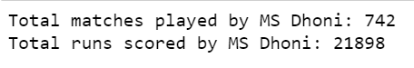
现在,让我们计算他参加的比赛总数以及他在所有格式中的总得分。
Python
# get total matches of
# a particular player
total_matches = data.Matches.sum()
print('Total matches played by MS Dhoni: %s' % total_matches)

# get total runs of
# a particular player
total_runs = data.Runs.sum()
print('Total runs scored by MS Dhoni: %s' % total_runs)
输出:
计算所有格式的运行得分相对于总运行的百分比,并在我们的原始数据框中添加百分比字段,可以这样做:
Python
# compute percentage of each format
percentage = []

for i in range(data.shape[0]):
    pct = (data.Runs[i] / total_runs) * 100
    percentage.append(round(pct, 2))

# display percentage
print(percentage)

# display data
data['Percentage'] = percentage
display(data)
输出:

现在,我们已准备好所有数据,我们可以开始绘制条形图,然后在条形图中的每个条形上显示每种格式的运行得分的相应百分比。
我们可以使用 matplotlib 库中的plt.bar()方法来绘制条形图。我们在 plt.bar() 方法中传递三个参数,它们对应于 X 轴值(格式)、Y 轴值(运行)以及我们要分配给条形图中每个条形的颜色。 plt.bar() 方法还返回条形图中矩形的坐标。我们可以创建一个名为“ graph ”的对象,用于存储这些坐标,然后我们可以使用 for 循环迭代这个对象来检索坐标。我们可以使用 get_width() 方法和 get_height() 方法分别返回条形图中每个条形的宽度和高度。此外,get_xy() 方法可用于获取每个条形最左下角的 x 和 y 坐标。
稍后,我们可以使用 plt.text() 方法将所需的文本(此处为百分比)放在绘图上,我们可以在 plt.text() 方法中传递 x 和 y 位置以及我们要写入的字符串。它将在条形图上写下所需的百分比。
Python
# depict illustration
plt.figure(figsize=(8, 8))
colors_list = ['Red', 'Orange', 'Blue', 'Purple']
graph = plt.bar(data.Format, data.Runs, color=colors_list)
plt.title('Percentage of runs scored by MS Dhoni across all formats')

i = 0
for p in graph:
    width = p.get_width()
    height = p.get_height()
    x, y = p.get_xy()

    plt.text(x+width/2,
             y+height*1.01,
             str(data.Percentage[i])+'%',
             ha='center',
             weight='bold')
    i += 1
plt.show()
当我们调用 plt.show() 方法时,我们的 bar 将被表示出来。
以下是基于上述方法的完整程序:
Python
# import modules
import pandas as pd
import matplotlib.pyplot as plt

# assign data
data = pd.DataFrame({'Format':['Test','ODI','T20I','IPL'],
                     'Matches': [90, 350, 98, 204],
                     'Runs':[4876,10773, 1617, 4632]
                    })


# compute percentage of each format
percentage = []
for i in range(data.shape[0]):
    pct = (data.Runs[i] / total_runs) * 100
    percentage.append(round(pct,2))
data['Percentage'] = percentage

# depict illustration
plt.figure(figsize=(8,8))
colors_list = ['Red','Orange', 'Blue', 'Purple']
graph = plt.bar(data.Format,data.Runs, color = colors_list)
plt.title('Percentage of runs scored by MS Dhoni across all formats')

i = 0
for p in graph:
    width = p.get_width()
    height = p.get_height()
    x, y = p.get_xy()
    plt.text(x+width/2,
             y+height*1.01,
             str(data.Percentage[i])+'%',
             ha='center',
             weight='bold')
    i+=1
plt.show()
输出: