在Python中使用 seaborn 的条形图
Seaborn 是一个惊人的Python统计图形绘图可视化库。它提供了漂亮的默认样式和调色板,使统计图更具吸引力。它建立在 matplotlib 库之上,并且与 pandas 的数据结构紧密集成。
Seaborn.barplot()
seaborn.barplot()方法用于绘制条形图。条形图表示数值变量的集中趋势估计值与每个矩形的高度,并使用误差条提供该估计值周围的不确定性的一些指示。
Syntax : seaborn.barplot(x=None, y=None, hue=None, data=None, order=None, hue_order=None, estimator=
Parameters : This method is accepting the following parameters that are described below :
- x, y : This parameter take names of variables in data or vector data, Inputs for plotting long-form data.
- hue : (optional) This parameter take column name for colour encoding.
- data : (optional) This parameter take DataFrame, array, or list of arrays, Dataset for plotting. If x and y are absent, this is interpreted as wide-form. Otherwise it is expected to be long-form.
- color : (optional) This parameter take matplotlib color, Color for all of the elements, or seed for a gradient palette.
Returns : Returns the Axes object with the plot drawn onto it.
在 Seaborn 条形图中对具有不同属性的变量进行分组
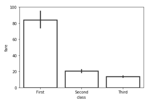
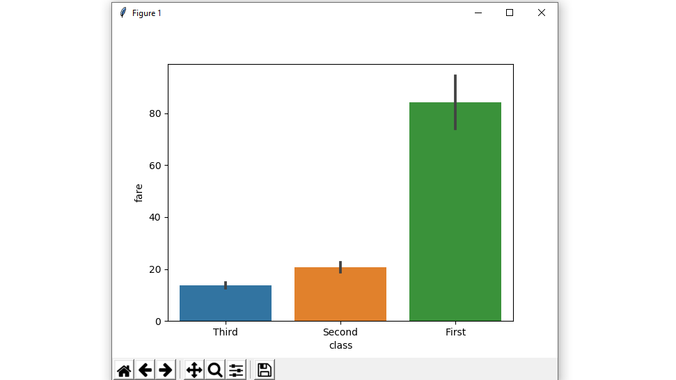
示例 1:绘制一组按分类变量分组的垂直条形图。
使用 seaborn 创建一个简单的条形图。
句法:
seaborn.barplot( x, y, data)
Python3
# importing the required library
import seaborn as sns
import matplotlib.pyplot as plt

# read a titanic.csv file
# from seaborn library
df = sns.load_dataset('titanic')

# class v / s fare barplot
sns.barplot(x = 'class', y = 'fare', data = df)

# Show the plot
plt.show()
Python3
# importing the required library
import seaborn as sns
import matplotlib.pyplot as plt

# read a titanic.csv file
# from seaborn library
df = sns.load_dataset('titanic')

# class v / s fare barplot
sns.barplot(x = 'class', y = 'fare', hue = 'sex', data = df)

# Show the plot
plt.show()
Python3
# importing the required library
import seaborn as sns
import matplotlib.pyplot as plt

# read a titanic.csv file
# from seaborn library
df = sns.load_dataset('titanic')

# fare v / s class horizontal barplot
sns.barplot(x = 'fare', y = 'class', hue = 'sex', data = df)

# Show the plot
plt.show()
Python3
# importing the required library
import seaborn as sns
import matplotlib.pyplot as plt

# read a titanic.csv file
# from seaborn library
df = sns.load_dataset('titanic')

# class v / s fare barplot in given order
sns.barplot(x = 'class', y = 'fare', data = df,
            order = ["Third", "Second", "First"])

# Show the plot
plt.show()
Python3
# importing the required library
import seaborn as sns
import matplotlib.pyplot as plt

# read a titanic.csv file from seaborn library
df = sns.load_dataset('titanic')

# class v / s fare barplot with same colour
sns.barplot(x = 'class', y = 'fare', data = df, color = "salmon")

# Show the plot
plt.show()
Python3
# importing the required library
import seaborn as sns
import matplotlib.pyplot as plt

# read a titanic.csv file
# from seaborn library
df = sns.load_dataset('titanic')

# class v / s fare barplot
# without error bars
sns.barplot(x = 'class', y = 'fare', data = df, ci = None)

# Show the plot
plt.show()
Python3
# importing the required library
import seaborn as sns
import matplotlib.pyplot as plt

# read a titanic.csv file
# from seaborn library
df = sns.load_dataset('titanic')

sns.barplot(x = 'class', y = 'fare',
            hue = 'sex', data = df, palette='pastel')

# Show the plot
plt.show()
Python3
# importing the required library
import seaborn as sns
from numpy import median
import matplotlib.pyplot as plt

# read a titanic.csv file
# from seaborn library
df = sns.load_dataset('titanic')

sns.barplot(x = 'class', y = 'fare', hue = 'sex', data = df, estimator=median)

# Show the plot
plt.show()
Python3
from numpy import mean
sns.barplot(x = 'class', y = 'fare', hue = 'sex', data = df, estimator=mean)
Python3
# importing the required library
import seaborn as sns
import matplotlib.pyplot as plt

# read a titanic.csv file
# from seaborn library
df = sns.load_dataset('titanic')

sns.barplot(x = 'class', y = 'fare', hue = 'sex', data = df,saturation = 0.1)

# Show the plot
plt.show()
Python3
# importing the required library
import seaborn as sns
import matplotlib.pyplot as plt

# read a titanic.csv file
# from seaborn library
df = sns.load_dataset('titanic')

sns.barplot(x="class", y="fare", data=df,
                 linewidth=2.5, facecolor=(1, 1, 1, 0),
                 errcolor=".2", edgecolor=".2")
输出 :
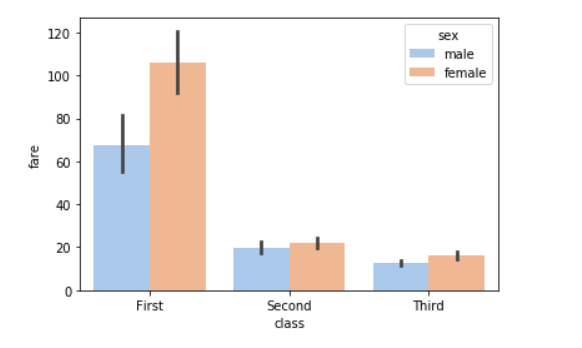
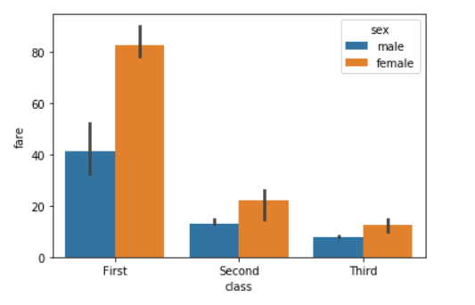
示例 2:绘制一组由两个变量嵌套分组的垂直条。
使用带有两个变量的色调参数创建条形图。
句法:
seaborn.barplot( x, y, data, hue)
Python3
# importing the required library
import seaborn as sns
import matplotlib.pyplot as plt

# read a titanic.csv file
# from seaborn library
df = sns.load_dataset('titanic')

# class v / s fare barplot
sns.barplot(x = 'class', y = 'fare', hue = 'sex', data = df)

# Show the plot
plt.show()
输出 :
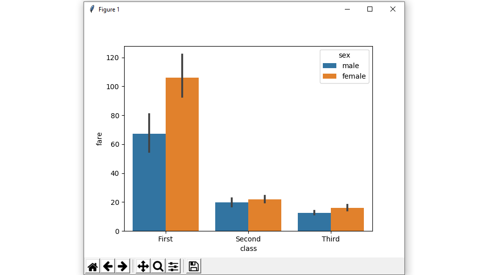
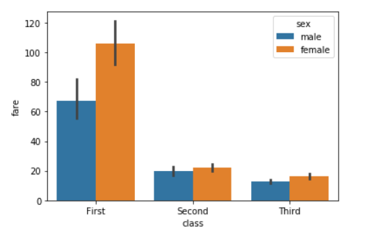
示例 3:显示水平条形图。
交换数据变量而不是两个数据变量,那么这意味着轴将这些数据变量中的每一个表示为轴。
X表示x轴,y表示y轴。
Python3
# importing the required library
import seaborn as sns
import matplotlib.pyplot as plt

# read a titanic.csv file
# from seaborn library
df = sns.load_dataset('titanic')

# fare v / s class horizontal barplot
sns.barplot(x = 'fare', y = 'class', hue = 'sex', data = df)

# Show the plot
plt.show()
输出 :
示例 4:按给定顺序绘制所有条形图。
通过传递显式顺序来控制条形图顺序。
Python3
# importing the required library
import seaborn as sns
import matplotlib.pyplot as plt

# read a titanic.csv file
# from seaborn library
df = sns.load_dataset('titanic')

# class v / s fare barplot in given order
sns.barplot(x = 'class', y = 'fare', data = df,
            order = ["Third", "Second", "First"])

# Show the plot
plt.show()
输出 :
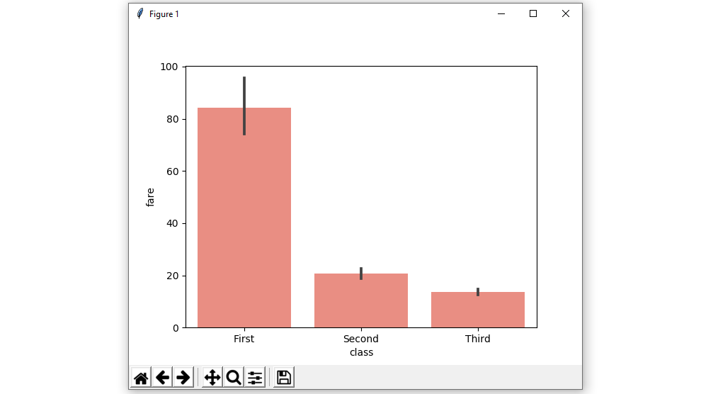
示例 5:使用颜色属性以单一颜色绘制所有条形图。
所有元素的颜色。
句法:
seaborn.barplot( x, y, data, color)
Python3
# importing the required library
import seaborn as sns
import matplotlib.pyplot as plt

# read a titanic.csv file from seaborn library
df = sns.load_dataset('titanic')

# class v / s fare barplot with same colour
sns.barplot(x = 'class', y = 'fare', data = df, color = "salmon")

# Show the plot
plt.show()
输出 :
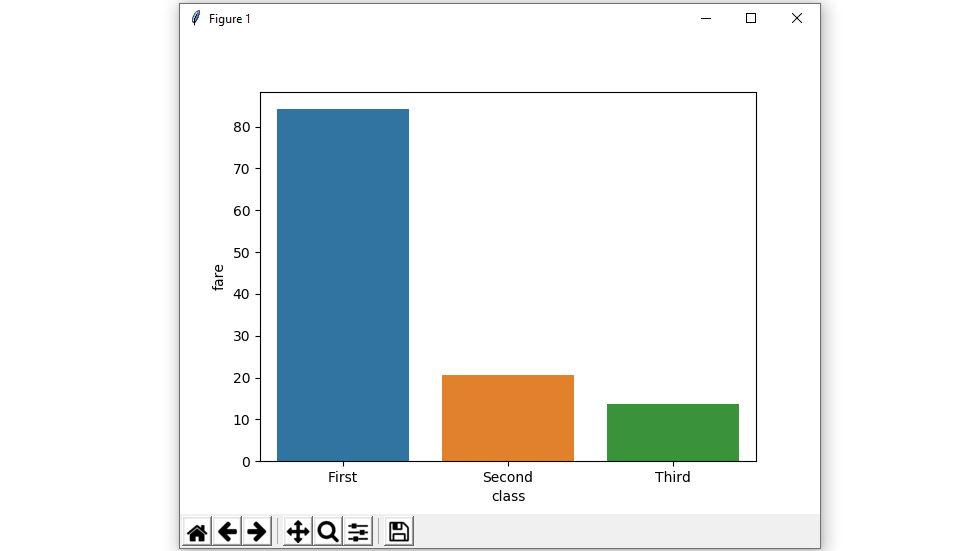
示例 6:使用 ci 属性的不带误差线的条形图。
我们将使用None 这意味着不会执行引导,并且不会绘制误差线
句法:
seaborn.barplot( x, y, data, ci)
Python3
# importing the required library
import seaborn as sns
import matplotlib.pyplot as plt

# read a titanic.csv file
# from seaborn library
df = sns.load_dataset('titanic')

# class v / s fare barplot
# without error bars
sns.barplot(x = 'class', y = 'fare', data = df, ci = None)

# Show the plot
plt.show()
输出 :
示例 7:用于使用调色板的色调变量的不同级别的颜色。
使用调色板,我们可以生成具有不同颜色的点。在下面的示例中,我们可以看到调色板可以负责生成具有不同颜色图值的条形图。
Syntax:
seaborn.barplot( x, y, data, palette=”color_name”)
Python3
# importing the required library
import seaborn as sns
import matplotlib.pyplot as plt

# read a titanic.csv file
# from seaborn library
df = sns.load_dataset('titanic')

sns.barplot(x = 'class', y = 'fare',
            hue = 'sex', data = df, palette='pastel')

# Show the plot
plt.show()
输出:
Possible values of palette are:
Accent, Accent_r, Blues, Blues_r, BrBG, BrBG_r, BuGn, BuGn_r, BuPu, BuPu_r, CMRmap, CMRmap_r, Dark2, Dark2_r,
GnBu, GnBu_r, Greens, Greens_r, Greys, Greys_r, OrRd, OrRd_r, Oranges, Oranges_r, PRGn, PRGn_r, Paired, Paired_r,
Pastel1, Pastel1_r, Pastel2, Pastel2_r, PiYG, PiYG_r, PuBu, PuBuGn, PuBuGn_r, PuBu_r, PuOr, PuOr_r, PuRd, PuRd_r,
Purples, Purples_r, RdBu, RdBu_r, RdGy, RdGy_r, RdPu, RdPu_r, RdYlBu, RdYlBu_r, RdYlGn, RdYlGn_r, Reds, Reds_r, Set1,
Set1_r, Set2, Set2_r, Set3, Set3_r, Spectral, Spectral_r, Wistia, Wistia_r, YlGn, YlGnBu, YlGnBu_r, YlGn_r, YlOrBr,
YlOrBr_r, YlOrRd, YlOrRd_r, afmhot, afmhot_r, autumn, autumn_r, binary, binary_r, bone, bone_r, brg, brg_r, bwr, bwr_r,
cividis, cividis_r, cool, cool_r, coolwarm, coolwarm_r, copper, copper_r, cubehelix, cubehelix_r, flag, flag_r, gist_earth,
gist_earth_r, gist_gray, gist_gray_r, gist_heat, gist_heat_r, gist_ncar, gist_ncar_r, gist_rainbow, gist_rainbow_r, gist_stern,
示例 8:使用统计函数NumPy .median 和NumPy .mean在每个分类 bin 内进行估计。
Python3
# importing the required library
import seaborn as sns
from numpy import median
import matplotlib.pyplot as plt

# read a titanic.csv file
# from seaborn library
df = sns.load_dataset('titanic')

sns.barplot(x = 'class', y = 'fare', hue = 'sex', data = df, estimator=median)

# Show the plot
plt.show()
输出:
对于 Numpy.mean:
Python3
from numpy import mean
sns.barplot(x = 'class', y = 'fare', hue = 'sex', data = df, estimator=mean)
输出:
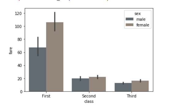
示例 9:使用饱和度参数。
绘制颜色的原始饱和度的比例。大色块通常看起来更好,颜色稍微不饱和,但如果您希望绘图颜色与输入颜色规范完美匹配,请将其设置为 1。
句法:
seaborn.barplot( x, y, data, saturation)
Python3
# importing the required library
import seaborn as sns
import matplotlib.pyplot as plt

# read a titanic.csv file
# from seaborn library
df = sns.load_dataset('titanic')

sns.barplot(x = 'class', y = 'fare', hue = 'sex', data = df,saturation = 0.1)

# Show the plot
plt.show()
输出:
示例 10:使用matplotlib.axes.Axes.bar()参数来控制样式。
我们可以使用线宽设置构成绘图元素的灰线的宽度。每当我们增加线宽时,点也会自动增加。
句法:
seaborn.barplot(x, y, data, linewidth, edgecolor)
Python3
# importing the required library
import seaborn as sns
import matplotlib.pyplot as plt

# read a titanic.csv file
# from seaborn library
df = sns.load_dataset('titanic')

sns.barplot(x="class", y="fare", data=df,
                 linewidth=2.5, facecolor=(1, 1, 1, 0),
                 errcolor=".2", edgecolor=".2")
输出: