在Python中使用 seaborn 的计数图
Seaborn是一个惊人的Python统计图形绘图可视化库。它提供了漂亮的默认样式和调色板,使统计图更具吸引力。它建立在 matplotlib 库之上,并且与 pandas 的数据结构紧密集成。
Seaborn.countplot()
seaborn.countplot()方法用于使用条形图显示每个分类箱中的观察计数。
Syntax : seaborn.countplot(x=None, y=None, hue=None, data=None, order=None, hue_order=None, orient=None, color=None, palette=None, saturation=0.75, dodge=True, ax=None, **kwargs)
Parameters : This method is accepting the following parameters that are described below:
- x, y: This parameter take names of variables in data or vector data, optional, Inputs for plotting long-form data.
- hue : (optional) This parameter take column name for colour encoding.
- data : (optional) This parameter take DataFrame, array, or list of arrays, Dataset for plotting. If x and y are absent, this is interpreted as wide-form. Otherwise it is expected to be long-form.
- order, hue_order : (optional) This parameter take lists of strings. Order to plot the categorical levels in, otherwise the levels are inferred from the data objects.
- orient : (optional)This parameter take “v” | “h”, Orientation of the plot (vertical or horizontal). This is usually inferred from the dtype of the input variables but can be used to specify when the “categorical” variable is a numeric or when plotting wide-form data.
- color : (optional) This parameter take matplotlib color, Color for all of the elements, or seed for a gradient palette.
- palette : (optional) This parameter take palette name, list, or dict, Colors to use for the different levels of the hue variable. Should be something that can be interpreted by color_palette(), or a dictionary mapping hue levels to matplotlib colors.
- saturation : (optional) This parameter take float value, Proportion of the original saturation to draw colors at. Large patches often look better with slightly desaturated colors, but set this to 1 if you want the plot colors to perfectly match the input color spec.
- dodge : (optional) This parameter take bool value, When hue nesting is used, whether elements should be shifted along the categorical axis.
- ax : (optional) This parameter take matplotlib Axes, Axes object to draw the plot onto, otherwise uses the current Axes.
- kwargs : This parameter take key, value mappings, Other keyword arguments are passed through to matplotlib.axes.Axes.bar().
Returns: Returns the Axes object with the plot drawn onto it.
下面的例子说明了 seaborn 库的 countplot() 方法。
在 Seaborn 计数图中对具有不同属性的变量进行分组
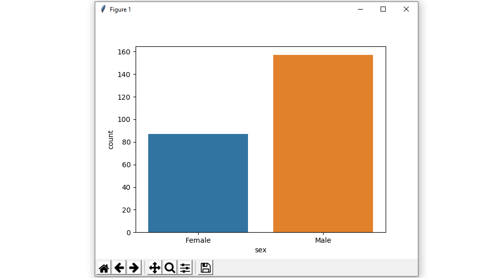
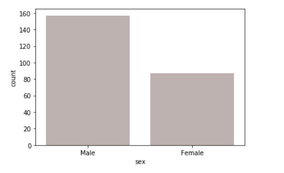
示例 1:显示单个分类变量的值计数。
如果我们只使用一个数据变量而不是两个数据变量,那么这意味着轴将这些数据变量中的每一个都表示为一个轴。
X表示x轴,y表示y轴。
句法:
seaborn.countplot(x)Python3
# importing the required library

import seaborn as sns
import matplotlib.pyplot as plt

# read a tips.csv file from seaborn library
df = sns.load_dataset('tips')

# count plot on single categorical variable
sns.countplot(x ='sex', data = df)

# Show the plot
plt.show()
Python3
# importing the required library

import seaborn as sns
import matplotlib.pyplot as plt

# read a tips.csv file from seaborn library
df = sns.load_dataset('tips')

# count plot on two categorical variable
sns.countplot(x ='sex', hue = "smoker", data = df)

# Show the plot
plt.show()
Python3
# importing the required library

import seaborn as sns
import matplotlib.pyplot as plt

# read a tips.csv file from seaborn library
df = sns.load_dataset('tips')

# count plot along y axis
sns.countplot(y ='sex', hue = "smoker", data = df)

# Show the plot
plt.show()
Python3
# importing the required library

import seaborn as sns
import matplotlib.pyplot as plt

# read a tips.csv file from seaborn library
df = sns.load_dataset('tips')

# use a different colour palette in count plot
sns.countplot(x ='sex', data = df, palette = "Set2")

# Show the plot
plt.show()
Python3
# importing the required library
import seaborn as sns
import matplotlib.pyplot as plt

# read a titanic.csv file
# from seaborn library
df = sns.load_dataset('titanic')

sns.countplot(x = 'class', y = 'fare',
            hue = 'sex',
            data = df,color="salmon")

# Show the plot
plt.show()
Python3
# importing the required library
import seaborn as sns
import matplotlib.pyplot as plt

# read a titanic.csv file
# from seaborn library
df = sns.load_dataset('titanic')

# class v / s fare barplot
sns.countplot(x ='sex', data = df,
              color="salmon",
              saturation = 0.1)
# Show the plot
plt.show()
Python3
# importing the required library
import seaborn as sns
import matplotlib.pyplot as plt

# read a titanic.csv file
# from seaborn library
df = sns.load_dataset('titanic')

# class v / s fare barplot
sns.countplot(x ='sex', data = df,color="salmon", facecolor=(0, 0, 0, 0),
                   linewidth=5,
                   edgecolor=sns.color_palette("BrBG", 2))
# Show the plot
plt.show()
输出 :
示例 2:显示两个分类变量的值计数并使用色调参数:
虽然点是在二维中绘制的,但可以通过根据第三个变量对点着色来将另一个维度添加到图中。
句法:
seaborn.countplot(x, y, hue, data);
Python3
# importing the required library

import seaborn as sns
import matplotlib.pyplot as plt

# read a tips.csv file from seaborn library
df = sns.load_dataset('tips')

# count plot on two categorical variable
sns.countplot(x ='sex', hue = "smoker", data = df)

# Show the plot
plt.show()
输出 :

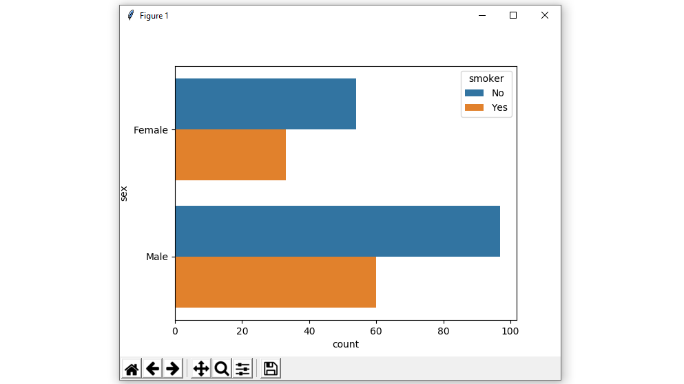
示例 3:水平绘制条形图。
在上面的示例中,我们看到了如何绘制单个水平计数图,并且在这里可以通过与另一个轴交换数据变量来执行多个水平计数图。
Python3
# importing the required library

import seaborn as sns
import matplotlib.pyplot as plt

# read a tips.csv file from seaborn library
df = sns.load_dataset('tips')

# count plot along y axis
sns.countplot(y ='sex', hue = "smoker", data = df)

# Show the plot
plt.show()
输出 :
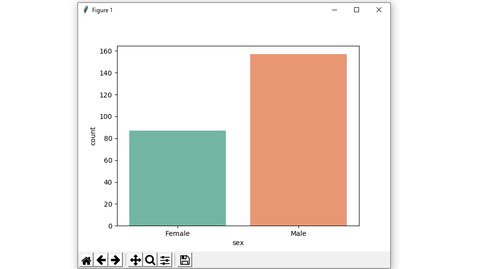
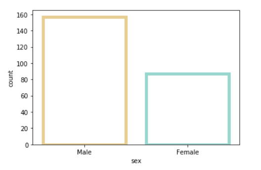
示例 4:使用不同的调色板属性。
使用调色板,我们可以生成具有不同颜色的点。在下面的示例中,我们可以看到调色板可以负责生成具有不同颜色图值的计数图。
句法:
seaborn.countplot(x, y, data, hue, palette)
Python3
# importing the required library

import seaborn as sns
import matplotlib.pyplot as plt

# read a tips.csv file from seaborn library
df = sns.load_dataset('tips')

# use a different colour palette in count plot
sns.countplot(x ='sex', data = df, palette = "Set2")

# Show the plot
plt.show()
输出 :
Possible values of palette are:
Accent, Accent_r, Blues, Blues_r, BrBG, BrBG_r, BuGn, BuGn_r, BuPu, BuPu_r, CMRmap, CMRmap_r, Dark2, Dark2_r,
GnBu, GnBu_r, Greens, Greens_r, Greys, Greys_r, OrRd, OrRd_r, Oranges, Oranges_r, PRGn, PRGn_r, Paired, Paired_r,
Pastel1, Pastel1_r, Pastel2, Pastel2_r, PiYG, PiYG_r, PuBu, PuBuGn, PuBuGn_r, PuBu_r, PuOr, PuOr_r, PuRd, PuRd_r,
Purples, Purples_r, RdBu, RdBu_r, RdGy, RdGy_r, RdPu, RdPu_r, RdYlBu, RdYlBu_r, RdYlGn, RdYlGn_r, Reds, Reds_r, Set1,
Set1_r, Set2, Set2_r, Set3, Set3_r, Spectral, Spectral_r, Wistia, Wistia_r, YlGn, YlGnBu, YlGnBu_r, YlGn_r, YlOrBr,
YlOrBr_r, YlOrRd, YlOrRd_r, afmhot, afmhot_r, autumn, autumn_r, binary, binary_r, bone, bone_r, brg, brg_r, bwr, bwr_r,
cividis, cividis_r, cool, cool_r, coolwarm, coolwarm_r, copper, copper_r, cubehelix, cubehelix_r, flag, flag_r, gist_earth,
gist_earth_r, gist_gray, gist_gray_r, gist_heat, gist_heat_r, gist_ncar, gist_ncar_r, gist_rainbow, gist_rainbow_r, gist_stern,
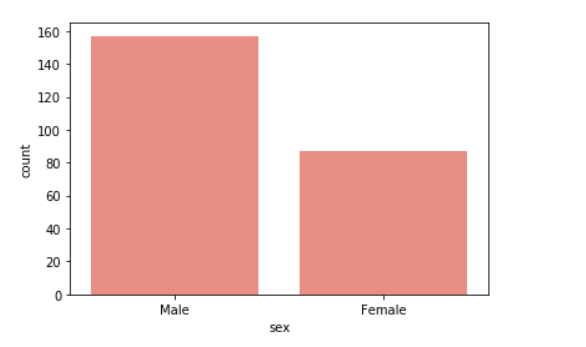
示例 5:在图中使用颜色参数。
使用颜色属性,我们是所有元素的颜色。
句法:
seaborn.countplot(x, y, data, color)
Python3
# importing the required library
import seaborn as sns
import matplotlib.pyplot as plt

# read a titanic.csv file
# from seaborn library
df = sns.load_dataset('titanic')

sns.countplot(x = 'class', y = 'fare',
            hue = 'sex',
            data = df,color="salmon")

# Show the plot
plt.show()
输出:
示例 6:在图中使用饱和度参数。
绘制颜色的原始饱和度的比例。大色块通常看起来更好,颜色稍微不饱和,但如果您希望绘图颜色与输入颜色规范完美匹配,请将其设置为 1。
句法:
seaborn.colorplot(x, y, data, saturation)
Python3
# importing the required library
import seaborn as sns
import matplotlib.pyplot as plt

# read a titanic.csv file
# from seaborn library
df = sns.load_dataset('titanic')

# class v / s fare barplot
sns.countplot(x ='sex', data = df,
              color="salmon",
              saturation = 0.1)
# Show the plot
plt.show()
输出:
示例 7:使用 matplotlib.axes.Axes.bar() 参数来控制样式。
我们可以使用线宽设置构成绘图元素的灰线的宽度。每当我们增加线宽时,点也会自动增加。
句法:
seaborn.countplot(x, y, data, linewidth, edgecolor)
Python3
# importing the required library
import seaborn as sns
import matplotlib.pyplot as plt

# read a titanic.csv file
# from seaborn library
df = sns.load_dataset('titanic')

# class v / s fare barplot
sns.countplot(x ='sex', data = df,color="salmon", facecolor=(0, 0, 0, 0),
                   linewidth=5,
                   edgecolor=sns.color_palette("BrBG", 2))
# Show the plot
plt.show()
输出:
Colormap Possible values are:
Accent, Accent_r, Blues, Blues_r, BrBG, BrBG_r, BuGn, BuGn_r, BuPu, BuPu_r,
CMRmap, CMRmap_r, Dark2, Dark2_r, GnBu, GnBu_r, Greens, Greens_r, Greys, Greys_r,
OrRd, OrRd_r, Oranges, Oranges_r, PRGn, PRGn_r, Paired, Paired_r, Pastel1, Pastel1_r,
Pastel2, Pastel2_r, PiYG, PiYG_r, PuBu, PuBuGn, PuBuGn_r, PuBu_r, PuOr, PuOr_r, PuRd,
PuRd_r, Purples, Purples_r, RdBu, RdBu_r, RdGy, RdGy_r, RdPu, RdPu_r, RdYlBu, RdYlBu_r,
RdYlGn, RdYlGn_r, Reds, Reds_r, Set1, Set1_r, Set2, Set2_r, Set3, Set3_r, Spectral,