在Python中使用 Seaborn 的线图
Seaborn是一个惊人的Python统计图形绘图可视化库。它提供默认样式和调色板,使统计图更具吸引力。它建立在 matplotlib 库之上,并且紧密集成到 pandas 的数据结构中。
线图
必须根据数据集或我们想要从图中得到的答案类型来选择数据集的视觉表示。散点图非常适合可视化统计关系。但是当涉及随时间(或连续变量)变化的数据时,散点图不是一个好的选择。相反,在 Seaborn 中,必须首选带有 kind = 'line' 的 lineplot() 或 relplot()。线图为每个点提供注释,并且有助于自定义标记、线型和图例。
Syntax: seaborn.lineplot(x=None, y=None, hue=None, size=None, style=None, data=None, palette=None, hue_order=None, hue_norm=None, sizes=None, size_order=None, size_norm=None, dashes=True, markers=None, style_order=None, units=None, estimator=’mean’, ci=95, n_boot=1000, seed=None, sort=True, err_style=’band’, err_kws=None, legend=’brief’, ax=None, **kwargs)
Parameters:
x, y: Input data variables; must be numeric.
data: Dataframe where each column is a variable and each row is an observation.
size: Grouping variable that will produce lines with different widths.
style: Grouping variable that will produce lines with different dashes and/or markers.
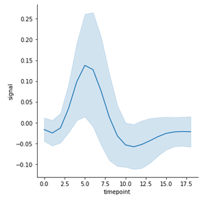
示例 1:让我们以 FMRI 数据集为例。这是时间序列数据的一个示例,其中变量是时间的函数。该数据集是内置的,可以使用 load_dataset() 访问,无需单独下载。
Python3
# import libraries
import seaborn as sns

# load dataset
fmri = sns.load_dataset("fmri")
Python3
# plotting lineplot for signal with respect to timepoint
# using relplot, kind = "line"
# code added by devanshigupta1304
sns.lineplot( x = "timepoint",
             y = "signal",
             data = fmri);
Python3
sns.lineplot( x = "timepoint",
             y = "signal",
             hue = "region",
             data = fmri);
Python3
sns.lineplot( x = "timepoint",
             y = "signal",
             hue = "region",
             style = "event",
             data = fmri);
Python3
sns.lineplot( x = "timepoint",
             y = "signal",
             size = "event",
             data = fmri);
Python3
# code added by devanshigupta1304
# using relplot with kind = "line"
# adding style and hue semantic
sns.relplot( x = "timepoint",
            y = "signal",
            hue = "region", style = "event",
            kind = "line", data = fmri);
Python3
# code added by devanshigupta1304
# plotting lineplot for signal with respect to timepoint
# using relplot, kind = "line"
# using standard deviation instead of confidence interval
sns.relplot(x = "timepoint", y = "signal",
            kind = "line", ci = "sd",
            data = fmri);
Python3
# using lineplot with style = column_name
# adding style and hue semantic
sns.lineplot(x = "timepoint", y = "signal",
             hue = "subject",style = "event",
             data = fmri);
Python3
# using lineplot
# adding palette, style and hue semantic
sns.lineplot( x = "timepoint", y = "signal",
             hue = "subject", style = "event",
             palette = "YlOrRd_r", data = fmri);
Python3
sns.lineplot( x = "timepoint",
             y = "signal",
             data = fmri,
             err_style="bars");
同一变量可以有多个测量值。因此,我们可以绘制所有 x 值的平均值和平均值周围的 95% 置信区间。默认情况下,这种聚合行为在 seaborn 中。
Python3
# plotting lineplot for signal with respect to timepoint
# using relplot, kind = "line"
# code added by devanshigupta1304
sns.lineplot( x = "timepoint",
             y = "signal",
             data = fmri);
输出-

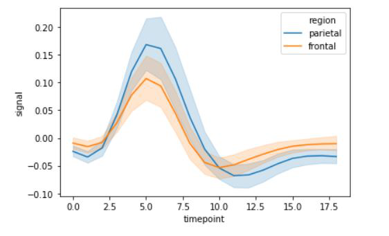
示例 2:使用色调参数创建多线图。
Python3
sns.lineplot( x = "timepoint",
             y = "signal",
             hue = "region",
             data = fmri);
输出:
示例 3:使用样式参数创建多条线图。
Python3
sns.lineplot( x = "timepoint",
             y = "signal",
             hue = "region",
             style = "event",
             data = fmri);
输出:
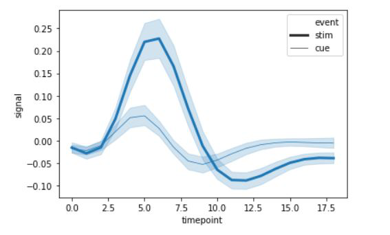
示例 4:使用尺寸参数创建多条线图。我们可以使用尺寸属性来改变线型。
Python3
sns.lineplot( x = "timepoint",
             y = "signal",
             size = "event",
             data = fmri);
输出:
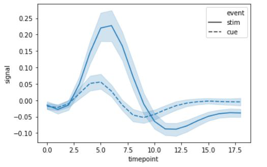
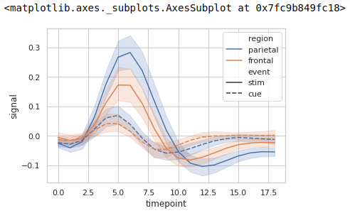
示例 5:根据类别对数据点进行分组,此处为区域和事件。我们可以将它们添加为色调和样式语义。这将默认更改线型。
Python3
# code added by devanshigupta1304
# using relplot with kind = "line"
# adding style and hue semantic
sns.relplot( x = "timepoint",
            y = "signal",
            hue = "region", style = "event",
            kind = "line", data = fmri);
输出:
示例 6:对于大型数据集,我们还可以表示每个时间点的标准差而不是置信区间,因为这可能非常耗时。
Python3
# code added by devanshigupta1304
# plotting lineplot for signal with respect to timepoint
# using relplot, kind = "line"
# using standard deviation instead of confidence interval
sns.relplot(x = "timepoint", y = "signal",
            kind = "line", ci = "sd",
            data = fmri);
输出 -
示例 7:我们可以对数据集中的不同列使用样式和色调。
Python3
# using lineplot with style = column_name
# adding style and hue semantic
sns.lineplot(x = "timepoint", y = "signal",
             hue = "subject",style = "event",
             data = fmri);
输出:

示例 8:使用调色板属性
Python3
# using lineplot
# adding palette, style and hue semantic
sns.lineplot( x = "timepoint", y = "signal",
             hue = "subject", style = "event",
             palette = "YlOrRd_r", data = fmri);
输出:

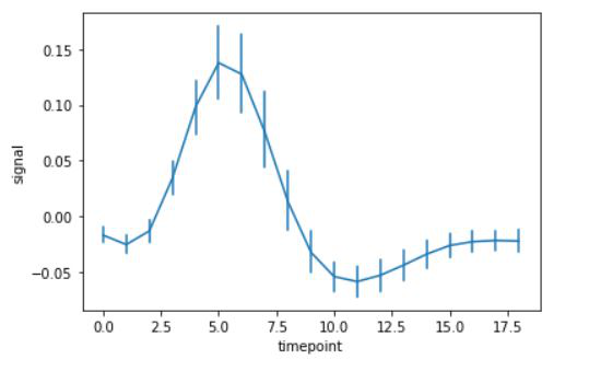
示例 9:使用 err_style 属性在折线图中添加误差线。
Python3
sns.lineplot( x = "timepoint",
             y = "signal",
             data = fmri,
             err_style="bars");
输出: