本文将向您介绍使用 Seaborn 在Python绘制图形,这是Python最受欢迎的统计可视化库。
安装:安装seaborn最简单的方法是使用pip。在终端中输入以下命令:
pip install seaborn
或者,您可以从这里下载并手动安装。
使用 Seaborn 绘制分类散点图
带状图
Python3
# Python program to illustrate
# Plotting categorical scatter
# plots with Seaborn

# importing the required module
import matplotlib.pyplot as plt
import seaborn as sns

# x axis values
x =['sun', 'mon', 'fri', 'sat', 'tue', 'wed', 'thu']

# y axis values
y =[5, 6.7, 4, 6, 2, 4.9, 1.8]

# plotting strip plot with seaborn
ax = sns.stripplot(x, y);

# giving labels to x-axis and y-axis
ax.set(xlabel ='Days', ylabel ='Amount_spend')

# giving title to the plot
plt.title('My first graph');

# function to show plot
plt.show()
Python3
# Python program to illustrate
# Stripplot using inbuilt data-set
# given in seaborn

# importing the required module
import matplotlib.pyplot as plt
import seaborn as sns

# use to set style of background of plot
sns.set(style="whitegrid")

# loading data-set
iris = sns.load_dataset('iris')

# plotting strip plot with seaborn
# deciding the attributes of dataset on
# which plot should be made
ax = sns.stripplot(x='species', y='sepal_length', data=iris)

# giving title to the plot
plt.title('Graph')

# function to show plot
plt.show()
Python3
# Python program to illustrate
# plotting using Swarmplot

# importing the required module
import matplotlib.pyplot as plt
import seaborn as sns

# use to set style of background of plot
sns.set(style="whitegrid")

# loading data-set
iris = sns.load_dataset('iris')

# plotting strip plot with seaborn
# deciding the attributes of dataset on
# which plot should be made
ax = sns.swarmplot(x='species', y='sepal_length', data=iris)

# giving title to the plot
plt.title('Graph')

# function to show plot
plt.show()
Python3
# importing the required module
import matplotlib.pyplot as plt
import seaborn as sns

# use to set style of background of plot
sns.set(style="whitegrid")

# loading data-set
iris = sns.load_dataset('iris')

# plotting strip plot with seaborn
# deciding the attributes of dataset on
# which plot should be made
ax = sns.swarmplot(x='sepal_length', y='species', data=iris)


# giving title to the plot
plt.title('Graph')

# function to show plot
plt.show()
Python3
# import the seaborn libaray
import seaborn as sns

# reading the dataset
df = sns.load_dataset('tips')

# change the estimator from mean to
# standard devaition
sns.barplot(x ='sex', y ='total_bill', data = df,
            palette ='plasma')
Python3
# import the seaborn libaray
import seaborn as sns

# reading the dataset
df = sns.load_dataset('tips')

sns.countplot(x ='sex', data = df)
Python3
# import the seaborn libaray
import seaborn as sns

# reading the dataset
df = sns.load_dataset('tips')

sns.boxplot(x='day', y='total_bill', data=df, hue='smoker')
Python3
# import the seaborn libaray
import seaborn as sns

# reading the dataset
df = sns.load_dataset('tips')
sns.violinplot(x='day', y='total_bill', data=df,
               hue='sex', split=True)
Python3
# import the seaborn libaray
import seaborn as sns

# reading the dataset
df = sns.load_dataset('tips')
sns.stripplot(x='day', y='total_bill', data=df,
              jitter=True, hue='smoker', dodge=True)
输出:
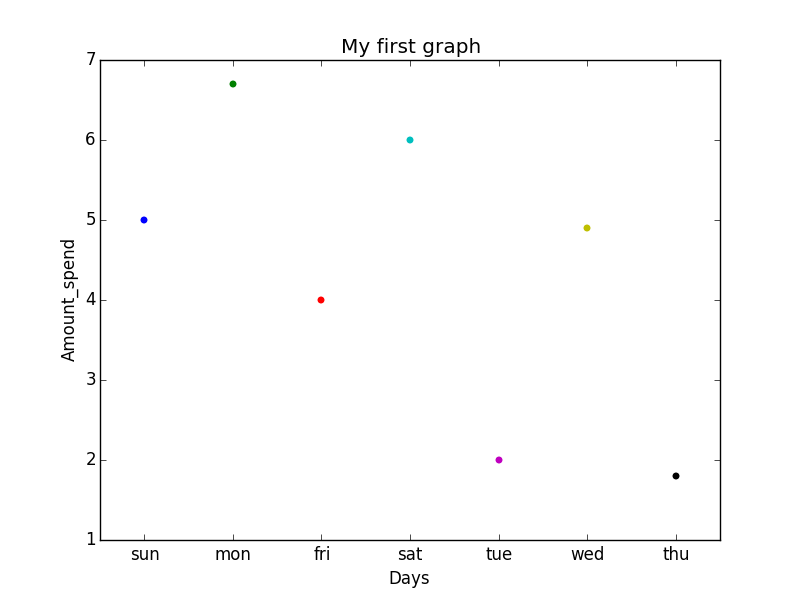
说明:这是一种借助seaborn的分类数据散点图。
- 分类数据在 x 轴上表示,值对应于通过 y 轴表示的它们。
- .stripplot()函数用于定义绘图的类型并使用它们在画布上绘制。
- .set()函数用于设置 x 轴和 y 轴的标签。
- .title()函数用于为图形提供标题。
- 要查看绘图,我们使用.show()函数。
Stripplot 使用 seaborn 中给出的内置数据集:
蟒蛇3
# Python program to illustrate
# Stripplot using inbuilt data-set
# given in seaborn

# importing the required module
import matplotlib.pyplot as plt
import seaborn as sns

# use to set style of background of plot
sns.set(style="whitegrid")

# loading data-set
iris = sns.load_dataset('iris')

# plotting strip plot with seaborn
# deciding the attributes of dataset on
# which plot should be made
ax = sns.stripplot(x='species', y='sepal_length', data=iris)

# giving title to the plot
plt.title('Graph')

# function to show plot
plt.show()
输出:
解释:
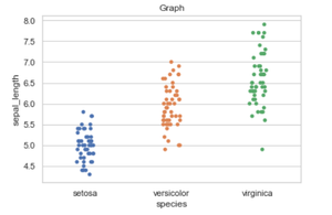
- iris是已经存在于 seaborn 模块中供使用的数据集。
- 我们使用.load_dataset()函数来加载数据。我们也可以通过在参数中给出文件的路径和名称来加载任何其他文件。
- .set(style=”whitegrid”)函数这里也用来定义绘图的背景。我们可以使用“darkgrid”
如果我们想要深色背景,而不是 whitegrid。 - 在.stripplot()函数,我们必须定义数据集的哪个属性在 x 轴上以及数据集的哪个属性应该在 y 轴上。 data = iris意味着我们之前定义的属性应该从给定的数据中获取。
- 我们也可以用 matplotlib 绘制这个图,但是 matplotlib 的问题是它的默认参数。 Seaborn 与 DataFrames 如此出色的原因是,例如,DataFrames 的标签会自动传播到绘图或其他数据结构,如您在上图中看到的,列名称物种位于 x 轴上,列名称stepal_length位于 y -axis,这在 matplotlib 中是不可能的。我们必须明确定义 x 轴和 y 轴的标签。
群图
蟒蛇3
# Python program to illustrate
# plotting using Swarmplot

# importing the required module
import matplotlib.pyplot as plt
import seaborn as sns

# use to set style of background of plot
sns.set(style="whitegrid")

# loading data-set
iris = sns.load_dataset('iris')

# plotting strip plot with seaborn
# deciding the attributes of dataset on
# which plot should be made
ax = sns.swarmplot(x='species', y='sepal_length', data=iris)

# giving title to the plot
plt.title('Graph')

# function to show plot
plt.show()
输出:
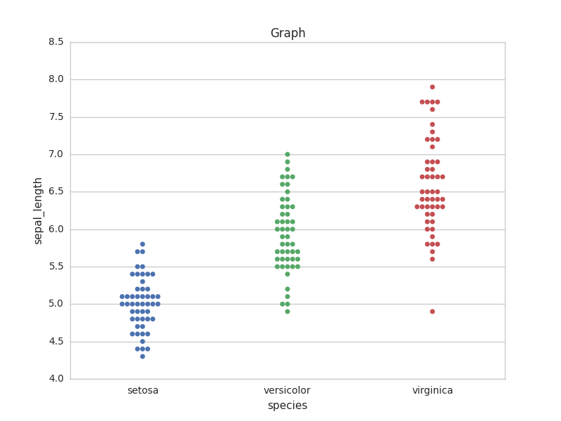
解释:
这与条带图非常相似,但唯一的区别是它不允许标记重叠。它会导致图的标记出现抖动,因此可以轻松读取图形而不会丢失信息,如上图所示。
- 我们使用.swarmplot()函数来绘制 swarn 图。
- 我们在 Seaborn 和 Matplotlib 中可以注意到的另一个区别是,使用 DataFrames 与使用 Matplotlib 并不顺利,如果我们使用 Pandas 进行探索性分析,这可能会很烦人。而这正是 Seaborn 轻松做到的,绘图函数对包含整个数据集的 DataFrame 和数组进行操作。
注意:如果我们愿意,我们还可以更改特定轴上数据的表示。
例子 :
蟒蛇3
# importing the required module
import matplotlib.pyplot as plt
import seaborn as sns

# use to set style of background of plot
sns.set(style="whitegrid")

# loading data-set
iris = sns.load_dataset('iris')

# plotting strip plot with seaborn
# deciding the attributes of dataset on
# which plot should be made
ax = sns.swarmplot(x='sepal_length', y='species', data=iris)


# giving title to the plot
plt.title('Graph')

# function to show plot
plt.show()
输出:

同样可以在striplot中完成。最后,我们可以说 Seaborn 是 matplotlib 的扩展版本,它试图使一组定义明确的困难事物变得容易。
条形图
条形图基本上用于根据某些方法聚合分类数据,默认情况下它是平均值。也可以理解为通过行动对群体进行可视化。为了使用这个图,我们为 x 轴选择一个分类列,为 y 轴选择一个数字列,我们看到它创建了一个图,每个分类列取平均值。
句法:
barplot([x, y, hue, data, order, hue_order, …])
蟒蛇3
# import the seaborn libaray
import seaborn as sns

# reading the dataset
df = sns.load_dataset('tips')

# change the estimator from mean to
# standard devaition
sns.barplot(x ='sex', y ='total_bill', data = df,
            palette ='plasma')
输出:
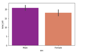
解释:
查看该图,我们可以说男性的平均 total_bill 多于女性。
- Palette 用于设置绘图的颜色
- 估计器用作每个分类箱内估计的统计函数。
计数图
计数图基本上计算类别并返回它们出现的计数。它是 seaborn 库提供的最简单的图之一。
句法:
countplot([x, y, hue, data, order, …])
蟒蛇3
# import the seaborn libaray
import seaborn as sns

# reading the dataset
df = sns.load_dataset('tips')

sns.countplot(x ='sex', data = df)
输出:
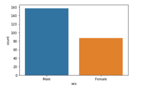
解释:
查看该图,我们可以说数据集中的男性人数多于女性人数。由于它只返回基于分类列的计数,我们只需要指定 x 参数。
箱形图
箱线图是通过四分位数描述的数值数据组的可视化表示。 Boxplot 还用于检测数据集中的异常值。
句法:
boxplot([x, y, hue, data, order, hue_order, …])
蟒蛇3
# import the seaborn libaray
import seaborn as sns

# reading the dataset
df = sns.load_dataset('tips')

sns.boxplot(x='day', y='total_bill', data=df, hue='smoker')
输出:
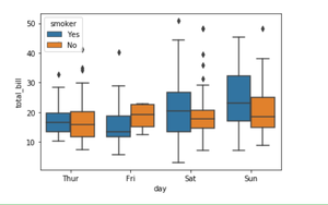
解释:
x 采用分类列,y 是数值列。因此,我们可以看到每天花费的总账单。” “色调”参数用于进一步添加分类分离。通过查看情节,我们可以说与吸烟的人相比,不吸烟的人在周五的账单更高。
小提琴图
它类似于箱线图,但它提供了更高、更高级的可视化,并使用核密度估计来更好地描述数据分布。
句法:
violinplot([x, y, hue, data, order, …])
蟒蛇3
# import the seaborn libaray
import seaborn as sns

# reading the dataset
df = sns.load_dataset('tips')
sns.violinplot(x='day', y='total_bill', data=df,
               hue='sex', split=True)
输出:
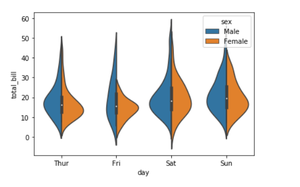
解释:
- 色调用于使用性别类别进一步分离数据
- 设置 split=True 将为每个级别绘制一半的小提琴。这可以更容易地直接比较分布。
带状图
它基本上根据类别创建一个散点图。
句法:
stripplot([x, y, hue, data, order, …])
蟒蛇3
# import the seaborn libaray
import seaborn as sns

# reading the dataset
df = sns.load_dataset('tips')
sns.stripplot(x='day', y='total_bill', data=df,
              jitter=True, hue='smoker', dodge=True)
输出:
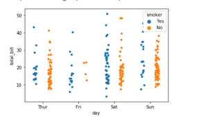
解释:
- 带状图的一个问题是您无法真正分辨哪些点是堆叠在一起的,因此我们使用抖动参数来添加一些随机噪声。
- jitter 参数用于添加一定量的抖动(仅沿分类轴),这在您有许多点并且它们重叠时非常有用,以便更容易查看分布。
- 色调用于提供额外的分类分离
- 设置 split=True 用于根据色调参数指定的类别绘制单独的带状图。