在 R 中使用 ggplot2 进行时间序列可视化
在本文中,我们将讨论使用 R 编程语言中的 ggplot2 包进行时间序列可视化。
时间序列是在订单时间线中列出的一系列数据点,即日期、年份或月份形式的轴之一。时间序列是一系列连续的等间隔时间点。时间序列分析包括分析时间序列数据的方法,以从数据中检索一些有意义的洞察力。时间序列数据分析在金融行业、制药、社交媒体公司、网络服务提供商、研究等众多行业中变得非常重要,因为它有助于根据过去数据的趋势预测未来事件。
为了更好地了解数据,我们需要一些工具来可视化它。 R 编程语言在 ggplot2 包中提供了强大的工具来可视化数据。我们可以使用 geom_line()函数使用折线图来可视化时间序列数据。
Syntax:
ggplot(dataframe , aes(x, y)) + geom_line()
Parameter:
- dataframe: determines the dataframe variable for plotting chart
- x: determines the time variable vector
- y: determines the data variable vector for time vector.
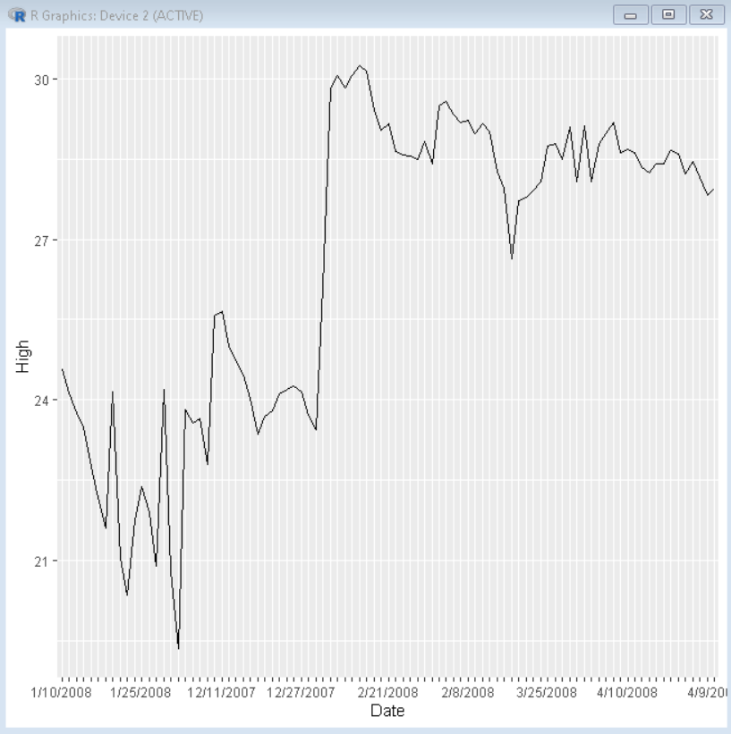
示例:描述时间序列数据的基本折线图。
使用中的数据框:这里
R
# load library ggplot2
library(ggplot2)

# create timeseries dataframe
dataframe <- data.frame(read.csv("sample2.csv"))

# create plot
ggplot(dataframe, aes(x=Date, y=High, group = 1)) +
  geom_line()+
# check.overlap avoids label overlapping
scale_x_discrete(guide = guide_axis(check.overlap = TRUE))
R
# load library ggplot2
library(ggplot2)

# create timeseries dataframe
dataframe <- data.frame(
                      Date = as.Date("2021-10-21") - 0:364,
                      High = runif(365) + seq(-140, 224)^2 / 10000)

# create plot
ggplot(dataframe, aes(x=Date, y=High, group = 1)) +
  geom_line()+

# check.overlap avoids label overlapping
scale_x_discrete(guide = guide_axis(check.overlap = TRUE))+

# change month format to long-form month
scale_x_date(date_labels = "%B")
R
# load library ggplot2
library(ggplot2)

# create timeseries dataframe
dataframe <- data.frame(
                      Date = as.Date("2021-10-21") - 0:364,
                      High = runif(365) + seq(-140, 224)^3 / 10000)

# create plot
ggplot(dataframe, aes(x=Date, y=High, group = 1)) +
  geom_line()+

# check.overlap avoids label overlapping
scale_x_discrete(guide = guide_axis(check.overlap = TRUE))+

# change month format to long-form month
# date_breaks and date_minor_breaks for axis break
scale_x_date(date_labels = "%B",date_breaks = "1 week")
R
# load library ggplot2
library(ggplot2)

# create timeseries dataframe
dataframe <- data.frame(
                      Date = as.Date("2021-10-21") - 0:364,
                      High = runif(365) + seq(-140, 224)^2 / 10000)

# create plot
ggplot(dataframe, aes(x=Date, y=High, group = 1)) +
  geom_line()+

# check.overlap avoids label overlapping
scale_x_discrete(guide = guide_axis(check.overlap = TRUE))+

# limit axis data
scale_x_date(limit=c(as.Date("2021-09-01"),as.Date("2021-10-21")))
输出:
数据标签格式
由于其中一个轴数据是日期形式的,我们可以将其格式化为多种日期形式。我们可以使用 scale_x_date()函数来选择 X 轴上显示的格式。
句法:
scale_x_date(date_labels = date-format-identifiers)
在这里,日期格式标识符是:Identifiers Explanation Example %d day as a number 21 %a short-form weekday Mon %A long-form weekday Monday %m month as number 10 %b short-form month Oct %B long-form month October %y 2 digit year 21 %Y 4 digit year 2021
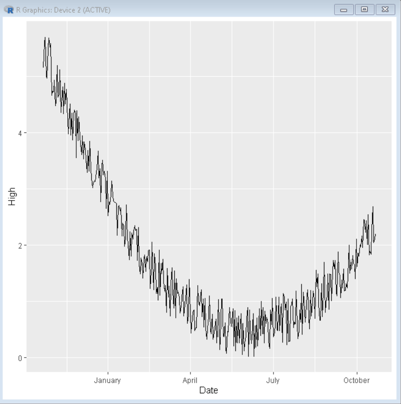
示例:使用数据标签标识符以长格式仅显示月份的时间序列。
R
# load library ggplot2
library(ggplot2)

# create timeseries dataframe
dataframe <- data.frame(
                      Date = as.Date("2021-10-21") - 0:364,
                      High = runif(365) + seq(-140, 224)^2 / 10000)

# create plot
ggplot(dataframe, aes(x=Date, y=High, group = 1)) +
  geom_line()+

# check.overlap avoids label overlapping
scale_x_discrete(guide = guide_axis(check.overlap = TRUE))+

# change month format to long-form month
scale_x_date(date_labels = "%B")
输出:
休息和小休息
我们可以使用 ggplot2 的 scale_x_date()函数的 date_breaks 和 date_minor_breaks 参数在图中使用次要或主要中断来创建不同的断点。
句法:
scale_x_date(date_breaks, date_minor_breaks)
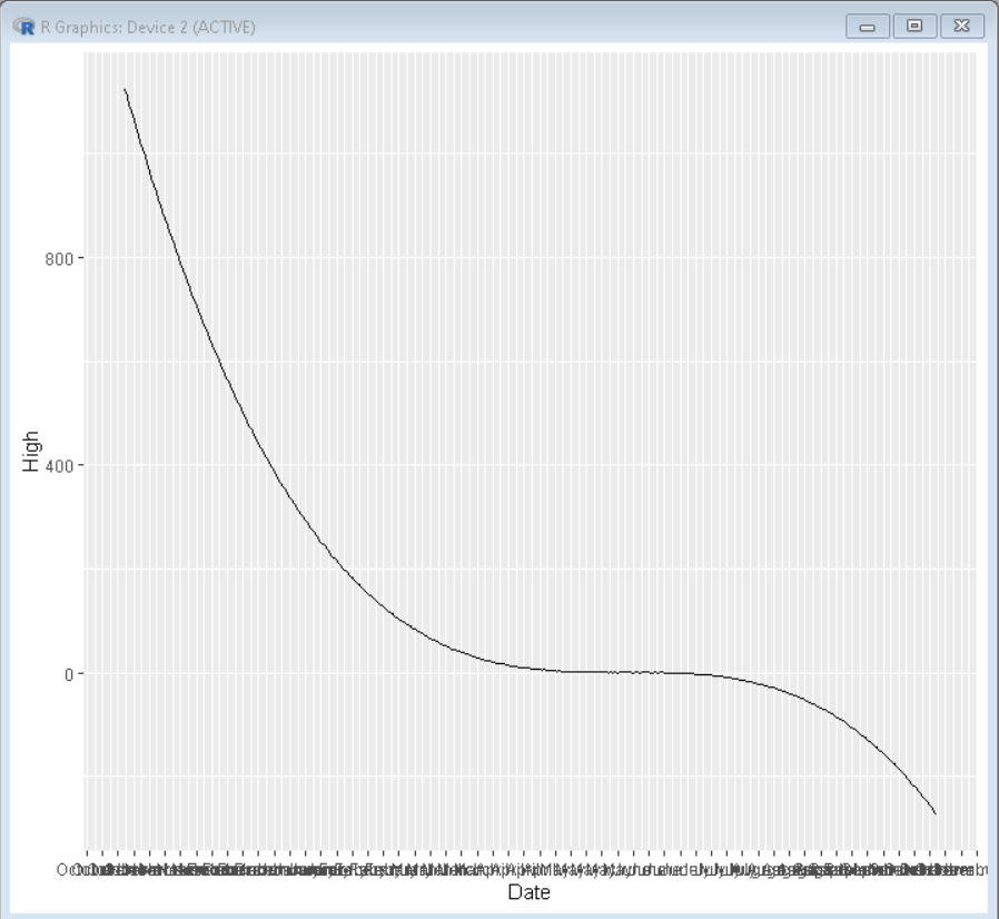
示例:具有手动日期中断和次要日期中断的基本时间序列图。
R
# load library ggplot2
library(ggplot2)

# create timeseries dataframe
dataframe <- data.frame(
                      Date = as.Date("2021-10-21") - 0:364,
                      High = runif(365) + seq(-140, 224)^3 / 10000)

# create plot
ggplot(dataframe, aes(x=Date, y=High, group = 1)) +
  geom_line()+

# check.overlap avoids label overlapping
scale_x_discrete(guide = guide_axis(check.overlap = TRUE))+

# change month format to long-form month
# date_breaks and date_minor_breaks for axis break
scale_x_date(date_labels = "%B",date_breaks = "1 week")
输出:
限制轴数据
在处理大型数据集时,我们可能需要关注一个小的时间范围。为此,我们使用 scale_x_date()函数的限制选项来选择数据中的时间范围。
句法:
scale_x_date(limit)
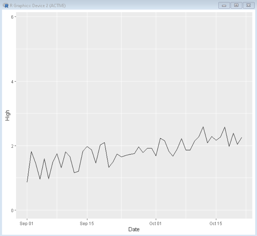
示例: 2021 年 10 月至 2021 年 7 月数据有限的地块。
R
# load library ggplot2
library(ggplot2)

# create timeseries dataframe
dataframe <- data.frame(
                      Date = as.Date("2021-10-21") - 0:364,
                      High = runif(365) + seq(-140, 224)^2 / 10000)

# create plot
ggplot(dataframe, aes(x=Date, y=High, group = 1)) +
  geom_line()+

# check.overlap avoids label overlapping
scale_x_discrete(guide = guide_axis(check.overlap = TRUE))+

# limit axis data
scale_x_date(limit=c(as.Date("2021-09-01"),as.Date("2021-10-21")))
输出: