使用 R 和 ggplot2 进行数据可视化
R编程语言中的ggplot2包也称为图形语法,是R语言中广泛使用的免费、开源且易于使用的可视化包。它是Hadley Wickham编写的最强大的可视化包。
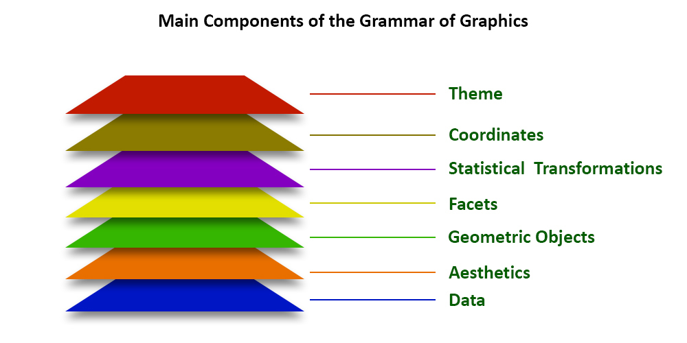
它包括几个对其进行管理的层。图层如下:
具有图形语法的层构建块
- 数据:元素是数据集本身
- 美学:数据映射到美学属性,如x轴、y轴、颜色、填充、大小、标签、alpha、形状、线宽、线型
- 几何学:如何使用点、线、直方图、条形图、箱线图显示我们的数据
- 方面:它使用列和行显示数据的子集
- 统计:分箱、平滑、描述性、中间
- 坐标:数据和显示之间的空间使用笛卡尔、固定、极坐标、极限
- 主题:非数据链接
使用的数据集
mtcars (motor trend car road test) 包括油耗和汽车设计和性能的 10 个方面,用于 32 辆汽车,并预装了 R 中的dplyr包。
R
# Installing the package
install.packages("dplyr")

# Loading package
library(dplyr)

# Summary of dataset in package
summary(mtcars)
R
# Loading packages
library(ggplot2)
library(dplyr)

# Data Layer
ggplot(data = mtcars)
R
# Aesthetic Layer
ggplot(data = mtcars, aes(x = hp, y = mpg, col = disp))
R
# Geometric layer
ggplot(data = mtcars,
       aes(x = hp, y = mpg, col = disp)) + geom_point()
R
# Adding size
ggplot(data = mtcars,
       aes(x = hp, y = mpg, size = disp)) + geom_point()

# Adding color and shape
ggplot(data = mtcars,
       aes(x = hp, y = mpg, col = factor(cyl),
                          shape = factor(am))) +
geom_point()

# Histogram plot
ggplot(data = mtcars, aes(x = hp)) +
       geom_histogram(binwidth = 5)
R
# Facet Layer
p <- ggplot(data = mtcars,
            aes(x = hp, y = mpg,
                shape = factor(cyl))) + geom_point()

# Separate rows according to transmission type
p + facet_grid(am ~ .)

# Separate columns according to cylinders
p + facet_grid(. ~ cyl)
R
# Statistics layer
ggplot(data = mtcars, aes(x = hp, y = mpg)) +
                               geom_point() +
       stat_smooth(method = lm, col = "red")
R
# Coordinates layer: Control plot dimensions
ggplot(data = mtcars, aes(x = wt, y = mpg)) +
                               geom_point() +
      stat_smooth(method = lm, col = "red") +
 scale_y_continuous("mpg", limits = c(2, 35),
                          expand = c(0, 0)) +
  scale_x_continuous("wt", limits = c(0, 25),
            expand = c(0, 0)) + coord_equal()
R
# Add coord_cartesian() to proper zoom in
ggplot(data = mtcars, aes(x = wt, y = hp, col = am)) +
                        geom_point() + geom_smooth() +
                        coord_cartesian(xlim = c(3, 6))
R
# Theme layer
ggplot(data = mtcars, aes(x = hp, y = mpg)) +
         geom_point() + facet_grid(. ~ cyl) +
        theme(plot.background = element_rect(
            fill = "black", colour = "gray"))
R
ggplot(data = mtcars, aes(x = hp, y = mpg)) +
        geom_point() + facet_grid(am ~ cyl) +
        theme_gray()
输出:
mpg             cyl             disp             hp
 Min.   :10.40   Min.   :4.000   Min.   : 71.1   Min.   : 52.0
 1st Qu.:15.43   1st Qu.:4.000   1st Qu.:120.8   1st Qu.: 96.5
 Median :19.20   Median :6.000   Median :196.3   Median :123.0
 Mean   :20.09   Mean   :6.188   Mean   :230.7   Mean   :146.7
 3rd Qu.:22.80   3rd Qu.:8.000   3rd Qu.:326.0   3rd Qu.:180.0
 Max.   :33.90   Max.   :8.000   Max.   :472.0   Max.   :335.0
      drat             wt             qsec             vs
 Min.   :2.760   Min.   :1.513   Min.   :14.50   Min.   :0.0000
 1st Qu.:3.080   1st Qu.:2.581   1st Qu.:16.89   1st Qu.:0.0000
 Median :3.695   Median :3.325   Median :17.71   Median :0.0000
 Mean   :3.597   Mean   :3.217   Mean   :17.85   Mean   :0.4375
 3rd Qu.:3.920   3rd Qu.:3.610   3rd Qu.:18.90   3rd Qu.:1.0000
 Max.   :4.930   Max.   :5.424   Max.   :22.90   Max.   :1.0000
       am              gear            carb
 Min.   :0.0000   Min.   :3.000   Min.   :1.000
 1st Qu.:0.0000   1st Qu.:3.000   1st Qu.:2.000
 Median :0.0000   Median :4.000   Median :2.000
 Mean   :0.4062   Mean   :3.688   Mean   :2.812
 3rd Qu.:1.0000   3rd Qu.:4.000   3rd Qu.:4.000
 Max.   :1.0000   Max.   :5.000   Max.   :8.000
R编程中的ggplot2包示例
我们使用ggplot2层在mtcars数据集上设计了可视化,其中包括 32 个汽车品牌和 11 个属性。
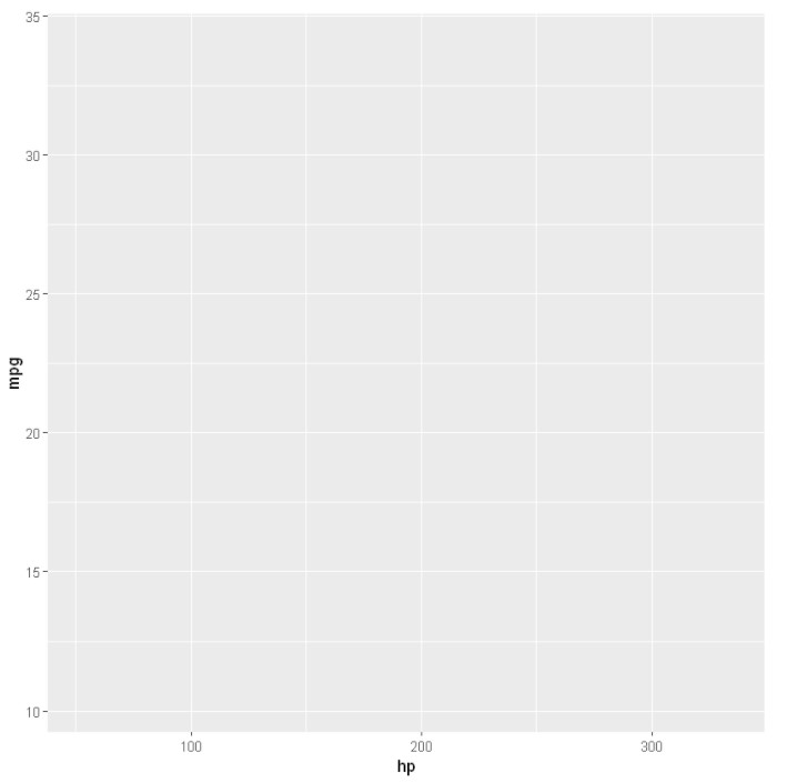
数据层:
在数据层中我们定义了要可视化的信息的来源,让我们使用 ggplot2 包中的 mtcars 数据集
R
# Loading packages
library(ggplot2)
library(dplyr)

# Data Layer
ggplot(data = mtcars)
输出:

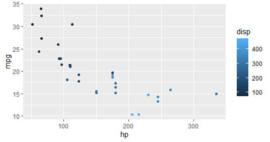
审美层:
在这里,我们将显示数据集并将其映射到某些美学中。
R
# Aesthetic Layer
ggplot(data = mtcars, aes(x = hp, y = mpg, col = disp))
输出:
几何层:
在几何层控制基本元素,看看我们的数据是如何使用点、线、直方图、条形图、箱线图显示的
R
# Geometric layer
ggplot(data = mtcars,
       aes(x = hp, y = mpg, col = disp)) + geom_point()
输出:
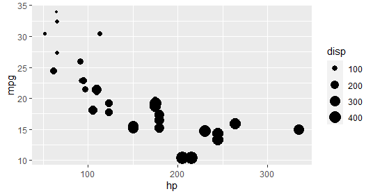
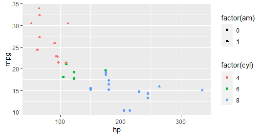
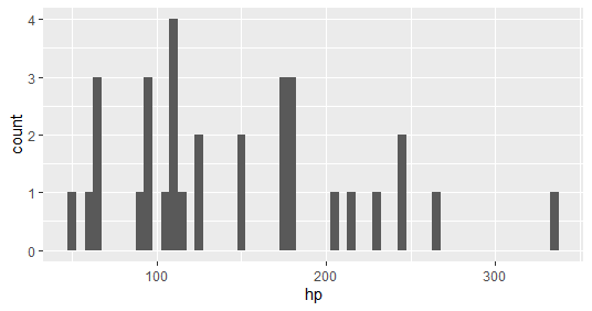
几何层:添加大小、颜色和形状,然后绘制直方图
R
# Adding size
ggplot(data = mtcars,
       aes(x = hp, y = mpg, size = disp)) + geom_point()

# Adding color and shape
ggplot(data = mtcars,
       aes(x = hp, y = mpg, col = factor(cyl),
                          shape = factor(am))) +
geom_point()

# Histogram plot
ggplot(data = mtcars, aes(x = hp)) +
       geom_histogram(binwidth = 5)
输出:
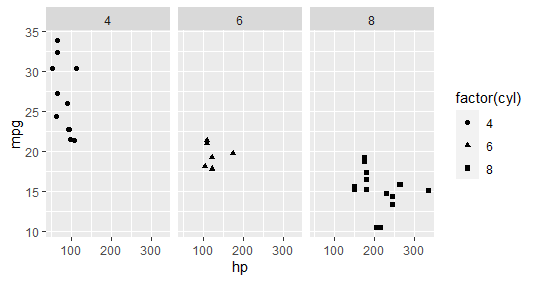
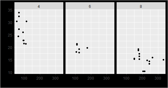
刻面层:
它用于将数据拆分为整个数据集的子集,并允许子集在同一个图上可视化。这里我们根据传输类型分隔行,根据气缸分隔列
R
# Facet Layer
p <- ggplot(data = mtcars,
            aes(x = hp, y = mpg,
                shape = factor(cyl))) + geom_point()

# Separate rows according to transmission type
p + facet_grid(am ~ .)

# Separate columns according to cylinders
p + facet_grid(. ~ cyl)
输出:

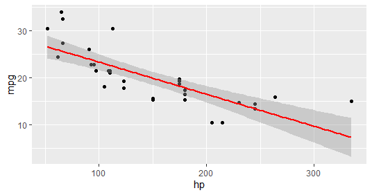
统计层
在这一层,我们使用 binning、smoothing、descriptive、intermediate
R
# Statistics layer
ggplot(data = mtcars, aes(x = hp, y = mpg)) +
                               geom_point() +
       stat_smooth(method = lm, col = "red")
输出:
坐标层:
在这些图层中,数据坐标被一起映射到所提到的图形平面,我们调整轴并使用控制图尺寸更改显示数据的间距。
R
# Coordinates layer: Control plot dimensions
ggplot(data = mtcars, aes(x = wt, y = mpg)) +
                               geom_point() +
      stat_smooth(method = lm, col = "red") +
 scale_y_continuous("mpg", limits = c(2, 35),
                          expand = c(0, 0)) +
  scale_x_continuous("wt", limits = c(0, 25),
            expand = c(0, 0)) + coord_equal()
输出:

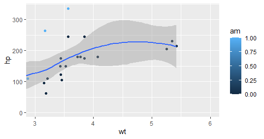
Coord_cartesian() 正确放大:
R
# Add coord_cartesian() to proper zoom in
ggplot(data = mtcars, aes(x = wt, y = hp, col = am)) +
                        geom_point() + geom_smooth() +
                        coord_cartesian(xlim = c(3, 6))
输出:
主题层:
该层控制更精细的显示点,例如字体大小和背景颜色属性。
示例 1:主题层 – element_rect()函数
R
# Theme layer
ggplot(data = mtcars, aes(x = hp, y = mpg)) +
         geom_point() + facet_grid(. ~ cyl) +
        theme(plot.background = element_rect(
            fill = "black", colour = "gray"))
输出:
示例 2:
R
ggplot(data = mtcars, aes(x = hp, y = mpg)) +
        geom_point() + facet_grid(am ~ cyl) +
        theme_gray()
输出:

ggplot2提供各种类型的可视化。包中可以包含更多参数,因为包可以更好地控制数据的可视化。许多包可以与 ggplot2 包集成,以使可视化具有交互性和动画效果。