使用 Matplotlib 和 Seaborn 在Python中进行数据可视化
有时似乎更容易浏览一组数据点并从中建立洞察力,但通常这个过程可能不会产生好的结果。由于这个过程,可能会有很多事情没有被发现。此外,现实生活中使用的大多数数据集都太大,无法手动进行任何分析。这基本上是数据可视化介入的地方。
数据可视化是一种更简单的数据呈现方式,无论它多么复杂,都可以借助图形表示来分析变量之间的趋势和关系。
以下是数据可视化的优势
- 更轻松地表示强制数据
- 突出表现好的和差的领域
- 探索数据点之间的关系
- 即使对于更大的数据点也能识别数据模式
在构建可视化时,牢记下面提到的一些要点始终是一个好习惯
- 在构建可视化时确保适当使用形状、颜色和大小
- 使用坐标系的绘图/图形更明显
- 关于数据类型的合适图的知识使信息更加清晰
- 标签、标题、图例和指针的使用向更广泛的受众传递无缝信息
Python库
有很多Python库可用于构建可视化,如matplotlib、vispy、bokeh、seaborn、pygal、folium、plotly、cufflinks和networkx 。其中, matplotlib和seaborn似乎非常广泛地用于基础到中级的可视化。
Matplotlib
它是一个令人惊叹的Python中用于二维数组绘图的可视化库,它是一个多平台数据可视化库,构建在NumPy数组上,旨在与更广泛的SciPy堆栈一起使用。它是由 John Hunter 在 2002 年引入的。让我们尝试了解matplotlib的一些好处和特性
- 它快速、高效,因为它基于numpy并且更容易构建
- 自成立以来,已经经历了开源社区的大量改进,因此也是一个具有高级功能的更好的库
- 维护良好的具有高质量图形的可视化输出吸引了大量用户
- 可以非常轻松地构建基本和高级图表
- 从用户/开发者的角度来看,由于它拥有庞大的社区支持,解决问题和调试变得更加容易
海伯恩
这个库最初是在斯坦福大学概念化和构建的,位于matplotlib之上。从某种意义上说,它有一些matplotlib的味道,而从可视化的角度来看,它比matplotlib好得多,并且还增加了一些功能。下面是它的优点
- 内置主题有助于更好的可视化
- 统计功能有助于获得更好的数据洞察力
- 更好的美学和内置的情节
- 有用的文档和有效的例子
可视化的本质
根据用于绘制可视化的变量数量和变量类型,我们可以使用不同类型的图表来理解关系。根据变量的数量,我们可以有
- 单变量图(只涉及一个变量)
- 双变量图(需要一个以上的变量)
单变量图可以让连续变量了解变量的分布和分布,而对于离散变量,它可以告诉我们计数
类似地,连续变量的双变量图可以显示基本统计量,例如相关性,因为连续变量与离散变量可以引导我们得出非常重要的结论,例如了解分类变量不同级别的数据分布。还可以开发两个离散变量之间的双变量图。
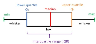
箱形图
箱线图,也称为箱线图,箱线图清楚地显示在下图中。在测量数据分布时,这是一个非常好的视觉表示。清楚地绘制中值、异常值和四分位数。了解数据分布是导致更好的模型构建的另一个重要因素。如果数据有异常值,推荐使用箱线图来识别它们并采取必要的措施。
Syntax: seaborn.boxplot(x=None, y=None, hue=None, data=None, order=None, hue_order=None, orient=None, color=None, palette=None, saturation=0.75, width=0.8, dodge=True, fliersize=5, linewidth=None, whis=1.5, ax=None, **kwargs)
Parameters:
x, y, hue: Inputs for plotting long-form data.
data: Dataset for plotting. If x and y are absent, this is interpreted as wide-form.
color: Color for all of the elements.
Returns: It returns the Axes object with the plot drawn onto it.
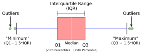
箱形图显示了数据的分布方式。图表中一般包含五项信息
- 最小值显示在图表的最左侧,左侧“晶须”的末端
- 第一个四分位数 Q1 是盒子的最左边(左须)
- 中位数显示为框中心的一条线
- 第三个四分位数 Q3,显示在框的最右侧(右须)
- 最大值位于框的最右侧
从下面的表示和图表中可以看出,可以为一个或多个变量绘制箱线图,为我们的数据提供非常好的洞察力。
箱线图的表示。
表示多变量分类变量的箱线图
表示多变量分类变量的箱线图
Python3
# import required modules
import matplotlib as plt
import seaborn as sns

# Box plot and violin plot for Outcome vs BloodPressure
_, axes = plt.subplots(1, 2, sharey=True, figsize=(10, 4))

# box plot illutration
sns.boxplot(x='Outcome', y='BloodPressure', data=diabetes, ax=axes[0])

# violin plot illustration
sns.violinplot(x='Outcome', y='BloodPressure', data=diabetes, ax=axes[1])
Python3
# Box plot for all the numerical variables
sns.set(rc={'figure.figsize': (16, 5)})

# multiple box plot illustration
sns.boxplot(data=diabetes.select_dtypes(include='number'))
Python3
# import module
import matplotlib.pyplot as plt

# scatter plot illustration
plt.scatter(diabetes['DiabetesPedigreeFunction'], diabetes['BMI'])
Python3
# import required modules
from mpl_toolkits.mplot3d import Axes3D

# assign axis values
x = [1, 2, 3, 4, 5, 6, 7, 8, 9, 10]
y = [5, 6, 2, 3, 13, 4, 1, 2, 4, 8]
z = [2, 3, 3, 3, 5, 7, 9, 11, 9, 10]

# adjust size of plot
sns.set(rc={'figure.figsize': (8, 5)})
fig = plt.figure()
ax = fig.add_subplot(111, projection='3d')
ax.scatter(x, y, z, c='r', marker='o')

# assign labels
ax.set_xlabel('X Label'), ax.set_ylabel('Y Label'), ax.set_zlabel('Z Label')

# display illustration
plt.show()
Python3
# illustrate histogram
features = ['BloodPressure', 'SkinThickness']
diabetes[features].hist(figsize=(10, 4))
Python3
# import required module
import seaborn as sns

# assign required values
_, axes = plt.subplots(nrows=1, ncols=2, figsize=(12, 4))

# illustrate count plots
sns.countplot(x='Outcome', data=diabetes, ax=axes[0])
sns.countplot(x='BloodPressure', data=diabetes, ax=axes[1])
Python3
# Finding and plotting the correlation for
# the independent variables

# import required module
import seaborn as sns

# adjust plot
sns.set(rc={'figure.figsize': (14, 5)})

# assign data
ind_var = ['CRIM', 'ZN', 'INDUS', 'CHAS', 'NOX', 'RM',
           'AGE', 'DIS', 'RAD', 'TAX', 'PTRATIO', 'B', 'LSTAT']

# illustrate heat map.
sns.heatmap(diabetes.select_dtypes(include='number').corr(),
            cmap=sns.cubehelix_palette(20, light=0.95, dark=0.15))
Python3
# import required module
import seaborn as sns
import numpy as np

# assign data
data = np.random.randn(50, 20)

# illustrate heat map
ax = sns.heatmap(data, xticklabels=2, yticklabels=False)
Python3
# import required module
import matplotlib.pyplot as plt

# Creating dataset
cars = ['AUDI', 'BMW', 'FORD', 'TESLA', 'JAGUAR', 'MERCEDES']
data = [23, 17, 35, 29, 12, 41]

# Creating plot
fig = plt.figure(figsize=(10, 7))
plt.pie(data, labels=cars)

# Show plot
plt.show()
Python3
# Import required module
import matplotlib.pyplot as plt
import numpy as np

# Creating dataset
cars = ['AUDI', 'BMW', 'FORD', 'TESLA', 'JAGUAR', 'MERCEDES']
data = [23, 17, 35, 29, 12, 41]

# Creating explode data
explode = (0.1, 0.0, 0.2, 0.3, 0.0, 0.0)

# Creating color parameters
colors = ("orange", "cyan", "brown", "grey", "indigo", "beige")

# Wedge properties
wp = {'linewidth': 1, 'edgecolor': "green"}

# Creating autocpt arguments
def func(pct, allvalues):
    absolute = int(pct / 100.*np.sum(allvalues))
    return "{:.1f}%\n({:d} g)".format(pct, absolute)

# Creating plot
fig, ax = plt.subplots(figsize=(10, 7))
wedges, texts, autotexts = ax.pie(data, autopct=lambda pct: func(pct, data), explode=explode, labels=cars,
                                  shadow=True, colors=colors, startangle=90, wedgeprops=wp,
                                  textprops=dict(color="magenta"))

# Adding legend
ax.legend(wedges, cars, title="Cars", loc="center left",
          bbox_to_anchor=(1, 0, 0.5, 1))
plt.setp(autotexts, size=8, weight="bold")
ax.set_title("Customizing pie chart")

# Show plot
plt.show()
Python3
# Import required module
import matplotlib.pyplot as plt
import numpy as np

# Assign axes
x = np.linspace(0,5.5,10)
y = 10*np.exp(-x)

# Assign errors regarding each axis
xerr = np.random.random_sample(10)
yerr = np.random.random_sample(10)

# Adjust plot
fig, ax = plt.subplots()
ax.errorbar(x, y, xerr=xerr, yerr=yerr, fmt='-o')

# Assign labels
ax.set_xlabel('x-axis'), ax.set_ylabel('y-axis')
ax.set_title('Line plot with error bars')

# Illustrate error bars
plt.show()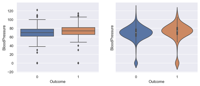
箱线图和小提琴图的输出
蟒蛇3
# Box plot for all the numerical variables
sns.set(rc={'figure.figsize': (16, 5)})

# multiple box plot illustration
sns.boxplot(data=diabetes.select_dtypes(include='number'))
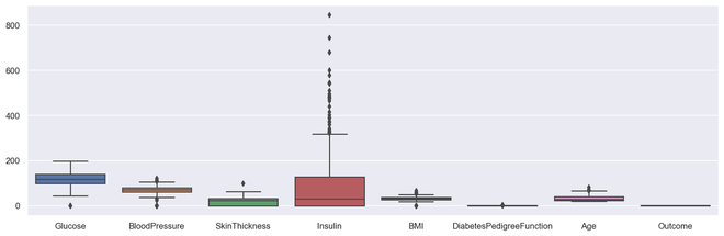
输出多盒图
散点图
散点图或散点图是一种双变量图,在构建方式上与折线图更相似。折线图使用 XY 轴上的一条线来绘制连续函数,而散点图则依靠点来表示单个数据片段。这些图对于查看两个变量是否相关非常有用。散点图可以是 2 维或 3 维的。
Syntax: seaborn.scatterplot(x=None, y=None, hue=None, style=None, size=None, data=None, palette=None, hue_order=None, hue_norm=None, sizes=None, size_order=None, size_norm=None, markers=True, style_order=None, x_bins=None, y_bins=None, units=None, estimator=None, ci=95, n_boot=1000, alpha=’auto’, x_jitter=None, y_jitter=None, legend=’brief’, ax=None, **kwargs)
Parameters:
x, y: Input data variables that should be numeric.
data: Dataframe where each column is a variable and each row is an observation.
size: Grouping variable that will produce points with different sizes.
style: Grouping variable that will produce points with different markers.
palette: Grouping variable that will produce points with different markers.
markers: Object determining how to draw the markers for different levels.
alpha: Proportional opacity of the points.
Returns: This method returns the Axes object with the plot drawn onto it.
散点图的优点
- 显示变量之间的相关性
- 适用于大数据集
- 更容易找到数据集群
- 更好地表示每个数据点
蟒蛇3
# import module
import matplotlib.pyplot as plt

# scatter plot illustration
plt.scatter(diabetes['DiabetesPedigreeFunction'], diabetes['BMI'])
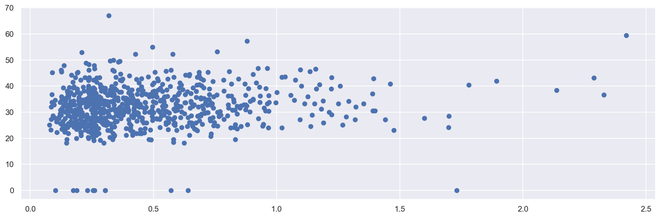
输出二维散点图
蟒蛇3
# import required modules
from mpl_toolkits.mplot3d import Axes3D

# assign axis values
x = [1, 2, 3, 4, 5, 6, 7, 8, 9, 10]
y = [5, 6, 2, 3, 13, 4, 1, 2, 4, 8]
z = [2, 3, 3, 3, 5, 7, 9, 11, 9, 10]

# adjust size of plot
sns.set(rc={'figure.figsize': (8, 5)})
fig = plt.figure()
ax = fig.add_subplot(111, projection='3d')
ax.scatter(x, y, z, c='r', marker='o')

# assign labels
ax.set_xlabel('X Label'), ax.set_ylabel('Y Label'), ax.set_zlabel('Z Label')

# display illustration
plt.show()
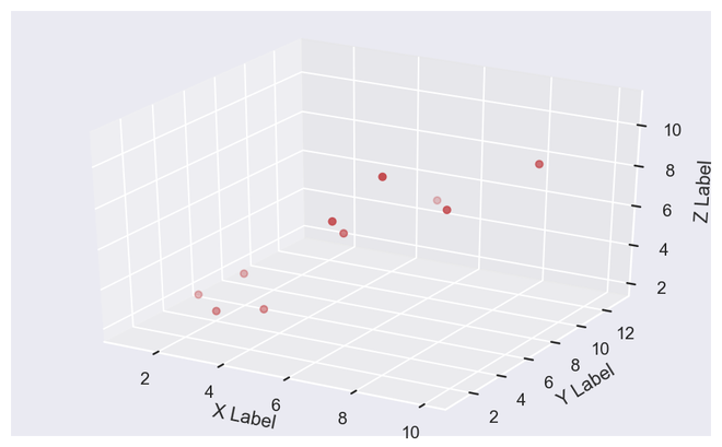
输出 3D 散点图
直方图
直方图显示数据计数,因此类似于条形图。直方图还可以告诉我们数据分布与正态曲线的接近程度。在制定统计方法时,我们有一个正态或接近正态分布的数据是非常重要的。然而,直方图本质上是单变量的,条形图是双变量的。
条形图根据类别绘制实际计数,例如,条形的高度表示该类别中的项目数,而直方图显示箱中相同的类别变量。
箱是构建直方图的组成部分,它们控制范围内的数据点。作为一种广泛接受的选择,我们通常将 bin 的大小限制为 5-20,但这完全取决于存在的数据点。
蟒蛇3
# illustrate histogram
features = ['BloodPressure', 'SkinThickness']
diabetes[features].hist(figsize=(10, 4))
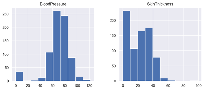
输出直方图
计数图
计数图是分类变量和连续变量之间的图。在这种情况下,连续变量是分类出现的次数或频率。从某种意义上说,计数图可以说是与直方图或条形图密切相关的。
Syntax : seaborn.countplot(x=None, y=None, hue=None, data=None, order=None, hue_order=None, orient=None, color=None, palette=None, saturation=0.75, dodge=True, ax=None, **kwargs)
Parameters : This method is accepting the following parameters that are described below:
- x, y: This parameter take names of variables in data or vector data, optional, Inputs for plotting long-form data.
- hue : (optional) This parameter take column name for colour encoding.
- data : (optional) This parameter take DataFrame, array, or list of arrays, Dataset for plotting. If x and y are absent, this is interpreted as wide-form. Otherwise it is expected to be long-form.
- order, hue_order : (optional) This parameter take lists of strings. Order to plot the categorical levels in, otherwise the levels are inferred from the data objects.
- orient : (optional)This parameter take “v” | “h”, Orientation of the plot (vertical or horizontal). This is usually inferred from the dtype of the input variables but can be used to specify when the “categorical” variable is a numeric or when plotting wide-form data.
- color : (optional) This parameter take matplotlib color, Color for all of the elements, or seed for a gradient palette.
- palette : (optional) This parameter take palette name, list, or dict, Colors to use for the different levels of the hue variable. Should be something that can be interpreted by color_palette(), or a dictionary mapping hue levels to matplotlib colors.
- saturation : (optional) This parameter take float value, Proportion of the original saturation to draw colors at. Large patches often look better with slightly desaturated colors, but set this to 1 if you want the plot colors to perfectly match the input color spec.
- dodge : (optional) This parameter take bool value, When hue nesting is used, whether elements should be shifted along the categorical axis.
- ax : (optional) This parameter take matplotlib Axes, Axes object to draw the plot onto, otherwise uses the current Axes.
- kwargs : This parameter take key, value mappings, Other keyword arguments are passed through to matplotlib.axes.Axes.bar().
Returns: Returns the Axes object with the plot drawn onto it.
它只是根据某种类型的类别显示项目出现的次数。在Python中,我们可以使用seaborn库创建一个 couplot。 Seaborn是Python中的一个模块,它构建在matplotlib之上,用于绘制具有视觉吸引力的统计图。
蟒蛇3
# import required module
import seaborn as sns

# assign required values
_, axes = plt.subplots(nrows=1, ncols=2, figsize=(12, 4))

# illustrate count plots
sns.countplot(x='Outcome', data=diabetes, ax=axes[0])
sns.countplot(x='BloodPressure', data=diabetes, ax=axes[1])
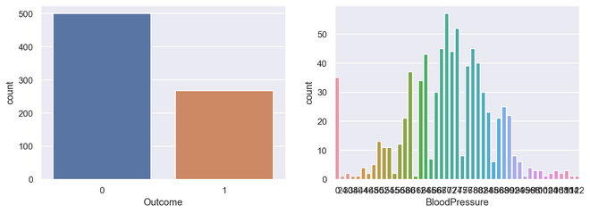
输出计数图
相关图
相关图是一种多变量分析,可以非常方便地查看与数据点的关系。散点图有助于了解一个变量对另一个变量的影响。相关性可以定义为一个变量对另一个变量的影响。
可以计算两个变量之间的相关性,也可以是一对多相关性,我们可以看到下图。相关性可以是正的、负的或中性的,相关性的数学范围是从 -1 到 1。了解相关性可能对模型构建阶段和理解模型输出产生非常显着的影响。
蟒蛇3
# Finding and plotting the correlation for
# the independent variables

# import required module
import seaborn as sns

# adjust plot
sns.set(rc={'figure.figsize': (14, 5)})

# assign data
ind_var = ['CRIM', 'ZN', 'INDUS', 'CHAS', 'NOX', 'RM',
           'AGE', 'DIS', 'RAD', 'TAX', 'PTRATIO', 'B', 'LSTAT']

# illustrate heat map.
sns.heatmap(diabetes.select_dtypes(include='number').corr(),
            cmap=sns.cubehelix_palette(20, light=0.95, dark=0.15))
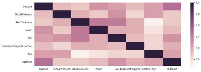
输出相关图
热图
热图是一种多变量数据表示。热图显示中的颜色强度成为了解数据点影响的重要因素。热图更容易理解,也更容易解释。在使用可视化进行数据分析时,借助绘图传达所需的信息非常重要。
Syntax:
seaborn.heatmap(data, *, vmin=None, vmax=None, cmap=None, center=None, robust=False, annot=None, fmt=’.2g’, annot_kws=None, linewidths=0, linecolor=’white’, cbar=True, cbar_kws=None, cbar_ax=None, square=False, xticklabels=’auto’, yticklabels=’auto’, mask=None, ax=None, **kwargs)
Parameters : This method is accepting the following parameters that are described below:
- x, y: This parameter take names of variables in data or vector data, optional, Inputs for plotting long-form data.
- hue : (optional) This parameter take column name for colour encoding.
- data : (optional) This parameter take DataFrame, array, or list of arrays, Dataset for plotting. If x and y are absent, this is interpreted as wide-form. Otherwise it is expected to be long-form.
- color : (optional) This parameter take matplotlib color, Color for all of the elements, or seed for a gradient palette.
- palette : (optional) This parameter take palette name, list, or dict, Colors to use for the different levels of the hue variable. Should be something that can be interpreted by color_palette(), or a dictionary mapping hue levels to matplotlib colors.
- ax : (optional) This parameter take matplotlib Axes, Axes object to draw the plot onto, otherwise uses the current Axes.
- kwargs : This parameter take key, value mappings, Other keyword arguments are passed through to matplotlib.axes.Axes.bar().
Returns: Returns the Axes object with the plot drawn onto it.
蟒蛇3
# import required module
import seaborn as sns
import numpy as np

# assign data
data = np.random.randn(50, 20)

# illustrate heat map
ax = sns.heatmap(data, xticklabels=2, yticklabels=False)
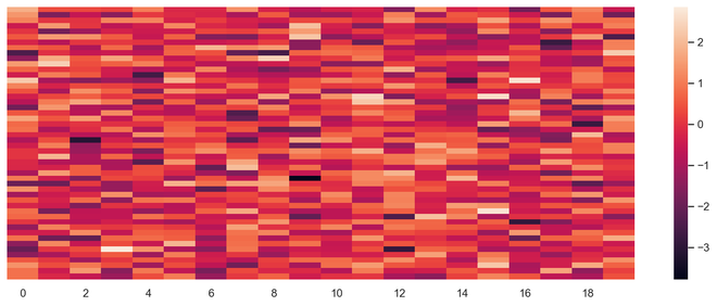
输出热图
饼形图
饼图是单变量分析,通常用于显示百分比或比例数据。变量中每个类的百分比分布在饼图的相应切片旁边提供。可用于构建饼图的Python库是matplotlib和seaborn。
Syntax: matplotlib.pyplot.pie(data, explode=None, labels=None, colors=None, autopct=None, shadow=False)
Parameters:
data represents the array of data values to be plotted, the fractional area of each slice is represented by data/sum(data). If sum(data)<1, then the data values returns the fractional area directly, thus resulting pie will have empty wedge of size 1-sum(data).
labels is a list of sequence of strings which sets the label of each wedge.
color attribute is used to provide color to the wedges.
autopct is a string used to label the wedge with their numerical value.
shadow is used to create shadow of wedge.
以下是饼图的优点
- 更轻松地对大数据点进行可视化汇总
- 不同类的效果和大小很容易理解
- 百分比点用于表示数据点中的类别
蟒蛇3
# import required module
import matplotlib.pyplot as plt

# Creating dataset
cars = ['AUDI', 'BMW', 'FORD', 'TESLA', 'JAGUAR', 'MERCEDES']
data = [23, 17, 35, 29, 12, 41]

# Creating plot
fig = plt.figure(figsize=(10, 7))
plt.pie(data, labels=cars)

# Show plot
plt.show()
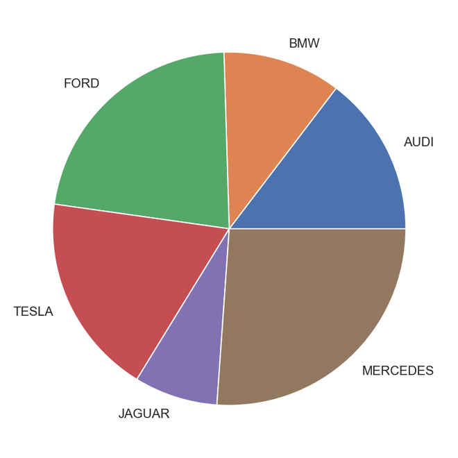
输出饼图
蟒蛇3
# Import required module
import matplotlib.pyplot as plt
import numpy as np

# Creating dataset
cars = ['AUDI', 'BMW', 'FORD', 'TESLA', 'JAGUAR', 'MERCEDES']
data = [23, 17, 35, 29, 12, 41]

# Creating explode data
explode = (0.1, 0.0, 0.2, 0.3, 0.0, 0.0)

# Creating color parameters
colors = ("orange", "cyan", "brown", "grey", "indigo", "beige")

# Wedge properties
wp = {'linewidth': 1, 'edgecolor': "green"}

# Creating autocpt arguments
def func(pct, allvalues):
    absolute = int(pct / 100.*np.sum(allvalues))
    return "{:.1f}%\n({:d} g)".format(pct, absolute)

# Creating plot
fig, ax = plt.subplots(figsize=(10, 7))
wedges, texts, autotexts = ax.pie(data, autopct=lambda pct: func(pct, data), explode=explode, labels=cars,
                                  shadow=True, colors=colors, startangle=90, wedgeprops=wp,
                                  textprops=dict(color="magenta"))

# Adding legend
ax.legend(wedges, cars, title="Cars", loc="center left",
          bbox_to_anchor=(1, 0, 0.5, 1))
plt.setp(autotexts, size=8, weight="bold")
ax.set_title("Customizing pie chart")

# Show plot
plt.show()
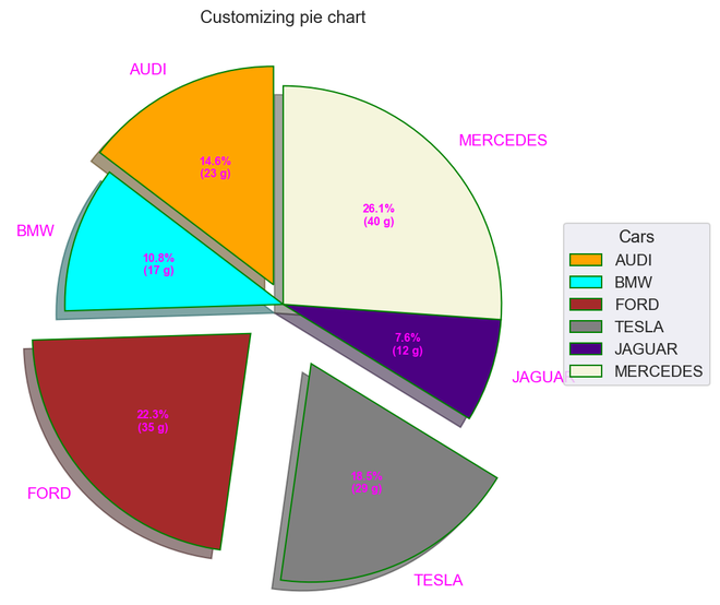
输出
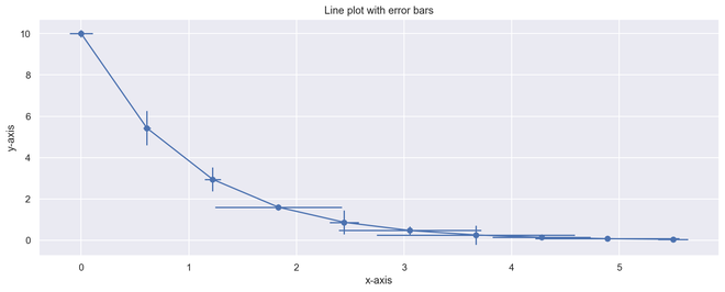
误差条
误差线可以定义为通过图形上一点的线,平行于其中一个轴,它表示该点对应坐标的不确定性或误差。这些类型的图对于理解和分析与目标的偏差非常方便。一旦识别出错误,就很容易对导致错误的因素进行更深入的分析。
- 可以轻松捕获数据点与阈值的偏差
- 轻松捕获大量数据点的偏差
- 它定义了底层数据
蟒蛇3
# Import required module
import matplotlib.pyplot as plt
import numpy as np

# Assign axes
x = np.linspace(0,5.5,10)
y = 10*np.exp(-x)

# Assign errors regarding each axis
xerr = np.random.random_sample(10)
yerr = np.random.random_sample(10)

# Adjust plot
fig, ax = plt.subplots()
ax.errorbar(x, y, xerr=xerr, yerr=yerr, fmt='-o')

# Assign labels
ax.set_xlabel('x-axis'), ax.set_ylabel('y-axis')
ax.set_title('Line plot with error bars')

# Illustrate error bars
plt.show()
输出误差图