Python|使用 XlsxWriter 模块在 Excel 工作表中绘制组合图表
先决条件:在 Excel 工作表上创建和书写
XlsxWriter是一个Python库,使用它可以对 excel 文件执行多种操作,例如创建、写入、算术运算和绘图。让我们看看如何使用实时数据绘制组合图表。
图表由至少一系列的一个或多个数据点组成。系列本身由对单元格范围的引用组成。为了在 Excel 表上绘制图表,首先,创建特定图表类型(即折线图、柱形图等)的图表对象。创建图表对象后,在其中插入数据,最后将该图表对象添加到工作表对象中。
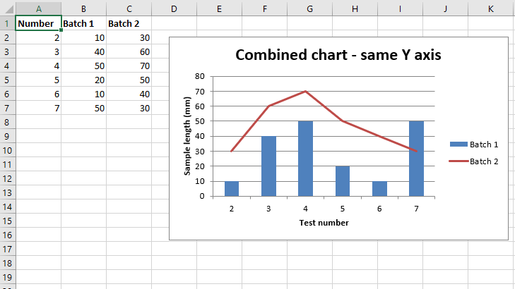
代码 #1:绘制共享相同 X 轴和 Y 轴的组合柱形图和折线图。
要在 Excel 工作表上绘制组合图表,请使用图表对象的 combine() 方法将两个图表对象组合在一起。
Python3
# import xlsxwriter module
import xlsxwriter

# Workbook() takes one, non-optional, argument
# which is the filename that we want to create.
workbook = xlsxwriter.Workbook('chart_combined.xlsx')

# The workbook object is then used to add new
# worksheet via the add_worksheet() method.
worksheet = workbook.add_worksheet()

# Create a new Format object to formats cells
# in worksheets using add_format() method .

# here we create bold format object .
bold = workbook.add_format({'bold': True})

# Add the worksheet data that the charts will refer to.
headings = ['Number', 'Batch 1', 'Batch 2']
data = [
    [2, 3, 4, 5, 6, 7],
    [10, 40, 50, 20, 10, 50],
    [30, 60, 70, 50, 40, 30],
]

# Write a row of data starting from 'A1'
# with bold format .
worksheet.write_row('A1', headings, bold)

# Write a column of data starting from
# 'A2', 'B2', 'C2' respectively .
worksheet.write_column('A2', data[0])
worksheet.write_column('B2', data[1])
worksheet.write_column('C2', data[2])

# Create a chart object that can be added
# to a worksheet using add_chart() method.

# here we create a column chart object .
# This will use as the primary chart.
column_chart1 = workbook.add_chart({'type': 'column'})

# Add a data series to a chart
# using add_series method.

# Configure the first series.
# = Sheet1 !$A$1 is equivalent to ['Sheet1', 0, 0].

# note : spaces is not inserted in b / w
# = and Sheet1, Sheet1 and !
# if space is inserted it throws warning.
column_chart1.add_series({
    'name':       '= Sheet1 !$B$1',
    'categories': '= Sheet1 !$A$2:$A$7',
    'values':     '= Sheet1 !$B$2:$B$7',
})

# Create a new line chart.
# This will use as the secondary chart.
line_chart1 = workbook.add_chart({'type': 'line'})

# Configure the data series for the secondary chart.
line_chart1.add_series({
    'name':       '= Sheet1 !$C$1',
    'categories': '= Sheet1 !$A$2:$A$7',
    'values':     '= Sheet1 !$C$2:$C$7',
})

# Combine both column and line charts together.
column_chart1.combine(line_chart1)

# Add a chart title
column_chart1.set_title({ 'name': 'Combined chart - same Y axis'})

# Add x-axis label
column_chart1.set_x_axis({'name': 'Test number'})

# Add y-axis label
column_chart1.set_y_axis({'name': 'Sample length (mm)'})

# add chart to the worksheet with given
# offset values at the top-left corner of
# a chart is anchored to cell D2
worksheet.insert_chart('D2', column_chart1, {'x_offset': 25, 'y_offset': 10})

# Finally, close the Excel file
# via the close() method.
workbook.close()
Python3
# import xlsxwriter module
import xlsxwriter

# Workbook() takes one, non-optional, argument
# which is the filename that we want to create.
workbook = xlsxwriter.Workbook('combined_chart_secondaryAxis.xlsx')

# The workbook object is then used to add new
# worksheet via the add_worksheet() method.
worksheet = workbook.add_worksheet()

# Create a new Format object to formats cells
# in worksheets using add_format() method .

# here we create bold format object .
bold = workbook.add_format({'bold': True})

# Add the worksheet data that the charts will refer to.
headings = ['Number', 'Batch 1', 'Batch 2']
data = [
    [2, 3, 4, 5, 6, 7],
    [10, 40, 50, 20, 10, 50],
    [30, 60, 70, 50, 40, 30],
]

# Write a row of data starting from 'A1'
# with bold format .
worksheet.write_row('A1', headings, bold)

# Write a column of data starting from
# 'A2', 'B2', 'C2' respectively .
worksheet.write_column('A2', data[0])
worksheet.write_column('B2', data[1])
worksheet.write_column('C2', data[2])

# Create a chart object that can be added
# to a worksheet using add_chart() method.

# here we create a column chart object .
# This will use as the primary chart.
column_chart2 = workbook.add_chart({'type': 'column'})

# Add a data series to a chart
# using add_series method.

# Configure the first series.
# = Sheet1 !$A$1 is equivalent to ['Sheet1', 0, 0].

# note : spaces is not inserted in b / w
# = and Sheet1, Sheet1 and !
# if space is inserted it throws warning.
column_chart2.add_series({
    'name':       '= Sheet1 !$B$1',
    'categories': '= Sheet1 !$A$2:$A$7',
    'values':     '= Sheet1 !$B$2:$B$7',
})

# Create a new line chart.
# This will use as the secondary chart.
line_chart2 = workbook.add_chart({'type': 'line'})

# Configure the data series for the secondary chart.
# We also set a secondary Y axis via (y2_axis).
line_chart2.add_series({
    'name':       '= Sheet1 !$C$1',
    'categories': '= Sheet1 !$A$2:$A$7',
    'values':     '= Sheet1 !$C$2:$C$7',
     'y2_axis':    True,
})

# Combine both column and line charts together.
column_chart2.combine(line_chart2)

# Add a chart title
column_chart2.set_title({ 'name': 'Combined chart - secondary Y axis'})

# Add x-axis label
column_chart2.set_x_axis({'name': 'Test number'})

# Add y-axis label
column_chart2.set_y_axis({'name': 'Sample length (mm)'})

# Note: the y2 properties are on the secondary chart.
line_chart2.set_y2_axis({'name': 'Target length (mm)'})

# add chart to the worksheet with given
# offset values at the top-left corner of
# a chart is anchored to cell D2
worksheet.insert_chart('D2', column_chart2, {'x_offset': 25, 'y_offset': 10})

# Finally, close the Excel file
# via the close() method.
workbook.close()
输出 :
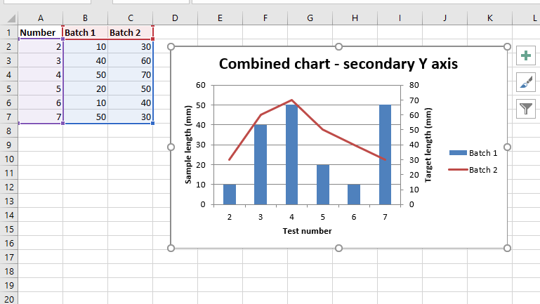
代码 #2:绘制一个组合柱形图和折线图,其中辅助图表将具有辅助 Y 轴。
为了在 Excel 工作表上绘制带有辅助 Y 轴的组合图表,我们通过“y2_axis”设置辅助 Y 轴。相应图表对象的 add_series() 方法的关键字参数。
Python3
# import xlsxwriter module
import xlsxwriter

# Workbook() takes one, non-optional, argument
# which is the filename that we want to create.
workbook = xlsxwriter.Workbook('combined_chart_secondaryAxis.xlsx')

# The workbook object is then used to add new
# worksheet via the add_worksheet() method.
worksheet = workbook.add_worksheet()

# Create a new Format object to formats cells
# in worksheets using add_format() method .

# here we create bold format object .
bold = workbook.add_format({'bold': True})

# Add the worksheet data that the charts will refer to.
headings = ['Number', 'Batch 1', 'Batch 2']
data = [
    [2, 3, 4, 5, 6, 7],
    [10, 40, 50, 20, 10, 50],
    [30, 60, 70, 50, 40, 30],
]

# Write a row of data starting from 'A1'
# with bold format .
worksheet.write_row('A1', headings, bold)

# Write a column of data starting from
# 'A2', 'B2', 'C2' respectively .
worksheet.write_column('A2', data[0])
worksheet.write_column('B2', data[1])
worksheet.write_column('C2', data[2])

# Create a chart object that can be added
# to a worksheet using add_chart() method.

# here we create a column chart object .
# This will use as the primary chart.
column_chart2 = workbook.add_chart({'type': 'column'})

# Add a data series to a chart
# using add_series method.

# Configure the first series.
# = Sheet1 !$A$1 is equivalent to ['Sheet1', 0, 0].

# note : spaces is not inserted in b / w
# = and Sheet1, Sheet1 and !
# if space is inserted it throws warning.
column_chart2.add_series({
    'name':       '= Sheet1 !$B$1',
    'categories': '= Sheet1 !$A$2:$A$7',
    'values':     '= Sheet1 !$B$2:$B$7',
})

# Create a new line chart.
# This will use as the secondary chart.
line_chart2 = workbook.add_chart({'type': 'line'})

# Configure the data series for the secondary chart.
# We also set a secondary Y axis via (y2_axis).
line_chart2.add_series({
    'name':       '= Sheet1 !$C$1',
    'categories': '= Sheet1 !$A$2:$A$7',
    'values':     '= Sheet1 !$C$2:$C$7',
     'y2_axis':    True,
})

# Combine both column and line charts together.
column_chart2.combine(line_chart2)

# Add a chart title
column_chart2.set_title({ 'name': 'Combined chart - secondary Y axis'})

# Add x-axis label
column_chart2.set_x_axis({'name': 'Test number'})

# Add y-axis label
column_chart2.set_y_axis({'name': 'Sample length (mm)'})

# Note: the y2 properties are on the secondary chart.
line_chart2.set_y2_axis({'name': 'Target length (mm)'})

# add chart to the worksheet with given
# offset values at the top-left corner of
# a chart is anchored to cell D2
worksheet.insert_chart('D2', column_chart2, {'x_offset': 25, 'y_offset': 10})

# Finally, close the Excel file
# via the close() method.
workbook.close()
输出 :