Python|使用 XlsxWriter 模块在 Excel 表中绘制饼图
先决条件:在 Excel 工作表上创建和书写
XlsxWriter是一个Python库,使用它可以对 excel 文件执行多种操作,例如创建、写入、算术运算和绘图。让我们看看如何使用实时数据绘制不同类型的饼图。
图表由至少一系列的一个或多个数据点组成。系列本身由对单元格范围的引用组成。
为了在 Excel 表上绘制图表,首先,创建特定图表类型的图表对象(即饼图等)。创建图表对象后,在其中插入数据,最后,将该图表对象添加到工作表对象中。
代码 #1:绘制简单的饼图。
要在 Excel 工作表上绘制简单的饼图,请使用add_chart()方法和工作簿对象的类型 'pie' 关键字参数。
# import xlsxwriter module
import xlsxwriter

# Workbook() takes one, non-optional, argument
# which is the filename that we want to create.
workbook = xlsxwriter.Workbook('chart_pie.xlsx')

# The workbook object is then used to add new
# worksheet via the add_worksheet() method.
worksheet = workbook.add_worksheet()

# Create a new Format object to formats cells
# in worksheets using add_format() method .

# here we create bold format object .
bold = workbook.add_format({'bold': 1})

# create a data list .
headings = ['Category', 'Values']

data = [
    ['Apple', 'Cherry', 'Pecan'],
    [60, 30, 10],
]

# Write a row of data starting from 'A1'
# with bold format.
worksheet.write_row('A1', headings, bold)

# Write a column of data starting from
# A2, B2, C2 respectively.
worksheet.write_column('A2', data[0])
worksheet.write_column('B2', data[1])

# Create a chart object that can be added
# to a worksheet using add_chart() method.

# here we create a pie chart object .
chart1 = workbook.add_chart({'type': 'pie'})

# Add a data series to a chart
# using add_series method.
# Configure the first series.
#[sheetname, first_row, first_col, last_row, last_col].
chart1.add_series({
    'name':       'Pie sales data',
    'categories': ['Sheet1', 1, 0, 3, 0],
    'values':     ['Sheet1', 1, 1, 3, 1],
})

# Add a chart title
chart1.set_title({'name': 'Popular Pie Types'})

# Set an Excel chart style. Colors with white outline and shadow.
chart1.set_style(10)

# Insert the chart into the worksheet(with an offset).
# the top-left corner of a chart is anchored to cell C2.
worksheet.insert_chart('C2', chart1, {'x_offset': 25, 'y_offset': 10})

# Finally, close the Excel file
# via the close() method.
workbook.close()
输出 : 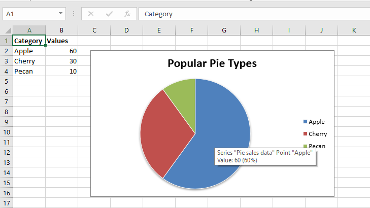 代码#2:用用户定义的分段颜色绘制一个饼图。
要在 Excel 工作表上使用用户定义的段颜色绘制饼图,请使用add_series()方法和图表对象的 points 关键字参数。
# import xlsxwriter module
import xlsxwriter

# Workbook() takes one, non-optional, argument
# which is the filename that we want to create.
workbook = xlsxwriter.Workbook('chart_pie_colour.xlsx')

# The workbook object is then used to add new
# worksheet via the add_worksheet() method.
worksheet = workbook.add_worksheet()

# Create a new Format object to formats cells
# in worksheets using add_format() method .

# here we create bold format object .
bold = workbook.add_format({'bold': 1})

# create a data list .
headings = ['Category', 'Values']

data = [
    ['Apple', 'Cherry', 'Pecan'],
    [60, 30, 10],
]

# Write a row of data starting from 'A1'
# with bold format .
worksheet.write_row('A1', headings, bold)

# Write a column of data starting from
# A2, B2, C2 respectively.
worksheet.write_column('A2', data[0])
worksheet.write_column('B2', data[1])

# Create a chart object that can be added
# to a worksheet using add_chart() method.

# here we create a pie chart object
chart2 = workbook.add_chart({'type': 'pie'})

# Add a data series to a chart
# using add_series method.

# Configure the first series.
# = Sheet1 !$A$1 is equivalent to ['Sheet1', 0, 0].
chart2.add_series({
    'name': 'Pie sales data',
    'categories': '= Sheet1 !$A$2:$A$4',
    'values':     '= Sheet1 !$B$2:$B$4',
    'points': [
        {'fill': {'color': '# 5ABA10'}},
        {'fill': {'color': '# FE110E'}},
        {'fill': {'color': '# CA5C05'}},
    ],
})

# Add a chart title.
chart2.set_title({'name': 'Pie Chart with user defined colors'})

# Insert the chart into the worksheet (with an offset)
# the top-left corner of a chart is anchored to cell C2.
worksheet.insert_chart('C2', chart2, {'x_offset': 25, 'y_offset': 10})

# Finally, close the Excel file
# via the close() method.
workbook.close()
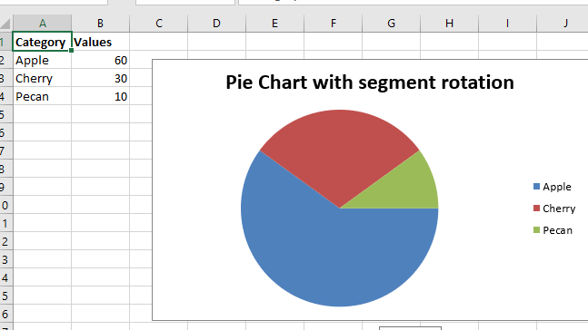
输出 : 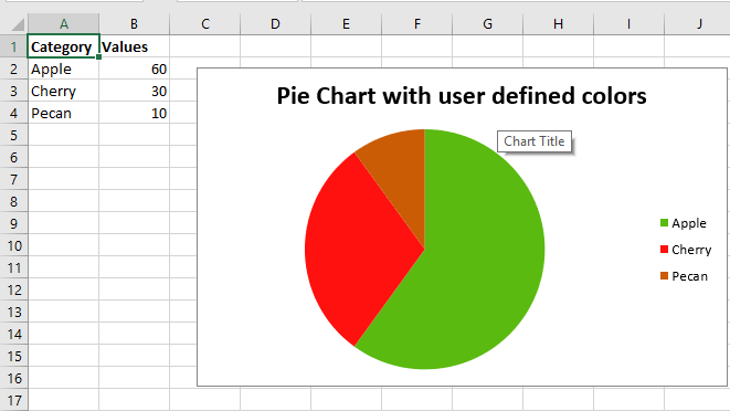 代码#3:绘制一个带有段旋转的饼图。
要在 Excel 工作表上绘制带有分段旋转的饼图,请使用带有图表对象的确定角度参数的 set_rotation() 方法。
# import xlsxwriter module
import xlsxwriter

# Workbook() takes one, non-optional, argument
# which is the filename that we want to create.
workbook = xlsxwriter.Workbook('chart_pie_rotation.xlsx')

# The workbook object is then used to add new
# worksheet via the add_worksheet() method.
worksheet = workbook.add_worksheet()

# Create a new Format object to formats cells
# in worksheets using add_format() method .

# here we create bold format object .
bold = workbook.add_format({'bold': 1})

# create a data list .
headings = ['Category', 'Values']

data = [
    ['Apple', 'Cherry', 'Pecan'],
    [60, 30, 10],
]

# Write a row of data starting from 'A1'
# with bold format .
worksheet.write_row('A1', headings, bold)

# Write a column of data starting from
# A2, B2, C2 respectively.
worksheet.write_column('A2', data[0])
worksheet.write_column('B2', data[1])

# Create a chart object that can be added
# to a worksheet using add_chart() method.

# here we create a pie chart object .
chart3 = workbook.add_chart({'type': 'pie'})

# Add a data series to a chart
# using add_series method.

# Configure the first series.
# = Sheet1 !$A$1 is equivalent to ['Sheet1', 0, 0].
chart3.add_series({
    'name': 'Pie sales data',
    'categories': '= Sheet1 !$A$2:$A$4',
    'values':     '= Sheet1 !$B$2:$B$4',
})

# Add a chart title.
chart3.set_title({'name': 'Pie Chart with segment rotation'})

# Change the angle / rotation of the first segment.
chart3.set_rotation(90)

# Insert the chart into the worksheet (with an offset).
# the top-left corner of a chart is anchored to cell C2.
worksheet.insert_chart('C2', chart3, {'x_offset': 25, 'y_offset': 10})

# Finally, close the Excel file
# via the close() method.
workbook.close()
输出: