Python|使用 XlsxWriter 模块在 Excel 工作表中绘制散点图
先决条件:在 excel 文件上创建和写入。
XlsxWriter是一个Python库,使用它可以对 excel 文件执行多种操作,例如创建、写入、算术运算和绘图。让我们看看如何使用实时数据绘制不同类型的散点图。
图表由至少一系列的一个或多个数据点组成。系列本身由对单元格范围的引用组成。
为了在 Excel 表上绘制图表,首先,创建特定图表类型(即散点图等)的图表对象。创建图表对象后,在其中插入数据,最后,将该图表对象添加到工作表对象中。
代码 #1:绘制简单的散点图。
要在 Excel 工作表上绘制简单的散点图,请使用 add_chart() 方法和工作簿对象的类型“散点”关键字参数。
# import xlsxwriter module
import xlsxwriter

# Workbook() takes one, non-optional, argument
# which is the filename that we want to create.
workbook = xlsxwriter.Workbook('chart_scatter.xlsx')

# The workbook object is then used to add new
# worksheet via the add_worksheet() method.
worksheet = workbook.add_worksheet()

# Create a new Format object to formats cells
# in worksheets using add_format() method .

# here we create bold format object .
bold = workbook.add_format({'bold': 1})

# create a data list .
headings = ['Number', 'Batch 1', 'Batch 2']

data = [
    [2, 3, 4, 5, 6, 7],
    [80, 80, 100, 60, 50, 100],
    [60, 50, 60, 20, 10, 20],
]

# Write a row of data starting from 'A1'
# with bold format .
worksheet.write_row('A1', headings, bold)

# Write a column of data starting from
# 'A2', 'B2', 'C2' respectively .
worksheet.write_column('A2', data[0])
worksheet.write_column('B2', data[1])
worksheet.write_column('C2', data[2])

# Create a chart object that can be added
# to a worksheet using add_chart() method.

# here we create a scatter chart object .
chart1 = workbook.add_chart({'type': 'scatter'})

# Add a data series to a chart
# using add_series method.

# Configure the first series.
# = Sheet1 !$A$1 is equivalent to ['Sheet1', 0, 0].

# note : spaces is not inserted in b / w
# = and Sheet1, Sheet1 and !
# if space is inserted it throws warning.
chart1.add_series({
    'name':       '= Sheet1 !$B$1',
    'categories': '= Sheet1 !$A$2:$A$7',
    'values':     '= Sheet1 !$B$2:$B$7',
})

# Configure a second series.
# Note use of alternative syntax to define ranges.
# [sheetname, first_row, first_col, last_row, last_col].
chart1.add_series({
    'name':       ['Sheet1', 0, 2],
    'categories': ['Sheet1', 1, 0, 6, 0],
    'values':     ['Sheet1', 1, 2, 6, 2],
})

# Add a chart title
chart1.set_title ({'name': 'Results of data analysis'})

# Add x-axis label
chart1.set_x_axis({'name': 'Test number'})

# Add y-axis label
chart1.set_y_axis({'name': 'Data length (mm)'})

# Set an Excel chart style.
chart1.set_style(11)

# add chart to the worksheet
# the top-left corner of a chart
# is anchored to cell E2 .
worksheet.insert_chart('E2', chart1)

# Finally, close the Excel file
# via the close() method.
workbook.close()
输出: 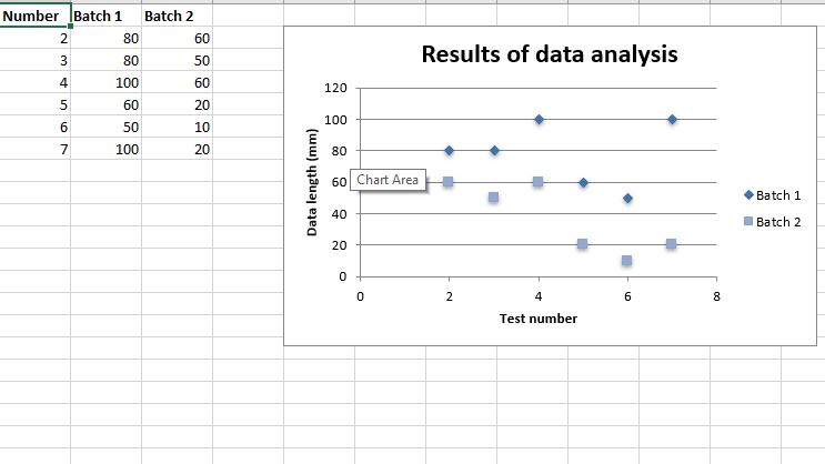 代码#2:用直线和标记绘制散点图子类型。
要在 Excel 工作表上绘制这种类型的图表,请使用 add_chart() 方法和工作簿对象的“scatter”类型和子类型“straight_with_markers”关键字参数。
# import xlsxwriter module
import xlsxwriter

# Workbook() takes one, non-optional, argument
# which is the filename that we want to create.
workbook = xlsxwriter.Workbook('chart_scatter2.xlsx')

# The workbook object is then used to add new
# worksheet via the add_worksheet() method.
worksheet = workbook.add_worksheet()

# Create a new Format object to formats cells
# in worksheets using add_format() method .

# here we create bold format object .
bold = workbook.add_format({'bold': 1})

# create a data list .
headings = ['Number', 'Batch 1', 'Batch 2']

data = [
    [2, 3, 4, 5, 6, 7],
    [80, 80, 100, 60, 50, 100],
    [60, 50, 60, 20, 10, 20],
]

# Write a row of data starting from 'A1'
# with bold format .
worksheet.write_row('A1', headings, bold)

# Write a column of data starting from
# 'A2', 'B2', 'C2' respectively .
worksheet.write_column('A2', data[0])
worksheet.write_column('B2', data[1])
worksheet.write_column('C2', data[2])

# Create a chart object that can be added
# to a worksheet using add_chart() method.

# here we create a  Scatter chart sub-type with
# straight lines and markers object .
chart1 = workbook.add_chart({'type': 'scatter', 'subtype': 'straight_with_markers'})

# Add a data series to a chart
# using add_series method.

# Configure the first series.
# = Sheet1 !$A$1 is equivalent to ['Sheet1', 0, 0].
chart1.add_series({
    'name':       '= Sheet1 !$B$1',
    'categories': '= Sheet1 !$A$2:$A$7',
    'values':     '= Sheet1 !$B$2:$B$7',
})

# Configure a second series.
# Note use of alternative syntax to define ranges.
# [sheetname, first_row, first_col, last_row, last_col].
chart1.add_series({
    'name':       ['Sheet1', 0, 2],
    'categories': ['Sheet1', 1, 0, 6, 0],
    'values':     ['Sheet1', 1, 2, 6, 2],
})

# Add a chart title
chart1.set_title ({'name': 'Results of data analysis'})

# Add x-axis label
chart1.set_x_axis({'name': 'Test number'})

# Add y-axis label
chart1.set_y_axis({'name': 'Data length (mm)'})

# Set an Excel chart style.
chart1.set_style(11)

# add chart to the worksheet
# the top-left corner of a chart
# is anchored to cell E2 .
worksheet.insert_chart('E2', chart1)

# Finally, close the Excel file
# via the close() method.
workbook.close()
输出: 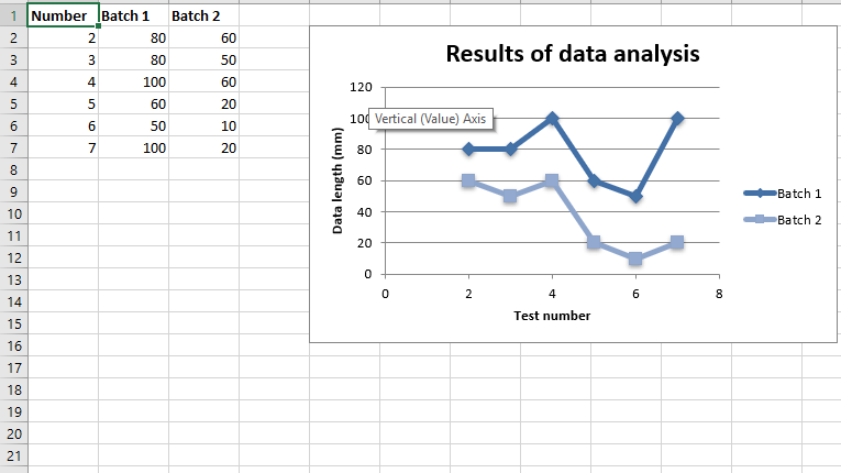 代码#3:用直线绘制散点图子类型,没有标记。
要在 Excel 工作表上绘制这种类型的图表,请使用 add_chart() 方法和工作簿对象的类型“scatter”和子类型“straight”关键字参数。
# import xlsxwriter module
import xlsxwriter

# Workbook() takes one, non-optional, argument
# which is the filename that we want to create.
workbook = xlsxwriter.Workbook('chart_scatter3.xlsx')

# The workbook object is then used to add new
# worksheet via the add_worksheet() method.
worksheet = workbook.add_worksheet()

# Create a new Format object to formats cells
# in worksheets using add_format() method .

# here we create bold format object .
bold = workbook.add_format({'bold': 1})

# create a data list .
headings = ['Number', 'Batch 1', 'Batch 2']

data = [
    [2, 3, 4, 5, 6, 7],
    [80, 80, 100, 60, 50, 100],
    [60, 50, 60, 20, 10, 20],
]

# Write a row of data starting from 'A1'
# with bold format .
worksheet.write_row('A1', headings, bold)

# Write a column of data starting from
# 'A2', 'B2', 'C2' respectively .
worksheet.write_column('A2', data[0])
worksheet.write_column('B2', data[1])
worksheet.write_column('C2', data[2])

# Create a chart object that can be added
# to a worksheet using add_chart() method.

# here we create a  Scatter chart sub-type with
# straight lines and no markers object .
chart1 = workbook.add_chart({'type': 'scatter', 'subtype': 'straight'})

# Add a data series to a chart
# using add_series method.

# Configure the first series.
# = Sheet1 !$A$1 is equivalent to ['Sheet1', 0, 0].
chart1.add_series({
    'name':       '= Sheet1 !$B$1',
    'categories': '= Sheet1 !$A$2:$A$7',
    'values':     '= Sheet1 !$B$2:$B$7',
})

# Configure a second series.
# Note use of alternative syntax to define ranges.
# [sheetname, first_row, first_col, last_row, last_col].
chart1.add_series({
    'name':       ['Sheet1', 0, 2],
    'categories': ['Sheet1', 1, 0, 6, 0],
    'values':     ['Sheet1', 1, 2, 6, 2],
})

# Add a chart title
chart1.set_title ({'name': 'Results of data analysis'})

# Add x-axis label
chart1.set_x_axis({'name': 'Test number'})

# Add y-axis label
chart1.set_y_axis({'name': 'Data length (mm)'})

# Set an Excel chart style.
chart1.set_style(11)

# add chart to the worksheet
# the top-left corner of a chart
# is anchored to cell E2 .
worksheet.insert_chart('E2', chart1)

# Finally, close the Excel file
# via the close() method.
workbook.close()
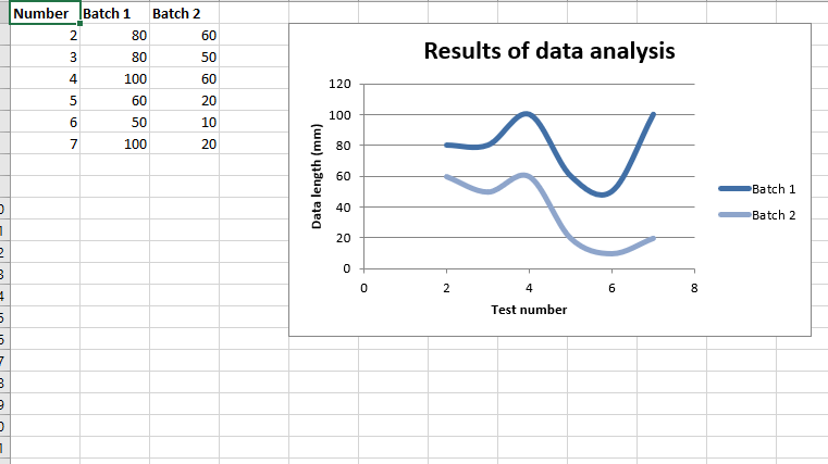
输出: 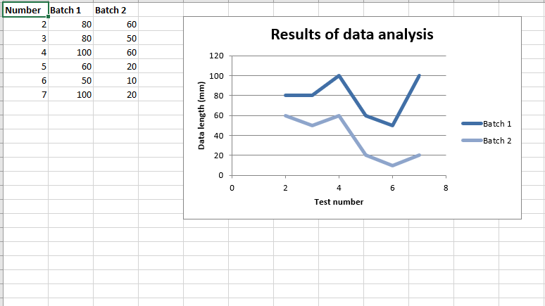 代码#4:用平滑的线条和标记绘制散点图子类型。
要在 Excel 工作表上绘制这种类型的图表,请使用 add_chart() 方法,工作簿对象的类型为“scatter”和子类型“smooth_with_markers”关键字参数。
# import xlsxwriter module
import xlsxwriter

# Workbook() takes one, non-optional, argument
# which is the filename that we want to create.
workbook = xlsxwriter.Workbook('chart_scatter4.xlsx')

# The workbook object is then used to add new
# worksheet via the add_worksheet() method.
worksheet = workbook.add_worksheet()

# Create a new Format object to formats cells
# in worksheets using add_format() method .

# here we create bold format object .
bold = workbook.add_format({'bold': 1})

# create a data list .
headings = ['Number', 'Batch 1', 'Batch 2']

data = [
    [2, 3, 4, 5, 6, 7],
    [80, 80, 100, 60, 50, 100],
    [60, 50, 60, 20, 10, 20],
]

# Write a row of data starting from 'A1'
# with bold format .
worksheet.write_row('A1', headings, bold)

# Write a column of data starting from
# 'A2', 'B2', 'C2' respectively .
worksheet.write_column('A2', data[0])
worksheet.write_column('B2', data[1])
worksheet.write_column('C2', data[2])

# Create a chart object that can be added
# to a worksheet using add_chart() method.

# here we create a  Scatter chart sub-type with
# smooth lines and markers object .
chart1 = workbook.add_chart({'type': 'scatter', 'subtype': 'smooth_with_markers'})

# Add a data series to a chart
# using add_series method.

# Configure the first series.
# = Sheet1 !$A$1 is equivalent to ['Sheet1', 0, 0].
chart1.add_series({
    'name':       '= Sheet1 !$B$1',
    'categories': '= Sheet1 !$A$2:$A$7',
    'values':     '= Sheet1 !$B$2:$B$7',
})

# Configure a second series.
# Note use of alternative syntax to define ranges.
# [sheetname, first_row, first_col, last_row, last_col].
chart1.add_series({
    'name':       ['Sheet1', 0, 2],
    'categories': ['Sheet1', 1, 0, 6, 0],
    'values':     ['Sheet1', 1, 2, 6, 2],
})

# Add a chart title
chart1.set_title ({'name': 'Results of data analysis'})

# Add x-axis label
chart1.set_x_axis({'name': 'Test number'})

# Add y-axis label
chart1.set_y_axis({'name': 'Data length (mm)'})

# Set an Excel chart style.
chart1.set_style(11)

# add chart to the worksheet
# the top-left corner of a chart
# is anchored to cell E2 .
worksheet.insert_chart('E2', chart1)

# Finally, close the Excel file
# via the close() method.
workbook.close()
输出 : 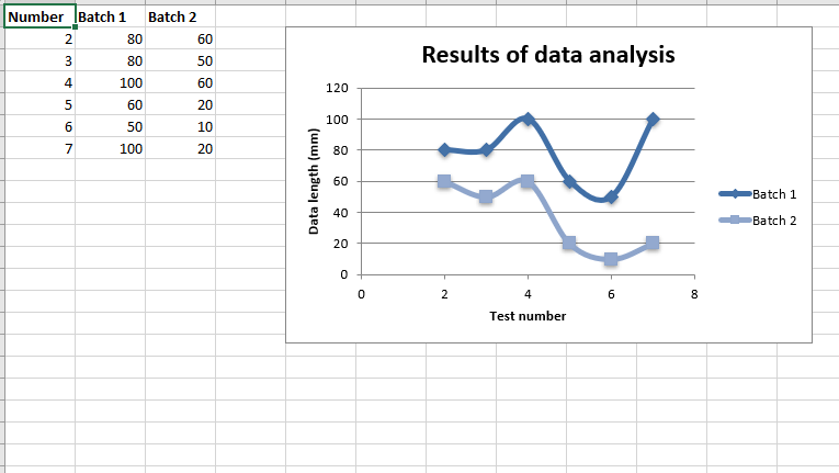 代码#5:绘制散点图子类型,线条流畅,没有标记。
要在 Excel 工作表上绘制这种类型的图表,请使用 add_chart() 方法,工作簿对象的类型为“scatter”和子类型“smooth”关键字参数。
# import xlsxwriter module
import xlsxwriter

# Workbook() takes one, non-optional, argument
# which is the filename that we want to create.
workbook = xlsxwriter.Workbook('chart_scatter5.xlsx')

# The workbook object is then used to add new
# worksheet via the add_worksheet() method.
worksheet = workbook.add_worksheet()

# Create a new Format object to formats cells
# in worksheets using add_format() method .

# here we create bold format object .
bold = workbook.add_format({'bold': 1})

# create a data list .
headings = ['Number', 'Batch 1', 'Batch 2']

data = [
    [2, 3, 4, 5, 6, 7],
    [80, 80, 100, 60, 50, 100],
    [60, 50, 60, 20, 10, 20],
]

# Write a row of data starting from 'A1'
# with bold format .
worksheet.write_row('A1', headings, bold)

# Write a column of data starting from
# 'A2', 'B2', 'C2' respectively .
worksheet.write_column('A2', data[0])
worksheet.write_column('B2', data[1])
worksheet.write_column('C2', data[2])

# Create a chart object that can be added
# to a worksheet using add_chart() method.

# here we create a  Scatter chart sub-type with
# smooth lines and no markers object .
chart1 = workbook.add_chart({'type': 'scatter', 'subtype': 'smooth'})

# Add a data series to a chart
# using add_series method.

# Configure the first series.
# = Sheet1 !$A$1 is equivalent to ['Sheet1', 0, 0].
chart1.add_series({
    'name':       '= Sheet1 !$B$1',
    'categories': '= Sheet1 !$A$2:$A$7',
    'values':     '= Sheet1 !$B$2:$B$7',
})

# Configure a second series.
# Note use of alternative syntax to define ranges.
# [sheetname, first_row, first_col, last_row, last_col].
chart1.add_series({
    'name':       ['Sheet1', 0, 2],
    'categories': ['Sheet1', 1, 0, 6, 0],
    'values':     ['Sheet1', 1, 2, 6, 2],
})

# Add a chart title
chart1.set_title ({'name': 'Results of data analysis'})

# Add x-axis label
chart1.set_x_axis({'name': 'Test number'})

# Add y-axis label
chart1.set_y_axis({'name': 'Data length (mm)'})

# Set an Excel chart style.
chart1.set_style(11)

# add chart to the worksheet
# the top-left corner of a chart
# is anchored to cell E2 .
worksheet.insert_chart('E2', chart1)

# Finally, close the Excel file
# via the close() method.
workbook.close()
输出: