将回归线添加到 R 中的 ggplot2 图
回归建模基于自变量的目标预测值。它主要用于找出变量和预测之间的关系。不同的回归模型因 - 它们正在考虑的因变量和自变量之间的关系类型以及所使用的自变量的数量而异。
理解事物的最好方法是可视化,我们可以通过在数据集中绘制回归线来可视化回归。在大多数情况下,我们使用散点图来表示我们的数据集并绘制一条回归线来可视化回归的工作方式。
方法:
在 R 编程语言中,很容易将事物可视化。绘制回归线的方法包括以下步骤:-
- 创建数据集以绘制数据点
- 使用 ggplot2 库使用 ggplot()函数绘制数据点
- 使用geom_point()函数在散点图中绘制数据集
- 使用任何平滑函数在数据集上绘制回归线,其中包括使用 lm()函数来计算线的截距和斜率。各种平滑功能如下所示。
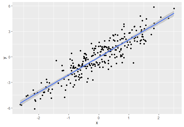
方法一:使用stat_smooth()
在 R 中,我们可以使用 stat_smooth()函数来平滑可视化。
Syntax: stat_smooth(method=”method_name”, formula=fromula_to_be_used, geom=’method name’)
Parameters:
- method: It is the smoothing method (function) to use for smoothing the line
- formula: It is the formula to use in the smoothing function
- geom: It is the geometric object to use display the data
为了在 stat_smooth()函数的帮助下在图形媒体上显示回归线,我们将方法传递为“lm”,该公式用作y ~ x 。和geom为“平滑”
R
# Create example data
rm(list = ls())
set.seed(87)
x <- rnorm(250)
y <- rnorm(250) + 2 *x
data <- data.frame(x, y)

# Print first rows of data
head(data)


# Install & load ggplot2
library("ggplot2")

# Create basic ggplot
# and Add regression line
ggp <- ggplot(data, aes(x, y)) +
  geom_point()
ggp
ggp +
  stat_smooth(method = "lm",
              formula = y ~ x,
              geom = "smooth")
R
# importing essential libraries
library(dplyr)

# Load the data
data("Boston", package = "MASS")

# Split the data into training and test set
training.samples <- Boston$medv %>%
  createDataPartition(p = 0.85, list = FALSE)

#Create train and test data
train.data  <- Boston[training.samples, ]
test.data <- Boston[-training.samples, ]

# plotting the data
ggp<-ggplot(train.data, aes(lstat, medv) ) +
  geom_point()

# adding the regression line to it
ggp+geom_smooth(method = "loess",
              formula = y ~ x)
R
rm(list = ls())

# Install & load ggplot2
library("ggplot2")


set.seed(87)

# Create example data
x <- rnorm(250)
y <- rnorm(250) + 2 *x
data <- data.frame(x, y)

reg<-lm(formula = y ~ x,
   data=data)

#get intercept and slope value
coeff<-coefficients(reg)
intercept<-coeff[1]
slope<- coeff[2]

# Create basic ggplot
ggp <- ggplot(data, aes(x, y)) +
  geom_point()

# add the regression line
ggp+geom_abline(intercept = intercept, slope = slope, color="red",
               linetype="dashed", size=1.5)+
  ggtitle("geeksforgeeks")
输出:
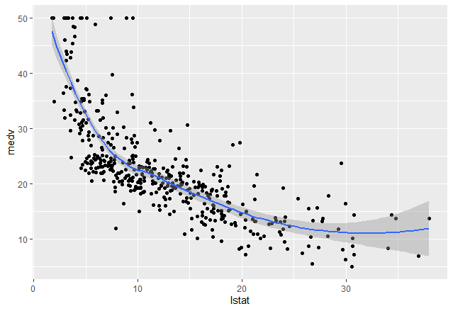
方法 2:使用 geom_smooth()
在 R 中,我们可以使用 geom_smooth()函数来表示回归线并平滑可视化。
Syntax: geom_smooth(method=”method_name”, formula=fromula_to_be_used)
Parameters:
- method: It is the smoothing method (function) to use for smoothing the line
- formula: It is the formula to use in the smoothing function
在此示例中,我们使用波士顿数据集,其中包含来自名为 MASS 的包的房价数据。为了借助 geom_smooth()函数在图形媒体上显示回归线,我们通过 方法为“黄土” ,公式为y ~ x 。
电阻
# importing essential libraries
library(dplyr)

# Load the data
data("Boston", package = "MASS")

# Split the data into training and test set
training.samples <- Boston$medv %>%
  createDataPartition(p = 0.85, list = FALSE)

#Create train and test data
train.data  <- Boston[training.samples, ]
test.data <- Boston[-training.samples, ]

# plotting the data
ggp<-ggplot(train.data, aes(lstat, medv) ) +
  geom_point()

# adding the regression line to it
ggp+geom_smooth(method = "loess",
              formula = y ~ x)
输出:
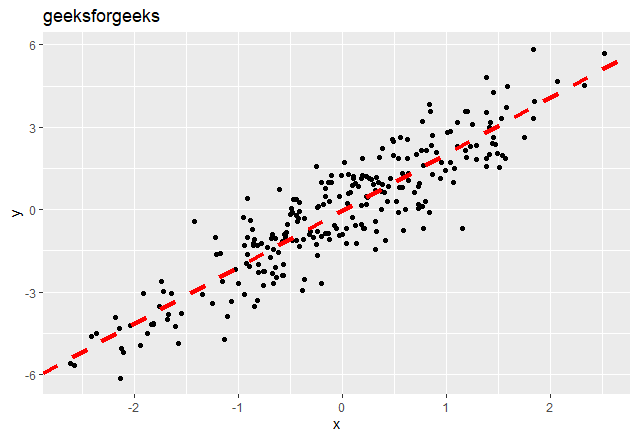
方法 3:使用 geom_abline()
我们可以使用 geom_abline()函数创建回归线。它使用通过使用 lm()函数应用线性回归计算的系数和截距。
Syntax: geom_abline(intercept, slope, linetype, color, size)
Parameters:
- intercept: The calculated y intercept of the line to be drawn
- slope: Slope of the line to be drawn
- linetype: Specifies the type of the line to be drawn
- color: Color of the lone to be drawn
- size: Indicates the size of the line
截距和斜率可以通过 lm()函数轻松计算,该函数用于线性回归,后跟系数()。
电阻
rm(list = ls())

# Install & load ggplot2
library("ggplot2")


set.seed(87)

# Create example data
x <- rnorm(250)
y <- rnorm(250) + 2 *x
data <- data.frame(x, y)

reg<-lm(formula = y ~ x,
   data=data)

#get intercept and slope value
coeff<-coefficients(reg)
intercept<-coeff[1]
slope<- coeff[2]

# Create basic ggplot
ggp <- ggplot(data, aes(x, y)) +
  geom_point()

# add the regression line
ggp+geom_abline(intercept = intercept, slope = slope, color="red",
               linetype="dashed", size=1.5)+
  ggtitle("geeksforgeeks")
输出: