R - 统计
统计学是一种数学分析形式,涉及数据的收集、组织、分析、解释和呈现。统计分析有助于充分利用可用的大量数据并提高解决方案的效率。
R - 统计
R 是一种编程语言,用于环境统计计算和图形。以下是对基本统计概念的介绍,例如绘制条形图、饼图、直方图和箱线图等图形。
在这篇文章中,我们将学习如何为单个变量绘制图表。在 R 中学习和实现统计需要以下软件:
- 软件
- RStudio IDE
在 R 编程语言中的统计中绘制图形的函数
以下是绘制图表以表示统计数据所需的函数列表:
- plot()函数:此函数用于绘制带有轴和标题的散点图。
句法:
plot(x, y = NULL, ylim = NULL, xlim = NULL, type = “b”….)
- data()函数:此函数用于加载指定的数据集。
句法:
data(list = character(), lib.loc = NULL, package = NULL…..)
- table()函数: table函数用于构建每个因子水平组合的计数列联表。
table(x, row.names = NULL, ...)- barplot()函数:它创建一个带有垂直/水平条的条形图。
句法:
barplot(height, width = 1, names.arg = NULL, space = NULL…)
- pie()函数:该函数用于创建饼图。
句法:
pie(x, labels = names(x), radius = 0.6, edges = 100, clockwise = TRUE …)
- hist()函数:函数hist()创建给定数据值的直方图。
句法:
hist(x, breaks = “Sturges”, probability = !freq, freq = NULL,…)
注意:您可以使用“?”找到有关每个函数的信息每个函数开始前的符号。
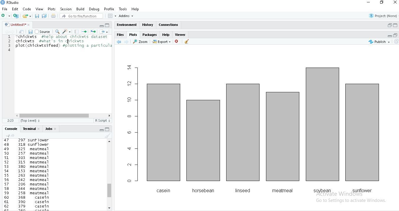
R 内置数据集对于入门和开发技能非常有用,因此我们将使用一些内置数据集。让我们从使用chickwts数据集创建一个简单的条形图开始,并学习如何使用数据集和RStudio的一些功能。
条形图
条形图表示带有矩形条的分类数据,其中条可以垂直或水平绘制。
R
# ? is used before a function
# to get help on that function
?plot
?chickwts
data(chickwts) #loading data into workspace
plot(chickwts$feed) # plot feed from chickwts
R
feeds=table(chickwts$feed)

# plots graph in decreasing order
barplot(feeds[order(feeds, decreasing=TRUE)])
R
feeds = table(chickwts$feed)

# outside margins bottom, left, top, right.
par(oma=c(1, 1, 1, 1))
par(mar=c(4, 5, 2, 1))

# las is used orientation of axis labels
barplot(feeds[order(feeds, decreasing=TRUE)]

# horiz is used for bars to be shown as horizontal.
barplot(feeds[order(feeds)], horiz=TRUE,

# col is used for colouring bars.
# xlab is used to label x-axis.
xlab="Number of chicks", las=1 col="yellow")
R
data("chickwts")

# main is used to create
# an heading for the chart
d = table(chickwts$feed)

pie(d[order(d, decreasing=TRUE)],
    clockwise=TRUE,
    main="Pie Chart of feeds from chichwits", )
R
# break is used for number of bins.
data(lynx)

# lynx is a built-in dataset.
lynx

# hist function is used to plot histogram.
hist(lynx)
hist(lynx, break=7, col="green",
    main="Histogram of Annual Canadian Lynx Trappings")
R
data(lynx)

# if freq=FALSE this will draw normal distribution
lynx
hist(lynx)
hist(lynx, break=7, col="green",
    freq=FALSE main="Histogram of Annual Canadian Lynx Trappings")

curve(dnorm(x, mean=mean(lynx),
            sd=sd(lynx)), col="red",
            lwd=2, add=TRUE)
R
# USJudgeRatings is Built-in Dataset.
?USJudgeRatings

# ylim is used to specify the range.
boxplot(USJudgeRatings$RTEN, horizontal=TRUE,
        xlab="Lawyers Rating", notch=TRUE,
ylim=c(0, 10), col="pink")在上面的代码中'?'在特定函数前面意味着它通过其语法提供有关该函数的信息。在R中'#'用于注释单行,R中没有多行注释。这里我们使用chickwts作为数据集,feed是数据集中的属性。
输出:
R
feeds=table(chickwts$feed)

# plots graph in decreasing order
barplot(feeds[order(feeds, decreasing=TRUE)])
输出:

R
feeds = table(chickwts$feed)

# outside margins bottom, left, top, right.
par(oma=c(1, 1, 1, 1))
par(mar=c(4, 5, 2, 1))

# las is used orientation of axis labels
barplot(feeds[order(feeds, decreasing=TRUE)]

# horiz is used for bars to be shown as horizontal.
barplot(feeds[order(feeds)], horiz=TRUE,

# col is used for colouring bars.
# xlab is used to label x-axis.
xlab="Number of chicks", las=1 col="yellow")
输出:

饼状图
饼图是一个圆形统计图,它被分成多个切片来显示不同大小的数据。
R
data("chickwts")

# main is used to create
# an heading for the chart
d = table(chickwts$feed)

pie(d[order(d, decreasing=TRUE)],
    clockwise=TRUE,
    main="Pie Chart of feeds from chichwits", )
输出:

直方图
直方图是数据(数字或分类)分布的表示。它类似于条形图,但它根据范围对数据进行分组。
R
# break is used for number of bins.
data(lynx)

# lynx is a built-in dataset.
lynx

# hist function is used to plot histogram.
hist(lynx)
hist(lynx, break=7, col="green",
    main="Histogram of Annual Canadian Lynx Trappings")
输出 :

R
data(lynx)

# if freq=FALSE this will draw normal distribution
lynx
hist(lynx)
hist(lynx, break=7, col="green",
    freq=FALSE main="Histogram of Annual Canadian Lynx Trappings")

curve(dnorm(x, mean=mean(lynx),
            sd=sd(lynx)), col="red",
            lwd=2, add=TRUE)
输出:

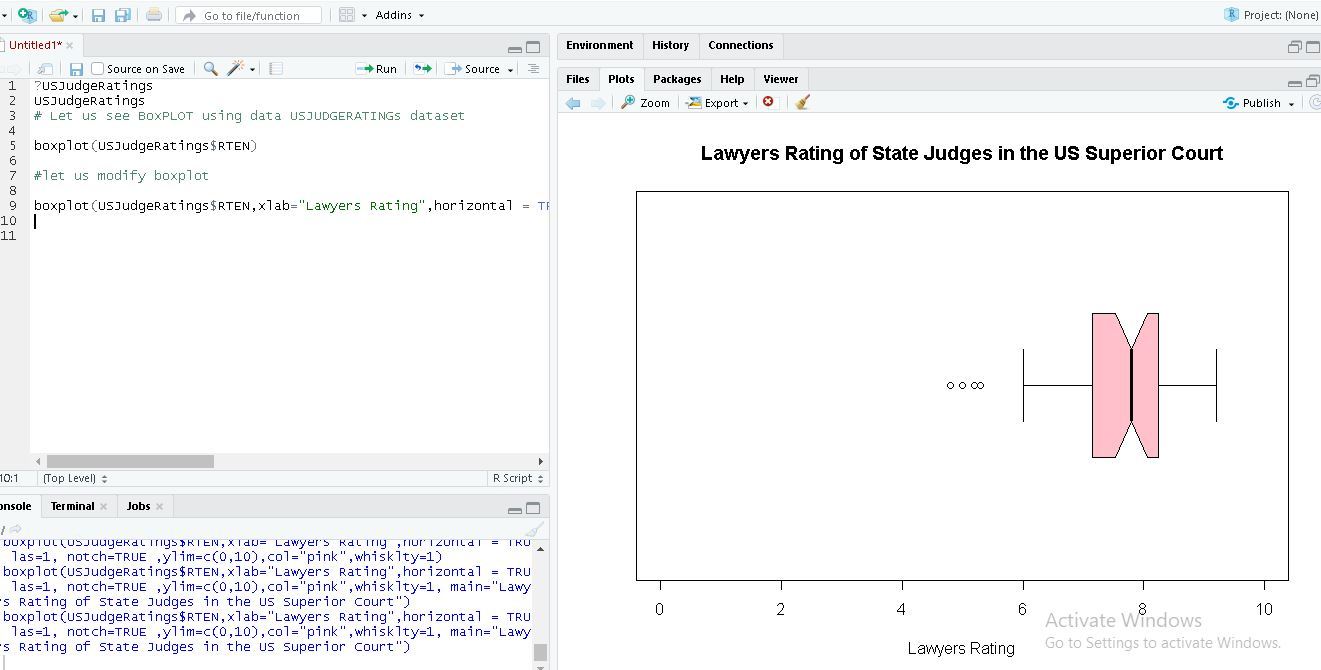
箱线图
箱线图是一种使用四分位数以图形方式描绘数值数据组的函数。它代表数据的分布并理解均值、中值和方差。
R
# USJudgeRatings is Built-in Dataset.
?USJudgeRatings

# ylim is used to specify the range.
boxplot(USJudgeRatings$RTEN, horizontal=TRUE,
        xlab="Lawyers Rating", notch=TRUE,
        ylim=c(0, 10), col="pink")
USJudgeRating 是一个具有 6 个属性的内置数据集,RTEN 是其中一个属性,它的评分在 0 到 10 之间。我们用它来绘制具有不同 boxplot函数属性的箱线图。
输出: