使用 graph_objects 类在 Plotly 中散点图
Plotly是一个Python库,用于设计图形,尤其是交互式图形。它可以绘制各种图形和图表,如直方图、条形图、箱线图、散布图等等。它主要用于数据分析和财务分析。 plotly 是一个交互式可视化库。
使用 graph_objects 类的散点图
散点图是那些数据点在水平轴和垂直轴上表示的图表,以显示一个变量如何影响另一个变量。 graph_objects 类的 scatter() 方法产生一个散点轨迹。属性的模式决定了数据点的外观。
Syntax: plotly.graph_objects.Scatter(arg=None, cliponaxis=None, connectgaps=None, customdata=None, customdatasrc=None, dx=None, dy=None, error_x=None, error_y=None, fill=None, fillcolor=None, groupnorm=None, hoverinfo=None, hoverinfosrc=None, hoverlabel=None, hoveron=None, hovertemplate=None, hovertemplatesrc=None, hovertext=None, hovertextsrc=None, ids=None, idssrc=None, legendgroup=None, line=None, marker=None, meta=None, metasrc=None, mode=None, name=None, opacity=None, orientation=None, r=None, rsrc=None, selected=None, selectedpoints=None, showlegend=None, stackgaps=None, stackgroup=None, stream=None, t=None, text=None, textfont=None, textposition=None, textpositionsrc=None, textsrc=None, texttemplate=None, texttemplatesrc=None, tsrc=None, uid=None, uirevision=None, unselected=None, visible=None, x=None, x0=None, xaxis=None, xcalendar=None, xsrc=None, y=None, y0=None, yaxis=None, ycalendar=None, ysrc=None, **kwargs)
参数:Name Description dx Sets the x coordinate step. dy Sets the y coordinate step. x Sets the x coordinates. x0 Alternate to x. Builds a linear space of x coordinates. Use with dx where x0 is the starting coordinate and dx the step. y Sets the y coordinates. y0 Alternate to y. Builds a linear space of y coordinates. Use with dy where y0 is the starting coordinate and dy the step.
例子:
Python3
import plotly.graph_objects as px
import numpy as np


# creating random data through randomint
# function of numpy.random
np.random.seed(42)

random_x= np.random.randint(1,101,100)
random_y= np.random.randint(1,101,100)

plot = px.Figure(data=[px.Scatter(
    x = random_x,
    y = random_y,
    mode = 'markers',)
])

plot.show()
Python3
import plotly.graph_objects as go
import numpy as np

n = 10000
plot = go.Figure(data=[go.Scatter(
    x = np.random.randn(n),
    mode = 'markers',
    marker=dict(
        color=np.random.randn(n),
        colorscale='Viridis',
        showscale=True
    )
)
])

plot.show()
Python3
import plotly.graph_objects as px
import numpy as np


# creating random data through randomint
# function of numpy.random
np.random.seed(42)

random_x= np.random.randint(1,101,100)
random_y= np.random.randint(1,101,100)

plot = px.Figure(data=[px.Scatter(
    x = random_x,
    y = random_y,
    mode = 'markers',
    marker_color='rgba(199, 10, 165, .9)')
])

plot.show()
Python3
import plotly.graph_objects as px
import plotly.express as go
import numpy as np

df = go.data.tips()

x = df['total_bill']
y = df['day']

plot = px.Figure(data=[px.Scatter(
    x = x,
    y = y,
    mode = 'markers',
    marker_color='rgba(199, 10, 165, .9)')
])

plot.update_traces(mode='markers', marker_size=10)

plot.show()
Python3
import plotly.graph_objects as px
import numpy as np


# creating random data through randomint
# function of numpy.random
np.random.seed(42)

random_x= np.random.randint(1,101,100)
random_y= np.random.randint(1,101,100)

plot = px.Figure(data=[px.Scatter(
    x = random_x,
    y = random_y,
    mode = 'markers',
    marker_size = [115, 20, 30])
])

plot.show()
输出:

用颜色维度呈现散点图
可以使用 showscale 参数显示色阶。此参数采用布尔值。如果该值为真,则显示比例,否则不显示。
例子:
Python3
import plotly.graph_objects as go
import numpy as np

n = 10000
plot = go.Figure(data=[go.Scatter(
    x = np.random.randn(n),
    mode = 'markers',
    marker=dict(
        color=np.random.randn(n),
        colorscale='Viridis',
        showscale=True
    )
)
])

plot.show()
输出:

样式化散点图
在散点图中可以使用关键字参数设置样式,让我们看看下面给出的示例:
示例 1:更改图表的颜色
Python3
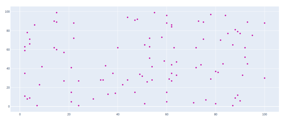
import plotly.graph_objects as px
import numpy as np


# creating random data through randomint
# function of numpy.random
np.random.seed(42)

random_x= np.random.randint(1,101,100)
random_y= np.random.randint(1,101,100)

plot = px.Figure(data=[px.Scatter(
    x = random_x,
    y = random_y,
    mode = 'markers',
    marker_color='rgba(199, 10, 165, .9)')
])

plot.show()
输出:
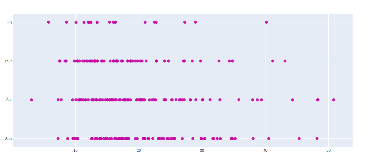
示例 2:使用提示数据集
Python3
import plotly.graph_objects as px
import plotly.express as go
import numpy as np

df = go.data.tips()

x = df['total_bill']
y = df['day']

plot = px.Figure(data=[px.Scatter(
    x = x,
    y = y,
    mode = 'markers',
    marker_color='rgba(199, 10, 165, .9)')
])

plot.update_traces(mode='markers', marker_size=10)

plot.show()
输出:
气泡散点图
可以使用标记大小创建气泡散点图。标记大小和颜色用于控制标记的整体大小。标记大小有助于保持图表中气泡内的颜色。
例子:
Python3
import plotly.graph_objects as px
import numpy as np


# creating random data through randomint
# function of numpy.random
np.random.seed(42)

random_x= np.random.randint(1,101,100)
random_y= np.random.randint(1,101,100)

plot = px.Figure(data=[px.Scatter(
    x = random_x,
    y = random_y,
    mode = 'markers',
    marker_size = [115, 20, 30])
])

plot.show()
输出:
