在Python可视化二元高斯分布
高斯分布(或正态分布)是自然界中最基本的概率分布之一。从它在日常生活中的出现到它在统计学习技术中的应用,它是有史以来最深刻的数学发现之一。本文将继续研究多维分布,并对二元正态分布有一个直观的了解。
覆盖二元分布的好处是我们可以使用适当的几何图直观地看到和理解。此外,通过二元分布学习的相同概念可以扩展到任意数量的维度。我们将首先简要介绍分布的理论方面,并对其各个方面进行详尽的分析,例如Python的协方差矩阵和密度函数!
二元高斯分布的概率密度函数(或密度函数或 PDF)
密度函数描述随机变量的相对似然 在给定的样本。如果给定样本附近的值很高,则意味着随机变量很可能在随机采样时采用该值。负责其特征的“钟形”,即给定二元高斯随机变量的密度函数
 在数学上定义为:
在哪里 是任何输入向量
 而符号
而符号 和
和 有他们通常的意思。
本文中使用的主要函数是 Scipy 实用程序中的 scipy.stats.multivariate_normal函数,用于 多元正态随机变量。
Syntax: scipy.stats.multivariate_normal(mean=None, cov=1)
Non-optional Parameters:
- mean: A Numpy array specifyinh the mean of the distribution
- cov: A Numpy array specifying a positive definite covariance matrix
- seed: A random seed for generating reproducible results
Returns: A multivariate normal random variable object scipy.stats._multivariate.multivariate_normal_gen object. Some of the methods of the returned object which are useful for this article are as follows:
- pdf(x): Returns the density function value at the value ‘x’
- rvs(size): Draws ‘size’ number of samples from the generated multivariate Gaussian distribution
协方差矩阵的“视觉”视图
协方差矩阵可能是二元高斯分布中最丰富的组件之一。协方差矩阵的每个元素定义了每个后续随机变量对之间的协方差。两个随机变量之间的协方差 和
和 在数学上定义为
![\sigma(X_1,X_2) = \mathop{\mathbb{E}}[(X_1-\mathop{\mathbb{E}}[X_1])(X_2-\mathop{\mathbb{E}}[X_2])]](https://mangodoc.oss-cn-beijing.aliyuncs.com/geek8geeks/Visualizing_the_Bivariate_Gaussian_Distribution_in_Python_9.jpg "由 QuickLaTeX.com 渲染") 在哪里
在哪里![\mathop{\mathbb{E}}[X]](https://mangodoc.oss-cn-beijing.aliyuncs.com/geek8geeks/Visualizing_the_Bivariate_Gaussian_Distribution_in_Python_10.jpg "由 QuickLaTeX.com 渲染") 表示给定随机变量的期望值
表示给定随机变量的期望值 .直观地说,通过观察协方差矩阵的对角元素,我们可以很容易地想象出由两个高斯随机变量在二维中绘制的轮廓。就是这样:
右侧对角线上的值表示相应随机变量的两个分量之间的联合协方差。如果值为 +ve,则意味着两个随机变量之间存在正协方差,这意味着如果我们朝着一个方向前进 然后增加
然后增加 也会朝那个方向增加,反之亦然。同样,如果值为负,则意味着
 会朝着增加的方向减少
 .
.
下面是协方差矩阵的实现:
在以下代码片段中,我们将生成具有相同均值的 3 个不同的高斯双变量分布![\mu = \begin{bmatrix}0\\[1ex]0\end{bmatrix}](https://mangodoc.oss-cn-beijing.aliyuncs.com/geek8geeks/Visualizing_the_Bivariate_Gaussian_Distribution_in_Python_16.jpg "由 QuickLaTeX.com 渲染") 但不同的协方差矩阵:
但不同的协方差矩阵:
- 具有 -ve 协方差的协方差矩阵 =
- 协方差为 0 的协方差矩阵 =
![\begin{bmatrix}1&0 \\[1ex] 0&1 \end{bmatrix}](https://mangodoc.oss-cn-beijing.aliyuncs.com/geek8geeks/Visualizing_the_Bivariate_Gaussian_Distribution_in_Python_18.jpg "由 QuickLaTeX.com 渲染")
- 协方差矩阵 +ve 协方差 =
![\begin{bmatrix}1&0.8 \\[1ex] 0.8&1 \end{bmatrix}](https://mangodoc.oss-cn-beijing.aliyuncs.com/geek8geeks/Visualizing_the_Bivariate_Gaussian_Distribution_in_Python_19.jpg "由 QuickLaTeX.com 渲染")
Python
# Importing the necessary modules
import numpy as np
import matplotlib.pyplot as plt
from scipy.stats import multivariate_normal


plt.style.use('seaborn-dark')
plt.rcParams['figure.figsize']=14,6

# Initializing the random seed
random_seed=1000

# List containing the variance
# covariance values
cov_val = [-0.8, 0, 0.8]

# Setting mean of the distributino to
# be at (0,0)
mean = np.array([0,0])

# Iterating over different covariance
# values
for idx, val in enumerate(cov_val):
    plt.subplot(1,3,idx+1)

    # Initializing the covariance matrix
    cov = np.array([[1, val], [val, 1]])

    # Generating a Gaussian bivariate distribution
    # with given mean and covariance matrix
    distr = multivariate_normal(cov = cov, mean = mean,
                                seed = random_seed)

    # Generating 5000 samples out of the
    # distribution
    data = distr.rvs(size = 5000)

    # Plotting the generated samples
    plt.plot(data[:,0],data[:,1], 'o', c='lime',
             markeredgewidth = 0.5,
             markeredgecolor = 'black')
    plt.title(f'Covariance between x1 and x2 = {val}')
    plt.xlabel('x1')
    plt.ylabel('x2')
    plt.axis('equal')

plt.show()
Python
# Importing the necessary modules
import numpy as np
import matplotlib.pyplot as plt
from scipy.stats import multivariate_normal


plt.style.use('seaborn-dark')
plt.rcParams['figure.figsize']=14,6
fig = plt.figure()

# Initializing the random seed
random_seed=1000

# List containing the variance
# covariance values
cov_val = [-0.8, 0, 0.8]

# Setting mean of the distributino
# to be at (0,0)
mean = np.array([0,0])

# Storing density function values for
# further analysis
pdf_list = []

# Iterating over different covariance values
for idx, val in enumerate(cov_val):

    # Initializing the covariance matrix
    cov = np.array([[1, val], [val, 1]])

    # Generating a Gaussian bivariate distribution
    # with given mean and covariance matrix
    distr = multivariate_normal(cov = cov, mean = mean,
                                seed = random_seed)

    # Generating a meshgrid complacent with
    # the 3-sigma boundary
    mean_1, mean_2 = mean[0], mean[1]
    sigma_1, sigma_2 = cov[0,0], cov[1,1]

    x = np.linspace(-3*sigma_1, 3*sigma_1, num=100)
    y = np.linspace(-3*sigma_2, 3*sigma_2, num=100)
    X, Y = np.meshgrid(x,y)

    # Generating the density function
    # for each point in the meshgrid
    pdf = np.zeros(X.shape)
    for i in range(X.shape[0]):
        for j in range(X.shape[1]):
            pdf[i,j] = distr.pdf([X[i,j], Y[i,j]])

    # Plotting the density function values
    key = 131+idx
    ax = fig.add_subplot(key, projection = '3d')
    ax.plot_surface(X, Y, pdf, cmap = 'viridis')
    plt.xlabel("x1")
    plt.ylabel("x2")
    plt.title(f'Covariance between x1 and x2 = {val}')
    pdf_list.append(pdf)
    ax.axes.zaxis.set_ticks([])

plt.tight_layout()
plt.show()

# Plotting contour plots
for idx, val in enumerate(pdf_list):
    plt.subplot(1,3,idx+1)
    plt.contourf(X, Y, val, cmap='viridis')
    plt.xlabel("x1")
    plt.ylabel("x2")
    plt.title(f'Covariance between x1 and x2 = {cov_val[idx]}')
plt.tight_layout()
plt.show()
输出:
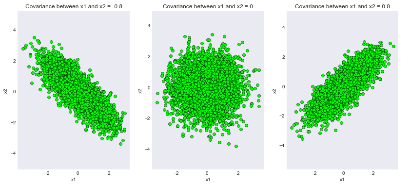
为不同协方差矩阵生成的样本
我们可以看到代码的输出已经成功满足了我们的理论证明!请注意,取值 0.8 只是为了方便起见。读者可以尝试不同程度的协方差并期望得到一致的结果。
概率密度函数的3D 视图:
现在我们可以转到二元高斯分布中最有趣和最具特征的方面之一,密度函数!密度函数负责分布的特征钟形。
Python
# Importing the necessary modules
import numpy as np
import matplotlib.pyplot as plt
from scipy.stats import multivariate_normal


plt.style.use('seaborn-dark')
plt.rcParams['figure.figsize']=14,6
fig = plt.figure()

# Initializing the random seed
random_seed=1000

# List containing the variance
# covariance values
cov_val = [-0.8, 0, 0.8]

# Setting mean of the distributino
# to be at (0,0)
mean = np.array([0,0])

# Storing density function values for
# further analysis
pdf_list = []

# Iterating over different covariance values
for idx, val in enumerate(cov_val):

    # Initializing the covariance matrix
    cov = np.array([[1, val], [val, 1]])

    # Generating a Gaussian bivariate distribution
    # with given mean and covariance matrix
    distr = multivariate_normal(cov = cov, mean = mean,
                                seed = random_seed)

    # Generating a meshgrid complacent with
    # the 3-sigma boundary
    mean_1, mean_2 = mean[0], mean[1]
    sigma_1, sigma_2 = cov[0,0], cov[1,1]

    x = np.linspace(-3*sigma_1, 3*sigma_1, num=100)
    y = np.linspace(-3*sigma_2, 3*sigma_2, num=100)
    X, Y = np.meshgrid(x,y)

    # Generating the density function
    # for each point in the meshgrid
    pdf = np.zeros(X.shape)
    for i in range(X.shape[0]):
        for j in range(X.shape[1]):
            pdf[i,j] = distr.pdf([X[i,j], Y[i,j]])

    # Plotting the density function values
    key = 131+idx
    ax = fig.add_subplot(key, projection = '3d')
    ax.plot_surface(X, Y, pdf, cmap = 'viridis')
    plt.xlabel("x1")
    plt.ylabel("x2")
    plt.title(f'Covariance between x1 and x2 = {val}')
    pdf_list.append(pdf)
    ax.axes.zaxis.set_ticks([])

plt.tight_layout()
plt.show()

# Plotting contour plots
for idx, val in enumerate(pdf_list):
    plt.subplot(1,3,idx+1)
    plt.contourf(X, Y, val, cmap='viridis')
    plt.xlabel("x1")
    plt.ylabel("x2")
    plt.title(f'Covariance between x1 and x2 = {cov_val[idx]}')
plt.tight_layout()
plt.show()
输出:
1) 密度函数
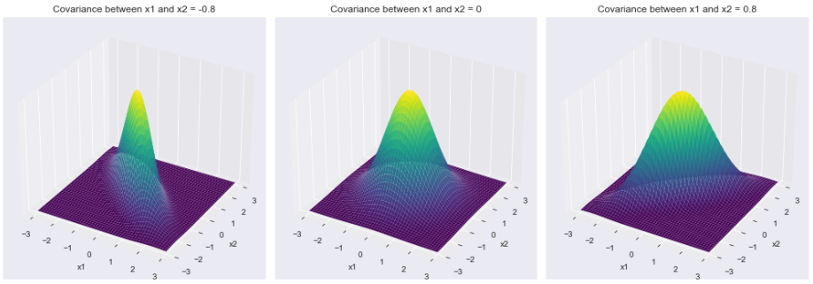
不同协方差矩阵对应的密度函数
2) 等高线图
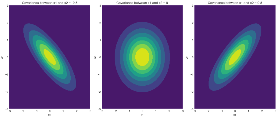
密度函数的轮廓
如我们所见,密度函数的轮廓与我们在上一节中绘制的样本完全匹配。请注意,3 西格玛边界(从 68-95-99.7 规则得出)确保了定义分布的最大样本覆盖率。如前所述,读者可以玩转不同的边界并期望得到一致的结果。
结论
我们通过一系列绘图了解了高斯双变量分布背后的各种复杂性,并使用Python用实际发现验证了理论结果。鼓励读者玩弄代码片段,以获得关于这个神奇分布的更深刻的直觉!