Python|使用openpyxl模块在excel表格中绘制图表|套装 – 1
先决条件:使用 openpyxl 读写到 excel 工作表
Openpyxl是一个Python库,使用它可以对 excel 文件执行多种操作,例如读取、写入、算术运算和绘图。让我们看看如何使用实时数据绘制不同的图表。
图表由至少一系列的一个或多个数据点组成。系列本身由对单元格范围的引用组成。
为了在 Excel 表上绘制图表,首先,创建特定图表类(即 BarChart、LineChart 等)的图表对象。创建图表对象后,在其中插入数据,最后,将该图表对象添加到工作表对象中。
代码 #1:绘制条形图
要在 Excel 工作表上绘制条形图,请使用 openpyxl.chart 子模块中的BarChart class 。
# import openpyxl module
import openpyxl

# import BarChart class from openpyxl.chart sub_module
from openpyxl.chart import BarChart,Reference

# Call a Workbook() function of openpyxl
# to create a new blank Workbook object
wb = openpyxl.Workbook()

# Get workbook active sheet
# from the active attribute.
sheet = wb.active

# write o to 9 in 1st column of the active sheet
for i in range(10):
    sheet.append([i])

# create data for plotting
values = Reference(sheet, min_col = 1, min_row = 1,
                         max_col = 1, max_row = 10)

# Create object of BarChart class
chart = BarChart()

# adding data to the Bar chart object
chart.add_data(values)

# set the title of the chart
chart.title = " BAR-CHART "

# set the title of the x-axis
chart.x_axis.title = " X_AXIS "

# set the title of the y-axis
chart.y_axis.title = " Y_AXIS "

# add chart to the sheet
# the top-left corner of a chart
# is anchored to cell E2 .
sheet.add_chart(chart, "E2")

# save the file
wb.save("barChart.xlsx")
输出: 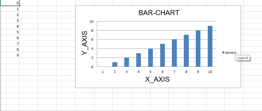
代码 #2:绘制 3D 条形图
要在 Excel 工作表上绘制 3D 条形图,请使用 openpyxl.chart 子模块中的BarChart3D class 。
# import openpyxl module
import openpyxl

# import BarChart3D class from openpyxl.chart sub_module
from openpyxl.chart import BarChart3D,Reference

# write o to 9 in 1st column of the active sheet
for i in range(10):
    sheet.append([i])

values = Reference(sheet, min_col = 1, min_row = 1,
                         max_col = 1, max_row = 10)

# Create object of BarChart3D class
chart = BarChart3D()

chart.add_data(values)

# set the title of the chart
chart.title = " BAR-CHART3D "

# set the title of the x-axis
chart.x_axis.title = " X AXIS "

# set the title of the y-axis
chart.y_axis.title = " Y AXIS "

# add chart to the sheet
# the top-left corner of a chart
# is anchored to cell E2.
sheet.add_chart(chart, "E2")

# save the file
wb.save("BarChart3D.xlsx")
输出: 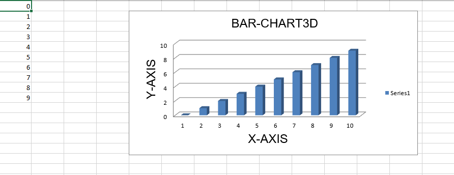
代码#3:绘制面积图
要在 Excel 工作表上绘制面积图,请使用 openpyxl.chart 子模块中的AreaChart class 。
import openpyxl

# import AreaChart class from openpyxl.chart sub_module
from openpyxl.chart import AreaChart,Reference


wb = openpyxl.Workbook()
sheet = wb.active

# write o to 9 in 1st column of the active sheet
for i in range(10):
    sheet.append([i])

values = Reference(sheet, min_col = 1, min_row = 1,
                         max_col = 1, max_row = 10)

# create object of AreaChart class
chart = AreaChart()

chart.add_data(values)

# set the title of the chart
chart.title = " AREA-CHART "

# set the title of the x-axis
chart.x_axis.title = " X-AXIS "

# set the title of the y-axis
chart.y_axis.title = " Y-AXIS "

# add chart to the sheet
# the top-left corner of a chart
# is anchored to cell E2 .
sheet.add_chart(chart, "E2")

# save the file
wb.save("AreaChart.xlsx")
输出: 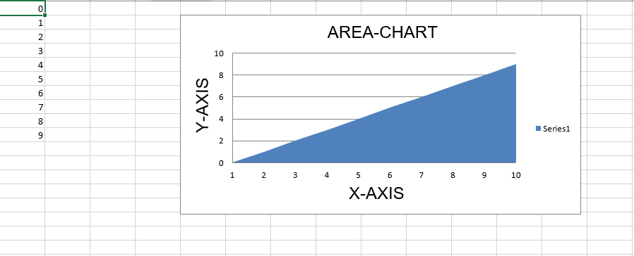
代码 #4:绘制 3D 面积图
要在 Excel 工作表上绘制 3D 面积图,请使用 openpyxl.chart 子模块中的AreaChart3D class 。
import openpyxl

# import AreaChart3D class from openpyxl.chart sub_module
from openpyxl.chart import AreaChart3D,Reference

wb = openpyxl.Workbook()
sheet = wb.active

# write o to 9 in 1st column of the active sheet
for i in range(10):
    sheet.append([i])

values = Reference(sheet, min_col = 1, min_row = 1,
                         max_col = 1, max_row = 10)

# Create object of AreaChart3D class
chart = AreaChart3D()

chart.add_data(values)

# set the title of the chart
chart.title = " AREA-CHART3D "

# set the title of the x-axis
chart.x_axis.title = " X-AXIS "

# set the title of the y-axis
chart.y_axis.title = " Y-AXIS "

# add chart to the sheet
# the top-left corner of a chart
# is anchored to cell E2 .
sheet.add_chart(chart, "E2")

# save the file
wb.save("AreaChart3D.xlsx")
输出: 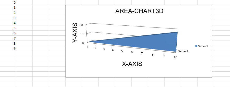
代码 #5:绘制折线图。
要在 Excel 工作表上绘制折线图,请使用 openpyxl.chart 子模块中的LineChart class 。
# import openpyxl module
import openpyxl

# import LineChart class from openpyxl.chart sub_module
from openpyxl.chart import LineChart,Reference

wb = openpyxl.Workbook()
sheet = wb.active

# write o to 9 in 1st column of the active sheet
for i in range(10):
    sheet.append([i])

values = Reference(sheet, min_col = 1, min_row = 1,
                         max_col = 1, max_row = 10)

# Create object of LineChart class
chart = LineChart()

chart.add_data(values)

# set the title of the chart
chart.title = " LINE-CHART "

# set the title of the x-axis
chart.x_axis.title = " X-AXIS "

# set the title of the y-axis
chart.y_axis.title = " Y-AXIS "

# add chart to the sheet
# the top-left corner of a chart
# is anchored to cell E2 .
sheet.add_chart(chart, "E2")

# save the file
wb.save("LineChart.xlsx")
输出: 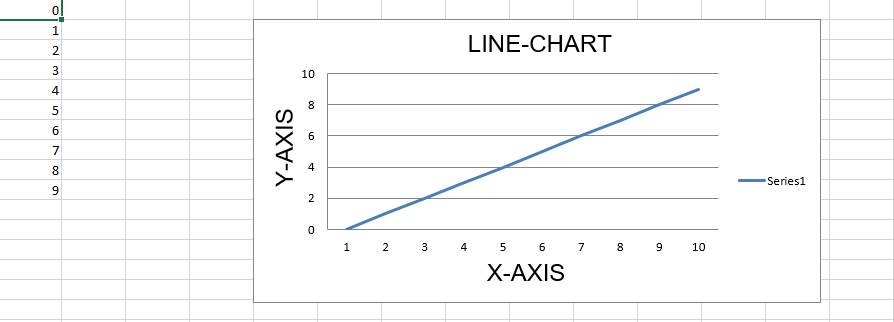
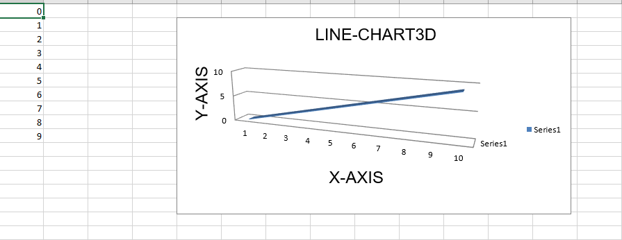
代码 #6:绘制 3D 折线图。
为了在 Excel 工作表上绘制 3D 折线图,我们必须使用 openpyxl.chart 子模块中的LineChart3D class 。
import openpyxl

# import LineChart3D class from openpyxl.chart sub_module
from openpyxl.chart import LineChart3D,Reference

wb = openpyxl.Workbook()
sheet = wb.active

# write o to 9 in 1st column of the active sheet
for i in range(10):
    sheet.append([i])

values = Reference(sheet, min_col = 1, min_row = 1,
                         max_col = 1, max_row = 10)

# Create object of LineChart3D class
chart = LineChart3D()

chart.add_data(values)

# set the title of the chart
chart.title = " LINE-CHART3D "


# set the title of the x-axis
chart.x_axis.title = " X-AXIS "

# set the title of the y-axis
chart.y_axis.title = " Y-AXIS "

# add chart to the sheet
# the top-left corner of a chart
# is anchored to cell E2 .
sheet.add_chart(chart, "E2")

# save the file
wb.save("LineChart3D.xlsx")
输出: