📌 相关文章
- Python | 使用openpyxl模块在Excel工作表中绘制图表 3
- Python | 使用openpyxl模块在Excel工作表中绘制图表 1
- Python | 使用openpyxl模块在Excel工作表中绘制图表 3(1)
- Python|使用openpyxl模块在excel表格中绘制图表|设置 3(1)
- Python|使用openpyxl模块在excel表格中绘制图表|设置 3
- Python|使用openpyxl模块在excel表格中绘制图表|套装 – 1
- Python|使用openpyxl模块在excel表格中绘制图表|套装 – 1(1)
- Python|使用openpyxl模块在excel表格中绘制图表|套装 – 2
- Python|使用 XlsxWriter 模块在 Excel 工作表中绘制组合图表(1)
- Python|使用 XlsxWriter 模块在 Excel 工作表中绘制组合图表
- Python|使用 XlsxWriter 模块在 Excel 工作表中绘制股票图表(1)
- Python|使用 XlsxWriter 模块在 Excel 工作表中绘制股票图表
- Python|使用 XlsxWriter 模块在 Excel 工作表中绘制不同类型的样式图表
- Python|使用 XlsxWriter 模块在 Excel 工作表中绘制不同类型的样式图表(1)
- Python|使用 XlsxWriter 模块在 Excel 表中绘制图表套装 – 1(1)
- Python|使用 XlsxWriter 模块在 Excel 表中绘制图表套装 – 1
- Python|使用 XlsxWriter 模块在 Excel 工作表中添加图表表(1)
- Python|使用 XlsxWriter 模块在 Excel 工作表中添加图表表
- Python | 使用XlsxWriter模块在Excel工作表中绘制饼图(1)
- Python | 使用XlsxWriter模块在Excel工作表中绘制饼图
- Python|使用 XlsxWriter 模块使用数据工具在 Excel 表中绘制图表 |套装 – 2
- Python|使用 XlsxWriter 模块使用数据工具在 Excel 表中绘制图表 |套装 – 2(1)
- Python|使用 XlsxWriter 模块在 Excel 工作表中绘制面积图(1)
- Python | 使用XlsxWriter模块在Excel工作表中绘制面积图(1)
- Python | 使用XlsxWriter模块在Excel工作表中绘制面积图
- Python|使用 XlsxWriter 模块在 Excel 工作表中绘制面积图
- Python | 使用XlsxWriter模块在Excel工作表中绘制条形图(1)
- Python | 使用XlsxWriter模块在Excel工作表中绘制条形图
- Python|使用 XlsxWriter 模块在 Excel 工作表中绘制条形图(1)
📜 Python | 使用openpyxl模块在Excel工作表中绘制图表 2
📅 最后修改于: 2020-04-11 06:27:58 🧑 作者: Mango
先决条件:Python | 使用openpyxl模块在Excel工作表中绘制图表 1
Openpyxl是一个Python库,使用它可以对excel文件执行多项操作,例如读取,编写,算术运算和绘制图形。
图表由至少一个系列的一个或多个数据点组成。系列本身由对单元格范围的引用组成。让我们看看如何使用openpyxl在Excel工作表上绘制散点图,气泡,饼图,3D饼图。
为了在Excel工作表上绘制图表,首先,创建特定图表类(即ScatterChart,PieChart等)的图表对象。创建图表对象后,在其中插入数据,最后,将该图表对象添加到图纸对象中。让我们看看如何使用实时数据绘制不同的图表。
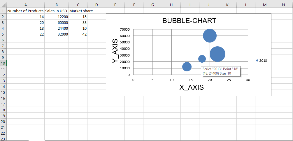
代码1:绘制气泡图。
气泡图类似于散点图,但使用第三维来确定气泡的大小。图表可以包括多个系列。
要在Excel工作表上绘制气泡图,请使用BubbleChart classopenpyxl.chart子模块。
# 导入openpyxl模块
import openpyxl
# 从openpyxl.chart sub_module导入BubbleChart,Reference,Series类
from openpyxl.chart import BubbleChart, Reference, Series
# 调用openpyxl的Workbook()函数以创建一个新的空白Workbook对象
wb = openpyxl.Workbook()
# 从active属性获取工作簿活动表.
sheet = wb.active
rows = [
    ("Number of Products", "Sales in USD", "Market share"),
    (14, 12200, 15),
    (20, 60000, 33),
    (18, 24400, 10),
    (22, 32000, 42),
]
# 将每一行的内容分别写入活动工作表的第一,第二和第三列.
for row in rows:
    sheet.append(row)
# Create object of BubbleChart class
chart = BubbleChart()
# 创建绘图数据
xvalues = Reference(sheet, min_col = 1,
                    min_row = 2, max_row = 5)
yvalues = Reference(sheet, min_col = 2,
                    min_row = 2, max_row = 5)
size = Reference(sheet, min_col = 3,
                min_row = 2, max_row = 5)
# 创建第一系列数据
series = Series(values = yvalues, xvalues = xvalues,
                      zvalues = size, title ="2013")
# 将系列数据添加到图表对象
chart.series.append(series)
# 设置图表标题
chart.title = " BUBBLE-CHART "
# 设置x轴的标题
chart.x_axis.title = " X_AXIS "
# 设置y轴的标题
chart.y_axis.title = " Y_AXIS "
# 将图表添加到工作表
# 图表的左上角固定在单元格E2上.
sheet.add_chart(chart, "E2")
# 保存文件
wb.save("bubbleChart.xlsx")
输出:

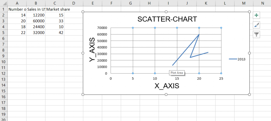
代码2:绘制散点图
散点图或xy图表类似于某些折线图。要在Excel工作表上绘制散点图,请使用openpyxl.chart子模块中的ScatterChart类。
# 导入openpyxl模块
import openpyxl
# 从openpyxl.chart sub_module导入BubbleChart,Reference,Series类
from openpyxl.chart import ScatterChart, Reference, Series
# 调用openpyxl#的Workbook()函数以创建一个新的空白Workbook对象
wb = openpyxl.Workbook()
# 从active属性获取工作簿活动表.
sheet = wb.active
rows = [
    ("Number of Products", "Sales in USD", "Market share"),
    (14, 12200, 15),
    (20, 60000, 33),
    (18, 24400, 10),
    (22, 32000, 42),
]
# 将每一行的内容分别写入活动工作表的第一,第二和第三列.
for row in rows:
    sheet.append(row)
# 创建ScatterChart类的对象
chart = ScatterChart()
# 创建绘图数据
xvalues = Reference(sheet, min_col = 1,
                    min_row = 2, max_row = 5)
yvalues = Reference(sheet, min_col = 2,
                    min_row = 2, max_row = 5)
size = Reference(sheet, min_col = 3,
                 min_row = 2, max_row = 5)
# 创建第一系列数据
series = Series(values = yvalues, xvalues = xvalues,
                      zvalues = size, title ="2013")
# 将系列数据添加到图表对象
chart.series.append(series)
# 设置图表标题
chart.title = " SCATTER-CHART "
# 设置x轴的标题
chart.x_axis.title = " X_AXIS "
# 设置y轴的标题
chart.y_axis.title = " Y_AXIS "
# 将图表添加到工作表
# 图表的左上角固定在单元格E2上.
sheet.add_chart(chart, "E2")
# 保存文件
wb.save(" ScatterChart.xlsx")
输出:

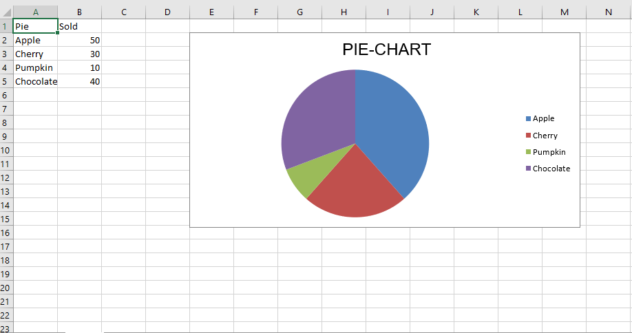
代码#3:绘制饼图
饼图将数据绘制为一个圆的切片,每个切片代表整个百分比。切片按顺时针方向绘制,圆的顶部为0°。饼图只能获取一系列数据。
要在Excel工作表上绘制饼图,请使用openpyxl.chart子模块中的PieChart类。
# 导入openpyxl模块
import openpyxl
# 从openpyxl.chart sub_module导入PieChart,Reference类
from openpyxl.chart import PieChart, Reference
# 调用openpyxl的Workbook()函数以创建一个新的空白Workbook对象
wb = openpyxl.Workbook()
# 从active属性获取工作簿活动表.
sheet = wb.active
datas = [
    ['Pie', 'Sold'],
    ['Apple', 50],
    ['Cherry', 30],
    ['Pumpkin', 10],
    ['Chocolate', 40],
]
# 将每一行的内容分别写入活动工作表的第一,第二和第三列 .
for row in datas:
    sheet.append(row)
# 创建PieChart类的对象
chart = PieChart()
# 创建绘图数据
labels = Reference(sheet, min_col = 1,
                   min_row = 2, max_row = 5)
data = Reference(sheet, min_col = 2,
                   min_row = 1, max_row = 5)
# 向饼图对象添加数据
chart.add_data(data, titles_from_data = True)
# 在图表对象中设置标签
chart.set_categories(labels)
# 设置图表标题
chart.title = " PIE-CHART "
# 将图表添加到工作表中图表的左上角固定到单元格E2 .
sheet.add_chart(chart, "E2")
# 保存文件
wb.save(" PieChart.xlsx")
输出:

代码4:绘制条形图
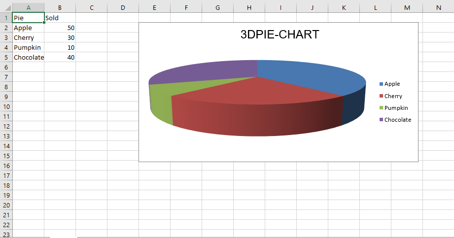
要在Excel工作表上绘制3D饼图,请使用openpyxl.chart子模块中的PieChart3D类。
# 导入openpyxl模块
import openpyxl
# 从openpyxl.chart sub_module导入PieChart,Reference类
from openpyxl.chart import PieChart3D, Reference
# 调用openpyxl的Workbook()函数以创建一个新的空白Workbook对象
wb = openpyxl.Workbook()
# 从active属性获取工作簿活动表.
sheet = wb.active
datas = [
    ['Pie', 'Sold'],
    ['Apple', 50],
    ['Cherry', 30],
    ['Pumpkin', 10],
    ['Chocolate', 40],
]
# 将每一行的内容分别写入活动工作表的第一,第二和第三列 .
for row in datas:
    sheet.append(row)
# 创建PiChart3D类的对象
chart = PieChart3D()
# 创建绘图数据
labels = Reference(sheet, min_col = 1,
                   min_row = 2, max_row = 5)
data = Reference(sheet, min_col = 2,
                   min_row = 1, max_row = 5)
# 向饼图对象添加数据
chart.add_data(data, titles_from_data = True)
# 在图表对象中设置标签
chart.set_categories(labels)
# 设置图表标题
chart.title = " 3DPIE-CHART "
# 将图表添加到工作表中#图表的左上角#固定到单元格E2 .
sheet.add_chart(chart, "E2")
# 保存文件
wb.save(" 3DPieChart.xlsx")
输出: