使用Python发散条形图
发散条形图用于简化多个组的比较。它的设计使我们能够比较不同组中的数值。它还可以帮助我们快速形象化有利和不利或积极和消极的反应。条形图由从中间开始的两个水平条的组合组成 - 一个条从右向左延伸,另一个从左向右延伸。条形的长度与其代表的数值相对应。
通常,两个发散的条形用不同的颜色表示。左边的值通常但不一定是消极或不满意的反应。
Python没有绘制发散条形图的特定函数。另一种方法是使用 hlines函数绘制具有特定线宽值的水平线,以将它们表示为水平条。
使用中的数据集:
- 梅赛德斯奔驰汽车销售数据
- Twitter 航空公司情绪
方法一:使用 Matplotlib
方法 :
- 导入模块
- 导入或创建数据
- 预处理数据集并清除不必要的噪音
- 指定用于表示水平条的颜色
- 按升序对值进行排序
- 设置 x 轴和 y 轴的标签以及图表的标题
- 显示发散条形图
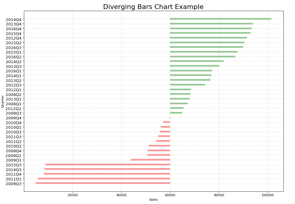
示例 1:
Python
import pandas as pd
import matplotlib.pyplot as plt
import string as str


# Creating a DataFrame from the CSV Dataset
df = pd.read_csv("car_sales.csv", sep=';')

# Separating the Date and Mercedes-Benz Cars unit sales (USA)
df['car_sales_z'] = df.loc[:, ['Mercedes-Benz Cars unit sales (USA)']]
df['car_sales_z'] = df['car_sales_z'] .str.replace(
    ',', '').astype(float)

# Removing null value
df.drop(df.tail(1).index, inplace=True)

for i in range(35):
    # Colour of bar chart is set to red if the sales
    # is < 60000 and green otherwise
    df['colors'] = ['red' if float(
        x) < 60000 else 'green' for x in df['car_sales_z']]

# Sort values from lowest to highest
df.sort_values('car_sales_z', inplace=True)

# Resets initial index in Dataframe to None
df.reset_index(inplace=True)

# Draw plot
plt.figure(figsize=(14, 10), dpi=80)

# Plotting the horizontal lines
plt.hlines(y=df.index, xmin=60000, xmax=df.car_sales_z,
           color=df.colors, alpha=0.4, linewidth=5)

# Decorations
# Setting the labels of x-axis and y-axis
plt.gca().set(ylabel='Quarter', xlabel='Sales')

# Setting Date to y-axis
plt.yticks(df.index, df.Date, fontsize=12)

# Title of Bar Chart
plt.title('Diverging Bars Chart Example', fontdict={
          'size': 20})

# Optional grid layout
plt.grid(linestyle='--', alpha=0.5)

# Displaying the Diverging Bar Chart
plt.show()
Python
import pandas as pd
import plotly.graph_objects as go


df = pd.read_csv("Tweets.csv")
df.head()

# Preprocessing the dataset to extract only
# the necessary columns
categories = [
    'negative',
    'neutral',
    'positive'
]

# Construct a pivot table with the column
# 'airline' as the index and the sentiments
# as the columns
gfg = pd.pivot_table(
    df,
    index='airline',
    columns='airline_sentiment',
    values='tweet_id',
    aggfunc='count'
)

# Include the sentiments - negative, neutral
# and positive
gfg = gfg[categories]

# Representing negative sentiment with negative
# numbers
gfg.negative = gfg.negative * -1

df = gfg

# Creating a Figure
Diverging = go.Figure()

# Iterating over the columns
for col in df.columns[4:]:

    # Adding a trace and specifying the parameters
    # for negative sentiment
    Diverging.add_trace(go.Bar(x=-df[col].values,
                               y=df.index,
                               orientation='h',
                               name=col,
                               customdata=df[col],
                               hovertemplate="%{y}: %{customdata}"))
for col in df.columns:

    # Adding a trace and specifying the parameters
    # for positive and neutral sentiment
    Diverging.add_trace(go.Bar(x=df[col],
                               y=df.index,
                               orientation='h',
                               name=col,
                               hovertemplate="%{y}: %{x}"))

# Specifying the layout of the plot
Diverging.update_layout(barmode='relative',
                        height=400,
                        width=700,
                        yaxis_autorange='reversed',
                        bargap=0.5,
                        legend_orientation='v',
                        legend_x=1, legend_y=0
                        )
Diverging
输出:
方法 2:使用 Plotly
方法:
- 导入所需的库
- 创建或导入数据
- 预处理数据集并清除不必要的噪音
- 使用 plotly.graph_objects 绘制图形
- 设置 x 轴和 y 轴的标签以及图例
- 显示发散条形图
例子:
Python
import pandas as pd
import plotly.graph_objects as go


df = pd.read_csv("Tweets.csv")
df.head()

# Preprocessing the dataset to extract only
# the necessary columns
categories = [
    'negative',
    'neutral',
    'positive'
]

# Construct a pivot table with the column
# 'airline' as the index and the sentiments
# as the columns
gfg = pd.pivot_table(
    df,
    index='airline',
    columns='airline_sentiment',
    values='tweet_id',
    aggfunc='count'
)

# Include the sentiments - negative, neutral
# and positive
gfg = gfg[categories]

# Representing negative sentiment with negative
# numbers
gfg.negative = gfg.negative * -1

df = gfg

# Creating a Figure
Diverging = go.Figure()

# Iterating over the columns
for col in df.columns[4:]:

    # Adding a trace and specifying the parameters
    # for negative sentiment
    Diverging.add_trace(go.Bar(x=-df[col].values,
                               y=df.index,
                               orientation='h',
                               name=col,
                               customdata=df[col],
                               hovertemplate="%{y}: %{customdata}"))
for col in df.columns:

    # Adding a trace and specifying the parameters
    # for positive and neutral sentiment
    Diverging.add_trace(go.Bar(x=df[col],
                               y=df.index,
                               orientation='h',
                               name=col,
                               hovertemplate="%{y}: %{x}"))

# Specifying the layout of the plot
Diverging.update_layout(barmode='relative',
                        height=400,
                        width=700,
                        yaxis_autorange='reversed',
                        bargap=0.5,
                        legend_orientation='v',
                        legend_x=1, legend_y=0
                        )
Diverging
输出:
