在 Matplotlib 中绘制一条水平线
Matplotlib 是一个流行的用于绘图的Python库,它提供了一个面向对象的 API 来渲染 GUI 绘图
绘制水平线相当简单,使用axhline()
matplotlib 库的 pyplot 模块中的axhline()函数用于在轴上添加一条水平线。
Syntax: matplotlib.pyplot.axhline(y, color, xmin, xmax, linestyle)
Parameters:
- y: Position on Y axis to plot the line, It accepts integers.
- xmin and xmax: scalar, optional, default: 0/1. It plots the line in the given range
- color: color for the line, It accepts a string. eg ‘r’ or ‘b’ .
- linestyle: Specifies the type of line, It accepts a string. eg ‘-‘, ‘–‘, ‘-.’, ‘:’, ‘None’, ‘ ‘, ”, ‘solid’, ‘dashed’, ‘dashdot’, ‘dotted’
绘制一条水平线
Python3
# importing library
import matplotlib.pyplot as plt

# specifying horizontal line type
plt.axhline(y = 0.5, color = 'r', linestyle = '-')

# rendering the plot
plt.show()
Python
# importing the module
import matplotlib.pyplot as plt

# plotting line within the given range
plt.axhline(y = .5, xmin = 0.25, xmax = 0.9)

# line colour is blue
plt.axhline(y = 3, color = 'b', linestyle = ':')

# line colour is white
plt.axhline(y = 1, color = 'w', linestyle = '--')

# line colour is red
plt.axhline(y = 2, color = 'r', linestyle = 'dashed')

# adding axis labels
plt.xlabel('x - axis')
plt.ylabel('y - axis')

# displaying the plot
plt.show()
Python3
# importing the module
import matplotlib.pyplot as plt

# plotting line within the given range
plt.axhline(y = .5, xmin = 0.25, xmax = 0.9)

# line colour is blue
plt.axhline(y = 3, color = 'b', linestyle = ':', label = "blue line")

# line colour is white
plt.axhline(y = 1, color = 'w', linestyle = '--', label = "white line")

# line colour is red
plt.axhline(y = 2, color = 'r', linestyle = 'dashed', label = "red line")

# adding axis labels
plt.xlabel('x - axis')
plt.ylabel('y - axis')

# plotting the legend
plt.legend(bbox_to_anchor = (1.0, 1), loc = 'upper center')

# displaying the plot
plt.show()
输出:

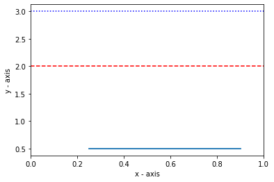
绘制多条水平线
要绘制多条水平线,请多次使用 axhline() 方法。
Python
# importing the module
import matplotlib.pyplot as plt

# plotting line within the given range
plt.axhline(y = .5, xmin = 0.25, xmax = 0.9)

# line colour is blue
plt.axhline(y = 3, color = 'b', linestyle = ':')

# line colour is white
plt.axhline(y = 1, color = 'w', linestyle = '--')

# line colour is red
plt.axhline(y = 2, color = 'r', linestyle = 'dashed')

# adding axis labels
plt.xlabel('x - axis')
plt.ylabel('y - axis')

# displaying the plot
plt.show()
输出:
添加图例
可以使用legend()函数添加图例。
蟒蛇3
# importing the module
import matplotlib.pyplot as plt

# plotting line within the given range
plt.axhline(y = .5, xmin = 0.25, xmax = 0.9)

# line colour is blue
plt.axhline(y = 3, color = 'b', linestyle = ':', label = "blue line")

# line colour is white
plt.axhline(y = 1, color = 'w', linestyle = '--', label = "white line")

# line colour is red
plt.axhline(y = 2, color = 'r', linestyle = 'dashed', label = "red line")

# adding axis labels
plt.xlabel('x - axis')
plt.ylabel('y - axis')

# plotting the legend
plt.legend(bbox_to_anchor = (1.0, 1), loc = 'upper center')

# displaying the plot
plt.show()
输出:
