Python的直方图和密度图
先决条件: Seaborn
直方图是将一组数据点组织到指定范围内的图形表示。创建直方图提供了数据分布的可视化表示。通过使用直方图,我们可以表示大量数据及其频率。
密度图是根据数据估计的直方图的连续和平滑版本。它是通过核密度估计来估计的。
在这种方法中,在每个单独的数据点绘制核(连续曲线),然后将所有这些曲线加在一起以进行单个平滑的密度估计。当我们想要比较单个变量在多个类别上的数据分布时,直方图会失败,当时密度图对于可视化数据很有用。
方法:
- 导入必要的库。
- 从seaborn库创建或导入数据集。
- 选择我们必须绘制的列。
- 为了制作绘图,我们使用由seaborn库提供的distplot()函数将直方图和密度图一起绘制,我们必须在其中传递数据集列。
- 我们还可以根据需要使用distplot()函数单独制作直方图和密度图。
- 为了单独创建直方图,我们必须将hist=False作为参数传递给distplot()函数。
- 为了单独创建密度图,我们必须将kde=False作为参数传递给 distplot()函数。
- 现在绘制绘图后,我们必须对其进行可视化,因此对于可视化,我们必须使用matplotlib.pyplot库提供的show()函数。
为了一起绘制直方图和密度图,我们使用由seaborn库提供的钻石和虹膜数据集。
示例 1:导入数据集并打印它们。
Python
# importing seaborn library
import seaborn as sns

# importing dataset from the library
df = sns.load_dataset('diamonds')

# printing the dataset
df
Python
# importing necessary libraries
import seaborn as sns
import matplotlib.pyplot as plt

# importing diamond dataset from the library
df = sns.load_dataset('diamonds')

# plotting histogram for carat using distplot()
sns.distplot(a=df.carat, kde=False)

# visualizing plot using matplotlib.pyplot library
plt.show()
Python
# importing libraries
import seaborn as sns
import matplotlib.pyplot as plt

# importing diamond dataset from the library
df = sns.load_dataset('diamonds')

# plotting density plot for carat using distplot()
sns.distplot(a=df.carat, hist=False)

# visualizing plot using matplotlib.pyplot library
plt.show()
Python
# importing libraries
import seaborn as sns
import matplotlib.pyplot as plt

# importing diamond dataset from the library
df = sns.load_dataset('diamonds')

# plotting histogram and density
# plot for carat using distplot()
sns.distplot(a=df.carat)

# visualizing plot using matplotlib.pyplot library
plt.show()
Python
# importing libraries
import seaborn as sns
import matplotlib.pyplot as plt

# importing diamond dataset from the library
df = sns.load_dataset('diamonds')

# plotting histogram and density plot
# for carat using distplot() by setting color
sns.distplot(a=df.carat, bins=40, color='purple',
             hist_kws={"edgecolor": 'black'})

# visualizing plot using matplotlib.pyplot library
plt.show()
Python
# importing libraries
import seaborn as sns
import matplotlib.pyplot as plt

# importing iris dataset from the library
df2 = sns.load_dataset('iris')

# plotting histogram and density plot for
# petal length using distplot() by setting color
sns.distplot(a=df2.petal_length, color='green',
             hist_kws={"edgecolor": 'black'})

# visualizing plot using matplotlib.pyplot library
plt.show()
Python
# importing libraries
import seaborn as sns
import matplotlib.pyplot as plt

# importing iris dataset from the library
df2 = sns.load_dataset('iris')

# plotting histogram and density plot for
# sepal width using distplot() by setting color
sns.distplot(a=df2.sepal_width, color='red',
             hist_kws={"edgecolor": 'white'})

# visualizing plot using matplotlib.pyplot library
plt.show()
输出:

示例 2:在默认设置下使用seaborn库绘制直方图。
Python
# importing necessary libraries
import seaborn as sns
import matplotlib.pyplot as plt

# importing diamond dataset from the library
df = sns.load_dataset('diamonds')

# plotting histogram for carat using distplot()
sns.distplot(a=df.carat, kde=False)

# visualizing plot using matplotlib.pyplot library
plt.show()
输出:

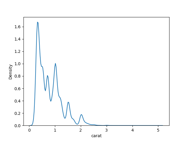
示例 3:在默认设置下使用seaborn库绘制密度图。
Python
# importing libraries
import seaborn as sns
import matplotlib.pyplot as plt

# importing diamond dataset from the library
df = sns.load_dataset('diamonds')

# plotting density plot for carat using distplot()
sns.distplot(a=df.carat, hist=False)

# visualizing plot using matplotlib.pyplot library
plt.show()
输出:
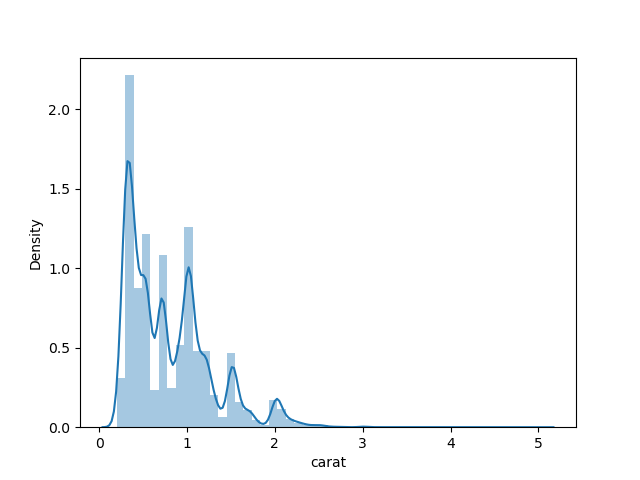
示例 4:在默认设置下一起绘制直方图和密度图。
Python
# importing libraries
import seaborn as sns
import matplotlib.pyplot as plt

# importing diamond dataset from the library
df = sns.load_dataset('diamonds')

# plotting histogram and density
# plot for carat using distplot()
sns.distplot(a=df.carat)

# visualizing plot using matplotlib.pyplot library
plt.show()
输出:
示例 5:通过设置 bin 和颜色将直方图和密度图一起绘制。
Python
# importing libraries
import seaborn as sns
import matplotlib.pyplot as plt

# importing diamond dataset from the library
df = sns.load_dataset('diamonds')

# plotting histogram and density plot
# for carat using distplot() by setting color
sns.distplot(a=df.carat, bins=40, color='purple',
             hist_kws={"edgecolor": 'black'})

# visualizing plot using matplotlib.pyplot library
plt.show()
输出:

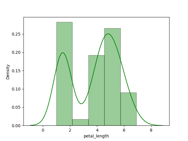
示例 6:使用 Iris 数据集绘制直方图和密度图。
Python
# importing libraries
import seaborn as sns
import matplotlib.pyplot as plt

# importing iris dataset from the library
df2 = sns.load_dataset('iris')

# plotting histogram and density plot for
# petal length using distplot() by setting color
sns.distplot(a=df2.petal_length, color='green',
             hist_kws={"edgecolor": 'black'})

# visualizing plot using matplotlib.pyplot library
plt.show()
输出:
我们还可以通过添加一行代码打印 iris 数据集,即 print(df2),数据集看起来像。

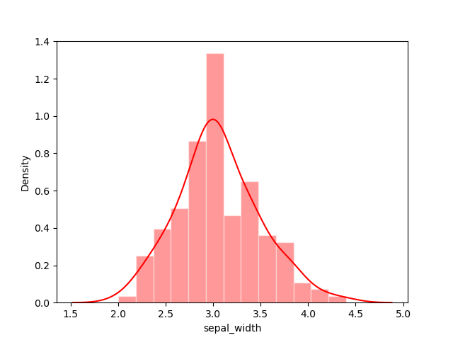
示例 7:在萼片长度上绘制直方图和密度图。
Python
# importing libraries
import seaborn as sns
import matplotlib.pyplot as plt

# importing iris dataset from the library
df2 = sns.load_dataset('iris')

# plotting histogram and density plot for
# sepal width using distplot() by setting color
sns.distplot(a=df2.sepal_width, color='red',
             hist_kws={"edgecolor": 'white'})

# visualizing plot using matplotlib.pyplot library
plt.show()
输出:
这样,我们可以根据需要在任何数据集列上一起绘制直方图和密度图。