Flutter的syncfusion_flutter_charts 库用于处理图表。图表在以可视形式描绘数据时非常有用。这些软件包附带各种精美且高性能的图表。它带有各种笛卡尔或圆形图表,具有流畅的交互和精美的动画,完全可定制和可扩展。
在本文中,我们将在一个简单的应用程序的帮助下研究相同的内容。要构建应用程序,请按照以下步骤操作:
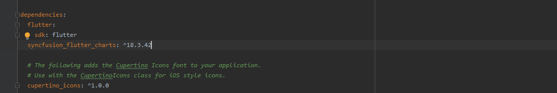
- 将依赖添加到pubspec.yaml 文件中
- 将依赖项导入到 main.js 中。dart文件。
- 使用扩展到StatefulWidget的StatelessWidget来构建应用程序
- 控制图表中数据的设计函数
- 调用所需类型的内置图表
让我们详细讨论这些步骤。
添加依赖:
要将依赖添加到pubspec.yaml 文件,请在依赖项部分添加syncfusion_flutter_charts ,如下所示:
导入依赖:
将依赖项导入到main. dart文件,使用以下代码:
import 'package:syncfusion_flutter_charts/charts.dart';
构建应用程序:
创建一个带有StateFulWidget的类,该类进一步扩展到一个StatelessWidget为应用程序提供一个带有appbar的基本结构和一个可以容纳内容的主体,如下所示:
Dart
class _ChartApp extends StatelessWidget {
  @override
  Widget build(BuildContext context) {
    return MaterialApp(
      title: 'Charts in Flutter',
      theme: ThemeData(primarySwatch: Colors.blue),
      home: _MyHomePage(),
    );
  }
}

class _MyHomePage extends StatefulWidget {
  _MyHomePage({Key key}) : super(key: key);

  @override
  _MyHomePageState createState() => _MyHomePageState();
}

class _MyHomePageState extends State<_MyHomePage> {
  @override
  Widget build(BuildContext context) {
    return Scaffold(
        appBar: AppBar(
          title: const Text('GeeksForGeeks'),
          backgroundColor: Colors.green,
        ),
        body:
  }
}
Dart
class _Infections {
  _Infections(this.year, this.victims);

  final String year;
  final double victims;
}
Dart
body: SfCartesianChart(
            primaryXAxis: CategoryAxis(),
            // Chart title
            title: ChartTitle(text: 'Monthly Covid-19 Infections'),
            // Enable legend
            legend: Legend(isVisible: true),
            // Enable tooltip
            tooltipBehavior: TooltipBehavior(enable: true),
            series: >[
              LineSeries<_Infections, String>(
                  dataSource: <_Infections>[
                    _Infections('Jan', 35000),
                    _Infections('Feb', 28000),
                    _Infections('Mar', 34000),
                    _Infections('Apr', 32000),
                    _Infections('May', 40000),
                    _Infections('Jun', 60000)
                  ],
                  xValueMapper: (_Infections victims, _) => victims.year,
                  yValueMapper: (_Infections victims, _) => victims.victims,
                  // Enable data label
                  dataLabelSettings: DataLabelSettings(isVisible: true))
            ]));
  }
}
Dart
import 'package:flutter/material.dart';
import 'package:syncfusion_flutter_charts/charts.dart';

void main() {
  return runApp(_ChartApp());
}

class _ChartApp extends StatelessWidget {
  @override
  Widget build(BuildContext context) {
    return MaterialApp(
      title: 'Charts in Flutter',
      theme: ThemeData(primarySwatch: Colors.blue),
      home: _MyHomePage(),
    );
  }
}

class _MyHomePage extends StatefulWidget {
  // ignore: prefer_const_constructors_in_immutables
  _MyHomePage({Key key}) : super(key: key);

  @override
  _MyHomePageState createState() => _MyHomePageState();
}

class _MyHomePageState extends State<_MyHomePage> {
  @override
  Widget build(BuildContext context) {
    return Scaffold(
        appBar: AppBar(
          title: const Text('GeeksForGeeks'),
          backgroundColor: Colors.green,
        ),
        body: SfCartesianChart(
            primaryXAxis: CategoryAxis(),
            // Chart title
            title: ChartTitle(text: 'Monthly Covid-19 Infections'),
            // Enable legend
            legend: Legend(isVisible: true),
            // Enable tooltip
            tooltipBehavior: TooltipBehavior(enable: true),
            series: >[
              LineSeries<_Infections, String>(
                  dataSource: <_Infections>[
                    _Infections('Jan', 35000),
                    _Infections('Feb', 28000),
                    _Infections('Mar', 34000),
                    _Infections('Apr', 32000),
                    _Infections('May', 40000),
                    _Infections('Jun', 60000)
                  ],
                  xValueMapper: (_Infections victims, _) => victims.year,
                  yValueMapper: (_Infections victims, _) => victims.victims,
                  // Enable data label
                  dataLabelSettings: DataLabelSettings(isVisible: true))
            ]));
  }
}

class _Infections {
  _Infections(this.year, this.victims);

  final String year;
  final double victims;
}
设计函数:
在这里,我们将构建一个函数_Infections(),它从一组固定的数据点中获取 COVID-19 数据,并根据月份和编号在图表上实现它们。当月的感染人数。这可以按如下方式完成:
Dart
class _Infections {
  _Infections(this.year, this.victims);

  final String year;
  final double victims;
}
这个函数可以直接在应用的body中使用,如下图:
Dart
body: SfCartesianChart(
            primaryXAxis: CategoryAxis(),
            // Chart title
            title: ChartTitle(text: 'Monthly Covid-19 Infections'),
            // Enable legend
            legend: Legend(isVisible: true),
            // Enable tooltip
            tooltipBehavior: TooltipBehavior(enable: true),
            series: >[
              LineSeries<_Infections, String>(
                  dataSource: <_Infections>[
                    _Infections('Jan', 35000),
                    _Infections('Feb', 28000),
                    _Infections('Mar', 34000),
                    _Infections('Apr', 32000),
                    _Infections('May', 40000),
                    _Infections('Jun', 60000)
                  ],
                  xValueMapper: (_Infections victims, _) => victims.year,
                  yValueMapper: (_Infections victims, _) => victims.victims,
                  // Enable data label
                  dataLabelSettings: DataLabelSettings(isVisible: true))
            ]));
  }
}
完整的源代码:
Dart
import 'package:flutter/material.dart';
import 'package:syncfusion_flutter_charts/charts.dart';

void main() {
  return runApp(_ChartApp());
}

class _ChartApp extends StatelessWidget {
  @override
  Widget build(BuildContext context) {
    return MaterialApp(
      title: 'Charts in Flutter',
      theme: ThemeData(primarySwatch: Colors.blue),
      home: _MyHomePage(),
    );
  }
}

class _MyHomePage extends StatefulWidget {
  // ignore: prefer_const_constructors_in_immutables
  _MyHomePage({Key key}) : super(key: key);

  @override
  _MyHomePageState createState() => _MyHomePageState();
}

class _MyHomePageState extends State<_MyHomePage> {
  @override
  Widget build(BuildContext context) {
    return Scaffold(
        appBar: AppBar(
          title: const Text('GeeksForGeeks'),
          backgroundColor: Colors.green,
        ),
        body: SfCartesianChart(
            primaryXAxis: CategoryAxis(),
            // Chart title
            title: ChartTitle(text: 'Monthly Covid-19 Infections'),
            // Enable legend
            legend: Legend(isVisible: true),
            // Enable tooltip
            tooltipBehavior: TooltipBehavior(enable: true),
            series: >[
              LineSeries<_Infections, String>(
                  dataSource: <_Infections>[
                    _Infections('Jan', 35000),
                    _Infections('Feb', 28000),
                    _Infections('Mar', 34000),
                    _Infections('Apr', 32000),
                    _Infections('May', 40000),
                    _Infections('Jun', 60000)
                  ],
                  xValueMapper: (_Infections victims, _) => victims.year,
                  yValueMapper: (_Infections victims, _) => victims.victims,
                  // Enable data label
                  dataLabelSettings: DataLabelSettings(isVisible: true))
            ]));
  }
}

class _Infections {
  _Infections(this.year, this.victims);

  final String year;
  final double victims;
}
输出:
想要一个更快节奏和更具竞争力的环境来学习 Android 的基础知识吗?
单击此处前往由我们的专家精心策划的指南,旨在让您立即做好行业准备!