Matplotlib 中的折线图 – Python
Matplotlib是Python中的数据可视化库。 pyplot是 matplotlib 的一个子库,是一组有助于创建各种图表的函数。折线图用于表示不同轴上两个数据 X 和 Y 之间的关系。在这里,我们将看到Python中折线图的一些示例:
简单的线图
首先导入 Matplotlib.pyplot 库用于绘图函数。此外,根据需要导入 Numpy 库。然后定义数据值 x 和 y。
Python3
# importing the required libraries
import matplotlib.pyplot as plt
import numpy as np

# define data values
x = np.array([1, 2, 3, 4])  # X-axis points
y = x*2  # Y-axis points

plt.plot(x, y)  # Plot the chart
plt.show()  # display
Python3
import matplotlib.pyplot as plt
import numpy as np


# Define X and Y variable data
x = np.array([1, 2, 3, 4])
y = x*2

plt.plot(x, y)
plt.xlabel("X-axis")  # add X-axis label
plt.ylabel("Y-axis")  # add Y-axis label
plt.title("Any suitable title")  # add title
plt.show()
Python3
import matplotlib.pyplot as plt
import numpy as np


x = np.array([1, 2, 3, 4])
y = x*2

plt.plot(x, y)
plt.xlabel("X-axis")
plt.ylabel("Y-axis")
plt.title("Any suitable title")
plt.show()  # show first chart

# The figure() function helps in creating a
# new figure that can hold a new chart in it.
plt.figure()
x1 = [2, 4, 6, 8]
y1 = [3, 5, 7, 9]
plt.plot(x1, y1, '-.')

# Show another chart with '-' dotted line
plt.show()
Python3
import matplotlib.pyplot as plt
import numpy as np

x = np.array([1, 2, 3, 4])
y = x*2

# first plot with X and Y data
plt.plot(x, y)

x1 = [2, 4, 6, 8]
y1 = [3, 5, 7, 9]

# second plot with x1 and y1 data
plt.plot(x1, y1, '-.')

plt.xlabel("X-axis data")
plt.ylabel("Y-axis data")
plt.title('multiple plots')
plt.show()
Python3
import matplotlib.pyplot as plt
import numpy as np

x = np.array([1, 2, 3, 4])
y = x*2

plt.plot(x, y)

x1 = [2, 4, 6, 8]
y1 = [3, 5, 7, 9]

plt.plot(x, y1, '-.')
plt.xlabel("X-axis data")
plt.ylabel("Y-axis data")
plt.title('multiple plots')

plt.fill_between(x, y, y1, color='green', alpha=0.5)
plt.show()
输出:
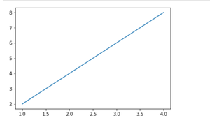
X 和 Y 数据之间的简单线图
我们可以在上面的输出图像中看到 x 轴和 y 轴上没有标签。因为标签对于理解图表维度是必要的。在下面的例子中,我们将看到如何在图表中添加标签,Ident
蟒蛇3
import matplotlib.pyplot as plt
import numpy as np


# Define X and Y variable data
x = np.array([1, 2, 3, 4])
y = x*2

plt.plot(x, y)
plt.xlabel("X-axis")  # add X-axis label
plt.ylabel("Y-axis")  # add Y-axis label
plt.title("Any suitable title")  # add title
plt.show()
输出:
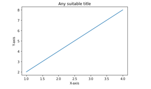
带有标签和标题的简单线图
多个图表
我们可以使用 pyplot.figure()函数在同一个容器中显示多个图表。这将帮助我们比较不同的图表并控制图表的外观和感觉。
蟒蛇3
import matplotlib.pyplot as plt
import numpy as np


x = np.array([1, 2, 3, 4])
y = x*2

plt.plot(x, y)
plt.xlabel("X-axis")
plt.ylabel("Y-axis")
plt.title("Any suitable title")
plt.show()  # show first chart

# The figure() function helps in creating a
# new figure that can hold a new chart in it.
plt.figure()
x1 = [2, 4, 6, 8]
y1 = [3, 5, 7, 9]
plt.plot(x1, y1, '-.')

# Show another chart with '-' dotted line
plt.show()
输出:

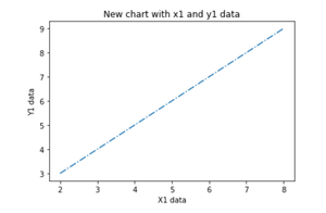
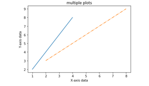
同一轴上的多个图
在这里,我们将看到如何在同一轴内添加 2 个图。
蟒蛇3
import matplotlib.pyplot as plt
import numpy as np

x = np.array([1, 2, 3, 4])
y = x*2

# first plot with X and Y data
plt.plot(x, y)

x1 = [2, 4, 6, 8]
y1 = [3, 5, 7, 9]

# second plot with x1 and y1 data
plt.plot(x1, y1, '-.')

plt.xlabel("X-axis data")
plt.ylabel("Y-axis data")
plt.title('multiple plots')
plt.show()
输出:
填充两个图之间的区域
使用 pyplot.fill_between()函数,我们可以填充同一图中两条线图之间的区域。这将有助于我们了解基于特定条件的两条线图之间的数据边际。
蟒蛇3
import matplotlib.pyplot as plt
import numpy as np

x = np.array([1, 2, 3, 4])
y = x*2

plt.plot(x, y)

x1 = [2, 4, 6, 8]
y1 = [3, 5, 7, 9]

plt.plot(x, y1, '-.')
plt.xlabel("X-axis data")
plt.ylabel("Y-axis data")
plt.title('multiple plots')

plt.fill_between(x, y, y1, color='green', alpha=0.5)
plt.show()
输出:
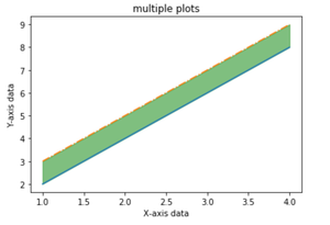
填充X轴数据对应的Y和Y1数据之间的区域