📌 相关文章
- Python Matplotlib数据可视化2
- Python Matplotlib数据可视化2(1)
- Matplotlib 中的折线图 – Python
- Matplotlib 中的折线图 – Python(1)
- R中的数据可视化
- R数据可视化
- R中的数据可视化(1)
- R数据可视化(1)
- python折线图 - Python(1)
- matplotlib clear plot - Python (1)
- R-折线图(1)
- R-折线图
- R – 折线图(1)
- R – 折线图
- matplotlib clear plot - Python 代码示例
- python plot - Python (1)
- python折线图 - Python代码示例
- 4-Plot(1)
- 4-Plot
- 使用 Matplotlib 和 Seaborn 在Python中进行数据可视化
- 使用 Matplotlib 和 Seaborn 在Python中进行数据可视化(1)
- Python中的 Matplotlib.pyplot.plot()函数(1)
- Python中的 Matplotlib.pyplot.plot()函数
- python plot - Python 代码示例
- 用于数据可视化的前 8 个Python库
- 用于数据可视化的前 8 个Python库(1)
- Python – 数据可视化教程
- Python – 数据可视化教程(1)
- Excel Power View-折线图可视化(1)
📜 Python Matplotlib数据可视化 plot折线图
📅 最后修改于: 2020-09-02 01:43:54 🧑 作者: Mango
在利用python处理数据/数据分析的时候,我们常常需要将数据按照一定的格式进行可视化,以便我们更好的分析或者演示。
在本节中,我们主要学习利用matplot工具可视化数据。Matplotlib是一个Python 2D绘图库,可生成高质量的图表和图形,并有助于我们可视化大数据以更好地理解。同时,我们也会使用功能Pandas,其是用于分析大型和复杂数据的便捷且有用的数据结构工具。
关于Pandas的使用,可以参考相关内容: https://www.imangodoc.com/608.html
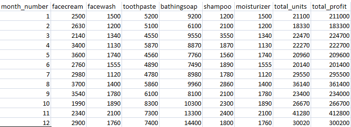
1.数据准备
我们一个csv文件作为我们需要处理的数据, 你可以在本地电脑自建一个一样的数据。
2.示例
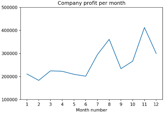
2.1 读取所有月份的总利润,绘制折线图
每月提供的总利润数据,生成的折线图必须包含以下属性:
- X标签名称=月号
- Y标签名称=总利润
import pandas as pd
import matplotlib.pyplot as plt

df = pd.read_csv("./sales_data.csv")
profitList = df ['total_profit'].tolist()
monthList  = df ['month_number'].tolist()
plt.plot(monthList, profitList, label = 'Month-wise Profit data of last year')
plt.xlabel('Month number')
plt.ylabel('Profit in dollar')
plt.xticks(monthList)
plt.title('Company profit per month')
plt.yticks([100000, 200000, 300000, 400000, 500000])
plt.show()
效果图如下:
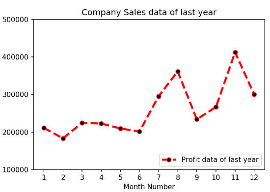
2.2 月份的总利润, 绘制不同样式折线图
绘图样式设置如下:
- 虚线样式和线条颜色应为红色
- 在右下角的位置显示图例。
- X标签名称=月号
- Y标签名称=售出单位编号
- 添加一个圆圈标记。
- 线标记颜色为已读
- 线宽应为3
-
import pandas as pd
import matplotlib.pyplot as plt

df = pd.read_csv("./sales_data.csv")
profitList = df ['total_profit'].tolist()
monthList  = df ['month_number'].tolist()

plt.plot(monthList, profitList, label = 'Profit data of last year',
      color='r', marker='o', markerfacecolor='k',
      linestyle='--', linewidth=3)

plt.xlabel('Month Number')
plt.ylabel('Profit in dollar')
plt.legend(loc='lower right')
plt.title('Company Sales data of last year')
plt.xticks(monthList)
plt.yticks([100000, 200000, 300000, 400000, 500000])
plt.show()
绘制效果如下:
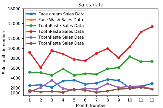
2.3 所有产品销售数据,绘制多条折线图
import pandas as pd
import matplotlib.pyplot as plt

df = pd.read_csv("./sales_data.csv")
monthList  = df ['month_number'].tolist()
faceCremSalesData   = df ['facecream'].tolist()
faceWashSalesData   = df ['facewash'].tolist()
toothPasteSalesData = df ['toothpaste'].tolist()
bathingsoapSalesData   = df ['bathingsoap'].tolist()
shampooSalesData   = df ['shampoo'].tolist()
moisturizerSalesData = df ['moisturizer'].tolist()

plt.plot(monthList, faceCremSalesData,label = 'Face cream Sales Data', marker='o', linewidth=3)
plt.plot(monthList, faceWashSalesData,label = 'Face Wash Sales Data',  marker='o', linewidth=3)
plt.plot(monthList, toothPasteSalesData,label = 'ToothPaste Sales Data', marker='o', linewidth=3)
plt.plot(monthList, bathingsoapSalesData,label = 'ToothPaste Sales Data', marker='o', linewidth=3)
plt.plot(monthList, shampooSalesData, label='ToothPaste Sales Data', marker='o', linewidth=3)
plt.plot(monthList, moisturizerSalesData, label ='ToothPaste Sales Data', marker='o', linewidth=3)

plt.xlabel('Month Number')
plt.ylabel('Sales units in number')
plt.legend(loc='upper left')
plt.xticks(monthList)
plt.yticks([1000, 2000, 4000, 6000, 8000, 10000, 12000, 15000, 18000])
plt.title('Sales data')
plt.show()
多折线图效果如下:
—->>>>下一章节我们将继续绘制散点图plt.scatter