Seaborn 中的关系图 – 第二部分
先决条件:Seaborn 中的关系图 - 第一部分
在本文的前一部分中,我们了解了 relplot()。现在,我们将阅读 seaborn 库中提供的另外两个关系图,即 scatterplot() 和 lineplot()。这两个图也可以在 relplot() 中的 kind 参数的帮助下绘制。基本上 relplot(),默认情况下,只给我们 scatterplot(),如果我们传递参数kind = “line” ,它给我们 lineplot()。
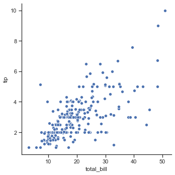
示例 1:使用 relplot() 可视化提示数据集
Python3
import seaborn as sns
sns.set(style ="ticks")

tips = sns.load_dataset('tips')
sns.relplot(x ="total_bill", y ="tip", data = tips)
Python3
import seaborn as sns


sns.set(style ="ticks")
tips = sns.load_dataset('tips')

sns.relplot(x ="total_bill",
            y ="tip",
            kind ="scatter",
            data = tips)
Python3
import seaborn as sns


sns.set(style ="ticks")
tips = sns.load_dataset('tips')

sns.relplot(x ="total_bill",
            y ="tip",
            kind ="line",
            data = tips)
Python3
import seaborn as sns


sns.set(style ="ticks")
tips = sns.load_dataset('tips')
markers = {"Lunch": "s", "Dinner": "X"}

ax = sns.scatterplot(x ="total_bill",
                     y ="tip",
                     style ="time",
                     markers = markers,
                     data = tips)
Python3
import seaborn as sns


iris = sns.load_dataset("iris")

sns.scatterplot(x = iris.sepal_length,
                y = iris.sepal_width,
                hue = iris.species,
                style = iris.species)
Python3
import seaborn as sns


sns.set(style = 'whitegrid')
fmri = sns.load_dataset("fmri")

sns.lineplot(x ="timepoint",
             y ="signal",
             data = fmri)
Python3
import seaborn as sns


sns.set(style = 'whitegrid')
fmri = sns.load_dataset("fmri")

sns.lineplot(x ="timepoint",
             y ="signal",
             hue ="region",
             style ="event",
             data = fmri)
Python3
import seaborn as sns


sns.set(style = 'whitegrid')
dots = sns.load_dataset("dots").query("align == 'dots'")

sns.lineplot(x ="time",
             y ="firing_rate",
             hue ="coherence",
             style ="choice",
             data = dots)
输出 :
示例 2:将 relplot() 与 kind=”scatter” 一起使用。
Python3
import seaborn as sns


sns.set(style ="ticks")
tips = sns.load_dataset('tips')

sns.relplot(x ="total_bill",
            y ="tip",
            kind ="scatter",
            data = tips)
输出 :

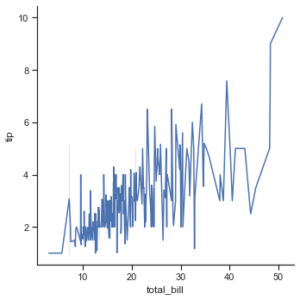
示例 3:将 relplot() 与 kind=”line” 一起使用。
Python3
import seaborn as sns


sns.set(style ="ticks")
tips = sns.load_dataset('tips')

sns.relplot(x ="total_bill",
            y ="tip",
            kind ="line",
            data = tips)
输出 :
虽然这两个图都可以使用 relplot() 绘制,但 seaborn 也有单独的函数来可视化这些图。与 relplot() 相比,这些函数还提供了一些其他功能。让我们更详细地讨论这些函数:
Seaborn.scatterplot()
散点图是统计可视化的支柱。它使用点云描述了两个变量的联合分布,其中每个点代表数据集中的一个观察值。这种描述允许眼睛推断出大量关于它们之间是否存在任何有意义关系的信息。
句法 :
seaborn.scatterplot(x=None, y=None, data=None, **kwargs)参数 :Parameter Value Use x, y numeric Input data variables data Dataframe Dataset that is being used. hue, size, style name in data; optional Grouping variable that will produce elements with different colors. palette name, list, or dict; optional Colors to use for the different levels of the hue variable. hue_order list; optional Specified order for the appearance of the hue variable levels. hue_norm tuple or Normalize object; optional Normalization in data units for colormap applied to the hue variable when it is numeric. sizes list, dict, or tuple; optional determines the size of each point in the plot. size_order list; optional Specified order for appearance of the size variable levels size_norm tuple or Normalize object; optional Normalization in data units for scaling plot objects when the size variable is numeric. markers boolean, list, or dictionary; optional object determining the shape of marker for each data points. style_order list; optional Specified order for appearance of the style variable levels alpha float proportional opacity of the points. legend “brief”, “full”, or False; optional If “brief”, numeric hue and size variables will be represented with a sample of evenly spaced values. If “full”, every group will get an entry in the legend. If False, no legend data is added and no legend is drawn. ax matplotlib axes; optional Axes object in which the plot is to be drawn. kwargs key, value pairings Other keyword arguments are passed through to the underlying plotting function.
示例 1:使用标记绘制散点图以区分人们访问餐厅的时间。
Python3
import seaborn as sns


sns.set(style ="ticks")
tips = sns.load_dataset('tips')
markers = {"Lunch": "s", "Dinner": "X"}

ax = sns.scatterplot(x ="total_bill",
                     y ="tip",
                     style ="time",
                     markers = markers,
                     data = tips)
输出:

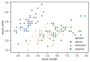
示例 2:在数据框中传递数据向量而不是名称。
Python3
import seaborn as sns


iris = sns.load_dataset("iris")

sns.scatterplot(x = iris.sepal_length,
                y = iris.sepal_width,
                hue = iris.species,
                style = iris.species)
输出:
Seaborn.lineplot()
散点图非常有效,但没有普遍最优的可视化类型。对于某些数据集,您可能希望将变化视为一个变量的时间函数,或类似的连续变量。在这种情况下,绘制线图是更好的选择。
句法 :
seaborn.lineplot(x=None, y=None, data=None, **kwargs)参数 :Parameter Value Use x, y numeric Input data variables data Dataframe Dataset that is being used. hue, size, style name in data; optional Grouping variable that will produce elements with different colors. palette name, list, or dict; optional Colors to use for the different levels of the hue variable. hue_order list; optional Specified order for the appearance of the hue variable levels. hue_norm tuple or Normalize object; optional Normalization in data units for colormap applied to the hue variable when it is numeric. sizes list, dict, or tuple; optional determines the size of each point in the plot. size_order list; optional Specified order for appearance of the size variable levels size_norm tuple or Normalize object; optional Normalization in data units for scaling plot objects when the size variable is numeric. markers, dashes boolean, list, or dictionary; optional object determining the shape of marker for each data points. style_order list; optional Specified order for appearance of the style variable levels units long_form_var Grouping variable identifying sampling units. When used, a separate line with correct terminology will be drawn for each unit but no legend entry will be inserted. Useful for displaying experimental replicate distribution when exact identities are not necessary. estimator name of pandas method or callable or None; optional Method for aggregating the vector y at the same x point through multiple observations. If None, all observations will be drawn. ci int or “sd” or None; optional Size of the confidence interval to be drawn when aggregating with an estimator. “sd” means drawing a standard deviation. n_boot int; optional> Number of bootstraps to use for confidence interval measurement. seed int, numpy.random.Generator, or numpy.random.RandomState; optional Seed or random number generator for reproducible bootstrapping. sort bool; optional is True, sorts the data. err_style “band” or “bars”; optional Either using translucent error bands to display the confidence intervals or discrete error bars. err_kws dict of keyword arguments Additional parameters to control the aesthetics of the error bars. legend “brief”, “full”, or False; optional If “brief”, numeric hue and size variables will be represented with a sample of evenly spaced values. If “full”, every group will get an entry in the legend. If False, no legend data is added and no legend is drawn. ax matplotlib axes; optional Axes object in which the plot is to be drawn. kwargs key, value pairings Other keyword arguments are passed through to the underlying plotting function.
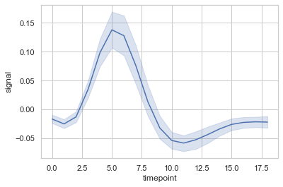
示例 1:使用 lineplot() 对“fmri”数据集进行基本可视化
Python3
import seaborn as sns


sns.set(style = 'whitegrid')
fmri = sns.load_dataset("fmri")

sns.lineplot(x ="timepoint",
             y ="signal",
             data = fmri)
输出 :
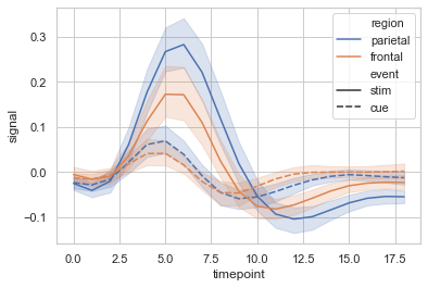
示例 2:根据类别对数据点进行分组,此处为区域和事件。
Python3
import seaborn as sns


sns.set(style = 'whitegrid')
fmri = sns.load_dataset("fmri")

sns.lineplot(x ="timepoint",
             y ="signal",
             hue ="region",
             style ="event",
             data = fmri)
输出 :
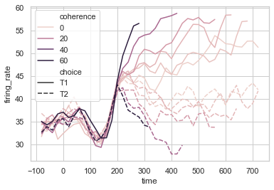
示例 3:可视化“点”数据集的复杂绘图,以展示 seaborn 的强大功能。在此,在此示例中,使用了定量颜色映射。
Python3
import seaborn as sns


sns.set(style = 'whitegrid')
dots = sns.load_dataset("dots").query("align == 'dots'")

sns.lineplot(x ="time",
             y ="firing_rate",
             hue ="coherence",
             style ="choice",
             data = dots)
输出 :