Seaborn 中的关系图 – 第一部分
关系图用于可视化数据点之间的统计关系。可视化是必要的,因为它允许人类看到数据中的趋势和模式。了解数据集中的变量如何相互关联以及它们之间的关系的过程称为统计分析。
Seaborn 与 matplotlib 不同,它还提供了一些默认数据集。在本文中,我们将使用名为“tips”的默认数据集。该数据集提供了有关在某家餐厅用餐的人的信息,以及他们是否给服务员留下小费、他们的性别以及他们是否吸烟等等。
让我们看一下数据集。
python3
# importing the library
import seaborn as sns

# reading the dataset
data = sns.load_dataset('tips')

# printing first five entries
print(data.head())
Python3
# importing the library
import seaborn as sns

# selecting style
sns.set(style ="ticks")

# reading the dataset
tips = sns.load_dataset('tips')

# plotting a simple visualization of data points
sns.relplot(x ="total_bill", y ="tip", data = tips)
Python3
# importing the library
import seaborn as sns

# selecting style
sns.set(style ="ticks")

# reading the dataset
tips = sns.load_dataset('tips')

sns.relplot(x="total_bill",
            y="tip",
            hue="time",
            data=tips)
Python3
# importing the library
import seaborn as sns

# selecting style
sns.set(style ="ticks")

# reading the dataset
tips = sns.load_dataset('tips')

sns.relplot(x="total_bill",
            y="tip",
            hue="day",
            col="time",
            row="sex",
            data=tips)
Python3
# importing the library
import seaborn as sns

# selecting style
sns.set(style ="ticks")

# reading the dataset
tips = sns.load_dataset('tips')

sns.relplot(x="total_bill",
            y="tip",
            hue="day",
            size="size",
            data=tips)
输出 :
total_bill   tip     sex smoker  day    time  size
0       16.99  1.01  Female     No  Sun  Dinner     2
1       10.34  1.66    Male     No  Sun  Dinner     3
2       21.01  3.50    Male     No  Sun  Dinner     3
3       23.68  3.31    Male     No  Sun  Dinner     2
4       24.59  3.61  Female     No  Sun  Dinner     4
为了绘制关系图,seaborn 提供了三个函数。这些都是:
- 关系图()
- 散点图()
- 线图()
Seaborn.relplot()
该函数为我们提供了对其他一些不同轴级函数的访问,这些函数显示了两个变量之间的关系以及子集的语义映射。
句法 :
seaborn.relplot(x=None, y=None, data=None, **kwargs) 参数 :
Parameter Value Use x, y numeric Input data variables Data Dataframe Dataset that is being used. hue, size, style name in data; optional Grouping variable that will produce elements with different colors. kind scatter or line; default : scatter defines the type of plot, either scatterplot() or lineplot() row, col names of variables in data; optional Categorical variables that will determine the faceting of the grid. col_wrap int; optional “Wrap” the column variable at this width, so that the column facets span multiple rows. row_order, col_order lists of strings; optional Order to organize the rows and columns of the grid. palette name, list, or dict; optional Colors to use for the different levels of the hue variable. hue_order list; optional Specified order for the appearance of the hue variable levels. hue_norm tuple or Normalize object; optional Normalization in data units for colormap applied to the hue variable when it is numeric. sizes list, dict, or tuple; optional determines the size of each point in the plot. size_order list; optional Specified order for appearance of the size variable levels size_norm tuple or Normalize object; optional Normalization in data units for scaling plot objects when the size variable is numeric. legend “brief”, “full”, or False; optional If “brief”, numeric hue and size variables will be represented with a sample of evenly spaced values. If “full”, every group will get an entry in the legend. If False, no legend data is added and no legend is drawn. height scalar; optional Height (in inches) of each facet. Aspect scalar; optional Aspect ratio of each facet, i.e. width/height facet_kws dict; optional Dictionary of other keyword arguments to pass to FacetGrid. kwargs key, value pairings Other keyword arguments are passed through to the underlying plotting function.
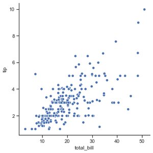
示例 1:可视化最基本的绘图以显示tips 数据集中的所有数据点。
Python3
# importing the library
import seaborn as sns

# selecting style
sns.set(style ="ticks")

# reading the dataset
tips = sns.load_dataset('tips')

# plotting a simple visualization of data points
sns.relplot(x ="total_bill", y ="tip", data = tips)
输出 :
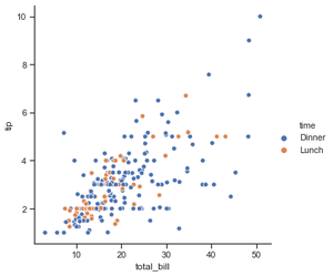
示例 2:根据类别(此处为时间)对数据点进行分组。
Python3
# importing the library
import seaborn as sns

# selecting style
sns.set(style ="ticks")

# reading the dataset
tips = sns.load_dataset('tips')

sns.relplot(x="total_bill",
            y="tip",
            hue="time",
            data=tips)
输出 :
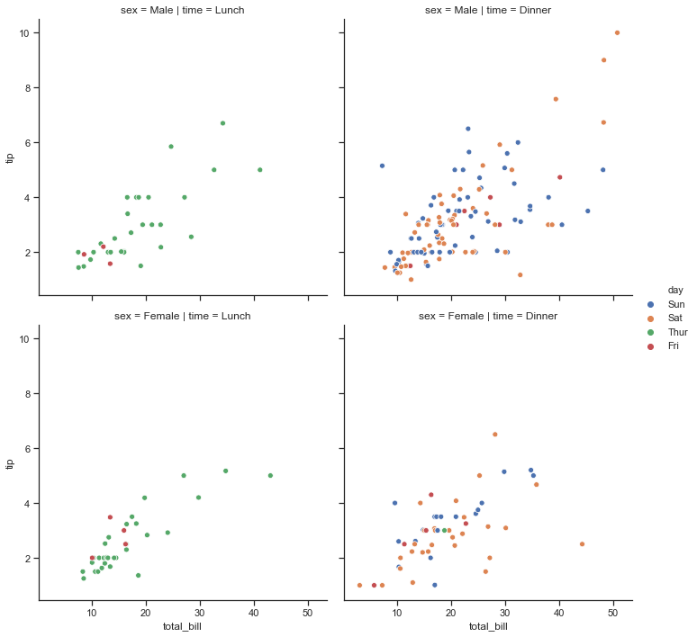
示例 3:使用 确定网格刻面的时间和性别。
Python3
# importing the library
import seaborn as sns

# selecting style
sns.set(style ="ticks")

# reading the dataset
tips = sns.load_dataset('tips')

sns.relplot(x="total_bill",
            y="tip",
            hue="day",
            col="time",
            row="sex",
            data=tips)
输出:
示例 4:使用 size 属性,我们可以看到具有不同大小的数据点。
Python3
# importing the library
import seaborn as sns

# selecting style
sns.set(style ="ticks")

# reading the dataset
tips = sns.load_dataset('tips')

sns.relplot(x="total_bill",
            y="tip",
            hue="day",
            size="size",
            data=tips)
输出:
