Android Jetpack Compose 中的 Canvas API
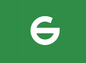
Jetpack Compose是一个现代 UI 工具包,旨在简化 Android 中的 UI 开发。它由一个反应式编程模型组成,具有 Kotlin 编程语言的简洁和易用性。它是完全声明性的,因此您可以通过调用一些将您的数据转换为 UI 层次结构的函数来描述您的 UI。当数据更改或更新时,框架会自动调用这些函数并为您更新视图。有时,应用程序需要在屏幕上绘制一些自定义图形,并精确控制在屏幕上绘制的内容。在本文中,我们将学习 jetpack compose 中 Canvas API 的基础知识,并尝试使用 canvas API 创建 GeeksforGeeks 徽标。下面是它最终的样子,
分步实施
第 1 步:创建一个新项目
要在 Android Studio Canary 版本中创建新项目,请参阅如何使用 Jetpack Compose 在 Android Studio Canary 版本中创建新项目。
第 2 步:使用 MainActivity.kt 文件
导航到应用程序 > Java > 您的应用程序的包名称并打开 MainActivity.kt 文件。
Kotlin
@Composable
fun Icon(modifier: Modifier = Modifier) {
    Canvas(modifier = modifier.size(100.dp), onDraw = {

        val canvasWidth = size.width
        val canvasHeight = size.height

        // we first draw the arc which
        // will be the curve of the logo
        drawArc(
            color = Color.White,
            // arc starts at 0 degree and ends
            startAngle = 0f,
            // set use center to false to draw the
            // arc without centered line
            // Tip: use center to true to draw the arc
            // with centered line and see the difference
            useCenter = false,
            // set the end angle of the arc
            sweepAngle = 300f,
            // set the width of the arc and
            // how the arc cap will be drawn
            // cap = StrokeCap.Round will draw
            // the arc with rounded end
            style = Stroke(width = 40f, cap = StrokeCap.Square)
        )

    })

}
Kotlin
class MainActivity : ComponentActivity() {
    override fun onCreate(savedInstanceState: Bundle?) {
        super.onCreate(savedInstanceState)
        setContent {
              // CanvasApiTheme is Auto generated theme,
              // It will be appnameTheme in your case
            CanvasAPITheme {
                Icon()
            }
        }
    }
}
Kotlin
// draw the center line of the logo
drawLine(
            color = Color.White,
            // set the start point of the
            // line to the center of the canvas
            start = Offset(x = 0f, y = canvasHeight / 2),
            // set the end point of the
            // line to the center of the canvas
            end = Offset(x = canvasWidth, y = canvasHeight / 2),
            // set the width of the line
            strokeWidth = 40f
        )
Kotlin
class MainActivity : ComponentActivity() {
override fun onCreate(savedInstanceState: Bundle?) {
super.onCreate(savedInstanceState)
setContent {
CanvasAPITheme {
// Create a box to and set contentAlignment
// to Center to center the Icon
Box(
modifier = Modifier
.fillMaxSize()
.background(Color(0xFF308D46)),
contentAlignment = Alignment.Center
) {
// Create a row
Row {
// Place one Icon in the row but
// rotate Y Axis by -180 degree
// it will look like mirror image
Icon(Modifier.graphicsLayer(rotationY = -180f))
// set some space between the icons
Spacer(modifier = Modifier.width(20.dp))
// Original Icon without rotation
Icon()
}
}
}
}
}
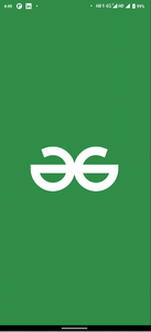
}如果您从 setContent 调用此可组合项,您将看到类似这样的内容。
科特林
class MainActivity : ComponentActivity() {
    override fun onCreate(savedInstanceState: Bundle?) {
        super.onCreate(savedInstanceState)
        setContent {
              // CanvasApiTheme is Auto generated theme,
              // It will be appnameTheme in your case
            CanvasAPITheme {
                Icon()
            }
        }
    }
}

现在我们需要在中心添加一条线。我们将在画布范围内使用函数drawLine 。在圆弧下方添加此代码,使其位于圆弧顶部
Note: Order in which shapes are written in canvas scope is the order in which they will be placed on each other.
科特林
// draw the center line of the logo
drawLine(
            color = Color.White,
            // set the start point of the
            // line to the center of the canvas
            start = Offset(x = 0f, y = canvasHeight / 2),
            // set the end point of the
            // line to the center of the canvas
            end = Offset(x = canvasWidth, y = canvasHeight / 2),
            // set the width of the line
            strokeWidth = 40f
        )
现在,如果您运行该应用程序,您将看到像这样的完整G。
我们的一侧的标志是完整的,我们只需将两个可组合的图标排成一排,使一个是彼此的镜像。 MainActivity 现在看起来像这样。请参阅评论以更好地理解。
科特林
class MainActivity : ComponentActivity() {
    override fun onCreate(savedInstanceState: Bundle?) {
        super.onCreate(savedInstanceState)
        setContent {
            CanvasAPITheme {
                // Create a box to and set contentAlignment
                // to Center to  center the Icon
                Box(
                    modifier = Modifier
                        .fillMaxSize()
                        .background(Color(0xFF308D46)),

                    contentAlignment = Alignment.Center
                ) {

                    // Create a row
                    Row {

                        // Place one Icon in the row but
                        // rotate Y Axis by -180 degree
                        // it will look like mirror image
                        Icon(Modifier.graphicsLayer(rotationY = -180f))

                        // set some space between the icons
                        Spacer(modifier = Modifier.width(20.dp))

                        // Original Icon without rotation
                        Icon()

                    }
                }
            }
        }
    }
}
现在运行应用程序以查看最终结果。
输出:
在本文中,我们使用了Arc和Line。 Canvas 还提供了绘制其他形状的选项,例如
- drawRect绘制一个矩形。
- drawImage绘制位图。
- drawRoundRect绘制一个圆角矩形。
- drawCircle绘制一个圆。
- drawOval为椭圆形。
- 绘制路径的drawPath 。
- drawPoints绘制参数中给出的点。