材质 UI 工具栏
Material-UI 是一个用户界面库,提供预定义和可定制的 React 组件,用于更快、更轻松的 Web 开发,这些 Material-UI 组件基于 Google 的 Material Design。在本文中,我们将讨论 Material-UI 库中的Toolbar组件。
工具栏:
ToolBar 不像其他 Material-UI 组件那样独立工作,它与 AppBar 一起工作。 Toolbar 组件设置子项的属性以使它们水平对齐。 Toolbar 组件简单地应用正常的 CSS flex(display: 'flex'),通过 alignItems: 'center' 进行垂直居中,一些填充和由 theme.mixins.toolbar 提供的 minHeight: 56px。
句法:
This Is ToolBar Example
安装反应应用程序:
Step1 :使用以下命令创建一个 React 应用程序。
npx create-react-app toolbar-example第2步:现在进入项目目录
cd toolbar-example安装 Material-UI:
通过 npm/yarn 安装 Material-UI 的源文件,它们负责注入所需的 CSS。
npm install @material-ui/core
// OR
yarn add @material-ui/core
导入 AppBar 和 Toolbar:
import AppBar from '@material-ui/core/AppBar';
import Toolbar from '@material-ui/core/Toolbar';
重要道具:
- children :是 Toolbar 的子项,通常可以是 IconButton、Button、Typography 等的混合体。
- component :用于根节点的组件。使用 HTML 元素的字符串或组件。例如:分区。
- disableGutters :用于启用或禁用装订线填充。示例:真或假。
- 变体:用于选择工具栏的变体。例如:规则的,密集的。
CSS 规则名称:
- root :这会将样式应用于根元素。
- gutters :如果 disableGutters={false},这会将样式应用于根元素。
- 常规:如果变体=“常规”,这会将样式应用于根元素。
- 密集:如果variant =“dense”,这会将样式应用于根元素。
示例 1:在此示例中,我们将工具栏实现为 Top AppBar。
Javascript
import React from 'react';
import {AppBar, Toolbar, IconButton, Typography, Button} from '@material-ui/core';
import { fade, makeStyles } from '@material-ui/core/styles';
import MenuIcon from '@material-ui/icons/Menu';
const useStyles = makeStyles((theme) => ({
root: {
flexGrow: 1,
},
menuButton: {
marginRight: theme.spacing(2),
},
title: {
flexGrow: 1,
display: 'none',
[
theme.breakpoints.up('sm')]: {
display: 'block',
},
},
}));
export default function ToolbarExample() {
const classes = useStyles();
return (
Welcome To GFG
);
}Javascript
import React from 'react';
import { makeStyles } from '@material-ui/core/styles';
import {
  AppBar,
  Toolbar,
  Typography,
  IconButton,
  Paper,
  Fab,
  List,
  ListItem,
  ListItemText} from '@material-ui/core';
import MenuIcon from '@material-ui/icons/Menu';
import AddIcon from '@material-ui/icons/Add';

const messages = [
  {
    id: 1,
    primary: 'Welcome To GeeksForGeeks',
    secondary: "A Computer Science Portal For Geeks",
  },
  {
    id: 2,
    primary: 'Welcome To GeeksForGeeks',
    secondary: "A Computer Science Portal For Geeks",
  },
  {
    id: 3,
    primary: 'Welcome To GeeksForGeeks',
    secondary: "A Computer Science Portal For Geeks",
  },
  {
    id: 4,
    primary: 'Welcome To GeeksForGeeks',
    secondary: "A Computer Science Portal For Geeks",
  },
  {
    id: 5,
    primary: 'Welcome To GeeksForGeeks',
    secondary: "A Computer Science Portal For Geeks",
  },
  {
    id: 6,
    primary: 'Welcome To GeeksForGeeks',
    secondary: "A Computer Science Portal For Geeks",
  },
  {
    id: 7,
    primary: 'Welcome To GeeksForGeeks',
    secondary: "A Computer Science Portal For Geeks",
  },
  {
    id: 8,
    primary: 'Welcome To GeeksForGeeks',
    secondary: "A Computer Science Portal For Geeks",
  }
];

const useStyles = makeStyles((theme) => ({
  text: {
    padding: theme.spacing(2, 2, 0),
  },
  paper: {
    paddingBottom: 50,
  },
  list: {
    marginBottom: theme.spacing(2),
  },
  appBar: {
    top: 'auto',
    bottom: 0,
  },
  fabButton: {
    position: 'absolute',
    zIndex: 1,
    top: -30,
    left: 0,
    right: 0,
    margin: '0 auto',
  },
}));

export default function BottomAppBar() {
  const classes = useStyles();
  return (


          List


          {messages.map(({ id, primary,
                           secondary, person }) => (


          ))}


  );
}运行应用程序的步骤:从项目的根目录使用以下命令运行应用程序:
npm start输出:

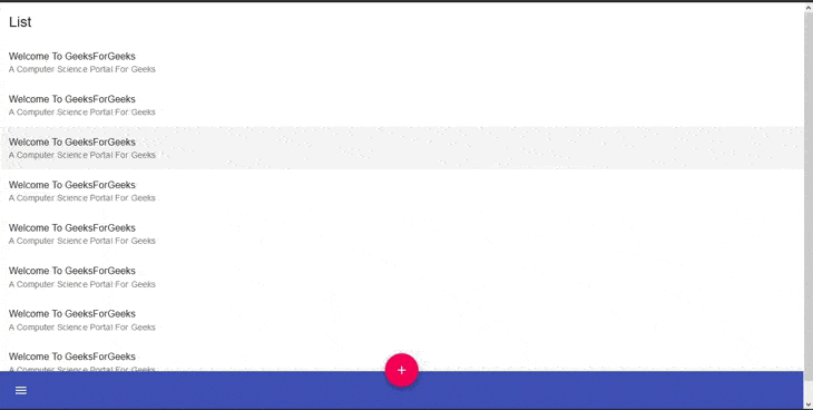
示例 2:作为底部 AppBar
Javascript
import React from 'react';
import { makeStyles } from '@material-ui/core/styles';
import {
  AppBar,
  Toolbar,
  Typography,
  IconButton,
  Paper,
  Fab,
  List,
  ListItem,
  ListItemText} from '@material-ui/core';
import MenuIcon from '@material-ui/icons/Menu';
import AddIcon from '@material-ui/icons/Add';

const messages = [
  {
    id: 1,
    primary: 'Welcome To GeeksForGeeks',
    secondary: "A Computer Science Portal For Geeks",
  },
  {
    id: 2,
    primary: 'Welcome To GeeksForGeeks',
    secondary: "A Computer Science Portal For Geeks",
  },
  {
    id: 3,
    primary: 'Welcome To GeeksForGeeks',
    secondary: "A Computer Science Portal For Geeks",
  },
  {
    id: 4,
    primary: 'Welcome To GeeksForGeeks',
    secondary: "A Computer Science Portal For Geeks",
  },
  {
    id: 5,
    primary: 'Welcome To GeeksForGeeks',
    secondary: "A Computer Science Portal For Geeks",
  },
  {
    id: 6,
    primary: 'Welcome To GeeksForGeeks',
    secondary: "A Computer Science Portal For Geeks",
  },
  {
    id: 7,
    primary: 'Welcome To GeeksForGeeks',
    secondary: "A Computer Science Portal For Geeks",
  },
  {
    id: 8,
    primary: 'Welcome To GeeksForGeeks',
    secondary: "A Computer Science Portal For Geeks",
  }
];

const useStyles = makeStyles((theme) => ({
  text: {
    padding: theme.spacing(2, 2, 0),
  },
  paper: {
    paddingBottom: 50,
  },
  list: {
    marginBottom: theme.spacing(2),
  },
  appBar: {
    top: 'auto',
    bottom: 0,
  },
  fabButton: {
    position: 'absolute',
    zIndex: 1,
    top: -30,
    left: 0,
    right: 0,
    margin: '0 auto',
  },
}));

export default function BottomAppBar() {
  const classes = useStyles();
  return (


          List


          {messages.map(({ id, primary,
                           secondary, person }) => (


          ))}


  );
}
输出: