Angular 材质工具栏组件
Angular Material是由 Google 开发的 UI 组件库,以便 Angular 开发人员可以以结构化和响应式的方式开发现代应用程序。通过使用这个库,我们可以极大地提高最终用户的用户体验,从而为我们的应用程序赢得人气。该库包含现代即用型元素,可以直接使用最少或无需额外代码。
句法:
Content 安装语法:
基本的先决条件是我们必须在系统上安装 Angular CLI 才能添加和配置 Angular 材质库。满足所需条件后,我们可以在 Angular CLI 上键入以下命令:
ng add @angular/material有关详细的安装过程,请参阅将 Angular 材质组件添加到 Angular 应用程序一文。
添加工具栏组件:
要使用工具栏组件,我们需要将其导入到module.ts文件中。
import { MatToolbarModule } from '@angular/material/toolbar';然后,我们需要将此组件添加到我们的导入数组中。在此之后,我们可以在我们的代码中使用它。
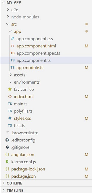
项目结构:
安装成功后,项目结构如下图所示:
示例:以下示例说明了 Angular 材质工具栏的实现。
app.module.ts
import { CommonModule } from "@angular/common";
import { NgModule } from "@angular/core";

import { MatToolbarModule } from "@angular/material/toolbar";
import { BrowserModule } from "@angular/platform-browser";
import { AppComponent } from "./app.component";
import { BrowserAnimationsModule }
      from "@angular/platform-browser/animations";
import { MatIconModule } from "@angular/material/icon";

@NgModule({
  declarations: [AppComponent],
  exports: [AppComponent],
  imports: [
    CommonModule,
    BrowserAnimationsModule,
    MatToolbarModule,
    BrowserModule,
    MatIconModule,
  ],
  bootstrap: [AppComponent],
})
export class AppModule {}
app.component.ts
import { Component } from '@angular/core';

@Component({
  selector: 'my-app',
  templateUrl: './app.component.html',
  styleUrls: [ './app.component.css' ]
})
export class AppComponent  {}
app.component.html
    GeeksforGeeks


    Tutorials

    assignment


    Contribute Article

    create


      how_to_reg
app.component.css
@import "~material-icons/iconfont/material-icons.css";

.example-icon {
  padding: 0 14px;
}
.example-spacer {
  flex: 1 1 auto;
}

.title-center {
  margin: 0 auto;
  color: white;
}

.title-toolbar {
  background: green;
}
输出:
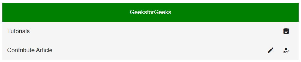
角度材质工具栏
参考: https ://material.angular.io/components/toolbar/overview