将 Matplotlib 与 Jupyter Notebook 一起使用
Jupyter Notebook是一个开源 Web 应用程序,可让您创建和共享包含实时代码、方程式、可视化和叙述性文本的文档。用途包括:数据清理和转换、数值模拟、统计建模、数据可视化、机器学习等等。
注意:有关更多信息,请参阅如何使用 Jupyter Notebook - 终极指南
Matplotlib是用于数据可视化的最流行的Python包之一。它是一个跨平台库,用于从数组中的数据制作 2D 绘图。开始时,您只需要进行必要的导入,准备一些数据,然后您可以在plot()函数的帮助下开始绘图。当你'重新完成,记得使用show()函数显示你的情节。
Matplotlib 是用Python编写的,并利用了NumPy ,这是Python的数值数学扩展。它由几个图组成,例如:-
- 线
- 酒吧
- 分散
- 直方图
- 还有很多
安装
- 使用pip安装 Matplotlib
Matplotlib 也可以使用Python包管理器 pip 安装。要使用 pip 安装 Matplotlib,请打开终端窗口并键入:pip install matplotlib - 使用Anaconda 提示安装 Matplotlib
Matplotlib 可以与 Anaconda Prompt 一起安装。如果您的机器上有 Anaconda Prompt,通常可以在 Windows 开始菜单中看到它。要安装 Matplotlib,请打开 Anaconda Prompt 并键入:conda install matplotlib

将 Matplotlib 与 Jupyter Notebook 一起使用
安装完成后。让我们开始使用 Matplotlib 和 Jupyter Notebook。我们将使用 Matplotlib 在 Jupyter Notebook 中绘制各种图表。
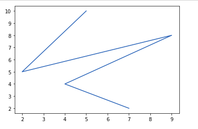
线图
# importing matplotlib module
from matplotlib import pyplot as plt

# x-axis values
x = [5, 2, 9, 4, 7]

# Y-axis values
y = [10, 5, 8, 4, 2]

# Function to plot
plt.plot(x, y)

# function to show the plot
plt.show()
输出 :
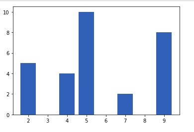
条形图
# importing matplotlib module
from matplotlib import pyplot as plt

# x-axis values
x = [5, 2, 9, 4, 7]

# Y-axis values
y = [10, 5, 8, 4, 2]

# Function to plot
plt.bar(x, y)

# function to show the plot
plt.show()
输出 :
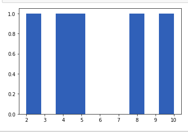
直方图
# importing matplotlib module
from matplotlib import pyplot as plt

# Y-axis values
y = [10, 5, 8, 4, 2]

# Function to plot histogram
plt.hist(y)

# Function to show the plot
plt.show()
输出 :
散点图
# importing matplotlib module
from matplotlib import pyplot as plt

# x-axis values
x = [5, 2, 9, 4, 7]

# Y-axis values
y = [10, 5, 8, 4, 2]

# Function to plot scatter
plt.scatter(x, y)

# function to show the plot
plt.show()
输出 :

在图表中添加标题并标记轴
我们可以使用以下命令为图表添加标题
matplotlib.pyplot.title("My title")我们可以使用以下函数标记 x 轴和 y 轴
matplotlib.pyplot.xlabel("Time (Hr)")

matplotlib.pyplot.ylabel("Position (Km)")
例子 :
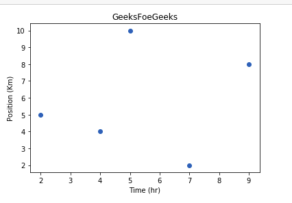
# importing matplotlib module
from matplotlib import pyplot as plt

# x-axis values
x = [5, 2, 9, 4, 7]

# Y-axis values
y = [10, 5, 8, 4, 2]

# Function to plot
plt.scatter(x, y)

# Adding Title
plt.title("GeeksFoeGeeks")

# Labeling the axes
plt.xlabel("Time (hr)")
plt.ylabel("Position (Km)")

# function to show the plot
plt.show()
输出:
我们还可以在同一个单元格中编写一个程序来一起打印多个图形。
我们可以通过在程序中重复 show()函数来垂直打印这些图,或者我们可以使用一个名为subplot()的函数来水平打印它们。
from matplotlib import pyplot as plt


x = [1, 2, 3, 4, 5]
y = [1, 4, 9, 16, 25]
plt.scatter(x, y)

# function to show the plot
plt.show()

plt.plot(x, y)

# function to show the plot
plt.show()
输出
