R 编程中的马赛克图
镶嵌图用于显示划分为两个或多个条件分布的表的对称性。马赛克图是可视化分层数据的好方法。矩形集合代表所有要可视化的元素,不同大小和颜色的矩形构成一个表格,但这些马赛克图表的独特之处在于元素的排列,其中有层次结构,这些元素被收集并标记在一起,也许即使有子类别。因此,马赛克图可用于非常有效地绘制分类数据,数据的面积显示相对比例。
在本文中,我们将学习如何用 R 编程语言创建马赛克图。用于此的包是vcd 。
方法一:使用mosaic()函数
R 编程语言中用于创建马赛克图的函数是mosaic()。
Syntax:
mosaic(x,shade=NULL,legend=NULL, main = NULL,..)
Parameters:
- x: Here, x is pointing to the variable that holds the dataset/table. We passed our dataset name here.
- shade: shade is a boolean variable, if it is set to be true then we will get a colored plot. Its default value is NULL.
- legend: the legend is a boolean variable, if it is set to be true then we will be able to see legends alongside our mosaic plot. Its default value is NULL.
- main: main is a string variable, here we pass the title of our mosaic plot.
要创建绘图,首先将包加载到空间中,然后创建数据集。创建的数据集被传递给函数。
示例 1:
R
library('vcd')

# creating a random dataset
# creating 6 rows
data_values <- matrix(c(80, 10, 15,
                        70, 86, 18,
                        60, 30, 12,
                        90, 20, 25,
                        60, 96, 88,
                        50, 20, 32))

# creating dataset with above values
data <- as.table(
  matrix(
    data_values,

    # specifying the number of rows
    nrow = 6,
    byrow = TRUE,

    # creating two lists one for rows
    # and one for columns
    dimnames = list(
      Random_Rows = c('A','B','C', 'D', 'E', 'F'),
      Random_Columns = c('col_1', 'col_2', 'col_3')
      )
    )
  )

# plotting the mosaic chart
mosaic(data)
R
library('vcd')

# creating a random dataset
# creating 6 rows
data_values <- matrix(c(80, 10, 15,
                        70, 86, 18,
                        60, 30, 12,
                        90, 20, 25,
                        60, 96, 88,
                        50, 20, 32))

# creating dataset with above values
data <- as.table(
  matrix(
    data_values,

    # specifying the number of rows
    nrow = 6,
    byrow = TRUE,

    # creating two lists one for rows
    # and one for columns
    dimnames = list(
      Random_Rows = c('A','B','C', 'D', 'E', 'F'),
      Random_Columns = c('col_1', 'col_2', 'col_3')
      )
    )
  )

# plotting the mosaic chart
mosaic(data,

       # shade is used to plot colored chart
       shade=TRUE,

       # adding title to the chart
       main = "A Mosaic Plot"
)
输出:
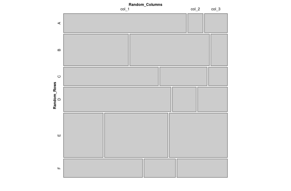
简单的马赛克图
还可以使用自定义功能绘制马赛克图,使其更具表现力。
示例 2:
电阻
library('vcd')

# creating a random dataset
# creating 6 rows
data_values <- matrix(c(80, 10, 15,
                        70, 86, 18,
                        60, 30, 12,
                        90, 20, 25,
                        60, 96, 88,
                        50, 20, 32))

# creating dataset with above values
data <- as.table(
  matrix(
    data_values,

    # specifying the number of rows
    nrow = 6,
    byrow = TRUE,

    # creating two lists one for rows
    # and one for columns
    dimnames = list(
      Random_Rows = c('A','B','C', 'D', 'E', 'F'),
      Random_Columns = c('col_1', 'col_2', 'col_3')
      )
    )
  )

# plotting the mosaic chart
mosaic(data,

       # shade is used to plot colored chart
       shade=TRUE,

       # adding title to the chart
       main = "A Mosaic Plot"
)
输出:
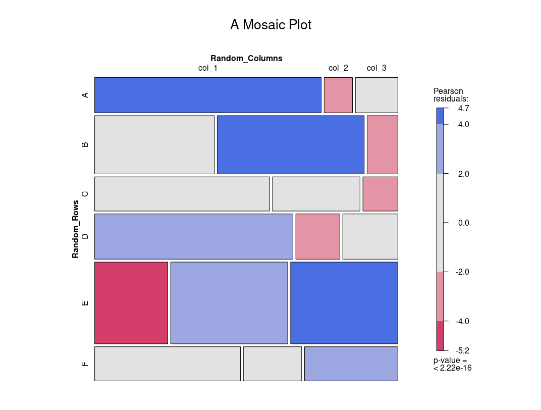
一个简单的马赛克图