R中的曲线拟合
在本文中,我们将讨论如何在 R 编程语言中将曲线拟合到数据框。
曲线拟合是统计分析的基本功能之一。它帮助我们确定趋势和数据,并帮助我们基于回归模型/函数预测未知数据。
数据框的可视化:
为了将曲线拟合到 R 语言中的某个数据框,我们首先借助基本散点图将数据可视化。在 R 语言中,我们可以使用 plot()函数创建一个基本的散点图。
句法:
plot( df$x, df$y)在哪里,
- df:确定要使用的数据框。
- x 和 y:确定轴变量。
例子:
R
# create sample data
sample_data <- data.frame(x=1:10,
                 y=c(25, 22, 13, 10, 5,
                     9, 12, 16, 34, 44))

#create a basic scatterplot
plot(sample_data$x, sample_data$y)
R
# create sample data
sample_data <- data.frame(x=1:10,
                 y=c(25, 22, 13, 10, 5,
                     9, 12, 16, 34, 44))

# fit polynomial regression models up to degree 5
linear_model1 <- lm(y~x, data=sample_data)
linear_model2 <- lm(y~poly(x,2,raw=TRUE), data=sample_data)
linear_model3 <- lm(y~poly(x,3,raw=TRUE), data=sample_data)
linear_model4 <- lm(y~poly(x,4,raw=TRUE), data=sample_data)
linear_model5 <- lm(y~poly(x,5,raw=TRUE), data=sample_data)

# create a basic scatterplot
plot(sample_data$x, sample_data$y)

# define x-axis values
x_axis <- seq(1, 10, length=10)

# add curve of each model to plot
lines(x_axis, predict(linear_model1, data.frame(x=x_axis)), col='green')
lines(x_axis, predict(linear_model2, data.frame(x=x_axis)), col='red')
lines(x_axis, predict(linear_model3, data.frame(x=x_axis)), col='purple')
lines(x_axis, predict(linear_model4, data.frame(x=x_axis)), col='blue')
lines(x_axis, predict(linear_model5, data.frame(x=x_axis)), col='orange')
R
# create sample data
sample_data <- data.frame(x=1:10,
                 y=c(25, 22, 13, 10, 5,
                     9, 12, 16, 34, 44))

# fit polynomial regression models up to degree 5
linear_model1 <- lm(y~x, data=sample_data)
linear_model2 <- lm(y~poly(x,2,raw=TRUE), data=sample_data)
linear_model3 <- lm(y~poly(x,3,raw=TRUE), data=sample_data)
linear_model4 <- lm(y~poly(x,4,raw=TRUE), data=sample_data)
linear_model5 <- lm(y~poly(x,5,raw=TRUE), data=sample_data)

# calculated adjusted R-squared of each model
summary(linear_model1)$adj.r.squared
summary(linear_model2)$adj.r.squared
summary(linear_model3)$adj.r.squared
summary(linear_model4)$adj.r.squared
summary(linear_model5)$adj.r.squared
R
# create sample data
sample_data <- data.frame(x=1:10,
                          y=c(25, 22, 13, 10, 5,
                              9, 12, 16, 34, 44))

# Create best linear model
best_model <- lm(y~poly(x,4,raw=TRUE), data=sample_data)

# create a basic scatterplot
plot(sample_data$x, sample_data$y)

# define x-axis values
x_axis <- seq(1, 10, length=10)

# plot best model
lines(x_axis, predict(best_model, data.frame(x=x_axis)), col='green')
输出:

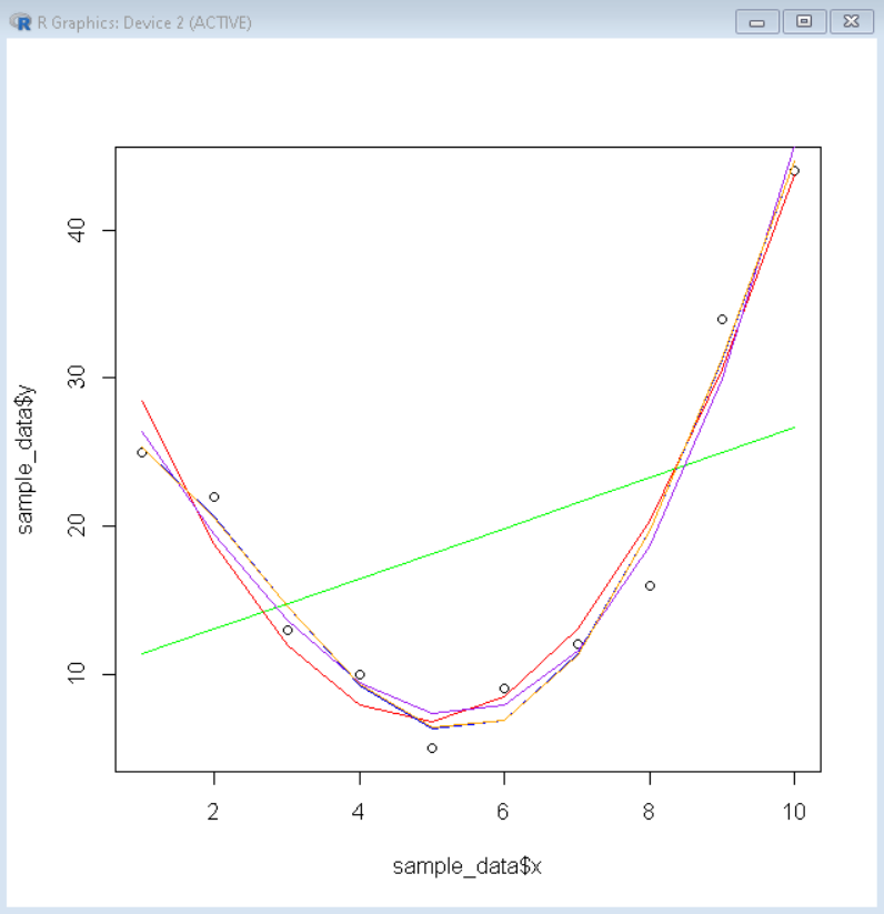
创建几条曲线以适应数据
然后我们创建所需程度的线性回归模型,并将它们绘制在散点图的顶部,以查看哪个更适合数据。我们使用 lm()函数来创建线性模型。然后使用 lines()函数使用这些线性模型在散点图顶部绘制线图。
句法:
lm( function, data)在哪里,
- 函数:确定拟合多项式函数。
- 数据:确定要在其上拟合函数的数据框。
例子:
R
# create sample data
sample_data <- data.frame(x=1:10,
                 y=c(25, 22, 13, 10, 5,
                     9, 12, 16, 34, 44))

# fit polynomial regression models up to degree 5
linear_model1 <- lm(y~x, data=sample_data)
linear_model2 <- lm(y~poly(x,2,raw=TRUE), data=sample_data)
linear_model3 <- lm(y~poly(x,3,raw=TRUE), data=sample_data)
linear_model4 <- lm(y~poly(x,4,raw=TRUE), data=sample_data)
linear_model5 <- lm(y~poly(x,5,raw=TRUE), data=sample_data)

# create a basic scatterplot
plot(sample_data$x, sample_data$y)

# define x-axis values
x_axis <- seq(1, 10, length=10)

# add curve of each model to plot
lines(x_axis, predict(linear_model1, data.frame(x=x_axis)), col='green')
lines(x_axis, predict(linear_model2, data.frame(x=x_axis)), col='red')
lines(x_axis, predict(linear_model3, data.frame(x=x_axis)), col='purple')
lines(x_axis, predict(linear_model4, data.frame(x=x_axis)), col='blue')
lines(x_axis, predict(linear_model5, data.frame(x=x_axis)), col='orange')
输出:
调整后 r 平方值的最佳拟合曲线
现在,由于我们无法仅通过视觉表示来确定更好的拟合模型,因此我们有一个汇总变量 r.squared,这有助于我们确定最佳拟合模型。调整后的 r 平方是减去模型误差后 Y 不变的方差百分比。 R 平方值越大,模型对于该数据帧的效果就越好。为了获得线性模型的调整后的 r 平方值,我们使用 summary()函数,其中包含调整后的 r 平方值作为变量 adj.r.squared。
句法:
summary( linear_model )$adj.r.squared在哪里,
- linear_model:确定要提取其摘要的线性模型。
例子:
R
# create sample data
sample_data <- data.frame(x=1:10,
                 y=c(25, 22, 13, 10, 5,
                     9, 12, 16, 34, 44))

# fit polynomial regression models up to degree 5
linear_model1 <- lm(y~x, data=sample_data)
linear_model2 <- lm(y~poly(x,2,raw=TRUE), data=sample_data)
linear_model3 <- lm(y~poly(x,3,raw=TRUE), data=sample_data)
linear_model4 <- lm(y~poly(x,4,raw=TRUE), data=sample_data)
linear_model5 <- lm(y~poly(x,5,raw=TRUE), data=sample_data)

# calculated adjusted R-squared of each model
summary(linear_model1)$adj.r.squared
summary(linear_model2)$adj.r.squared
summary(linear_model3)$adj.r.squared
summary(linear_model4)$adj.r.squared
summary(linear_model5)$adj.r.squared
输出:
[1] 0.07066085
[2] 0.9406243
[3] 0.9527703
[4] 0.955868
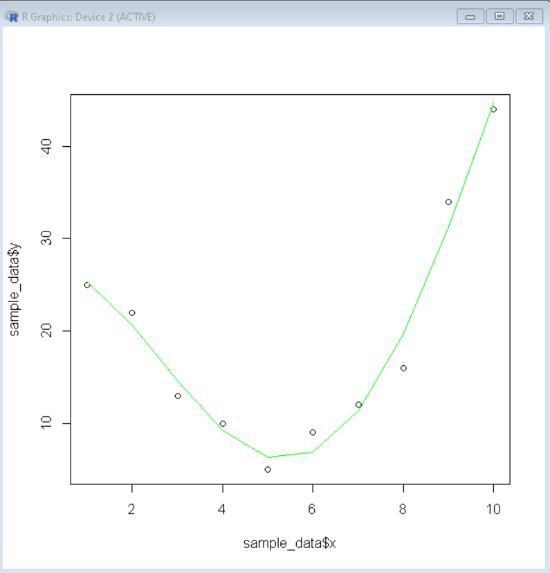
[5] 0.9448878用数据框可视化最佳拟合曲线:
现在,从上面的总结中,我们知道四阶线性模型最适合曲线,调整后的 r 平方值为 0.955868。因此,我们将使用散点图可视化四度线性模型,这是数据框的最佳拟合曲线。
例子:
R
# create sample data
sample_data <- data.frame(x=1:10,
                          y=c(25, 22, 13, 10, 5,
                              9, 12, 16, 34, 44))

# Create best linear model
best_model <- lm(y~poly(x,4,raw=TRUE), data=sample_data)

# create a basic scatterplot
plot(sample_data$x, sample_data$y)

# define x-axis values
x_axis <- seq(1, 10, length=10)

# plot best model
lines(x_axis, predict(best_model, data.frame(x=x_axis)), col='green')
输出: