在Python中使用 Altair 绘制带有回归线的散点图
先决条件:牛郎星
在本文中,我们将讨论如何使用 Altair 库使用回归线绘制散点图。
散点图和回归线
- 两个不同数值变量的值在散点图中用点或圆圈表示。散点图也称为散点图或散点图。每个点在水平和垂直轴上的位置表示单个数据点的值。
- 散点图有利于观察变量之间的关系。
- 回归线是最适合数据的直线,因此从线到图表上绘制的点的总距离最小。
安装:
要安装 Altair 库,请在命令提示符下编写以下命令。
pip install altair在这篇关于数据集的文章中,我们使用了 vega_datasets 包,在命令提示符下安装以下命令。
pip install vega_datasets方法:
- 导入必要的库。
- 从 vega_dataset 包创建或加载数据集。
- 要使用 Altair 库绘制散点图,我们必须给出三个重要的元素进行绘制,如下所示。
- 在第一个元素 altair.Chart(dataset) 中,将数据集作为参数传递。
- 在带有点 (.) 的第二个元素中添加 mark_point() 这个元素指定我们正在绘制的图表类型。
- 在带有点 (.) 的第三个元素中添加 encode(),其中传递我们正在绘制散点图的列。
- 将此散点图存储在名为“fig”的变量中。
- 然后绘制回归线 transform_regression()函数并将列作为绘制回归线的参数传递,并将其添加到存储在“fig”变量中的散点图。
- 将带有回归线的散点图存储在变量中,命名为“final_plot”。
- 如果在Python文件中编写程序代码,请使用 save()函数保存绘图,您可以使用 CTRL+O 命令在 Chrome 浏览器上查看该绘图,然后打开保存的绘图进行可视化。
- 否则,如果在 Jupyter notebook 或 notebook 环境中编写,请使用 show() 来可视化绘图。
- 了解如何使用 Jupyter Notebook:Jupyter Notebook 入门。
- 为了更好的理解,让我们使用Vega数据集包自带的airports和seattle_weather数据集来做一些例子。
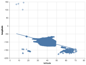
示例 1:机场数据集上带有回归线的默认散点图。
Python
# importing libraries
import altair as alt
from vega_datasets import data

# importing airports dataset from
# vega_datasets package
airport = data.airports()

# making the scatter plot on latitude and longitude
fig = alt.Chart(airport).mark_point().encode(x='latitude',y='longitude')

# making the regression line using transform_regression
# function and add with the scatter plot
final_plot = fig + fig.transform_regression('latitude','longitude').mark_line()

# saving the scatter plot with regression line
final_plot.save('output1.html')
Python
# importing libraries
import altair as alt
from vega_datasets import data

# importing airports dataset from vega_datasets package
airport = data.airports()

# making the scatter plot on latitude and longitude
# setting color on the basis of country
fig = alt.Chart(airport).mark_point().encode(
  x='latitude',y='longitude',color='country')

# making the regression line using transform_regression
# function and add with the scatter plot
final_plot = fig + fig.transform_regression('latitude','longitude').mark_line()

# saving the scatter plot with regression line
final_plot.save('output2.html')
Python
# importing libraries
import altair as alt
from vega_datasets import data

# importing weather dataset from vega_datasets package
weather_data = data.seattle_weather()

# making the scatter plot on temp_max and temp_min
fig = alt.Chart(weather_data).mark_point().encode(x='temp_max',y='temp_min')

# making the regression line using transform_regression
# function and add with the scatter plot
final_plot = fig + fig.transform_regression('temp_max','temp_min').mark_line()

# saving the scatter plot with regression line
final_plot.save('output3.html')
Python
# importing libraries
import altair as alt
from vega_datasets import data

# importing weather dataset from vega_datasets package
weather_data = data.seattle_weather()

# making the scatter on temp_max and temp_min
fig = alt.Chart(weather_data).mark_point().encode(
  x='temp_max',y='temp_min',color='weather')

# making the regression line using transform_regression
# function and add with the scatter plot
final_plot = fig + fig.transform_regression('temp_max','temp_min').mark_line()

# saving the scatter plot with regression line
final_plot.save('output4.html')
输出:
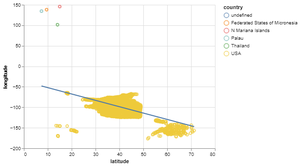
示例 2:通过使用机场数据集设置颜色来绘制带有回归线的散点图。
Python
# importing libraries
import altair as alt
from vega_datasets import data

# importing airports dataset from vega_datasets package
airport = data.airports()

# making the scatter plot on latitude and longitude
# setting color on the basis of country
fig = alt.Chart(airport).mark_point().encode(
  x='latitude',y='longitude',color='country')

# making the regression line using transform_regression
# function and add with the scatter plot
final_plot = fig + fig.transform_regression('latitude','longitude').mark_line()

# saving the scatter plot with regression line
final_plot.save('output2.html')
输出:
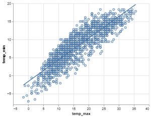
示例 3:使用 seattle_weather 数据集的带有回归线的默认散点图。
Python
# importing libraries
import altair as alt
from vega_datasets import data

# importing weather dataset from vega_datasets package
weather_data = data.seattle_weather()

# making the scatter plot on temp_max and temp_min
fig = alt.Chart(weather_data).mark_point().encode(x='temp_max',y='temp_min')

# making the regression line using transform_regression
# function and add with the scatter plot
final_plot = fig + fig.transform_regression('temp_max','temp_min').mark_line()

# saving the scatter plot with regression line
final_plot.save('output3.html')
输出:
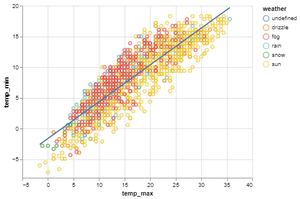
示例 4:通过使用 seattle_weather 数据集设置颜色来绘制带回归线的散点图。
Python
# importing libraries
import altair as alt
from vega_datasets import data

# importing weather dataset from vega_datasets package
weather_data = data.seattle_weather()

# making the scatter on temp_max and temp_min
fig = alt.Chart(weather_data).mark_point().encode(
  x='temp_max',y='temp_min',color='weather')

# making the regression line using transform_regression
# function and add with the scatter plot
final_plot = fig + fig.transform_regression('temp_max','temp_min').mark_line()

# saving the scatter plot with regression line
final_plot.save('output4.html')
输出: