在Python中的 3D 绘图上绘制 2D 数据
在本文中,我们将学习如何在Python中在 3D 绘图上绘制 2D 数据。我们将演示两种方法来学习这个概念。第一种方法将使用Matplotlib.pyplot.gca()函数,它是 matplotlib 库的 pyplot 模块。但在此之前,我们需要配置我们将在哪里创建我们的项目并学习概念。我们可以使用google colab ,也可以使用Sublime Text 、 Jupiter Notebook或其他各种代码编辑器在我们的本地机器上完成。
下面是描述如何在Python中在 3D 绘图上绘制 2D 数据的各种示例:
示例 1:
使用 Matplotlib.pyplot.gca()函数。 matplotlib.pyplot.gca()函数帮助我们获取当前轴或在必要时创建一个。在 gca()函数中,我们将投影定义为 3D 投影。
Python3
# importing numpy package
import numpy as np
# importing matplotlib package
import matplotlib.pyplot as plt

# Creating an empty canvas(figure)
fig = plt.figure()

# Using the gca function, we are defining
# the current axes as a 3D projection
ax = fig.gca(projection='3d')

# Labelling X-Axis
ax.set_xlabel('X-Axis')

# Labelling Y-Axis
ax.set_ylabel('Y-Axis')

# Labelling Z-Axis
ax.set_zlabel('Z-Axis')

# Creating 100 values for X
# in between 0 and 1
x = np.linspace(0, 1, 10)

# Creating 100 values for Y
# in between 0 and 1
y = np.linspace(0, 1, 10)

# Creating a sine curve
z = np.sin(x * 2 * np.pi) / 2 + 0.5

# zdir='z' fixes all the points to zs=0 and
# (x,y) points are ploted in the x-y axis
# of the graph
ax.plot(x, y, zs=0, zdir='z')

# zdir='y' fixes all the points to zs=0 and
# (x,y) points are ploted in the x-z axis of the
# graph
ax.plot(x, y, zs=0, zdir='y')

# zdir='z' fixes all the points to zs=0 and
# (x,z) points are ploted in the x-y axis of
# the  graph
ax.plot(x, z, zs=0, zdir='z')

# Showing the above plot
plt.show()
Python3
# importing numpy package
import numpy as np
# importing matplotlib package
import matplotlib.pyplot as plt
# creating an empty canvas
fig = plt.figure()
# Creating an empty 3D axes of the plot
ax = fig.add_subplot(projection='3d')
# Labeling the X Axis
ax.set_xlabel('X Axis')
# Labeling the Y-Axis
ax.set_ylabel('Y Axis')
# Labeling the Z-Axis
ax.set_zlabel('Z Axis')
# Creating X as an array of numbers
# from 1 to 10
x = np.arange(11)
# Creating Y as an array of numbers
# which are square of the numbers
# in X
y = x**2
# Creating a 2D data Scatter plot for the
# on a 3D axis figure
ax.scatter(x, y, c='b')
# Showing the above 3D plot
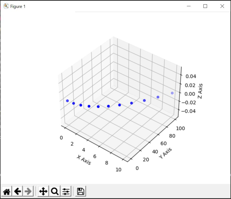
plt.show()创建一个空图形并将轴定义为 3D 投影后, plt.show()将使输出看起来像这样。

解释:
标记每个轴后,我们创建了 3 个不同的变量 x、y 和 z,其中 x 和 y 包含 10 个从 0 到 1 的均匀间隔元素,z 是一条正弦曲线。在 ax.plot 的帮助下,我们在 3D 平面的不同轴上绘制 (x,y),(x,z)[2D Data] 点。最后,我们的输出将如下所示:
输出:

示例 2:
在这个例子中,我们不会使用 Matplotlib.pyplot.gca()函数,但我们将创建一组 2D 数据,我们将在 3D 投影中使用这些数据制作 2D 绘图。上述想法的代码如下:
蟒蛇3
# importing numpy package
import numpy as np
# importing matplotlib package
import matplotlib.pyplot as plt

# creating an empty canvas
fig = plt.figure()

# Creating an empty 3D axes of the plot
ax = fig.add_subplot(projection='3d')

# Labeling the X Axis
ax.set_xlabel('X Axis')

# Labeling the Y-Axis
ax.set_ylabel('Y Axis')

# Labeling the Z-Axis
ax.set_zlabel('Z Axis')

# Creating X as an array of numbers
# from 1 to 10
x = np.arange(11)

# Creating Y as an array of numbers
# which are square of the numbers
# in X
y = x**2

# Creating a 2D data Scatter plot for the
# on a 3D axis figure
ax.scatter(x, y, c='b')

# Showing the above 3D plot
plt.show()
解释:
导入包后,我们将创建一个空的画布或图形。然后,我们通过指定它将是 3D 投影来创建图形的轴。如果我们现在显示 write 'plt.show()'并构建我们的代码,那么结果将如下所示:

在此之后,我们将设置三轴 X、Y 和 Z 的标签。之后我们将创建我们的点集 (x, y) 其中是使用np.arange()函数和 y 创建的数字列表包含 x 中每个数字的平方。对于所有 2D 数据,我们在 3D 图中绘制散点图,其中点 (x, y) 表示为蓝色。之后,我们显示上图。
输出: