使用 Sklearn 实现 DBSCAN 算法
先决条件: DBSCAN 算法
基于密度的带噪声应用空间聚类( DBCSAN ) 是一种聚类算法,于 1996 年提出。2014 年,该算法在领先的数据挖掘会议 KDD 上获得“时间测试”奖。
数据集——信用卡。
第 1 步:导入所需的库
import numpy as np
import pandas as pd
import matplotlib.pyplot as plt

from sklearn.cluster import DBSCAN
from sklearn.preprocessing import StandardScaler
from sklearn.preprocessing import normalize
from sklearn.decomposition import PCA
第 2 步:加载数据
X = pd.read_csv('..input_path/CC_GENERAL.csv')
# Dropping the CUST_ID column from the data
X = X.drop('CUST_ID', axis = 1)
# Handling the missing values
X.fillna(method ='ffill', inplace = True)
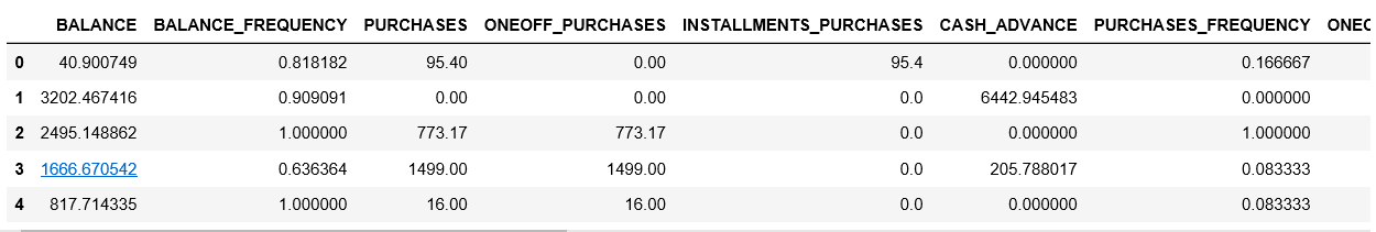
print(X.head())
第 3 步:预处理数据
# Scaling the data to bring all the attributes to a comparable level
scaler = StandardScaler()
X_scaled = scaler.fit_transform(X)

# Normalizing the data so that
# the data approximately follows a Gaussian distribution
X_normalized = normalize(X_scaled)

# Converting the numpy array into a pandas DataFrame
X_normalized = pd.DataFrame(X_normalized)
第 4 步:降低数据的维度以使其可视化
pca = PCA(n_components = 2)
X_principal = pca.fit_transform(X_normalized)
X_principal = pd.DataFrame(X_principal)
X_principal.columns = ['P1', 'P2']
print(X_principal.head())

第 5 步:构建聚类模型
# Numpy array of all the cluster labels assigned to each data point
db_default = DBSCAN(eps = 0.0375, min_samples = 3).fit(X_principal)
labels = db_default.labels_
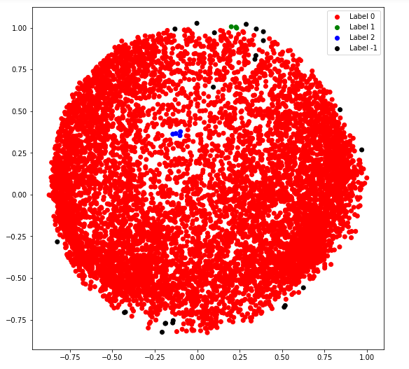
第 6 步:可视化聚类
# Building the label to colour mapping
colours = {}
colours[0] = 'r'
colours[1] = 'g'
colours[2] = 'b'
colours[-1] = 'k'

# Building the colour vector for each data point
cvec = [colours[label] for label in labels]

# For the construction of the legend of the plot
r = plt.scatter(X_principal['P1'], X_principal['P2'], color ='r');
g = plt.scatter(X_principal['P1'], X_principal['P2'], color ='g');
b = plt.scatter(X_principal['P1'], X_principal['P2'], color ='b');
k = plt.scatter(X_principal['P1'], X_principal['P2'], color ='k');

# Plotting P1 on the X-Axis and P2 on the Y-Axis
# according to the colour vector defined
plt.figure(figsize =(9, 9))
plt.scatter(X_principal['P1'], X_principal['P2'], c = cvec)

# Building the legend
plt.legend((r, g, b, k), ('Label 0', 'Label 1', 'Label 2', 'Label -1'))

plt.show()
第 7 步:调整模型的参数
db = DBSCAN(eps = 0.0375, min_samples = 50).fit(X_principal)
labels1 = db.labels_
第 8 步:可视化更改
colours1 = {}
colours1[0] = 'r'
colours1[1] = 'g'
colours1[2] = 'b'
colours1[3] = 'c'
colours1[4] = 'y'
colours1[5] = 'm'
colours1[-1] = 'k'

cvec = [colours1[label] for label in labels]
colors = ['r', 'g', 'b', 'c', 'y', 'm', 'k' ]

r = plt.scatter(
        X_principal['P1'], X_principal['P2'], marker ='o', color = colors[0])
g = plt.scatter(
        X_principal['P1'], X_principal['P2'], marker ='o', color = colors[1])
b = plt.scatter(
        X_principal['P1'], X_principal['P2'], marker ='o', color = colors[2])
c = plt.scatter(
        X_principal['P1'], X_principal['P2'], marker ='o', color = colors[3])
y = plt.scatter(
        X_principal['P1'], X_principal['P2'], marker ='o', color = colors[4])
m = plt.scatter(
        X_principal['P1'], X_principal['P2'], marker ='o', color = colors[5])
k = plt.scatter(
        X_principal['P1'], X_principal['P2'], marker ='o', color = colors[6])

plt.figure(figsize =(9, 9))
plt.scatter(X_principal['P1'], X_principal['P2'], c = cvec)
plt.legend((r, g, b, c, y, m, k),
           ('Label 0', 'Label 1', 'Label 2', 'Label 3 'Label 4',
            'Label 5', 'Label -1'),
           scatterpoints = 1,
           loc ='upper left',
           ncol = 3,
           fontsize = 8)
plt.show()
